🐛
MUI v5 DataGridの使い方 その2 ~クリックできるアイコンセルを表示する~
前回に続いて、Vite+React+TypeScript 環境で MUI の DataGrid の使い方を、Tips的にまとめていきます。
MUI v5 DataGrid の記事一覧
MUI v5 DataGridの使い方 その1 ~基本の使い方から日本語化まで~
MUI v5 DataGridの使い方 その2 ~クリックできるアイコンセルを表示する~
MUI v5 DataGridの使い方 その3 ~セルの縦線を表示する(不具合対応済み)~
MUI v5 DataGridの使い方 その4 ~列ヘッダ、列の設定~
MUI v5 DataGridの使い方 その5 ~フッター~
MUI v5 DataGridの使い方 その6 ~グリッドのPropsの一覧~
MUI v5 DataGridの使い方 その7~有償版(Pro版)のエラー対応~
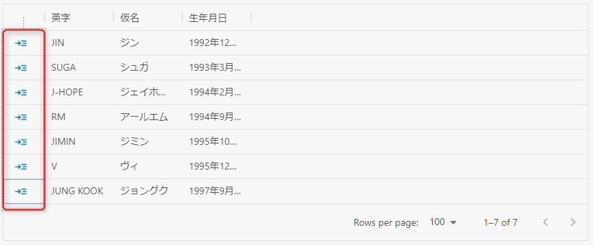
列にクリックできるアイコンを表示する
グリッドの先頭列にアクション付きの画像を表示します。
グリッド列情報の type に action を指定し、getActions に GridActionsCellItem コンポーネントを指定します。
import * as React from 'react'
import {
  DataGrid,
  GridColDef,
  GridRowsProp,
  GridActionsCellItem,
  GridRowParams
} from '@mui/x-data-grid'
import { SvgIcon } from '@mui/material'
import { ReactComponent as godetail } from '@/assets/go_detail.svg'

const rows: GridRowsProp = [
  { id: 1, name: 'JIN', kana: 'ジン', birth: '1992年12月4日' },
  { id: 2, name: 'SUGA', kana: 'シュガ', birth: '1993年3月9日' },
  { id: 3, name: 'J-HOPE', kana: 'ジェイホープ', birth: '	1994年2月18日' },
  { id: 4, name: 'RM', kana: 'アールエム', birth: '1994年9月12日' },
  { id: 5, name: 'JIMIN', kana: 'ジミン', birth: '1995年10月13日' },
  { id: 6, name: 'V', kana: 'ヴィ', birth: '1995年12月30日' },
  { id: 7, name: 'JUNG KOOK', kana: 'ジョングク', birth: '1997年9月1日' }
]

export function List() {
  // アイコンをクリックしたときの処理
  const handleDetailClick = React.useCallback(
    (params: GridRowParams) => (event: { stopPropagation: () => void }) => {
      event.stopPropagation()
      console.log(`handleDetailClick:id=${params.id}`)
    },
    []
  )

  // 表示するアクションを返す関数です
  const getDetailAction = React.useCallback(
    (params: GridRowParams) => [
      <GridActionsCellItem
        icon={<SvgIcon component={godetail} sx={{ color: '#1e8cb0' }} />}
        label="詳細"
        onClick={handleDetailClick(params)}
        color="inherit"
      />
    ],
    [handleDetailClick]
  )

  // グリッド列情報
  const cols: GridColDef[] = [
    {
      field: 'detailAction',
      headerName: '',
      align: 'left',
      width: 60,
      type: 'actions',         // action を指定
      getActions: getDetailAction   // GridActionsCellItem コンポーネントを指定
    } as GridColDef,
    {
      field: 'name',
      headerName: '英字'
    },
    {
      field: 'kana',
      headerName: '仮名'
    },
    {
      field: 'birth',
      headerName: '生年月日'
    }
  ]

  return (
      <div style={{ width: '100%' }}>
        <DataGrid
          columns={cols}
          rows={rows}
          density="compact"
          autoHeight
        />
      </div>
  )
}
アイコンにツールチップを表示する場合は、IconButton コンポーネントとTooltip コンポーネントで囲みます。
const colDetailAction = React.useCallback(
    (params: GridRowParams) => [
      <GridActionsCellItem
        icon={
          <Tooltip title="詳細画面へ">
            <IconButton>
              <SvgIcon component={godetail} sx={{ color: '#1e8cb0' }}
            </IconButton>
          </Tooltip>
        }
        label="詳細"
        onClick={handleDetailClick(params)}
        color="inherit"
      />
    ],
    [handleDetailClick]
  )
Discussion