🐡
Next.js + Tailwind CSS + Storybook のセットアップ
Nextプロジェクトを作成する
$ npx create-next-app@latest --ts demo-next-storybook
$ cd demo-next-storybook
Next.jsのバージョン: 12.1.6
Tailwindをインストールする
参考
$ npm install -D tailwindcss postcss autoprefixer
$ npx tailwindcss init -p
tailwind.config.js と postcss.config.js が生成される
configファイルにパスを追加する
tailwind.config.js
 module.exports = {
   content: [
+    "./pages/**/*.{js,ts,jsx,tsx}",
+    "./components/**/*.{js,ts,jsx,tsx}",
   ],
   theme: {
     extend: {},
   },
   plugins: [],
 }
CSSファイルに@tailwindディレクティブを追加する
styles/globals.css
+@tailwind base;
+@tailwind components;
+@tailwind utilities;
Buttonコンポーネントを作る
components/Button/Button.tsxを作成する
components/Button/Button.tsx
import React from "react";

type Props = {
  outlined?: boolean;
  size?: 'small' | 'middle';
  children: React.ReactNode;
  onClick?: () => void;
}

export const Button: React.FC<Props> = ({
  outlined = false,
  size = 'middle',
  children,
  onClick
}) => {
  return (
    <button
      type="button"
      className={`
        rounded
        ${size === 'middle'
          ? 'px-5 py-1'
          : 'px-3 py-1 text-sm'
        }
        ${outlined
          ? 'border border-blue-600 text-blue-600 hover:bg-blue-600 hover:text-white'
          : 'border-none bg-blue-600 text-white hover:bg-blue-500'
        }
      `}
      onClick={onClick}
      >
        {children}
    </button>
  );
};
rootページに表示する
pages/index.tsx
 import type { NextPage } from 'next'
 import Head from 'next/head'
 import Image from 'next/image'
+import { Button } from '../components/Button/Button'
 import styles from '../styles/Home.module.css'

 const Home: NextPage = () => {
   return (
     <div className={styles.container}>
       // ...
       <main className={styles.main}>
         <h1 className={styles.title}>
           Welcome to <a href="https://nextjs.org">Next.js!</a>
         </h1>

+        <Button
+          outlined={false}
+          size={'small'}
+          onClick={() => document.location.href = "https://reactjs.org"}
+        >
+          Submit
+        </Button>

         // ...
       </main>
     </div>
   )
 }

 export default Home
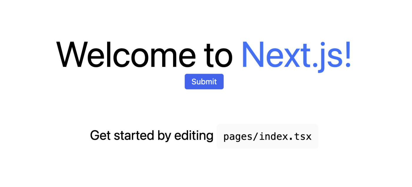
outlined={false}, size={'small'} の場合
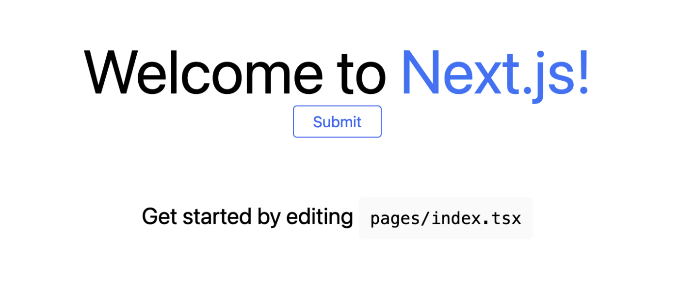
outlined={true}, size={'middle'} の場合
Storybookをインストールする
参考
$ npx sb init
.storybook/main.js と .storybook/preview.js とサンプルファイルが生成される
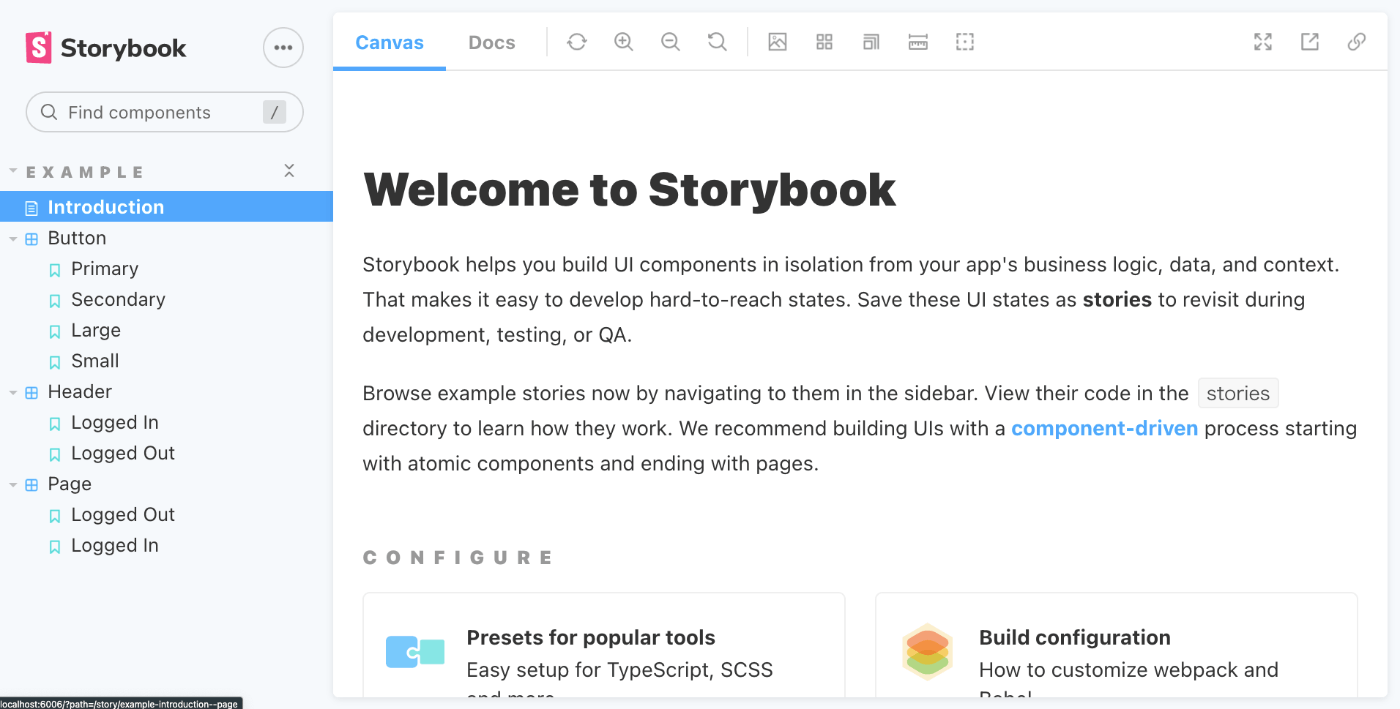
storybookを起動する
$ yarn storybook
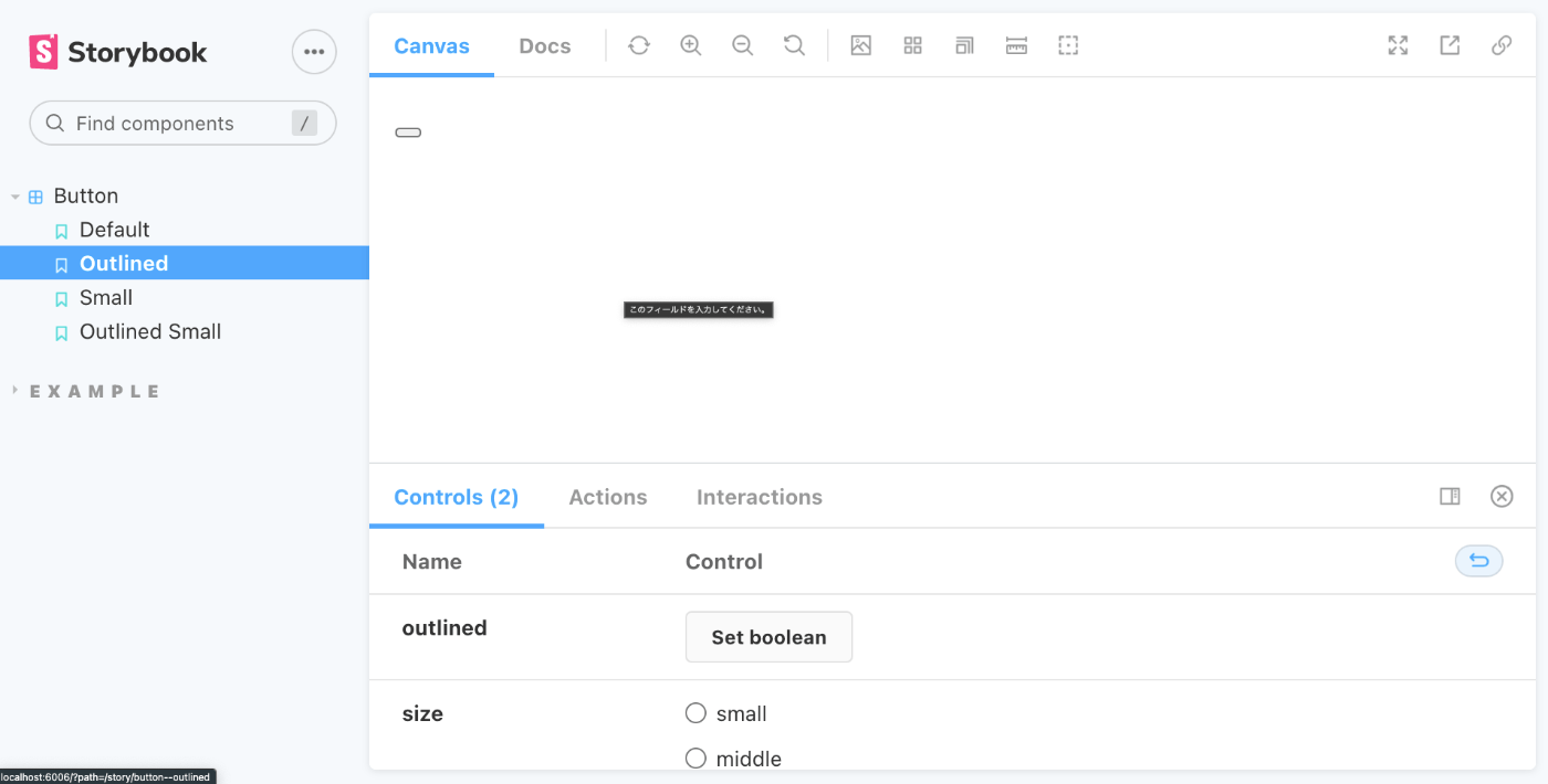
Buttonコンポーネントのストーリーファイルを作成する
src/components/Button/Button.stories.tsxを作成する
src/components/Button/Button.stories.tsx
import React, { Children } from "react";
import { ComponentStory, ComponentMeta } from '@storybook/react';
import { Button } from "./Button";
export default {
title: 'Button',
component: Button,
} as ComponentMeta<typeof Button>;
const Template: ComponentStory<typeof Button> = (args) => <Button {...args}>{args.children}</Button>;
export const Default = Template.bind({});
Default.args = {
children: 'Button',
};
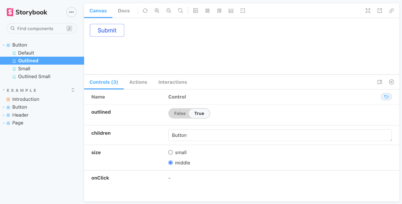
export const Outlined = Template.bind({});
Outlined.args = {
outlined: true,
children: 'Button',
};
export const Small = Template.bind({});
Small.args = {
size: 'small',
children: 'Button',
};
export const OutlinedSmall = Template.bind({});
OutlinedSmall.args = {
outlined: true,
size: 'small',
children: 'Button',
};
ストーリーファイルを読み込むためにパスを追加する
.storybook/main.js
 module.exports = {
   "stories": [
     "../stories/**/*.stories.mdx",
     "../stories/**/*.stories.@(js|jsx|ts|tsx)",
+    "../components/**/*.stories.@(js|jsx|ts|tsx)"
   ],
   "addons": [
     "@storybook/addon-links",
     "@storybook/addon-essentials",
     "@storybook/addon-interactions"
   ],
   "framework": "@storybook/react",
   "core": {
     "builder": "@storybook/builder-webpack5"
   }
 }
まだTailwindが読み込まれていない
Tailwind CSSをStorybookで読み込む
@storybook/addon-postcssをインストールする
$ yarn add -D @storybook/addon-postcss
設定を追加する
.storybook/main.js
   "addons": [
     "@storybook/addon-links",
     "@storybook/addon-essentials",
     "@storybook/addon-interactions",
+    {
+      name: '@storybook/addon-postcss',
+      options: {
+        postcssLoaderOptions: {
+          implementation: require('postcss'),
+        },
+      },
+    }
.storybook/preview.jsでCSSファイルをimportする
.storybook/preview.js
+import '../styles/globals.css';

 export const parameters = {
   actions: { argTypesRegex: "^on[A-Z].*" },
   controls: {
     matchers: {
       color: /(background|color)$/i,
       date: /Date$/,
     },
   },
 }
表示できた
testingライブラリをインストールする
$ yarn add -D @testing-library/react @testing-library/jest-dom jest jest-environment-jsdom
- React Testing Library, Jest
- テストフレームワーク
- よく組み合わせて使われる
- jest-dom
- Jestを拡張子使いやすくするカスタムMatcherのセットを提供する
- jest-environment-jsdom
- TODO
setupTests.tsを作成する
setupTests.ts
import '@testing-library/jest-dom';
jest.config.jsを作成する
jest.config.js
// jest.config.js
const nextJest = require('next/jest')

const createJestConfig = nextJest({
  // Provide the path to your Next.js app to load next.config.js and .env files in your test environment
  dir: './',
})

// Add any custom config to be passed to Jest
const customJestConfig = {
  // Add more setup options before each test is run
  // setupFilesAfterEnv: ['<rootDir>/jest.setup.js'],
  // if using TypeScript with a baseUrl set to the root directory then you need the below for alias' to work
  moduleDirectories: ['node_modules', '<rootDir>/'],
  testEnvironment: 'jest-environment-jsdom',
}

// createJestConfig is exported this way to ensure that next/jest can load the Next.js config which is async
module.exports = createJestConfig(customJestConfig)
参考
@storybook/testing-reactアドオンのインストールする
(jest のテストコード中に Story を利用可能にする)
$ yarn add -D @storybook/testing-react
npm scriptsにtestコマンドを追加する
package.json
 {
   "name": "demo-next-storybook",
   "version": "0.1.0",
   "private": true,
   "scripts": {
     "dev": "next dev",
     "build": "next build",
     "start": "next start",
+    "test": "jest --watch",
     "lint": "next lint",
     "storybook": "start-storybook -p 6006",
     "build-storybook": "build-storybook"
   },
   // ...
 }
Buttonコンポーネントのテストを作成する
components/Button/Button.test.tsxを作成する
import { render, screen } from '@testing-library/react';
import { composeStories } from '@storybook/testing-react';
import * as stories from './Button.stories';

const { Default } = composeStories(stories);

test('render button with default args', () => {
  render(<Default>Button</Default>);
  const buttonElement = screen.getByText(/Button/i);
  expect(buttonElement).not.toBeNull();
});
テストを実行する
$ yarn test
Discussion
こちらのコード、正しくは以下のコードではないでしょうか?
@ryo-takahashi さん
ご指摘ありがとうございます、その通りでした!
以下のように修正させていただきました