【Flutter Widget of the Week #33】Flexibleを使ってみた
はじめに
Flutter Widget of the Week #33 Flexible についてまとめましたので、紹介します。
Flexible
与えられたサイズに応じて柔軟に Widget の大きさを変えたい場合、 Flexible が効果的です。
以前紹介したExpanded も一つの方法ですが、Flexible を使う方法もあるので、合わせて見てもらえたらと思います。
では、さっそくサンプルを動かして使い方を見てみましょう。
Flexible サンプルコード
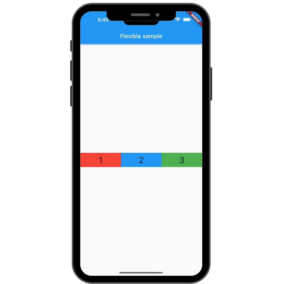
Flexible サンプル実行画面
基本のサンプルコード全体
class FlexibleSample extends StatelessWidget {
const FlexibleSample({super.key});
Widget build(BuildContext context) {
return Scaffold(
appBar: AppBar(
title: const Text('Flexible sample'),
),
body: Center(
child: Row(
children: <Widget>[
Flexible(
child: Container(
alignment: Alignment.center,
height: 50,
color: Colors.red,
child: const Text(
'1',
style: TextStyle(fontSize: 30),
textAlign: TextAlign.center,
),
),
),
Flexible(
child: Container(
alignment: Alignment.center,
height: 50,
color: Colors.blue,
child: const Text(
'2',
style: TextStyle(fontSize: 30),
textAlign: TextAlign.center,
),
),
),
Flexible(
child: Container(
alignment: Alignment.center,
height: 50,
color: Colors.green,
child: const Text(
'3',
style: TextStyle(fontSize: 30),
textAlign: TextAlign.center,
),
),
)
],
),
),
);
}
}
使い方は簡単で、Container を Flexible でラップするだけです。
また、Flexible には flex プロパティがあります。
サンプルの3つの Flexible にそれぞれ以下のような指定をすると
flex を指定した時のコード
class FlexibleSample extends StatelessWidget {
const FlexibleSample({super.key});
Widget build(BuildContext context) {
return Scaffold(
appBar: AppBar(
title: const Text('Flexible sample'),
),
body: Center(
child: Row(
children: <Widget>[
Flexible(
flex: 3,
child: Container(
alignment: Alignment.center,
height: 50,
color: Colors.red,
child: const Text(
'1',
style: TextStyle(fontSize: 30),
textAlign: TextAlign.center,
),
),
),
Flexible(
flex: 2,
child: Container(
alignment: Alignment.center,
height: 50,
color: Colors.blue,
child: const Text(
'2',
style: TextStyle(fontSize: 30),
textAlign: TextAlign.center,
),
),
),
Flexible(
flex: 1,
child: Container(
alignment: Alignment.center,
height: 50,
color: Colors.green,
child: const Text(
'3',
style: TextStyle(fontSize: 30),
textAlign: TextAlign.center,
),
),
)
],
),
),
);
}
}
左から 3 : 2 : 1 の比率のサイズで表示されるようになります。
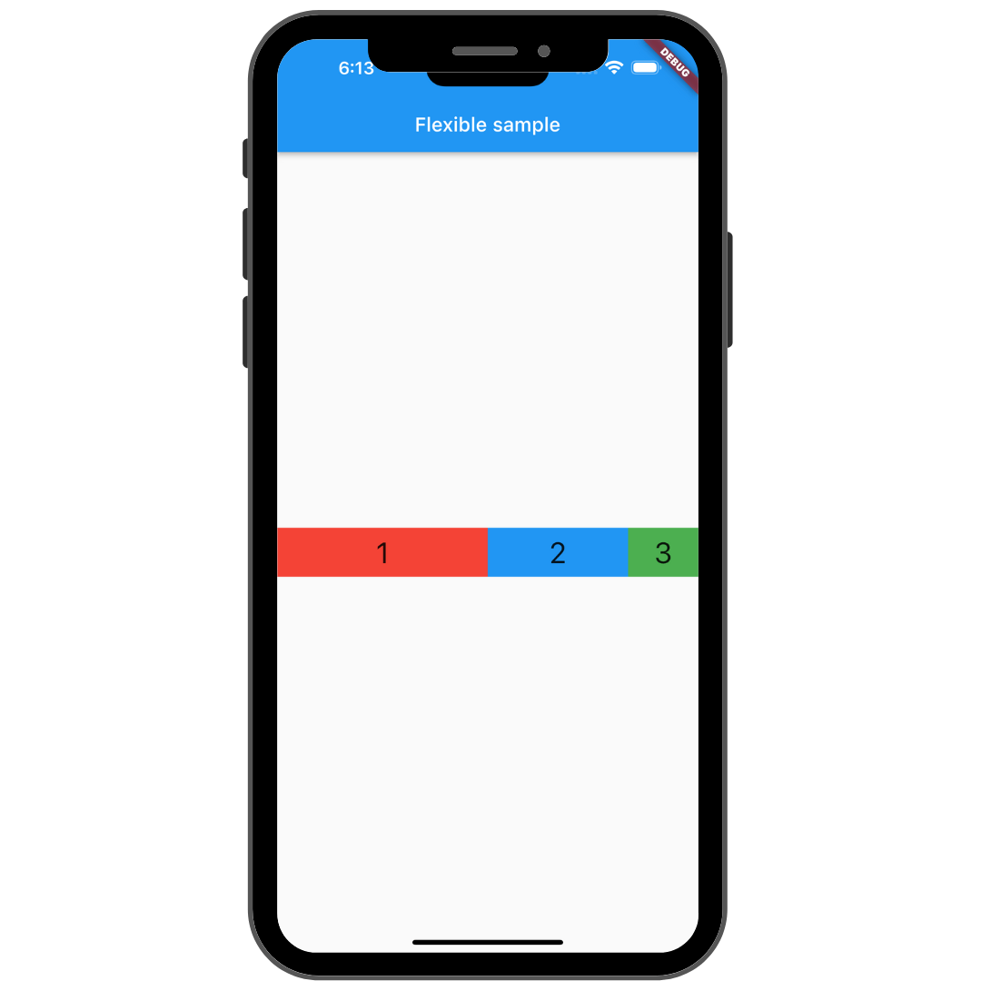
flex 指定した時の実行画面
次に3つある Flexible のうち、1つだけ子要素の Container に width を指定すると、
width を指定した時のコード
class FlexibleSample extends StatelessWidget {
const FlexibleSample({super.key});
Widget build(BuildContext context) {
return Scaffold(
appBar: AppBar(
title: const Text('Flexible sample'),
),
body: Center(
child: Row(
children: <Widget>[
Flexible(
child: Container(
alignment: Alignment.center,
width: 20,
height: 50,
color: Colors.red,
child: const Text(
'1',
style: TextStyle(fontSize: 30),
textAlign: TextAlign.center,
),
),
),
Flexible(
child: Container(
alignment: Alignment.center,
height: 50,
color: Colors.blue,
child: const Text(
'2',
style: TextStyle(fontSize: 30),
textAlign: TextAlign.center,
),
),
),
Flexible(
flex: 1,
child: Container(
alignment: Alignment.center,
height: 50,
color: Colors.green,
child: const Text(
'3',
style: TextStyle(fontSize: 30),
textAlign: TextAlign.center,
),
),
)
],
),
),
);
}
}
width を指定した部分だけそのサイズとなり、右側にスペースができます。
ここが Expanded と異なる部分で、 Expanded の場合、スペースを埋めるような表示になります。

width 指定した時の実行画面
基本的な使い方としては以上です。
Flexible のプロパティについて
Flexible にはいくつかプロパティがあるので、一部紹介します。
(new) Flexible Flexible({
  Key? key,
  int flex = 1,
  FlexFit fit = FlexFit.loose,
  required Widget child,
})
①flex
この子要素に使用するフレックス係数を指定する
デフォルトは 1
型は int 型
②fit
柔軟な子要素が、空いているスペースにどのように表示されるかを指定する
デフォルトは FlexFit.loose
型は FlexFit 型
最後に
今回は Flexible を紹介しました。途中でも軽く説明しましたが、Expanded とどちら使うべきかは、子要素が使用可能なスペースを全部埋める必要があるかどうかで変えてもらえれば大丈夫だと思います。
ぜひ使ってみてください。
次は #34 MediaQuery です。またお会いしましょう。
参考記事
Discussion