FlutterでMaterial Design 3に対応する
For English
Flutter 3が先日発表されました。
Flutter 3では、Material Design 3に対応しています。
ただ、完全に対応しているわけではなく、まだ対応していないWidgetが存在します。
Material Design 3への対応状況について↓
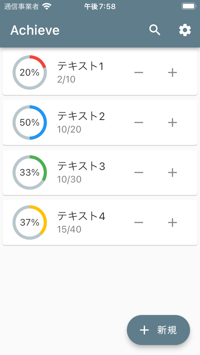
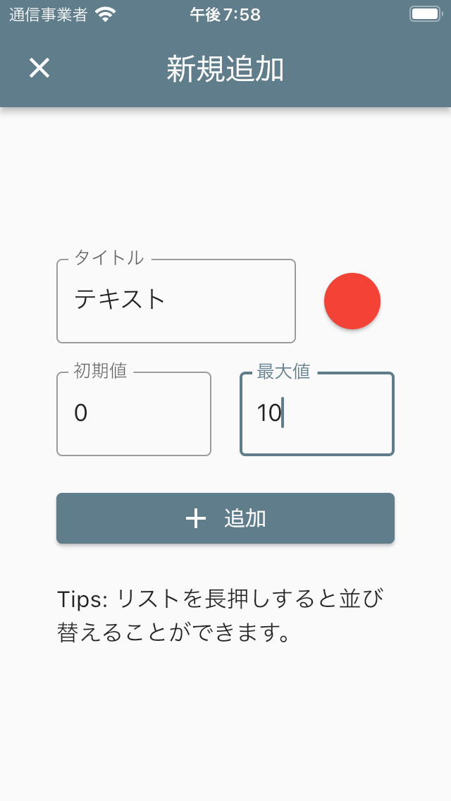
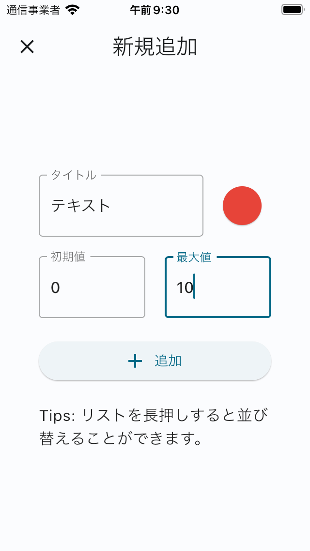
この記事では、私がつくったアプリ「Achieve: ToDoカウンター」をMaterial Design 3に対応した過程をまとめます。
環境
[✓] Flutter (Channel stable, 3.0.0, on macOS 12.3.1 21E258 darwin-arm, locale ja-JP)
[✓] Android toolchain - develop for Android devices (Android SDK version 31.0.0)
[✓] Xcode - develop for iOS and macOS (Xcode 13.3)
[✓] Chrome - develop for the web
[✓] Android Studio (version 2021.1)
[✓] VS Code (version 1.67.1)
[✓] Connected device (4 available)
[✓] HTTP Host Availability
Material Design 3の適用
現時点において、FlutterでMaterial Design 3が自動的に適用されるわけではありません。
These changes will be provided as an opt-in solution for now and the current Material 2 functionality will remain a part of the framework for a while (at least 1 year+). This will give developers a lot of time to opt-in and move over their projects.
https://github.com/flutter/flutter/issues/91605
Material Design 3を適用するには、ThemeDataのところでuseMaterial3: trueを追加します。
また、primarySwatchをcolorSchemeSeedに変更します。
colorSchemeSeedにすることで、Material Design 3に適合したColor systemをアプリに適用できます。
ThemeData(
+ useMaterial3: true,
+ colorSchemeSeed: Colors.blueGrey,
- primarySwatch: Colors.blueGrey,
  brightness: Brightness.light,
)
以下のようになりました。
| Before | After |
|---|---|
 |
 |
 |
 |
AppBar, Card, FAB(FloatingActionButton), ElevatedButtonの色・形が変わったことがわかります。
個人的に、いままでのAppBarの色は少し野暮ったい感じがしてたので、白っぽい色になってくれたのがうれしいです(ちなみに、下にスクロールした状態だと少し色が濃くなります)。
全体的にいい感じだとは思うんですが、ElevatedButtonが白っぽくなって見にくくなったので変えたいと思います。
ただ変えるといっても、Material Design 3に従ったものにしてみます。
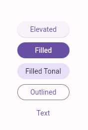
ElevatedButtonについて
Material Design 3でのElevatedButton
FlutterでのElevatedButtonは、Material Design 2でのContained buttonと対応するものです。
このContained buttonについて、Material Design 3では、Filled button, Filled tonal button, Elevated buttonという3種類に分かれています。
https://flutter.github.io/samples/web/material_3_demo/#/
対応表
| Flutter | Material Design 2 | Material Design 3 |
|---|---|---|
| ElevatedButton | Contained button | Filled button, Filled tonal button, Elevated button |
| OutlinedButton | Outlined Button | Outlined button |
| TextButton | Text button | Text button |
Filled button
FABの次に重要なことを示すボタン
The filled button’s contrasting surface color makes it the most prominent button after the FAB. It’s used for final or unblocking actions in a flow.
https://m3.material.io/components/all-buttons
Filled tonal button
Filled buttonよりも強調しないけど重要なことを示すボタン
Filled tonal buttons have a lighter background color and darker label color, making them less visually prominent than a regular, filled button. They’re still used for final or unblocking actions in a flow, but do so with less emphasis.
https://m3.material.io/components/all-buttons
Elevated button (Material Design 3)
使用例を見ると、Filled tonal buttonよりも重要度下がり、Outlined buttonと同じくらいの重要度?
Elevated buttons are essentially filled buttons with a lighter background color and a shadow.
https://m3.material.io/components/all-buttons
そのため、ボタンの示す重要度としては、
Filled button > Filled tonal button >= Elevated button (= Outlined button > Text button)
という感じだと思います。
FlutterでFilled button
今回は、画面内に1つだけあるボタンなので、重要度が高いことを示すFilled buttonにしてみます。
FlutterでのElevatedButtonは、何も指定しなければMaterial Design 3でのElevated buttonとなります。
FilledButtonというWidgetは現時点でFlutterにないため、Filled buttonにするには、ElevatedButton内でstyleを追加する必要があります。
For now we are suggesting using the existing ElevatedButton with styles to achieve the Filled and Filled Tonal looks. You can see examples of these in the sample added for the PR:https://github.com/flutter/flutter/pull/100794/files#diff-aac3a34e6f8e5c540516600483774c89534da079af53feb8ea1ac7dd76c1558b
We may look into adding subclasses for these, but we were trying to be conservative with adding new APIs.
https://github.com/flutter/flutter/issues/99022 より
ElevatedButton.icon(
  style: ElevatedButton.styleFrom(
    // Foreground color
    onPrimary: Theme.of(context).colorScheme.onPrimary,
    // Background color
    primary: Theme.of(context).colorScheme.primary,
  ).copyWith(elevation: ButtonStyleButton.allOrNull(0.0)),
  onPressed: () {},
  icon: const Icon(Icons.add),
  label: const Text('追加'),
)
| Elevated button | Filled button |
|---|---|
|
 |
これで見やすいボタンになりました!
Filled tonal buttonの場合は、以下のstyleを適用してください。
style: ElevatedButton.styleFrom(
  // Foreground color
  onPrimary: Theme.of(context).colorScheme.onSecondaryContainer,
  // Background color
  primary: Theme.of(context).colorScheme.secondaryContainer,
).copyWith(elevation: ButtonStyleButton.allOrNull(0.0)),
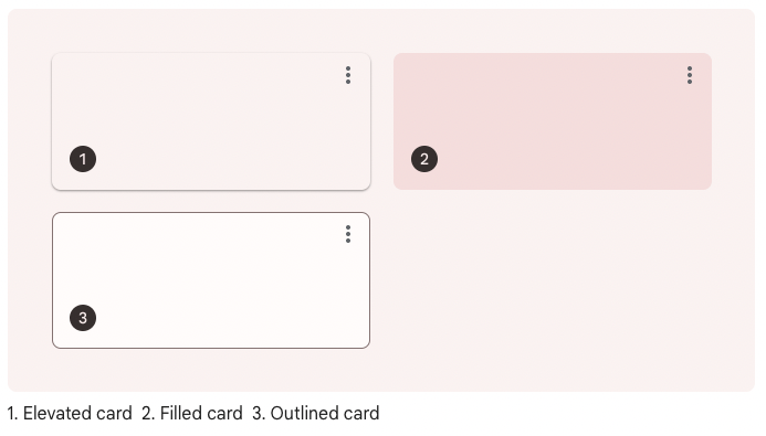
Cardについて
Material Design 3でのCard
Cardについて、Material Design 3では、Elevated card, Filled card, Outlined cardという3種類が公式のカードの種類とされています。
https://m3.material.io/components/cards/guidelines
FlutterでのCardは、何も指定しなければElevated cardとなり、elevation, shape等を設定することによりFilled card, Outlined cardにすることができます。
どれを選択すべきかどうかは、読みやすさや機能性はどれも同じなため、スタイルだけによって決めていいようです。
背景との分離度は、
Outlined card > Elevated card > Filled card
とのことです。
Each provides the same legibility and functionality, so the type you use depends on style alone.
https://m3.material.io/components/cards/guidelines
FlutterでFilled card, Outlined card
Filled cardにするには、Card()内に以下コードを追加します。
elevation: 0,
color: Theme.of(context).colorScheme.surfaceVariant,
Outlined cardの場合は、Card()内に以下コードを追加します。
elevation: 0,
shape: RoundedRectangleBorder(
  side: BorderSide(
    color: Theme.of(context).colorScheme.outline,
  ),
  borderRadius: const BorderRadius.all(Radius.circular(12)),
),
今回のアプリで試しにOutlined cardにしてみました。
| Elevated card | Outlined card |
|---|---|
|
 |
どっちがいいかはなんともいえないところです。
Outlined cardの方がシンプルでいいかな?ということでOutlined cardをとりあえず採用することにしました。
Iconについて
Flutterでよく使うIcon(Icons.~)。
これは、Material IconsというGoogleが提供しているアイコンです。
Material Design 3では、Material Iconsではなく、Material Symbolsがデフォルトのアイコンになります。
Material Symbolsでは、weight, fill, optical size, gradeという4つの属性をいじることができる可変アイコンフォントになりました。
Material Iconsでは、デフォルトでアイコンの中身が塗りつぶされている状態でしたが、Material Symbolsでは、塗りつぶされていない状態がデフォルト?のようです。
今のところ、FlutterではMaterial Symbolsに対応していません。 が、Material Iconsのoutlinedアイコンを使ってそれっぽい感じにしてみました。
- Icon(Icons.settings)
+ Icon(Icons.settings_outlined)
AppBarの色変更に伴う対応
このアプリでは、検索機能を使う際、AppBarのtitleにTextFieldを指定して入力できるようにしています。
今までは、AppBarとTextFieldの色が同じで文字が見えなくなっていたので、TextFieldのfont, cursor, boderの色をColors.whiteにしていました。
Material Design 3では、AppBarが背景と同じ色になり、TextFieldで色を指定しなくとも文字がちゃんと見えるようになったので、色の指定をなくしました。
その他 Dialog等
Material Design 3に対応したことによって、レイアウトが崩れる等UIに問題が生じていないか確認します。
例えば、Dialogは以下のように変わります。
| Before | After |
|---|---|
 |
 |
現在、Material Design 3に対応しているWidgetは以下の通り。
- AlertDialog
- AppBar
- Card
- Dialog
- ElevatedButton
- FloatingActionButton
- Material
- NavigationBar
- NavigationRail
- OutlinedButton
- StretchingOverscrollIndicator, replacing the GlowingOverscrollIndicator
- TextButton
これらのWidgetは、今までと色・形が変わっていると思うので、特に確認しておきましょう。
【追記】 ColorSchemeの色を指定
Card内のIconButtonとsubtitleの色をもう少し濃くしたかったので、色を指定したいと思います。
Material Design 3でのカラーシステムは、key colorをもとにcolor schemeというカラーパレット?が生成されます。
Flutterでは、ThemeDataのところで指定したcolorSchemeSeedをもとにcolorSchemeが生成されます。
Outlined cardでは、Surfaceという役割の色が使われているので、その上にある色ということでonSurfaceをIconButtonとsubtitleの色に指定します。
onSurfaceを指定する場合は以下のコードになります。
Theme.of(context).colorScheme.onSurface
このColor Schemeの色・カラーコードを確認できるWebアプリを作りました。
Before After
| Before | After |
|---|---|
|
 |
|
|
いい感じです!
今後徐々にMaterial Design 3に対応するWidgetが増えていき、いずれMaterial Design 3がデフォになると思うので、ぼちぼち対応していきたいです。
また、Android 12から提供されているDynamic color機能もできれば今後対応したいと思います。
↓このパッケージを使ってDynamic color機能を実装するっぽい
今回Material Design 3を適用したアプリ(まだそのアップデートしてません)↓ 今までつくったアプリ↓
Discussion