WPF - カスタムコントール - ContextMenu で一覧選択
はじめに
WPF カスタムコントールを用いることで、手軽に標準コントールの外観/挙動を変更することができます。
本記事では、ContextMenu を用いた一覧選択について記載します。
WPF カスタムコントール については下記記事もあります
テスト環境
ここに記載した情報/ソースコードは、Visual Studio Community 2022 を利用した下記プロジェクトで生成したモジュールを Windows 11 24H2 で動作確認しています。
- WPF - .NET Framework 4.8
- WPF - .NET 8
サンプル
対象
ComboBox - DropDownList 一覧選択相当の UI を、Button - ContextMenu で実現することを目指します。
構成
ContextMenu を用いて、ComboBox 相当の UI を実現するために、下記3つのカスタムコントールを用意します。
| カスタムコントール | 基底クラス |
|---|---|
| PopupSelectButton | Button |
| PopupSelectMenu | ContextMenu |
| PopupSelectItem | MenuItem |
この3つのカスタムコントールを以下のように配置する形態とします。
<local:PopupSelectButton x:Name="btnGengo" Width="100" Height="30"
    HorizontalAlignment="Left">
  <local:PopupSelectButton.ContextMenu>
    <local:PopupSelectMenu>
      <local:PopupSelectItem ItemValue="明治"/>
      <local:PopupSelectItem ItemValue="大正"/>
      <local:PopupSelectItem ItemValue="昭和"/>
      <local:PopupSelectItem ItemValue="平成"/>
      <local:PopupSelectItem ItemValue="令和"/>
      </local:PopupSelectMenu>
   </local:PopupSelectButton.ContextMenu>
</local:PopupSelectButton>
- PopupSelectButton 配下に PopupSelectMenu を配置して、PopupSelectButton.Click イベントで PopupSelectMenu を表示
- PopupSelectMenu 配下に選択肢を PopupSelectItem で配置
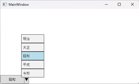
外観
DockPanel で最下端に配置した実行結果を提示します。
サンプル プロジェクト
カスタムコントール追加
Visual Studio で WPF アプリケーションのプロジェクト WpfApp1 を作成して、ソリューションエクスプローラで Controls というサブフォルダを用意します。
この Controls というサブフォルダを選択して、追加 - 新しい項目 を選択します。
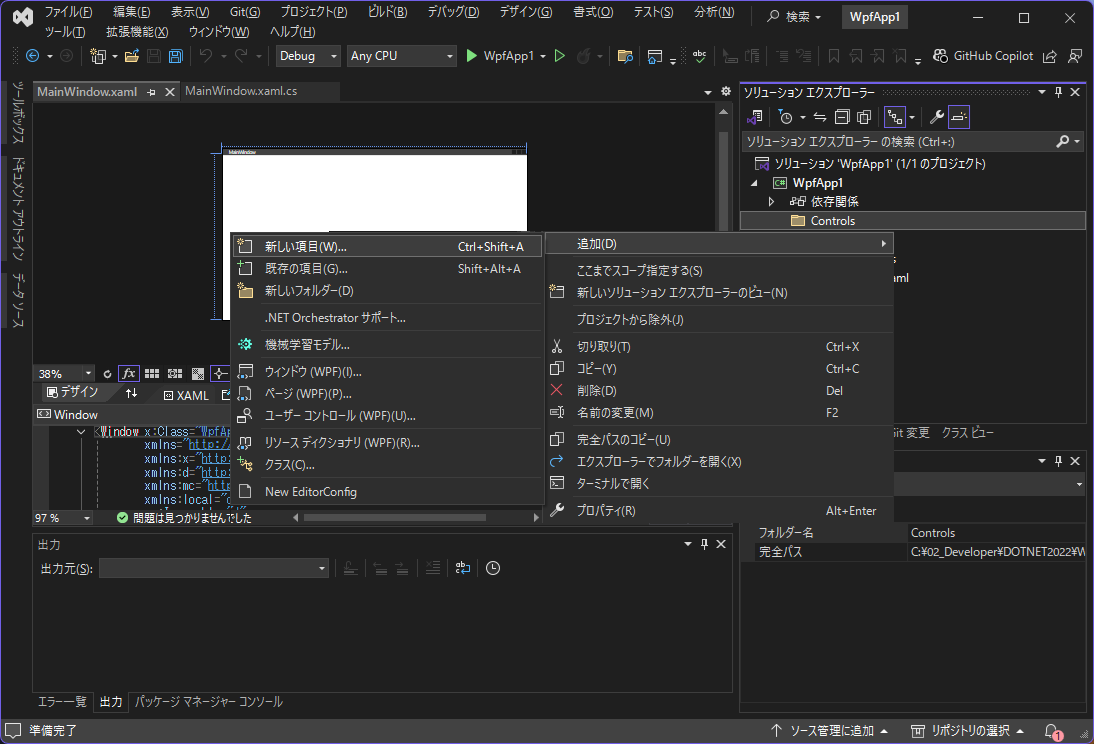
新しい項目追加で カスタムコントール(WPF)を選択して、PopupSelectButton.cs を作成します。

カスタムコントールを追加すると Theme\Generic.xaml が自動的に追加されます。
同様の手順で、PopupSelectMenu.cs と PopupSelectItem.cs を作成します。

namespace 修正
カスタムコントールを Controls 配下に配置したので、下記2ファイルの local namespece を修正します。
- Themes\Generic.xaml
- MainWindow.xaml
xmlns:local="clr-namespace:WpfApp1"
 ↓
xmlns:local="clr-namespace:WpfApp1.Controls"
サンプルコード
PopupSelectItem
選択肢として利用する PopupSelectItem のポイント
- xaml でプロパティ既定値を設定
- xaml - ControlTemplate で Border - ContentPresenter として外観を設定
- xaml - ControlTemplate.Triggers で IsChecked などの状態に対する外観を設定
- PopupSelectMenu.SelectedIndex に対応させるプロパティとして、ItemIndex 用意
- ItemIndex はユーザ指定ではなく、PopupSelectMenu.OnApplyTemplate で自動採番
- MenuItem のラベル表示は Header プロパティですが、上記 ItemIndex とペアとなる ItemValue プロパティを追加して、xaml - ContentPresenter で Content にバインド
- ItemIndex, ItemValue は DependencyProperty とする
<!-- PopupSelectItem -->
<Style TargetType="{x:Type local:PopupSelectItem}"
    BasedOn="{StaticResource {x:Type MenuItem}}">
  <!-- プロパティ既定値 -->
  <Setter Property="Background" Value="Gainsboro" />
  <Setter Property="BorderBrush" Value="Black" />
  <Setter Property="Foreground" Value="Black" />
  <Setter Property="BorderThickness" Value="1" />
  <Setter Property="Height" Value="30"/>
  <Setter Property="MinWidth" Value="80"/>
  <!-- コントール外観 -->
  <Setter Property="Template">
    <Setter.Value>
      <ControlTemplate TargetType="{x:Type local:PopupSelectItem}">
        <Border Background="{TemplateBinding Background}"
            BorderBrush="{TemplateBinding BorderBrush}"
            BorderThickness="{TemplateBinding BorderThickness}"
            Height="{TemplateBinding Height}">
          <ContentPresenter Content="{TemplateBinding ItemValue}"
              Margin="5,0,0,0" VerticalAlignment="Center"/>
        </Border>
        <ControlTemplate.Triggers>
          <!-- 選択されている場合 -->
          <Trigger Property="IsChecked" Value="True">
            <Setter Property="Background" Value="LightBlue"/>
          </Trigger>
          <!-- ディセーブルの場合 -->
          <Trigger Property="IsEnabled" Value="False">
            <Setter Property="Background" Value="Lavender" />
            <Setter Property="BorderBrush" Value="Gray" />
            <Setter Property="Foreground" Value="White"/>
          </Trigger>
          <!-- キーボードフォーカスがある場合 -->
          <Trigger Property="IsKeyboardFocused" Value="True">
            <Setter Property="Background" Value="LightSteelBlue" />
          </Trigger>
        </ControlTemplate.Triggers>
      </ControlTemplate>
    </Setter.Value>
  </Setter>

  <!-- キー操作を考慮しないケースでは下記を設定
  <Setter Property="Focusable" Value="False"/>
  <Setter Property="IsTabStop" Value="False"/>
  -->
</Style>
namespace WpfApp1.Controls
{
  public class PopupSelectItem : MenuItem
  {
    // 依存関係プロパティ
    public static readonly DependencyProperty ItemIndexProperty =
        DependencyProperty.Register("ItemIndex", typeof(int),
        typeof(PopupSelectItem), new PropertyMetadata(-1));
    public static readonly DependencyProperty ItemValueProperty =
        DependencyProperty.Register("ItemValue", typeof(string),
        typeof(PopupSelectItem), new PropertyMetadata(string.Empty));

    // プロパティ
    public int ItemIndex
    {
      get => (int)GetValue(ItemIndexProperty);
      set => SetValue(ItemIndexProperty, value);
    }
    public string ItemValue
    {
      get => (string)GetValue(ItemValueProperty);
      set => SetValue(ItemValueProperty, value);
    }

    // 静的コンストラクタ - クラス全体の初期化で1度だけ呼び出される
    static PopupSelectItem()
    {
      // DefaultStyleKeyの設定
      DefaultStyleKeyProperty.OverrideMetadata(
          typeof(PopupSelectItem),
          new FrameworkPropertyMetadata(typeof(PopupSelectItem)));
    }
    // インスタンス コンストラクタ - インスタンスごとに呼び出される
    public PopupSelectItem()
    {

    }
    // テンプレート適用イベントハンドラ
    public override void OnApplyTemplate()
    {
      base.OnApplyTemplate();
      this.Click += this.OnClick;
    }
    // .NET Framework 時は object? の ? 不要
    private void OnClick(object? sender, RoutedEventArgs e)
    {
      if (this.Parent is PopupSelectMenu menu)
      {
        // 上位 PopupSelectMenu に自身の ItemIndex 通知
        menu.SetSelectedIndex(this.ItemIndex);
      }
    }
  }
}
PopupSelectMenu
選択肢を一覧表示する PopupSelectMenu のポイント
- xaml でプロパティ既定値を設定
- PopupSelectMenu で Opacity を設定すれば、配下 PopupSelectItem にも反映
- PopupSelectMenu.OnApplyTemplate で、配下 PopupSelectItem.ItemIndex を自動採番
- PopupSelectMenu.SelectItem で、配下 PopupSelectItem のうちひとつを選択状態とする
- 後述「不具合に対する調整」を確認
<!-- PopupSelectMenu -->
<Style TargetType="{x:Type local:PopupSelectMenu}"
    BasedOn="{StaticResource {x:Type ContextMenu}}">
  <!-- プロパティ既定値 -->
  <Setter Property="Opacity" Value="0.85"/>
  <!-- コントール外観 -->
  <Setter Property="Template">
    <Setter.Value>
      <ControlTemplate TargetType="{x:Type local:PopupSelectMenu}">
        <Border>
          <StackPanel IsItemsHost="True"/>
        </Border>
      </ControlTemplate>
    </Setter.Value>
  </Setter>
</Style>
namespace WpfAppNet.Controls
{
  public class PopupSelectMenu : ContextMenu
  {
    // 静的コンストラクタ - クラス全体の初期化で1度だけ呼び出される
    static PopupSelectMenu()
    {
      // DefaultStyleKeyの設定
      DefaultStyleKeyProperty.OverrideMetadata(
          typeof(PopupSelectMenu),
          new FrameworkPropertyMetadata(typeof(PopupSelectMenu)));
    }
    // インスタンス コンストラクタ - インスタンスごとに呼び出される
    public PopupSelectMenu()
    {

    }
    // テンプレート適用イベントハンドラ
    public override void OnApplyTemplate()
    {
      base.OnApplyTemplate();
      this.Opened += OnOpened;

      // このタイミングでは、テンプレート内要素(子コントール)にアクセス可能
      // 子コントール PopupSelectItem.ItemIndex に 0 から序数設定
      int index = 0;
      foreach (PopupSelectItem item in
          LogicalTreeHelper.GetChildren(this).OfType<PopupSelectItem>())
      {
        item.ItemIndex = index++;
      }
    }
    // .NET Framework 時は object? の ? 不要
    private void OnOpened(object? sender, RoutedEventArgs e)
    {
      if (sender is PopupSelectMenu menu
       && menu.PlacementTarget is PopupSelectButton button)
      {
        SelectItem(button.SelectedIndex);
      }
    }
    // PopupMenuButton の SelectedIndex を変更
    public void SetSelectedIndex(int index)
    {
      if (this.PlacementTarget is PopupSelectButton button)
      {
        button.SelectedIndex = index;
      }
    }
    // PopupSelectItem 選択状態変更
    public void SelectItem(int targetIndex)
    {
      // 選択状態変更
      int index = 0;
      foreach (PopupSelectItem item in this.Items)
      {
        item.IsChecked = (targetIndex == index++);
        if (item.IsChecked)
        {
          // TODO - マウスカーソル移動(後述)

          item.Focus();  //フォーカス設定
        }
      }
    }
    // PopupSelectItem 表示データ取得
    public string GetItemValue(int index)
    {
      string text = string.Empty;
      if (this.HasItems && index >= 0 && index < this.Items.Count
       && this.Items[index] is PopupSelectItem item)
      {
        text = item.ItemValue?.ToString() ?? string.Empty;
      }
      return text;
    }
  }
}
PopupSelctButton
PopupSelectMenu を表示する PopupSelctButton のポイント
- xaml でプロパティ既定値を設定
- xaml - ControlTemplate で Gird を用いて「 選択値 | ▼ 」という外観を構築
- xaml - ControlTemplate.Triggers で IsEnabled 状態に対する外観を設定
- 現在の選択値管理用に SelectedIndex を DependencyProperty として追加
- 値変更ハンドラとして OnSelectedIndexChanged 指定
- SelectedIndexChanged イベントハンドラを登録を可能とする
- OnSelectedIndexChanged で、SelectedIndexChanged に登録されている処理を実行
- Click 処理で PopupSelectMenu を表示
<!-- PopupSelectButton -->
<Style TargetType="{x:Type local:PopupSelectButton}"
    BasedOn="{StaticResource {x:Type Button}}">
  <!-- プロパティ既定値 -->
  <Setter Property="MinHeight" Value="25"/>
  <Setter Property="MinWidth" Value="100"/>
  <!-- コントール外観 -->
  <Setter Property="Template">
    <Setter.Value>
      <ControlTemplate TargetType="{x:Type local:PopupSelectButton}">
        <Border Width="{TemplateBinding Width}"
            Height="{TemplateBinding Height}"
            Background="{TemplateBinding Background}"
            BorderBrush="{TemplateBinding BorderBrush}"
            BorderThickness="{TemplateBinding BorderThickness}">
          <Grid>
            <!-- 3列レイアウト 「 選択値 | ▼ 」 -->
            <Grid.ColumnDefinitions>
              <ColumnDefinition Width="*"/>
              <ColumnDefinition Width="2px"/>
              <ColumnDefinition Width="15px"/>
            </Grid.ColumnDefinitions>
            <ContentPresenter Grid.Column="0"
                HorizontalAlignment="Center" VerticalAlignment="Center"/>
            <Border Grid.Column="1" BorderThickness="1" Width="1" Margin="1,0,0,0"
                BorderBrush="{TemplateBinding BorderBrush}"/>
            <TextBlock Grid.Column="2" Text="▼" FontSize="13"
                HorizontalAlignment="Center" VerticalAlignment="Center"/>
          </Grid>
        </Border>
        <ControlTemplate.Triggers>
          <!-- ディセーブルの場合 -->
          <Trigger Property="IsEnabled" Value="False">
            <Setter Property="Background" Value="Lavender" />
            <Setter Property="BorderBrush" Value="Gray" />
            <Setter Property="Foreground" Value="DarkGray"/>
          </Trigger>
        </ControlTemplate.Triggers>
      </ControlTemplate>
    </Setter.Value>
  </Setter>

  <!-- キー操作を考慮しないケースでは下記を設定
  <Setter Property="Focusable" Value="False"/>
  <Setter Property="IsTabStop" Value="False"/>
  -->
</Style>
namespace WpfAppNet.Controls
{
  public class PopupSelectButton : Button
  {
    // 依存関係プロパティ
    public static readonly DependencyProperty SelectedIndexProperty =
        DependencyProperty.Register("SelectedIndex", typeof(int),
        typeof(PopupSelectButton), new PropertyMetadata(-1, OnSelectedIndexChanged));

    // プロパティ
    public int SelectedIndex
    {
      get => (int)GetValue(SelectedIndexProperty);
      set => SetValue(SelectedIndexProperty, value);
    }

    // イベント - .NET Framework 時は EventHandler<...>? の ? 不要
    public event EventHandler<SelectionChangedEventArgs>? SelectedIndexChanged;
    private static void OnSelectedIndexChanged(DependencyObject obj,
                                               DependencyPropertyChangedEventArgs e)
    {
      if (obj is PopupSelectButton button)
      {
        var oldIndex = (int)e.OldValue;
        var newIndex = (int)e.NewValue;
        // PopupSelectMenu
        if (button.ContextMenu is PopupSelectMenu menu && menu.HasItems)
        {
          // 表示更新
          button.Content = menu.GetItemValue(newIndex);
          // 選択状態変更
          if (menu.IsOpen)
          {
            menu.SelectItem(newIndex);
          }
        }
        // SelectedIndexChanged イベント
        var args = new SelectionChangedEventArgs(
            Selector.SelectionChangedEvent,
            new[] { oldIndex },
            new[] { newIndex });
        button.SelectedIndexChanged?.Invoke(button, args);
      }
    }
    // 静的コンストラクタ - クラス全体の初期化で1度だけ呼び出される
    static PopupSelectButton()
    {
      // DefaultStyleKeyの設定
      DefaultStyleKeyProperty.OverrideMetadata(
          typeof(PopupSelectButton),
          new FrameworkPropertyMetadata(typeof(PopupSelectButton)));
    }
    // インスタンス コンストラクタ - インスタンスごとに呼び出される
    public PopupSelectButton()
    {

    }
    // テンプレート適用イベントハンドラ
    public override void OnApplyTemplate()
    {
      base.OnApplyTemplate();
      this.Click += OnClick;

      // xaml で SelectedIndex 初期値設定した場合に対処
      if (this.ContextMenu is PopupSelectMenu menu)
      {
        this.Content = menu.GetItemValue(this.SelectedIndex);
      }
    }
    // .NET Framework 時は object? の ? 不要
    private void OnClick(object? sender, RoutedEventArgs e)
    {
      if (sender is PopupSelectButton button
       && button.ContextMenu is PopupSelectMenu menu && menu.HasItems)
      {
        // PopupSelectMenu 表示
        menu.PlacementTarget = this;
        menu.IsOpen = true;
      }
    }
  }
}
メイン画面
メイン画面の xaml、コードビハインドも掲載しておきます。
<Window x:Class="WpfApp1.MainWindow"
  xmlns="http://schemas.microsoft.com/winfx/2006/xaml/presentation"
  xmlns:x="http://schemas.microsoft.com/winfx/2006/xaml"
  xmlns:d="http://schemas.microsoft.com/expression/blend/2008"
  xmlns:mc="http://schemas.openxmlformats.org/markup-compatibility/2006"
  xmlns:local="clr-namespace:WpfApp1.Controls"
  mc:Ignorable="d"
  Title="MainWindow" Height="300" Width="500">
  <DockPanel LastChildFill="False">
    <local:PopupSelectButton x:Name="btnGengo" Width="100" Height="30"
        HorizontalAlignment="Left" SelectedIndex="2"
        DockPanel.Dock="Bottom">
      <local:PopupSelectButton.ContextMenu>
        <local:PopupSelectMenu>
          <local:PopupSelectItem ItemValue="明治"/>
          <local:PopupSelectItem ItemValue="大正"/>
          <local:PopupSelectItem ItemValue="昭和"/>
          <local:PopupSelectItem ItemValue="平成"/>
          <local:PopupSelectItem ItemValue="令和"/>
        </local:PopupSelectMenu>
      </local:PopupSelectButton.ContextMenu>
    </local:PopupSelectButton>
  </DockPanel>
</Window>
public partial class MainWindow : Window
{
  public MainWindow()
  {
    InitializeComponent();
    btnGengo.SelectedIndexChanged += PopupSelectButton_SelectedIndexChanged;
  }
  // .NET Framework 時は object? の ? 不要
  private void PopupSelectButton_SelectedIndexChanged(object? sender,
                                                      SelectionChangedEventArgs e)
  {
    if (sender is PopupSelectButton button)
    {
      if (e.AddedItems.Count > 0 && e.AddedItems[0] is int value)
      {
        MessageBox.Show($"{button.Name} Value={value}");
      }
      else
      {
        MessageBox.Show($"{button.Name} value is empty");
      }
    }
  }
}
不具合に対する調整
PopupSelctButton
冒頭に記載した、マウスカーソルが離れた位置で、キー操作クリック不具合の対応です。
クリック操作がマウスかキーかを判定するために、PreviewMouseDown、PreviewKeyDown イベントを利用します。
private bool isMouseClick = false;
// .NET Framework 時は object? の ? 不要
private void OnPreviewMouseDown(object? sender, MouseButtonEventArgs e)
{
  isMouseClick = true;
}
// .NET Framework 時は object? の ? 不要
private void OnPreviewKeyDown(object? sender, KeyEventArgs e)
{
  isMouseClick = false;
}
WIN32API を用いて、対象コントール中央位置にマウスを移動させるメソッドを作成します。
PopupSelctButton 以外での利用も考慮して、Controls 下に新規クラスで CommonOperations.cs を追加して、ここに実装します。
namespace WpfAppNet.Controls
{
  public class CommonOperations
  {
    // マウスカーソル移動
    public static void MoveCursorToControl(Control control)
    {
      // 対象の位置を取得
      var point = control.PointToScreen(new System.Windows.Point(0, 0));
      int x = (int)(point.X + control.RenderSize.Width / 2);  // 対象の中央X座標
      int y = (int)(point.Y + control.RenderSize.Height / 2); // 対象の中央Y座標

      // マウスカーソルを移動
      NativeMethods.SetCursorPos(x, y);
    }
    // WIN32API
    private static class NativeMethods
    {
      [DllImport("user32.dll")]
      public static extern bool SetCursorPos(int X, int Y);
    }
  }
}
これらのソースを対処した上、既存ソースを修正します。
// テンプレート適用イベントハンドラ
public override void OnApplyTemplate()
{
  base.OnApplyTemplate();
  this.Click += OnClick;
  this.PreviewMouseDown += OnPreviewMouseDown;  // 不具合対応
  this.PreviewKeyDown += OnPreviewKeyDown;      // 不具合対応

  // xaml で SelectedIndex 初期値設定した場合に対処
  if (this.ContextMenu is PopupSelectMenu menu)
  {
    this.Content = menu.GetItemValue(this.SelectedIndex);
  }
}
// .NET Framework 時は object? の ? 不要
private void OnClick(object? sender, RoutedEventArgs e)
{
  if (sender is PopupSelectButton button
   && button.ContextMenu is PopupSelectMenu menu && menu.HasItems)
  {
    // 不具合対応 - キー操作時
    if (!isMouseClick)
    {
      // マウスカーソル移動
      CommonOperations.MoveCursorToControl(button);
    }
    // PopupSelectMenu 表示
    menu.PlacementTarget = this;
    menu.IsOpen = true;
  }
}
PopupSelectMenu
PopupSelectMenu の OnOpend で、現在選択されている PopupSelectItem を Focus していますが、一覧選択表示時に、マウスカーソルが選択対象以外の PopupSelectItem 上に入ってしまうと、そちらに Focus が取られてしまいます。
PopupSelctButton で実装した MoveCursorToControl を、現在選択されている PopupSelectItem に対して実することで対処可能です。
    // PopupSelectItem 選択状態変更
    public void SelectItem(int targetIndex)
    {
      // 選択状態変更
      int index = 0;
      foreach (PopupSelectItem item in this.Items)
      {
        item.IsChecked = (targetIndex == index++);
        if (item.IsChecked)
        {
          CommonOperations.MoveCursorToControl(item);  // マウスカーソル移動
          item.Focus();                                //フォーカス設定
        }
      }
    }
出典
本記事は、2025/04/XX Qiita 投稿記事の転載です。
Discussion