WPF - カスタムコントール - CheckBox 外観変更
はじめに
WPF カスタムコントールを用いることで、手軽に標準コントールの外観/挙動を変更することができます。
本記事では、CheckBox 外観変更について記載します。
WPF カスタムコントール については下記記事もあります
テスト環境
ここに記載した情報/ソースコードは、Visual Studio Community 2022 を利用した下記プロジェクトで生成したモジュールを Windows 11 24H2 で動作確認しています。
- WPF - .NET Framework 4.8
- WPF - .NET 8
CheckBox
CheckBox 状態値、通常は Checked / Unchecked の2パターンですが、IsThreeState プロパティを true にすることで、 Indeterminate も使用可能となります。
| 状態 | IsChecked プロパティ値 |
|---|---|
| Checked(選択) | true |
| Unchecked(非選択) | false |
| Indeterminate(不確定) | null |
IsThreeState = false 時、CheckBox クリック操作は、Checked, Unchecked トグル動作です。
IsThreeState = true 時、Checked, Indeterminate, Unchecked 循環トグル動作となります。
サンプル
初期デザイン
CheckBox カスタムコントールとして、下記外観を考えてみます。
横 19pixel 縦 20pixel(mainBody)を、レイアウトエリアとします。
枠部分(innerBorder)は 14 x 14 の正方形です。
Checked マーク(markChecked)は、実際に動作させて調整することにします。
最終デザイン
標準 CheckBox と、後述サンプルコード CustomCheckBox の実行結果を掲載します。
上段が CheckBox、下段が CustomCheckBox です。

サンプルプロジェクト
カスタムコントール追加
Visual Studio で WPF アプリケーションのプロジェクト WpfApp1 を作成して、ソリューションエクスプローラで Controls というサブフォルダを用意します。
この Controls というサブフォルダを選択して、追加 - 新しい項目 を選択します。
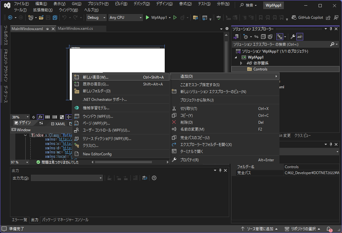
新しい項目追加で カスタムコントール(WPF)を選択して、CustomCheckBox.cs を作成します。

カスタムコントールを追加すると Theme\Generic.xaml が自動的に追加されます。
namespace 修正
カスタムコントールを Controls 配下に配置したので、下記2ファイルの local namespece を修正します。
- Themes\Generic.xaml
- MainWindow.xaml
xmlns:local="clr-namespace:WpfApp1"
 ↓
xmlns:local="clr-namespace:WpfApp1.Controls"
サンプルコード
CustomCheckBox
外観は、BulletDecorator を利用します。
このコントロールには Bullet と Child の2つのコンテンツプロパティがあります。
- Bullet
- CheckBox/RadioButtn 選択状態、箇条書きのマーカー/アイコン
- Child
- 選択肢内容、箇条書き内容
BulletDecorator.Bullet で CheckBox 選択状態の外観をデザインします。
- レイアウト
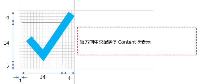
- 前述「サンプル - 初期デザイン」横 19pixel 縦 20pixel を Grid で定義
- 縦方向
- 最小 20pixel
-
Height="{TemplateBinding Height}"として、センタリングするため、最上下端 RowDefinition をHeight="1*"(単純にHeight="20" VerticalAlignment="Center"とすると、CustomCheckBox に Height 指定時センタリングされない) - 上余白、正方形枠、下余白、それぞれの Height を 4, 14, 2 pixcel
- 横方向
- 19pxcel
- 左余白、正方形枠、右余白、それぞれの Width を 1, 14, 4 pixcel
- mainBody
- レイアウト 行1列0 から3行3列のエリア
- Pressed 状態で表示する Border を Transparent で指定
- innerBorder
- レイアウト 行2列1 から1行1列のエリア
- 正方形の枠
- markChecked
- レイアウト 行1列0 から3行3列のエリア
- Path で指定座標を折れ線で描画
- Opacity="0" で透明
- markIndeterminate
- レイアウト 行2列1 から1行1列のエリア
- 文字 X を中央配置
- Opacity="0" で透明
BulletDecorator.Child で CheckBox 選択肢内容の外観をデザインします。
- contentText
- ContentPresenter だと、Foreground 指定ができないので、TextBlock 利用
ControlTemplate.Triggers では下記を指定します。
- Checked 状態
- markChecked の Opacity を 1 として表示
- Indeterminate 状態
- markIndeterminate の Opacity を 1 として表示
- Press 状態
- mainBody の Background を指定値として表示
- Disable 状態
- markChecked, contentText, innerBorder 配色変更
<!-- CustomCheckBox -->
<Style TargetType="{x:Type local:CustomCheckBox}"
       BasedOn="{StaticResource {x:Type CheckBox}}">
  <Setter Property="Template">
    <Setter.Value>
      <ControlTemplate TargetType="{x:Type local:CustomCheckBox}">
        <BulletDecorator>
          <BulletDecorator.Bullet>
            <Grid Height="{TemplateBinding Height}" MinHeight="20" Width="19">
              <Grid.RowDefinitions>
                <RowDefinition Height="1*"/>
                <RowDefinition Height="4"/>
                <RowDefinition Height="14"/>
                <RowDefinition Height="2"/>
                <RowDefinition Height="1*"/>
              </Grid.RowDefinitions>
              <Grid.ColumnDefinitions>
                <ColumnDefinition Width="1"/>
                <ColumnDefinition Width="14"/>
                <ColumnDefinition Width="4"/>
              </Grid.ColumnDefinitions>
              <!-- CheckBox レイアウトエリア -->
              <Border Name="mainBody"
                      Grid.Row="1" Grid.Column="0" Grid.RowSpan="3" Grid.ColumnSpan="3"
                      CornerRadius="4" BorderThickness="1"
                      BorderBrush="Transparent" Background="Transparent"/>
              <!-- CheckBox の Box  -->
              <Border Name="innerBorder"
                      Grid.Row="2" Grid.Column="1"
                      BorderThickness="1"
                      BorderBrush="Gray" Background="Transparent"/>
              <!-- Checked マーク -->
              <Path Name="markChecked"
                    Grid.Row="1" Grid.Column="0" Grid.RowSpan="3" Grid.ColumnSpan="3"
                    Opacity="0"
                    StrokeThickness="4" Stroke="SkyBlue">
                <Path.Data>
                  <PathGeometry>
                    <PathFigure IsClosed="False" StartPoint="4,10">
                      <LineSegment Point="9,14"/>
                      <LineSegment Point="18,1"/>
                    </PathFigure>
                  </PathGeometry>
                </Path.Data>
              </Path>
              <!-- Indeterminate マーク -->
              <TextBlock Name="markIndeterminate"
                         Grid.Row="2" Grid.Column="1"
                         Opacity="0" Margin="0,0,0,2"
                         HorizontalAlignment="Center" VerticalAlignment="Center"
                         Text="×"
                         FontSize="14" FontFamily="Meiryo UI"
                         Foreground="#808080" Focusable="False"/>
            </Grid>
          </BulletDecorator.Bullet>
          <BulletDecorator.Child>
            <TextBlock x:Name="contentText"
                       HorizontalAlignment="Left" VerticalAlignment="Center"
                       Text="{TemplateBinding Content}"/>
          </BulletDecorator.Child>
        </BulletDecorator>

        <ControlTemplate.Triggers>
          <!-- Checked 状態 -->
          <Trigger Property="IsChecked" Value="True">
            <Setter TargetName="markChecked" Property="Opacity" Value="1"/>
          </Trigger>
          <!-- Indeterminate 状態 -->
          <Trigger Property="IsChecked" Value="{x:Null}">
            <Setter TargetName="markIndeterminate" Property="Opacity" Value="1"/>
          </Trigger>
          <!-- Pressed 状態 -->
          <Trigger Property="IsPressed" Value="True">
            <Setter TargetName="mainBody" Property="Background" Value="LightCyan"/>
          </Trigger>
          <!-- Disable 状態 -->
          <Trigger Property="IsEnabled" Value="False">
            <Setter TargetName="markChecked" Property="Stroke" Value="LightSlateGray"/>
            <Setter TargetName="contentText" Property="Foreground" Value="DimGray"/>
            <Setter TargetName="innerBorder" Property="Background" Value="Gainsboro"/>
            <Setter TargetName="innerBorder" Property="BorderBrush" Value="Silver"/>
          </Trigger>
        </ControlTemplate.Triggers>
      </ControlTemplate>
    </Setter.Value>
  </Setter>
</Style>
namespace WpfApp1.Controls
{
  public class CustomCheckBox : CheckBox
  {
    // 静的コンストラクタ - クラス全体の初期化で1度だけ呼び出される
    static CustomCheckBox()
    {
      // DefaultStyleKeyの設定
      DefaultStyleKeyProperty.OverrideMetadata(typeof(CustomCheckBox),
          new FrameworkPropertyMetadata(typeof(CustomCheckBox)));
    }
    // インスタンス コンストラクタ - インスタンスごとに呼び出される
    public CustomCheckBox()
    {

    }
  }
}
メイン画面
メイン画面の xaml も掲載しておきます。
<Window x:Class="WpfApp1.MainWindow"
  xmlns="http://schemas.microsoft.com/winfx/2006/xaml/presentation"
  xmlns:x="http://schemas.microsoft.com/winfx/2006/xaml"
  xmlns:d="http://schemas.microsoft.com/expression/blend/2008"
  xmlns:mc="http://schemas.openxmlformats.org/markup-compatibility/2006"
  xmlns:local="clr-namespace:WpfApp1.Controls"
  mc:Ignorable="d"
  Title="MainWindow" Height="200" Width="600">
  <StackPanel>
    <Grid Height="120">
      <Grid.RowDefinitions>
        <RowDefinition Height="1*"/>
        <RowDefinition Height="1*"/>
      </Grid.RowDefinitions>
      <Grid.ColumnDefinitions>
      <ColumnDefinition Width="1*"/>
        <ColumnDefinition Width="1*"/>
        <ColumnDefinition Width="1*"/>
      </Grid.ColumnDefinitions>
      <!-- 標準コントール  -->
      <CheckBox x:Name="cbHoge00" Grid.Column="0" Grid.Row="0"
                Width="180" IsThreeState="True"
                HorizontalAlignment="Left" VerticalAlignment="Center"
                IsChecked="True" Content="選択状態"/>
      <CheckBox x:Name="cbHoge10" Grid.Column="1" Grid.Row="0"
                Width="180" IsThreeState="True"
                HorizontalAlignment="Left" VerticalAlignment="Center"
                IsChecked="{x:Null}" Content="不確定状態"/>
      <CheckBox x:Name="cbHoge20" Grid.Column="2" Grid.Row="0"
                Width="180" IsThreeState="True"
                HorizontalAlignment="Left" VerticalAlignment="Center"
                IsChecked="True" IsEnabled="False" Content="無効状態"/>
      <!-- カスタムコントール  -->
      <local:CustomCheckBox x:Name="cbHoge01" Grid.Column="0" Grid.Row="1"
          Width="180" IsThreeState="True"
          HorizontalAlignment="Left" VerticalAlignment="Center"
          IsChecked="True" Content="選択状態"/>
      <local:CustomCheckBox x:Name="cbHoge11" Grid.Column="1" Grid.Row="1"
          Width="180" IsThreeState="True"
          HorizontalAlignment="Left" VerticalAlignment="Center"
          IsChecked="{x:Null}" Content="不確定状態"/>
      <local:CustomCheckBox x:Name="cbHoge21" Grid.Column="2" Grid.Row="1"
          Width="180" IsThreeState="True"
          HorizontalAlignment="Left" VerticalAlignment="Center"
          IsChecked="True" IsEnabled="False" Content="無効状態"/>
    </Grid>
  </StackPanel>
</Window>
出典
本記事は、2025/05/07 Qiita 投稿記事の転載です。
Discussion