SliverGrid/SliverList に、綺麗に背景色や BoxDecorationをつける
2023/9/12 追記
Flutter 3.13.0 で、公式が sliver_tools の API の替わりになるものを提供しました。
メインの API である MultiSliver と SliverStack x SliverPositioned.fill が標準装備されたので、プロジェクトからは外れました。
今までありがとう、sliver_tools。
MultiSliver
SliverMainAxisGroup/SliverCrossAxisGroup
Sliver Main/Cross AxisExpanded とかも実装されたようです。
SliverStack x SliverPositioned.fill
DecoratedSliver
Flutter 2.3.3(stable)
Dart 2.18.1(stable)
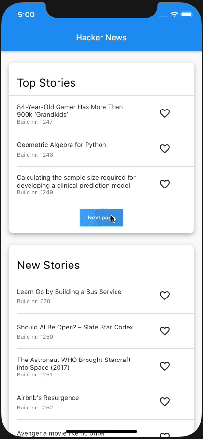
デモ実装
一覧表示などにほぼ必須な CustomScrollView に使用する Sliver ウィジェット。さまざまなものが用意されていますが、背景色をつけるための SliverContainer とか SliverDecoratedBox みたいなものは用意されていません。
それを提供してくれているパッケージがあるので、紹介します。
2022/10/3 現在で、Published 27 days ago で、シェア数も Like 数も多い信頼のおけるパッケージです。
Stack ウィジェットのような挙動をする、SliverStack を利用して、 children の1つめにSliverPositioned.fill を設定することで実現できます。
SliverStack(children: [
// background
SliverPositioned.fill(
  child: DecoratedBox(decoration: _listDecoration)),

// list
SliverPadding(
	padding: _listTilePadding,
	// 配列が empty の場合の切り替え
	sliver: SliverVisibility(
	  visible: todos.isNotEmpty,
	  sliver: SliverList(
	      delegate: SliverChildBuilderDelegate((context, index) {
	    final todo = todos[index];

	    return Column(
	      children: [
		// ListTile
		_ListTile(todo: todo, toggleArchive: _toggleArchive),

		const SizedBox(
		  height: 16,
		),
		if (todos.length - index == 1)
		  ElevatedButton(
		      onPressed: () {
			for (var i = 0; i < 10; i++) {
			  _add(argTitle: '$i: ${_uuid.v4()}');
			}
		      },
		      child: const Text('add 10 items'))
	      ],
	    );
	  }, childCount: todos.length)),
	  replacementSliver: SliverToBoxAdapter(
	    child: Center(
		child: Text(
	      'No  Data',
	      style: TextStyle(color: _textColor),
	    )),
	  ),
	),
	)
]),
適切に SlilverPadding などを設定していけば、割と自由に デザインすることができます。

使いやすくするために、SliverDecoratedBox として切り出して使うこともできます。
import 'package:flutter/material.dart';
import 'package:sliver_tools/sliver_tools.dart';
class SliverDecoratedBox extends StatelessWidget {
const SliverDecoratedBox({
Key? key,
required this.decoration,
required this.sliver,
// 本来の DecoratedBox にはないプロパティなので、これを入れるかは好み
this.padding,
}) : super(key: key);
final Decoration decoration;
final EdgeInsetsGeometry? padding;
final Widget sliver;
Widget build(BuildContext context) {
return SliverStack(children: [
SliverPositioned.fill(
child: DecoratedBox(
decoration: decoration,
)),
if (padding == null)
sliver
else
SliverPadding(
padding: padding!,
sliver: sliver,
)
]);
}
}
その他に、sliver_tools では、複数の Sliver ウィジェットを children として渡せる MultiSliver など(Sliver ウィジェットの切り出しに便利)、色々用意されているので触ってみる価値はあると思います。
Discussion