Next.jsの理解を深める!Chapter 13-14
 nakamoto
Chapter 13
Handling all errors with error.tsx
The error.tsx file can be used to define a UI boundary for a route segment. It serves as a catch-all for unexpected errors and allows you to display a fallback UI to your users.
There are a few things you'll notice about the code above:
"use client" - error.tsx needs to be a Client Component.
It accepts two props:
error: This object is an instance of JavaScript's native Error object.
reset: This is a function to reset the error boundary. When executed, the function will try to re-render the route segment.
-
error.tsxファイルは予期しないエラーのcatch-allとして機能し、
ユーザーにフォールバックUIを表示できる。
このファイルには、主に以下の特徴がある。 -
use client:error.tsxはクライアントコンポーネントである必要がある。 - 2つの
propsを受け取る。
error:これはJavaScriptのネイティブErrorオブジェクトのインスタンス。
reset:これはエラーバウンダリをリセットする関数。
実行されると、関数はルートセグメントの再レンダリングを試みる。
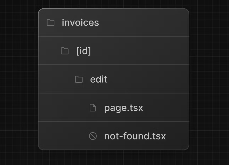
Handling 404 errors with the notFound function
Another way you can handle errors gracefully is by using the notFound function. While error.tsx is useful for catching all errors, notFound can be used when you try to fetch a resource that doesn't exist.
For example, visit http://localhost:3000/dashboard/invoices/2e94d1ed-d220-449f-9f11-f0bbceed9645/edit.
This is a fake UUID that doesn't exist in your database.
You'll immediately see error.tsx kicks in because this is a child route of /invoices where error.tsx is defined.
However, if you want to be more specific, you can show a 404 error to tell the user the resource they're trying to access hasn't been found.
import Link from 'next/link';
import { FaceFrownIcon } from '@heroicons/react/24/outline';

export default function NotFound() {
  return (
    <main className="flex h-full flex-col items-center justify-center gap-2">
      <FaceFrownIcon className="w-10 text-gray-400" />
      <h2 className="text-xl font-semibold">404 Not Found</h2>
      <p>Could not find the requested invoice.</p>
      <Link
        href="/dashboard/invoices"
        className="mt-4 rounded-md bg-blue-500 px-4 py-2 text-sm text-white transition-colors hover:bg-blue-400"
      >
        Go Back
      </Link>
    </main>
  );
}
That's something to keep in mind, notFound will take precedence over error.tsx, so you can reach out for it when you want to handle more specific errors!
-
notFound関数を使用して404エラーを適切に処理することもできる。error.tsxが全てのエラーをキャッチするのに役立つ一方、notFoundは存在しないリソースをフェッチしようとしたときに使用できる。例えば、DBに存在しない偽のUUIDを持つURLを訪れるとerror.tsxが介入するが、ユーザーがアクセスしようとするリソースが見つからないことを示す404エラーを表示することもできる。notFoundはerror.tsxよりも優先されるため、特定のエラーを処理したい場合に便利。
nakamotoChapter 14(first)
What is accessibility?
Accessibility refers to designing and implementing web applications that everyone can use, including those with disabilities. It's a vast topic that covers many areas, such as keyboard navigation, semantic HTML, images, colors, videos, etc.
-
アクセシビリティとは障害を持つ人を含むすべての人が使えるようにウェブアプリケーションを設計し実装すること。これはキーボードナビゲーション、セマンティックHTML、画像、色、ビデオ等の多くの分野をカバーする広範なトピック。アクセシビリティはウェブサイトをより包括的で利用しやすいものにするための重要な側面。
Using the ESLint accessibility plugin in Next.js
By default, Next.js includes the eslint-plugin-jsx-a11y plugin to help catch accessibility issues early. For example, this plugin warns if you have images without alt text, use the aria-* and role attributes incorrectly, and more.
- Next.jsにはデフォルトで
eslint-plugin-jsx-a11yプラグインが含まれており、アクセシビリティの問題を早期に発見するのに役立つ。たとえば、このプラグインは画像にaltテキストがない場合やaria-* 属性やrole属性を誤って使用してる場合に警告を出す。これにより、アクセシビリティの要件を満たしていない潜在的な問題を開発者がすぐに修正できるようになる。
Improving form accessibility
There are three things we're already doing to improve accessibility in our forms:
Semantic HTML: Using semantic elements (<input>, <option>, etc) instead of <div>. This allows assistive technologies (AT) to focus on the input elements and provide appropriate contextual information to the user, making the form easier to navigate and understand.
Labelling: Including <label> and the htmlFor attribute ensures that each form field has a descriptive text label. This improves AT support by providing context and also enhances usability by allowing users to click on the label to focus on the corresponding input field.
Focus Outline: The fields are properly styled to show an outline when they are in focus. This is critical for accessibility as it visually indicates the active element on the page, helping both keyboard and screen reader users to understand where they are on the form. You can verify this by pressing tab.
- フォームの
アクセシビリティを向上させるためには3つの点が重要。 -
セマンティックHTML:<input>や<option>などのセマンティックな要素を<div>の代わりに使用すると支援技術(AT)が入力要素に焦点を当て適切な文脈情報をユーザーに提供できるようになる。これにより、フォームをナビゲートし理解しやすくなる。 -
ラベリング:<label>とhtmlFor属性を含めると各フォームフィールドに記述的なテキストラベルが付けられる。これにより、ATサポートが向上し、ラベルをクリックすることで対応する入力フィールドにフォーカスできるようになり、使いやすさも向上する。 -
フォーカスアウトライン:フィールドがフォーカスされるとアウトラインが適切に表示されるようにスタイリングされる。これは、ページ上のアクティブな要素を視覚的に示すことが重要であり、キーボードやスクリーンリーダーはユーザーがフォーム上の位置を理解するのに役立つ。これは、タブキーを押して確認できる。
nakamotoChapter 14(second)
Client-Side validation
There are a couple of ways you can validate forms on the client. The simplest would be to rely on the form validation provided by the browser by adding the required attribute to the <input> and <select> elements in your forms. For example:
<input
  id="amount"
  name="amount"
  type="number"
  placeholder="Enter USD amount"
  className="peer block w-full rounded-md border border-gray-200 py-2 pl-10 text-sm outline-2 placeholder:text-gray-500"
  required
/>
- クライアント側でフォームを検証する方法は幾つかある。最も簡単な方法の一つはブラウザが提供するフォーム検証機能に依存すること。これは、フォーム内の
<input>や<select>要素にrequired属性を追加して行う。たとえば、必須フィールドとしてマークするとそのフィールドが空のままフォームが送信されるのを防げる。これは、フォーム要素に簡単な検証を追加するための基本的な方法。
Server-Side validation
By validating forms on the server, you can:
Ensure your data is in the expected format before sending it to your database.
Reduce the risk of malicious users bypassing client-side validation.
Have one source of truth for what is considered valid data.
- サーバー側でフォームを検証することにより、以下の利点がある。データがDBに送信される前に、期待される形式であることを確認できる。悪意のあるユーザーがクライアント側の検証を回避するリスクを減らせる。何が有効なデータとみなされるかについて一元的な基準を持てる。サーバー側の検証はセキュリティを向上させると同時に、データの整合性を保つ上で重要な役割を果たす。
In your action.ts file, you can use Zod to validate form data. Update your FormSchema as follows:
const FormSchema = z.object({
  id: z.string(),
  customerId: z.string({
    invalid_type_error: 'Please select a customer.',
  }),
  amount: z.coerce
    .number()
    .gt(0, { message: 'Please enter an amount greater than $0.' }),
  status: z.enum(['pending', 'paid'], {
    invalid_type_error: 'Please select an invoice status.',
  }),
  date: z.string(),
});
In the code above, you're also adding the following aria labels:
aria-describedby="customer-error": This establishes a relationship between the select element and the error message container. It indicates that the container with id="customer-error" describes the select element. Screen readers will read this description when the user interacts with the select box to notify them of errors.
id="customer-error": This id attribute uniquely identifies the HTML element that holds the error message for the select input. This is necessary for aria-describedby to establish the relationship.
aria-live="polite": The screen reader should politely notify the user when the error inside the div is updated. When the content changes (e.g. when a user corrects an error), the screen reader will announce these changes, but only when the user is idle so as not to interrupt them.
-
aria-describedby="customer-error":select要素とエラーメッセージコンテナの関係を確立しid="customer-error"を持つコンテナがselect要素を説明する。スクリーンリーダーは、ユーザーがセレクトボックスを操作する際にこの説明を読み上げ、エラーについて通知する。 -
id="customer-error":select入力のエラーメッセージを保持するHTML要素を一意に識別する。これはaria-describedbyが関係を確立するために必要となる。 -
aria-live="polite":div内のエラーが更新されたとき、スクリーンリーダーはユーザーに対して親切に通知すべき。内容が変更されると(例えば、ユーザーがエラーを修正したとき)その変更をアナウンスするが、ユーザーの操作を妨げないように待機状態でのみ行う。