🤪
ニューモーフィズムでむにゅっとしたボタンを実装する
webデザインについて調べていると、「ニューモーフィズム(Neumorphism)」というデザイン手法に出会ったので、cssで実装してみました。
ニューモーフィズム(Neumorphism)とは
ニューモーフィズム(Neumorphism)とは、ベース(背景)から要素が押し出されていたり、窪んでいたりするようなスタイルのデザイン手法です。
凹凸によって要素を表現しているため、ミニマルデザインとの相性がとても良く、美しく洗練された印象のデザインに仕上げることができます。
ニューモーフィズムとは?デザイン方法やルールのまとめ
どうやら2020年からデザイントレンドとして再度注目を集めているそうです。
(元となるスキューモーフィズムという現実世界に存在するものをデジタルの世界で再現するデザイン手法が以前に流行していました。)
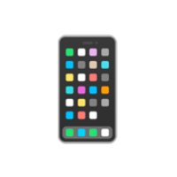
自分の記憶では、昔のiphoneの計算機のUIがこのニューモーフィズムで作られていた気がします。

pinterestで検索をかけるとたくさんヒットしました。
検索結果

実装
非常に簡単です。
以下のサイトで簡単にニューモーフィズムをcssを使って再現できます。

下記コードで再現しました。
<!DOCTYPE html>
<html>
	<head>
		<meta charset="utf-8" />
		<meta name="viewport" content="width=device-width, initial-scale=1.0" />
		<title>Neumorphism</title>
	</head>
	<style>
		body {
			background-color: #afdcf3;
			display: flex;
			align-items: center;
			justify-content: center;
			min-height: 100vh;
		}

		.flex {
			display: flex;
			justify-content: center;
			align-items: center;
			width: 100%;
			gap: 0px 100px;
		}

		.neumorphism {
			width: 300px;
			height: 300px;
			border-radius: 57px;
			background: #afdcf3;
			box-shadow: 9px 9px 18px #95bbcf, -9px -9px 18px #c9fdff;
		}

		.neumorphism:active {
			box-shadow: inset 9px 9px 18px #95bbcf, inset -9px -9px 18px #c9fdff;
		}

		.neumorphism2 {
			width: 236px;
			height: 236px;
			border-radius: 50%;
			background: linear-gradient(145deg, #bbebff, #9ec6db);
			box-shadow: 24px 24px 47px #93b9cc, -24px -24px 47px #cbffff;
		}

		.neumorphism2:active {
			background: linear-gradient(145deg, #9ec6db, #bbebff);
		}
	</style>
	<body>
		<div class="flex">
			<div class="neumorphism"></div>
			<div class="neumorphism2"></div>
		</div>
	</body>
</html>
実装結果

思っていた通りのむにゅっとしたUIが再現できました!😎
参考にさせていただいた記事
Discussion