[Angular][ライブラリ]angular-gridster2でドラッグアンドドロップ可能なタイルを実装する
環境
Angular13系
AngularGridster2
ドラッグアンドドロップでタイルを配置できます。
また、タイルの追加、削除、リサイズも実装できるライブラリです。
インストール
npm i angular-gridster2
インポート
import { GridsterModule } from 'angular-gridster2';

@NgModule({
  imports: [ GridsterModule ],
  ...
})
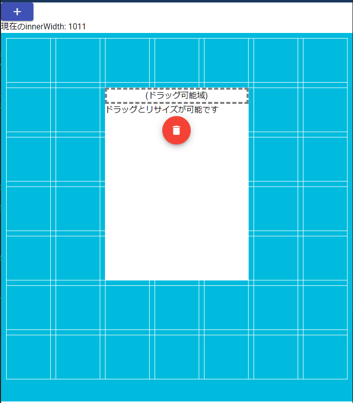
使用例
<button mat-raised-button color="primary" (click)="addItem()" aria-label="icon button with a add icon">
  <mat-icon>add</mat-icon>
</button>
<div>
  現在のinnerWidth: {{innerWidth}}
</div>

<gridster [options]="options" class="gridster-contents">
  <gridster-item [item]="item" *ngFor="let item of dashboard; index as i">
    <div class="draggable-handler">
      (ドラッグ可能域)
    </div>
    <div>
      ドラッグとリサイズが可能です
    </div>
    <div class="delete-button">
      <button mat-fab color="warn" (click)="removeItem(i)" aria-label="icon button with a delete icon">
        <mat-icon>delete</mat-icon>
      </button>
    </div>
  </gridster-item>
</gridster>
import { Component } from '@angular/core';
import { GridsterConfig, GridsterItem } from 'angular-gridster2';

@Component({
  selector: 'app-root',
  templateUrl: './app.component.html',
  styleUrls: ['./app.component.css']
})
export class AppComponent {
  options: GridsterConfig = {};
  dashboard: Array<GridsterItem> = [];

  innerWidth = window.innerWidth;

  ngOnInit(): void {
    this.options = {
      gridType: 'scrollVertical', // 固定縦横比を縦スクロールで対応
      // gridType: 'scrollHorizontal', // 固定縦横比を水平スクロールで対応
      draggable: { // ドラッグ設定
        enabled: true, // ドラッグ許可
        ignoreContent: true, // dragHandleClassのみドラッグイベントを可能にする
        dragHandleClass: 'draggable-handler', // ここで指定したクラスのみドラッグイベントを可能にする
      },
      resizable: { // リサイズ設定
        enabled: true, // リサイズを許可する
      },
      swap: true, // 入れ替えを許可する
      displayGrid: 'always', // グリッド線を常に表示
      minCols: 7, // 最小列数
      maxCols: 7, // 最大列数(minCols以上はドラッグで表示される)
      minRows: 7, // 最小行数
      maxRows: 7, // 最大行数(minRows以上はドラッグで表示される)
      maxItemCols: 5, // アイテムの最大列数
      maxItemRows: 5, // アイテムの最大行数
      compactType: 'none', // 整列しない(自由)
      pushItems: true, // リサイズとドラッグでアイテムを押しのける
      mobileBreakpoint: 640, // 画面の幅が640px以下でグリッドを解除しアイテムを1列にする
    };

    this.dashboard = [
      {cols: 3, rows: 4, y: 1, x: 2}, // 初期値 横3マス, 縦4マス,をy1, x2の位置に配置
    ];
  }

  removeItem(index: number): void {
    this.dashboard.splice(index, 1); // index番目を1つ取り除く
  }

  addItem(): void {
    this.dashboard.push({cols: 3, rows: 3, y: 0, x: 0});
  }

}
.gridster-contents {
  background-color: #0bd;
  /* height: 100vh; */
  height: calc(100vh - 200px);
}
.draggable-handler {
  border: 4px dashed gray;
  text-align: center;
}
.delete-button {
  text-align: center;
}
💡 GridsterConfig型のoptionsに様々なオプションを指定できます。
指定可能なオプションはGridSterConfig型で説明します。
オプションを含んだoptionsをテンプレートの<gridster>タグのoptionsにプロパティバインドし、適応します。
💡 GridsterItem型のdashboardには各アイテムが入ります。各アイテムを定義するときに、プロパティを設定することでどのような大きさのアイテムにするか指定できます。
💡 各アイテム(GridItem)は親要素(<gridster>)の利用可能なすべてのスペースを取得します。
そのため、親要素はサイズもつ必要があります。
GridsterItem型
💡 各アイテム自体の情報 アイテムの大きさなど
インターフェース
export interface GridsterItem {
  x: number;
  y: number;
  rows: number;
  cols: number;
  layerIndex?: number;
  initCallback?: (item: GridsterItem, itemComponent: GridsterItemComponentInterface) => void;
  dragEnabled?: boolean;
  resizeEnabled?: boolean;
  compactEnabled?: boolean;
  maxItemRows?: number;
  minItemRows?: number;
  maxItemCols?: number;
  minItemCols?: number;
  minItemArea?: number;
  maxItemArea?: number;
  [propName: string]: any;
}
-
proNameはインデックス型なので、持たせたいプロパティを自由に追加可能
例)
dashboard: Array<GridsterItem> = [];

  ngOnInit(): void {

  this.dashboard = [
   // ここに各アイテム自体のプロパティを記述
   {cols: 2, rows: 1, y: 0, x: 0},
   {cols: 2, rows: 2, y: 0, x: 2}
  ];

}
プロパティ
Items
| プロパティ | 概要 | 型 | デフォルト |
|---|---|---|---|
| x | アイテムの開始位置。x軸のマス数。指定しない場合は自動位置決めされる | Number | undefined |
| y | アイテムの開始位置。y軸のマス数。指定しない場合は自動位置決めされる | Number | undefined |
| rows | アイテムが占領する行数。もし足りない場合はグリッドオプション defaultItemRows を使用 | Number | undefined |
| cols | アイテムが占領する列数。もし足りない場合はグリッドオプション defaultItemCols を使用 | Number | undefined |
| minItemRows | オーバーライドグリッドオプションminItemRows | Number | undefined |
| maxItemRows | オーバーライドグリッドオプションmaxItemRows | Number | undefined |
| minItemCols | オーバーライドグリッドオプションminItemCols | Number | undefined |
| maxItemCols | オーバーライドグリッドオプションmaxItemCols | Number | undefined |
| minItemArea | オーバーライドグリッドオプションminItemArea | Number | undefined |
| maxitemArea | オーバーライドグリッドオプションmaxItemArea | Number | undefined |
| dragEnabled | オーバーライドグリッドオプションdraggable.enabled | Boolean | undefined |
| resizeEnabled | オーバーライドグリッドオプションresizable.enabled | Boolean | undefined |
| compactEnabled | グリッドオプションコンパクトを無効にする | Boolean | undefined |
| initCallback | 初期化コールバック サイズ > 0 | 関数(GridsterItem, GridsterItemComponent) | undefined |
| resizablehandles | オーバーライドグリッドオプションresizable.handles | オブジェクト({s: boolean, e: boolean, n: boolean, w: boolean, se: boolean, ne:boolean, sw: boolean, nw: boolean}) | undefined |
GridsterConfig型
💡 各種設定やコールバック関数などを指定
インターフェース
```tsx
export interface GridsterConfig {
    gridType?: gridTypes;
    scale?: number;
    fixedColWidth?: number;
    fixedRowHeight?: number;
    keepFixedHeightInMobile?: boolean;
    keepFixedWidthInMobile?: boolean;
    setGridSize?: boolean;
    compactType?: compactTypes;
    mobileBreakpoint?: number;
    allowMultiLayer?: boolean;
    defaultLayerIndex?: number;
    maxLayerIndex?: number;
    baseLayerIndex?: number;
    minCols?: number;
    maxCols?: number;
    minRows?: number;
    maxRows?: number;
    defaultItemCols?: number;
    defaultItemRows?: number;
    maxItemCols?: number;
    maxItemRows?: number;
    minItemCols?: number;
    minItemRows?: number;
    minItemArea?: number;
    maxItemArea?: number;
    rowHeightRatio?: number;
    margin?: number;
    outerMargin?: boolean;
    outerMarginTop?: number | null;
    outerMarginRight?: number | null;
    outerMarginBottom?: number | null;
    outerMarginLeft?: number | null;
    useTransformPositioning?: boolean;
    scrollSensitivity?: number | null;
    scrollSpeed?: number;
    initCallback?: (gridster: GridsterComponentInterface) => void;
    destroyCallback?: (gridster: GridsterComponentInterface) => void;
    gridSizeChangedCallback?: (gridster: GridsterComponentInterface) => void;
    itemChangeCallback?: (item: GridsterItem, itemComponent: GridsterItemComponentInterface) => void;
    itemResizeCallback?: (item: GridsterItem, itemComponent: GridsterItemComponentInterface) => void;
    itemInitCallback?: (item: GridsterItem, itemComponent: GridsterItemComponentInterface) => void;
    itemRemovedCallback?: (item: GridsterItem, itemComponent: GridsterItemComponentInterface) => void;
    itemValidateCallback?: (item: GridsterItem) => boolean;
    draggable?: Draggable;
    resizable?: Resizable;
    swap?: boolean;
    swapWhileDragging?: boolean;
    pushItems?: boolean;
    disablePushOnDrag?: boolean;
    disablePushOnResize?: boolean;
    disableAutoPositionOnConflict?: boolean;
    pushDirections?: PushDirections;
    pushResizeItems?: boolean;
    displayGrid?: displayGrids;
    disableWindowResize?: boolean;
    disableWarnings?: boolean;
    scrollToNewItems?: boolean;
    disableScrollHorizontal?: boolean;
    disableScrollVertical?: boolean;
    enableEmptyCellClick?: boolean;
    enableEmptyCellContextMenu?: boolean;
    enableEmptyCellDrop?: boolean;
    enableEmptyCellDrag?: boolean;
    enableOccupiedCellDrop?: boolean;
    emptyCellClickCallback?: (event: MouseEvent, item: GridsterItem) => void;
    emptyCellContextMenuCallback?: (event: MouseEvent, item: GridsterItem) => void;
    emptyCellDropCallback?: (event: DragEvent, item: GridsterItem) => void;
    emptyCellDragCallback?: (event: MouseEvent, item: GridsterItem) => void;
    emptyCellDragMaxCols?: number;
    emptyCellDragMaxRows?: number;
    ignoreMarginInRow?: boolean;
    dirType?: dirTypes;
    api?: {
        resize?: () => void;
        optionsChanged?: () => void;
        getNextPossiblePosition?: (newItem: GridsterItem) => boolean;
        getFirstPossiblePosition?: (item: GridsterItem) => GridsterItem;
        getLastPossiblePosition?: (item: GridsterItem) => GridsterItem;
        getItemComponent?: (item: GridsterItem) => GridsterItemComponentInterface | undefined;
    };
    [propName: string]: any;
}
```
例)
options: GridsterConfig = {};

ngOnignit(): void {
  this.options = {
    // ここにプロパティを記述していく
  }
}
主要なプロパティ
Grid Types
💡 グリッドレイアウトのタイプなどの設定
例)
gridType: 'scrollVertial',
プロパティ
| プロパティ | 概要 | 型 | デフォルト |
|---|---|---|---|
| gridType | グリッドのレイアウトのタイプを指定。グリッドの種類の表を参照 | String | fit |
| fixedColWidth | 列の幅を固定 | Number | 250 |
| fixedRowHeight | 行の高さを固定 | Number | 250 |
| rowHeightRatio | gridType: scrollVertical, scrollHorizontal の場合、列の幅に対する行の高さの比率 | Number | 1 |
| keepFixedHeightInMobile | モバイルレイアウトで固定GridTypeの高さを維持 | Boolean | FALSE |
| keepFixedWidthInMobile | モバイルレイアウトで固定GridTypeの幅を維持 | Boolean | FALSE |
| useBodyForBreakpoint | モバイルレイアウトに切り替えるタイミングを 要素の幅で判断する | Boolean | FALSE |
| setGridSize | コンテンツに応じたグリッドサイズを設定する | Boolean | FALSE |
| mobileBreakpoint | 画面の幅がこれ以上ない場合は、グリッドレイアウトを解除してアイテムを積み重ねる | Number | 640 |
-
mobileBreakpointで指定した幅以下になった場合のアイテム数は、maxColsとmaxRowsで指定した範囲に収まる数のみ
グリッドの種類
| 型 | 概要 | enum |
|---|---|---|
| fit | スクロールせずにコンテナ内のアイテムにフィットします | Fit |
| scrollVertical | アイテムとグリッドの縦横比率が同じになるように縦スクロールで対応します | ScrollVertical |
| scrollHorizontal | アイテムとグリッドの縦横比率が同じになるように横スクロールで対応します | ScrollHorizontal |
| fixed | fixedColWidth と fixedRowHeight オプションに基づいて、行と列の寸法を設定します | Fixed |
| verticalFixed | 行をfixedRowHeightに設定し、列の幅を利用可能なスペースに合わせます | VerticalFixed |
| horizontalFixed | 列をfixedColWidthに設定し、行の高さを利用可能なスペースに合わせます | HorizontalFixed |
Compact
💡 空きマスの詰め方 整列設定
例)
compactType: 'none',
CompactTypeというenumも定義されているので、下記のようにすることも可能。
compactType: CompactType.None,
| プロパティ | 概要 | 型 | デフォルト | オプション | enum |
|---|---|---|---|---|---|
| compactType | コンパクトアイテム | String | 'none' | 'none', 'compactUp', 'compactLeft', 'compactUp&Left', 'compactLeft&Up', 'compactRight', 'compactUp&Right', 'compactRight&Up', 'compactDown', 'compactDown&Left', 'compactLeft&Down', 'compactDown&Right', 'compactRight&Down' | None, CompactUp, CompactLeft, CompactUpAndLeft, CompactLeftAndUp, CompactRight, CompactUpAndRight, CompactRightAndUp, CompactDown, CompactDownAndLeft, CompactLeftAndDown, CompactDownAndRight, CompactRightAndDown |
GridMargins
💡 グリッドやアイテム間のマージン設定
例)
margin: 5,
| プロパティ | 概要 | 型 | デフォルト |
|---|---|---|---|
| margin | グリッドアイテム間のマージン | Number | 10 |
| outerMargin | コンテナの側面に余白が適用するかどうか | Boolean | TRUE |
| outerMarginTop | グリッドの上端外側のマージンをオーバーライドする | Number | null |
| outerMarginRight | グリッドの右外側のマージンをオーバーライドする | Number | null |
| outerMarginBottom | グリッドの底部外側マージンをオーバーライドする | Number | null |
| outerMarginLeft | グリッドの左外側のマージンをオーバーライドする | Number | null |
useTransformPositioning
アイテムの配置をtransformとtop/leftのいずれかに切り替えることができます。
| プロパティ | 概要 | 型 |
|---|---|---|
| useTransformPositioning | アイテムの配置をtransformとtop/leftのいずれかに切り替える | Boolean |
Grid Sizes
💡 グリッドの設定
例)
mingCols: 10,
| プロパティ | 概要 | 型 | デフォルト |
|---|---|---|---|
| minCols | 1画面で表示するグリッドの最小列数 | Number | 1 |
| maxCols | グリッドの最大列数(minCols以上はドラッグで表示される) | Number | 100 |
| minRows | 1画面で表示するグリッドの最大行数 | Number | 1 |
| maxRows | グリッドの最大行数(minRows以上はドラッグで表示される) | Number | 100 |
| defaultItemCols | 項目のデフォルトの幅(列) | Number | 1 |
| defaultItemRows | 項目のデフォルトの高さ(行) | Number | 1 |
| minItemCols | アイテムの最小列数 | Number | 1 |
| maxItemCols | アイテムの最大列数 | Number | 50 |
| minItemRows | アイテムの最小行数 | Number | 1 |
| maxItemRows | アイテムの最大行数 | Number | 50 |
| minItemArea | 最小アイテム領域:列数×行数 | Number | 1 |
| maxItemArea | 最大項目面積:列数×行数 | Number | 2500 |
| addEmptyRowsCount | 最後に空の行を追加する | Number | 0 |
-
minColsとminRowsは1画面上に表示する最小マス数-
gridType: ‘fit’のときはアイテムとグリッドの比率を維持せず伸縮して表示します。そのため縦横のサイズは変化するが表示されるグリッド数は
maxColsとmaxRowsの値になります。 -
gridType: ‘scrollVertical’のときはminRowsがminCols未満の時、縦横比の関係で表示されるグリッド数が変化するが、maxRowsの値は変化していないので値を超えるグリッドに配置することはできません。gridType: ‘scrollHorizontal’も同じような挙動になります。
-
-
maxColsとmaxRowsは配置できる最大のマス数-
minColsやminRowsで指定した数以上はドラッグで移動することで表示されます。
-
Empty Cell
💡 空のセルに対する設定
例)
enableEmptyCellClick: true,
| プロパティ | 概要 | 型 | デフォルト |
|---|---|---|---|
| enableEmptyCellClick | 空のセルクリックイベントを有効にする | Boolean | FALSE |
| enableEmptyCellContextMenu | 空のセルのコンテキストメニュー(右クリック)イベントを有効にする | Boolean | FALSE |
| enableEmptyCellDrop | 空のセルドロップのイベントを有効にする | Boolean | FALSE |
| enableEmptyCellDrag | 空のセルのドラッグイベントを有効にする | Boolean | FALSE |
| enableOccupiedCellDrop | 占領されたセルのドロップイベントを有効にする | Boolean | FALSE |
| emptyCellDragMaxCols | 空のセルドラッグの最大列数を制限する | Number | 50 |
| emptyCellDragMaxRows | 空のセルドラッグの最大行数を制限する | Number | 50 |
| emptyCellClickCallback | 空のセルがクリックされたときのコールバック | Function(event, gridsterItem) | undefined |
| emptyCellContextMenuCallback | 空のセルのコンテキストメニュー(右クリック)コールバック | Function(event, gridsterItem) | undefined |
| emptyCellDropCallback | 空のセルのドラッグドロップコールバック。HTML5 ドラッグ&ドロップ | Function(event, gridsterItem) | undefined |
| emptyCellDragCallback | 空のセルをドラッグして、Excelのセルのようにアイテムを作成する | Function(event, gridsterItem) | undefined |
Mics
例)
ignoreMarginInRow: false,
| プロパティ | 概要 | 型 | デフォルト |
|---|---|---|---|
| disableWindowResize | window on resizeリスナーを無効にします。これにより、ウィンドウのサイズ変更時にグリッドが再計算されなくなります | Boolean | FALSE |
| scrollToNewItems | 追加したアイテムにスクロールするかどうか | Boolean | FALSE |
| disableWarnings | グリッドアイテムの誤配置に関するコンソールログの警告を無効にする | Boolean | FALSE |
| ignoreMarginInRow | 複数行にまたがるアイテムの行間ギャップを無視する。gridType: fixed , verticalFixed, horizontalFixed の場合のみ。 | Boolean | FALSE |
| disableAutoPositionOnConflict | 競合状態でのアイテムの自動配置を無効にする | Boolean | FALSE |
| scale | ズームイン/ズームアウトするためのスケールパラメータ | number | 1 |
Drag
💡 アイテムのドラッグ設定
例) 下記の場合、draggable-handlerというクラスが付いている要素(エリア)からのみドラッグイベントが可能になる。
ignoreContentがfalseの場合、gridster-itemの要素のどこからでもドラッグイベントが可能になる。
draggable: {
  enabled: true,
  ignoreContent: true,
  dragHandleClass: 'draggable-handler',
},
| プロパティ | 概要 | 型 | デフォルト |
|---|---|---|---|
| draggable.delayStart | ドラッグの開始を遅延させるミリ秒 | Number | 0 |
| draggable.enabled | ドラッグ可能なアイテムの有効化/無効化 | Boolean | FALSE |
| draggable.ignoreContent | trueの場合、ドラッグはdragHandleClassの要素からだけ開始されます | Boolean | FALSE |
| draggable.dragHandleClass | ignoreContent が true の時、ここで指定したクラスからのみドラッグを可能にする | String | 'drag-handler' |
| draggable.ignoreContentClass | ドラッグイベントを無視するデフォルトのコンテンツクラス | String | 'gridster-item-content' |
| draggable.stop | アイテムのドラッグが停止したときのコールバック。ドラッグをキャンセル/承認するためのPromise returnを受け付ける | Function(item, gridsterItem, event) | undefined |
| draggable.start | アイテムのドラッグを開始したときのコールバック | Function(item, gridsterItem, event) | undefined |
| draggable.dropOverItems | アイテムのドロップを有効にする。SwapとPushが無効の場合、動作する | Boolean | FALSE |
| draggable.dropOverItemsCallback | アイテムをドラッグして他のアイテムにドロップしたときのコールバック | Function(sourceItem, targetItem, grid) | undefined |
| disableScrollHorizontal | グリッドの端にいるときの自動水平スクロールの有効化・無効化 | Boolean | FALSE |
| disableScrollVertical | グリッドの端にいるときの自動垂直スクロールの有効化/無効化 | Boolean | FALSE |
Resize
💡 アイテムのリサイズ設定
例) リサイズ可能にする
resizable: {
  enable: true
}
| プロパティ | 概要 | 型 | デフォルト |
|---|---|---|---|
| resizable.delayStart | リサイズ開始を遅延させるミリ秒(タッチ操作に有効 | Number | 0 |
| resizable.enabled | リサイズ可能なアイテムの有効化・無効化 | Boolean | FALSE |
| resizable.stop | アイテムのリサイズが停止したときのコールバック。リサイズをキャンセル/承認するためのPromiseリターンを受け取ります | Function(item, gridsterItem, event) | undefined |
| resizable.start | アイテムのリサイズが開始されたときのコールバック | Function(item, gridsterItem, event) | undefined |
| resizable.handles | リサイズ可能なアイテムの端 | Object | {s: true, e: true, n: true, w: true, se: true, ne:true, sw: true, nw: true} |
Swap
💡 アイテムの入れ替え設定
| プロパティ | 概要 | 型 | デフォルト |
|---|---|---|---|
| swap | ドロップすると位置が入れ替わる | Boolean | TRUE |
| swapWhileDragging | ドラッグ中にアイテムをスワップし、新しい位置を保存する | Boolean | FALSE |
Push
💡 アイテムを押しのける設定
例)
pushItems: true,
| プロパティ | 概要 | 型 | デフォルト |
|---|---|---|---|
| pushItems | リサイズとドラッグでアイテムをプッシュする | Boolean | FALSE |
| disablePushOnDrag | プッシュオンドラッグを無効にする | Boolean | FALSE |
| disablePushOnResize | リサイズ時のプッシュを無効にする | Boolean | FALSE |
| pushResizeItems | アイテムのサイズを変更すると、隣接するアイテムが縮小されます | Boolean | FALSE |
| pushDirections | アイテムが押される方向を制御する | Object | {north: true, east: true, south: true, west:true} |
Display Grid
💡 グリッド線の表示設定
displayGrid: 'always',
| プロパティ | 概要 | 型 | デフォルト | オプション |
|---|---|---|---|---|
| displayGrid | グリッド表示 | String | 'onDrag&Resize' | 'always', 'onDrag&Resize', 'none' |
-
onDrag&Resize: ドラッグとリサイズの時 -
always: 常に -
none: 表示しない
Grid Events
💡 コールバックイベントの設定
| プロパティ | 概要 | 型 | デフォルト |
|---|---|---|---|
| initCallback | グリッドが初期化された後に呼び出されるコールバック | Function(gridsterComponent) | undefined |
| destroyCallback | グリッドが破棄された後に呼び出されるコールバック | Function(gridsterComponent) | undefined |
| gridSizeChangedCallback | グリッドが列/行のサイズを変更した後に呼び出されるコールバック | Function(gridsterComponent) | undefined |
| itemChangeCallback | 各項目の x, y, rows, cols が変更されたときに呼び出されるコールバック | Function(gridsterItem, gridsterItemComponent) | undefined |
| itemResizeCallback | 幅/高さが変化したときに各項目に対して呼び出されるコールバック | Function(gridsterItem, gridsterItemComponent) | undefined |
| itemInitCallback | 初期化時に各項目に対して呼び出されるコールバック | Function(gridsterItem, gridsterItemComponent) | undefined |
| itemRemovedCallback | 各アイテムが削除されたときに呼び出されるコールバック | Function(gridsterItem, gridsterItemComponent) | undefined |
| itemValidateCallback | アイテムの位置/サイズを検証するために呼び出すコールバック。有効な場合はtrueを返します | Function(gridsterItem) | undefined |
コールバックインターフェース
initCallback?: (gridster: GridsterComponentInterface) => void;
destroyCallback?: (gridster: GridsterComponentInterface) => void;
gridSizeChangedCallback?: (gridster: GridsterComponentInterface) => void;
itemChangeCallback?: (item: GridsterItem, itemComponent: GridsterItemComponentInterface) => void;
itemResizeCallback?: (item: GridsterItem, itemComponent: GridsterItemComponentInterface) => void;
itemInitCallback?: (item: GridsterItem, itemComponent: GridsterItemComponentInterface) => void;
itemRemovedCallback?: (item: GridsterItem, itemComponent: GridsterItemComponentInterface) => void;
itemValidateCallback?: (item: GridsterItem) => boolean;
scrollSensitivity
スクロールを開始するダッシュボードのマージン
| プロパティ | 概要 | 型 |
|---|---|---|
| scrollSensitivity | スクロールを開始するダッシュボードのマージン | Number |
scrollSpeed
scrollSensitivityゾーンにあるとき、マウスの動きごとにどの程度スクロールするか
| プロパティ | 概要 | 型 |
|---|---|---|
| scrollSpeed | scrollSensitivity ゾーンにあるとき、マウスの動きごとにどの程度スクロールするか | Number |
タグ要素
gridster
各アイテム(GridsterItem)をラップする。
<gridster [options]="options">
-
gridsterタグの[options]プロパティにGridsterConfig型のデータをバインド -
optons:GridsterCofig型 各種設定やコールバック関数の指定など
gridster-item
各アイテムそのものを展開する。
<gridster-item [item]="item" *ngFor="let item of dashboard">
-
item:GridsterItem型 アイテムそのものの情報やアイテムの位置・サイズ情報など -
gridster-itemタグの[item]プロパティにGridsterItem型のデータをバインド - アイテム情報が複数ある場合は
*ngForで展開
レスポンシブ対応
画面の幅によって、グリッドのマス数を変化させる。
import { Component } from '@angular/core';
import { GridsterConfig, GridsterItem } from 'angular-gridster2';

@Component({
  selector: 'app-root',
  templateUrl: './app.component.html',
  styleUrls: ['./app.component.css']
})
export class AppComponent {
  options: GridsterConfig = {};
  dashboard: Array<GridsterItem> = [];

  private gridCols = 20;
  private gridRows = 20;

  innerWidth = window.innerWidth;

  constructor() {

    // 初期化時のinnerWidthによってグリッド列数を変える
    if (1500 <= window.innerWidth) {
      this.gridCols = 30;
    } else if (1000 <= window.innerWidth) {
      this.gridCols = 13;
    } else {
      this.gridCols = 6;
    }
  }

  ngOnInit(): void {
    this.options = {
      gridType: 'scrollVertical', // 固定縦横比を縦スクロールで対応
      // gridType: 'scrollHorizontal', // 固定縦横比を水平スクロールで対応
      draggable: { // ドラッグ設定
        enabled: true, // ドラッグ許可
        ignoreContent: true, // dragHandleClassのみドラッグイベントを可能にする
        dragHandleClass: 'draggable-handler', // ここで指定したクラスのみドラッグイベントを可能にする
      },
      resizable: { // リサイズ設定
        enabled: true, // リサイズを許可する
      },
      swap: true, // 入れ替えを許可する
      displayGrid: 'always', // グリッド線を常に表示
      minCols: this.gridCols, // 最小列数
      maxCols: this.gridCols, // 最大列数(minCols以上はドラッグで表示される)
      minRows: this.gridRows, // 最小行数
      maxRows: this.gridRows, // 最大行数(minRows以上はドラッグで表示される)
      maxItemCols: 5, // アイテムの最大列数
      maxItemRows: 5, // アイテムの最大行数
      compactType: 'none', // 整列しない(自由)
      pushItems: true, // リサイズとドラッグでアイテムを押しのける
      mobileBreakpoint: 640, // 画面の幅が640px以下でグリッドを解除しアイテムを1列にする
    };

    this.dashboard = [
      {cols: 3, rows: 4, y: 1, x: 2}, // 初期値 横3マス, 縦4マス,をy1, x2の位置に配置
    ];
  }

  removeItem(index: number): void {
    this.dashboard.splice(index, 1); // index番目を1つ取り除く
  }

  addItem(): void {
    this.dashboard.push({cols: 3, rows: 3, y: 0, x: 0});
  }

}
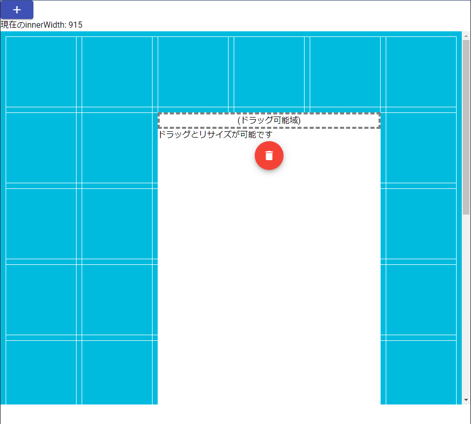
下図のようにinnerWidthによってグリッド列数が変化します。
-
innerWidthが1500px以上
グリッド列数が30
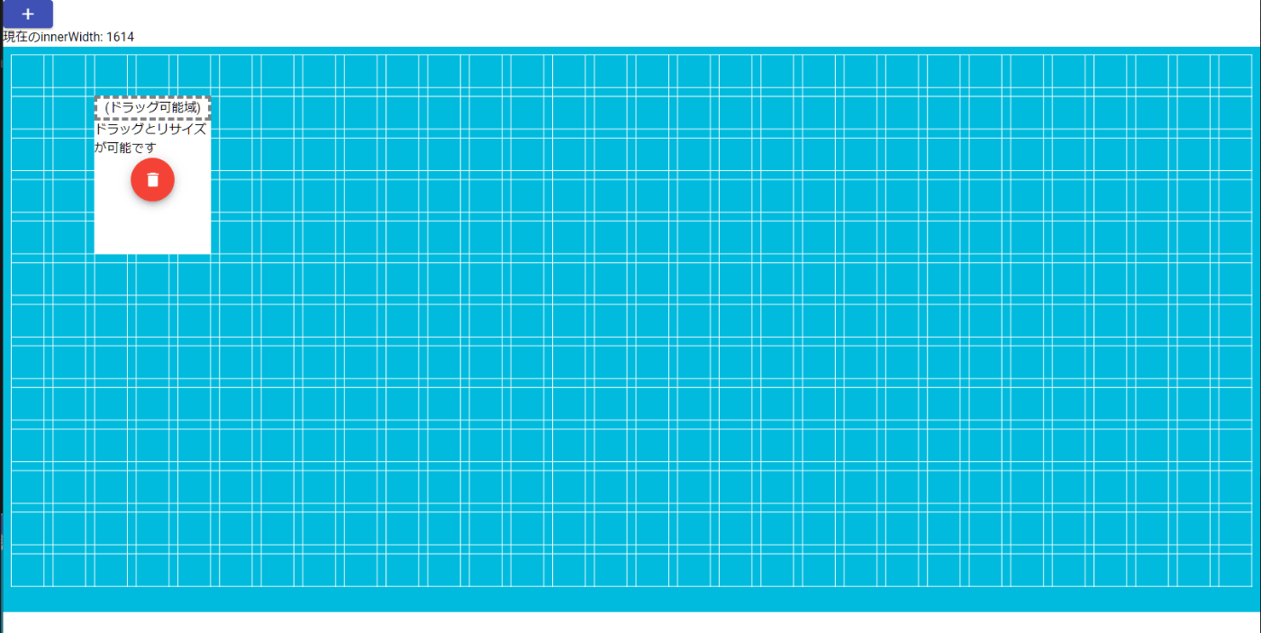
-
innerWidthが1000px以上1500px未満
グリッド列数が13
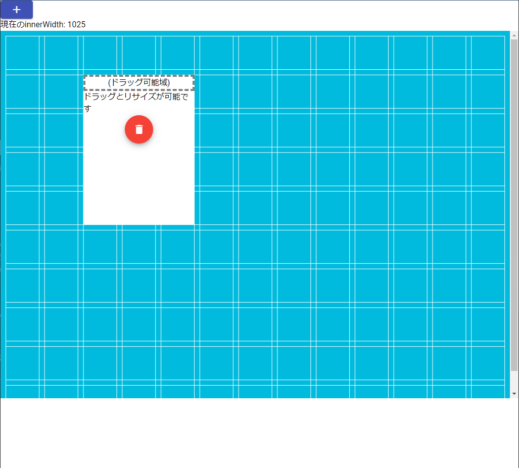
-
innerWidthが1000px未満
グリッド列数が6
画面内のグリッド数を固定する
minColsとmaxCols、minRowsとmaxRowsを同じにする。
minCols: 10,
maxCols: 10,
minRows: 8,
maxRows: 8,
画面内で表示される最小を10にし、最大値も同じなので画面内のグリッド数を固定できる。(gridTypeがscrollVerticalなど縦横比を固定する場合はminColsとminRowsはスクロールバーで対応される)
参考
Discussion