【コピペ用】表・テーブルレイアウトのテンプレート【HTML/CSS/Sass】
コーディングをしていると定期的に出てくる表やテーブルレイアウトの実装。
正直、毎回必ず出てくるわけではないので微妙に記憶に残りづらく、テーブルの実装が出るたびに「HTML table 書き方」とかで何度も調べた経験があります。
毎回調べるのはさすがに面倒なのと、自分自身がよく使うレイアウトをあらかじめコピペして使い回せるようにしようということで、今回は HTML/CSS でよく使う表・テーブルレイアウトのコピペ用テンプレートをまとめます。
まとめるレイアウトの種類は以下の 3 つ。
- 上に見出しが来るタイプの表・テーブル
- 横に見出しが来るタイプの表・テーブル
- 上と横両方に見出しが来るタイプの表・テーブル
順番に紹介していきます。
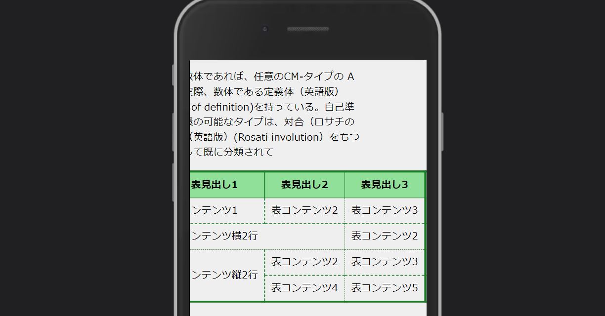
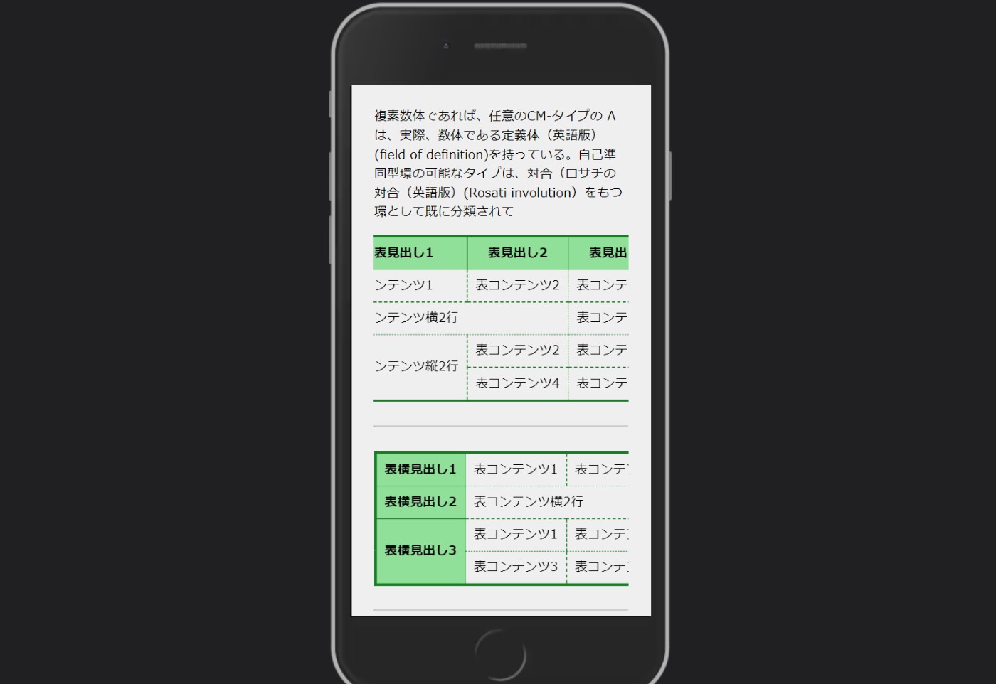
上に見出しが来るタイプの表・テーブル
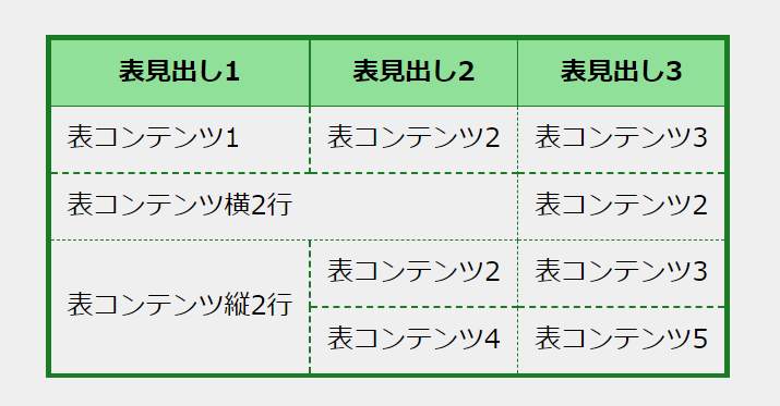
まずは上に見出しが来るタイプの表。
自分が知る限り一番よく見る無難なレイアウトですね。LPの価格プラン比較や、特徴の比較などなど使いみちがたくさんある表です。
コードは以下の通り。私はSassで使うことが多いのでSassのコードも一緒に記載しておきました。
HTML のコード
<table  class="c-table">
    <tr>
        <th>表見出し1</th>
        <th>表見出し2</th>
        <th>表見出し3</th>
    </tr>
    <tr>
        <td>表コンテンツ1</td>
        <td>表コンテンツ2</td>
        <td>表コンテンツ3</td>
    </tr>

    <!--  横に結合する  -->
    <tr>
        <td  colspan="2">表コンテンツ横2行</td>
        <td>表コンテンツ2</td>
    </tr>

    <!--  縦に結合する  -->
    <tr>
        <td  rowspan="2">表コンテンツ縦2行</td>
        <td>表コンテンツ2</td>
        <td>表コンテンツ3</td>
    </tr>
    <tr>
        <td>表コンテンツ4</td>
        <td>表コンテンツ5</td>
    </tr>
</table>
CSS のコード
/*  table  layout  template  */
.c-table  {
    border-collapse:  collapse;
    border:  solid  3px  #1b7c26;
}
.c-table  th,
.c-table  td  {
    padding:  8px  10px;
}
.c-table  th  {
    border:  solid  1px  #1b7c26;
    background-color:  #90e099;
}
.c-table  td  {
    border:  dashed  1px  #1b7c26;
}
Sass のコード
/*  table  layout  template  */
.c-table  {
    border-collapse:  collapse;
    border:  solid  3px  #1b7c26;
    th,
    td  {
        padding:  8px  10px;
    }
    th  {
        border:  solid  1px  #1b7c26;
        background-color:  #90e099;
    }
    td  {
        border:  dashed  1px  #1b7c26;
    }
}
横に見出しが来るタイプの表・テーブル
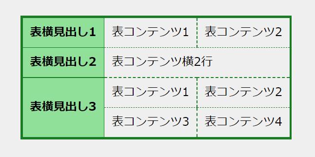
次に紹介するのは、横に見出しが来る横並びタイプの表・テーブルです。
ブログで商品の概要を項目ごとにまとめる際によく使いました。
コードはこんな感じです。
HTML のコード
<table  class="c-compare">
    <tr>
        <th>表横見出し1</th>
        <td>表コンテンツ1</td>
        <td>表コンテンツ2</td>
    </tr>

    <!--  横に結合する  -->
    <tr>
        <th>表横見出し2</th>
        <td  colspan="2">表コンテンツ横2行</td>
    </tr>

    <!--  縦に結合する  -->
    <tr>
        <th  rowspan="2">表横見出し3</th>
        <td>表コンテンツ1</td>
        <td>表コンテンツ2</td>
    </tr>
    <tr>
        <td>表コンテンツ3</td>
        <td>表コンテンツ4</td>
    </tr>
</table>
CSS のコード
/*  table  layout  template  */
.c-compare  {
    border-collapse:  collapse;
    border:  solid  3px  #1b7c26;
}
.c-compare  th,
.c-compare  td  {
    padding:  8px  10px;
}
.c-compare  th  {
    border:  solid  1px  #1b7c26;
    background-color:  #90e099;
}
.c-compare  td  {
  border:  dashed  1px  #1b7c26;
}
Sass のコード
/*  table  layout  template  */
.c-compare  {
  border-collapse:  collapse;
  border:  solid  3px  #1b7c26;
  th,
  td  {
    padding:  8px  10px;
  }
  th  {
    border:  solid  1px  #1b7c26;
    background-color:  #90e099;
  }
  td  {
    border:  dashed  1px  #1b7c26;
  }
}
上と横両方に見出しが来るタイプの表・テーブル
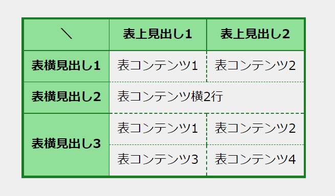
次は上と横両方に見出しがあるマトリクス状の表・テーブルです。
何やかんや使いそうで意外とあまり使わないけど、たまに使うことのあるレイアウトな印象。
コードはこのようになります。
HTML のコード
<table  class="c-matrix">
  <tr>
    <th>\</th>
    <th>表上見出し1</th>
    <th>表上見出し2</th>
  </tr>
  <tr>
    <th>表横見出し1</th>
    <td>表コンテンツ1</td>
    <td>表コンテンツ2</td>
  </tr>

  <!--  横に結合する  -->
  <tr>
    <th>表横見出し2</th>
    <td  colspan="2">表コンテンツ横2行</td>
  </tr>

  <!--  縦に結合する  -->
  <tr>
    <th  rowspan="2">表横見出し3</th>
    <td>表コンテンツ1</td>
    <td>表コンテンツ2</td>
  </tr>
  <tr>
    <td>表コンテンツ3</td>
    <td>表コンテンツ4</td>
  </tr>
</table>
CSS のコード
/*  table  layout  template  */
.c-matrix  {
  border-collapse:  collapse;
  border:  solid  3px  #1b7c26;
}
.c-matrix  th,
.c-matrix  td  {
  padding:  8px  10px;
}
.c-matrix  th  {
  border:  solid  1px  #1b7c26;
  background-color:  #90e099;
}
.c-matrix  td  {
  border:  dashed  1px  #1b7c26;
}
Sass のコード
/*  table  layout  template  */
.c-matrix  {
  border-collapse:  collapse;
  border:  solid  3px  #1b7c26;
  th,
  td  {
    padding:  8px  10px;
  }
  th  {
    border:  solid  1px  #1b7c26;
    background-color:  #90e099;
  }
  td  {
    border:  dashed  1px  #1b7c26;
  }
}
横スクロールさせたレスポンシブ対応バージョン
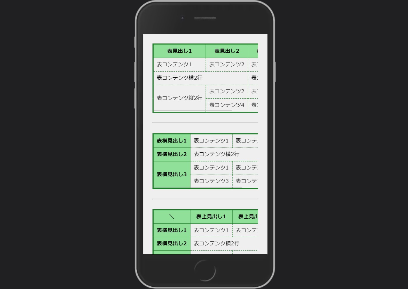
表の項目が多いとレスポンシブ対応のことを考えてスクロールできるようにしておきましょう。
tableタグに直接以下の3行を足せばいい感じにはなります。
white-space:  nowrap;
overflow-x:  auto;
-webkit-overflow-scrolling:  touch;
ただ、普通に3行追加するだけだとテーブルだけじゃなくてページ全体が横にスクロールできてしまってUI的に微妙です。
 パッと見大丈夫だけど…。
 こんな感じでページ全部がズレる…。
なので、レスポンシブ対応させる際はtable全体をdivで囲んでからスタイリングして、ページはズレないようにしながらテーブルだけ横にスクロールできるようにします。
 表だけスクロールできています。
先程紹介したレイアウトごとにコードを紹介していきますね。
上に見出しが来るタイプの表・テーブル
HTML のコード
<div  class="c-table">
  <table>
    <tr>
      <th>表見出し1</th>
      <th>表見出し2</th>
      <th>表見出し3</th>
    </tr>
    <tr>
      <td>表コンテンツ1</td>
      <td>表コンテンツ2</td>
      <td>表コンテンツ3</td>
    </tr>

    <!--  横に結合する  -->
    <tr>
      <td  colspan="2">表コンテンツ横2行</td>
      <td>表コンテンツ2</td>
    </tr>

    <!--  縦に結合する  -->
    <tr>
      <td  rowspan="2">表コンテンツ縦2行</td>
      <td>表コンテンツ2</td>
      <td>表コンテンツ3</td>
    </tr>
    <tr>
      <td>表コンテンツ4</td>
      <td>表コンテンツ5</td>
    </tr>
  </table>
</div>
CSS のコード
/*  table  layout  template  */
.c-table  table  {
  border-collapse:  collapse;
  border:  solid  3px  #1b7c26;
}
.c-table  th,
.c-table  td  {
  padding:  8px  10px;
}
.c-table  th  {
  border:  solid  1px  #1b7c26;
  background-color:  #90e099;
}
.c-table  td  {
  border:  dashed  1px  #1b7c26;
}
@media  only  screen  and  (max-width:  600px)  {
  .c-table  {
    white-space:  nowrap;
    overflow-x:  auto;
    -webkit-overflow-scrolling:  touch;
  }
}
Sass のコード
/*  table  layout  template  */
.c-table  {
  table  {
    border-collapse:  collapse;
    border:  solid  3px  #1b7c26;
  }
  th,
  td  {
    padding:  8px  10px;
  }
  th  {
    border:  solid  1px  #1b7c26;
    background-color:  #90e099;
  }
  td  {
    border:  dashed  1px  #1b7c26;
  }
  @media  only  screen  and  (max-width:  600px)  {
    white-space:  nowrap;
    overflow-x:  auto;
    -webkit-overflow-scrolling:  touch;
  }
}
横に見出しが来るタイプの表・テーブル
HTML のコード
<div  class="c-compare">
  <table>
    <tr>
      <th>表横見出し1</th>
      <td>表コンテンツ1</td>
      <td>表コンテンツ2</td>
    </tr>

    <!--  横に結合する  -->
    <tr>
      <th>表横見出し2</th>
      <td  colspan="2">表コンテンツ横2行</td>
    </tr>

    <!--  縦に結合する  -->
    <tr>
      <th  rowspan="2">表横見出し3</th>
      <td>表コンテンツ1</td>
      <td>表コンテンツ2</td>
    </tr>
    <tr>
      <td>表コンテンツ3</td>
      <td>表コンテンツ4</td>
    </tr>
  </table>
</div>
CSS のコード
/*  table  layout  template  */
.c-compare  table  {
  border-collapse:  collapse;
  border:  solid  3px  #1b7c26;
}
.c-compare  th,
.c-compare  td  {
  padding:  8px  10px;
}
.c-compare  th  {
  border:  solid  1px  #1b7c26;
  background-color:  #90e099;
}
.c-compare  td  {
  border:  dashed  1px  #1b7c26;
}
@media  only  screen  and  (max-width:  600px)  {
  .c-compare  {
    white-space:  nowrap;
    overflow-x:  auto;
    -webkit-overflow-scrolling:  touch;
  }
}
Sass のコード
/*  table  layout  template  */
.c-compare  {
  table  {
    border-collapse:  collapse;
    border:  solid  3px  #1b7c26;
  }
  .c-compare  th,
  .c-compare  td  {
    padding:  8px  10px;
  }
  .c-compare  th  {
    border:  solid  1px  #1b7c26;
    background-color:  #90e099;
  }
  .c-compare  td  {
    border:  dashed  1px  #1b7c26;
  }
  @media  only  screen  and  (max-width:  600px)  {
    white-space:  nowrap;
    overflow-x:  auto;
    -webkit-overflow-scrolling:  touch;
  }
}
上と横両方に見出しが来るタイプの表・テーブル
HTML のコード
<div  class="c-matrix">
  <table>
    <tr>
      <th>\</th>
      <th>表上見出し1</th>
      <th>表上見出し2</th>
    </tr>
    <tr>
      <th>表横見出し1</th>
      <td>表コンテンツ1</td>
      <td>表コンテンツ2</td>
    </tr>

    <!--  横に結合する  -->
    <tr>
      <th>表横見出し2</th>
      <td  colspan="2">表コンテンツ横2行</td>
    </tr>

    <!--  縦に結合する  -->
    <tr>
      <th  rowspan="2">表横見出し3</th>
      <td>表コンテンツ1</td>
      <td>表コンテンツ2</td>
    </tr>
    <tr>
      <td>表コンテンツ3</td>
      <td>表コンテンツ4</td>
    </tr>
  </table>
</div>
CSS のコード
/*  table  layout  template  */
.c-matrix  table  {
  border-collapse:  collapse;
  border:  solid  3px  #1b7c26;
}
.c-matrix  th,
.c-matrix  td  {
  padding:  8px  10px;
}
.c-matrix  th  {
  border:  solid  1px  #1b7c26;
  background-color:  #90e099;
}
.c-matrix  td  {
  border:  dashed  1px  #1b7c26;
}
@media  only  screen  and  (max-width:  600px)  {
  .c-matrix  {
    white-space:  nowrap;
    overflow-x:  auto;
    -webkit-overflow-scrolling:  touch;
  }
}
Sass のコード
/*  table  layout  template  */
.c-matrix  {
  table  {
    border-collapse:  collapse;
    border:  solid  3px  #1b7c26;
  }
  caption  {
    padding:  8px;
    color:  #fff;
    font-weight:  bold;
    background:  #1b7c26;
  }
  th,
  td  {
    padding:  8px  10px;
  }
  th  {
    border:  solid  1px  #1b7c26;
    background-color:  #90e099;
  }
  td  {
    border:  dashed  1px  #1b7c26;
  }
  @media  only  screen  and  (max-width:  600px)  {
    white-space:  nowrap;
    overflow-x:  auto;
    -webkit-overflow-scrolling:  touch;
  }
}
caption タグで表全体の見出しや注釈をつくる
正直そこまで使わないですが、captionタグで表・テーブルの見出しや注釈をつくることもできます。
デモ画像とコードを順に紹介しますね。
表全体の見出しを設置する
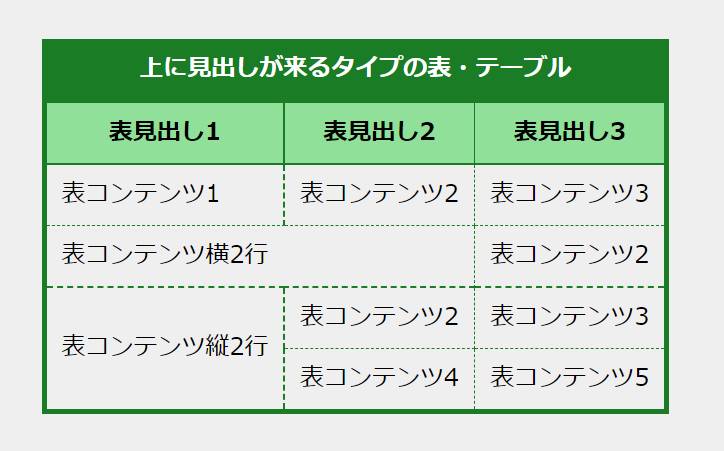
表・テーブルの上に全体を囲うように表全体の見出しがあるタイプ。
tableタグ内にcaptionタグを追加して、CSSをざっと当てるだけで実装できます。
HTML のコード
  <div  class="c-table">
    <table>
+     <caption>
+        上に見出しが来るタイプの表・テーブル
+     </caption>
      <tr>
        <th>表見出し1</th>
        <th>表見出し2</th>
        <th>表見出し3</th>
      </tr>
      <tr>
        <td>表コンテンツ1</td>
        <td>表コンテンツ2</td>
        <td>表コンテンツ3</td>
      </tr>

      <!--  横に結合する  -->
      <tr>
        <td  colspan="2">表コンテンツ横2行</td>
        <td>表コンテンツ2</td>
      </tr>

      <!--  縦に結合する  -->
      <tr>
        <td  rowspan="2">表コンテンツ縦2行</td>
        <td>表コンテンツ2</td>
        <td>表コンテンツ3</td>
      </tr>
      <tr>
        <td>表コンテンツ4</td>
        <td>表コンテンツ5</td>
      </tr>
    </table>
  </div>
CSS のコード
/*  table  layout  template  */
.c-table  table  {
  border-collapse:  collapse;
  border:  solid  3px  #1b7c26;
}
+  .c-table  caption  {
+    color:  #fff;
+    font-weight:  bold;
+    padding:  8px;
+    background:  #1b7c26;
+  }
.c-table  th,
.c-table  td  {
  padding:  8px  10px;
}
.c-table  th  {
  border:  solid  1px  #1b7c26;
  background-color:  #90e099;
}
.c-table  td  {
  border:  dashed  1px  #1b7c26;
}
@media  only  screen  and  (max-width:  600px)  {
  .c-table  {
    white-space:  nowrap;
    overflow-x:  auto;
    -webkit-overflow-scrolling:  touch;
  }
}
Sass のコード
/*  table  layout  template  */
.c-table{
    table  {
        border-collapse:  collapse;
        border:  solid  3px  #1b7c26;
    }
+  caption  {
+      color:  #fff;
+      font-weight:  bold;
+      padding:  8px;
+      background:  #1b7c26;
+  }
    th,
    td  {
        padding:  8px  10px;
    }
    th  {
        border:  solid  1px  #1b7c26;
        background-color:  #90e099;
    }
    td  {
        border:  dashed  1px  #1b7c26;
    }
    @media  only  screen  and  (max-width:  600px)  {
        white-space:  nowrap;
        overflow-x:  auto;
        -webkit-overflow-scrolling:  touch;
    }
}
表に対する注釈を設置する
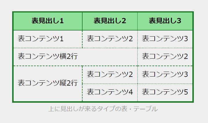
見出しほどじゃないけど、注釈的なかたちで文章を表・テーブルの外に入れたいときもcaptionタグで上の画像のように実装できます。
コードは以下の通りです。
HTML のコード
 <div class="c-table">
   <table>
+    <caption>
+      上に見出しが来るタイプの表・テーブル
+    </caption>
     <tr>
       <th>表見出し1</th>
       <th>表見出し2</th>
       <th>表見出し3</th>
     </tr>
     <tr>
       <td>表コンテンツ1</td>
       <td>表コンテンツ2</td>
       <td>表コンテンツ3</td>
     </tr>

     <!--  横に結合する  -->
     <tr>
       <td  colspan="2">表コンテンツ横2行</td>
       <td>表コンテンツ2</td>
     </tr>

     <!--  縦に結合する  -->
     <tr>
       <td  rowspan="2">表コンテンツ縦2行</td>
       <td>表コンテンツ2</td>
       <td>表コンテンツ3</td>
     </tr>
     <tr>
       <td>表コンテンツ4</td>
       <td>表コンテンツ5</td>
     </tr>
   </table>
 </div>
CSS のコード
/*  table  layout  template  */
.c-table  table  {
    border-collapse:  collapse;
    border:  solid  3px  #1b7c26;
}
+  .c-table  caption  {
+      caption-side:  bottom;
+      color:  #999;
+      font-size:  14px;
+      margin-top:  5px;
+  }
.c-table  th,
.c-table  td  {
    padding:  8px  10px;
}
.c-table  th  {
    border:  solid  1px  #1b7c26;
    background-color:  #90e099;
}
.c-table  td  {
    border:  dashed  1px  #1b7c26;
}
@media  only  screen  and  (max-width:  600px)  {
    .c-table  {
        white-space:  nowrap;
        overflow-x:  auto;
        -webkit-overflow-scrolling:  touch;
    }
}
Sass のコード
/*  table  layout  template  */
.c-table{
    table  {
        border-collapse:  collapse;
        border:  solid  3px  #1b7c26;
    }
+  caption  {
+      caption-side:  bottom;
+      color:  #999;
+      font-size:  14px;
+      margin-top:  5px;
+  }
    th,
    td  {
        padding:  8px  10px;
    }
    th  {
        border:  solid  1px  #1b7c26;
        background-color:  #90e099;
    }
    td  {
        border:  dashed  1px  #1b7c26;
    }
    @media  only  screen  and  (max-width:  600px)  {
        white-space:  nowrap;
        overflow-x:  auto;
        -webkit-overflow-scrolling:  touch;
    }
}
注釈を下以外にしたい場合は、caption-side: bottom;のbottomを自由に変えると場所を変えられます。
最後に
ということで、表・テーブルレイアウトのコピペ用テンプレの紹介でした。他にもtheadとかtbodyを使うやり方もありますが、今回は最低限レイアウトに必要な知識に絞って紹介しました。
また新しいタイプの表・テーブルをコーディングした際は更新していきます。
皆さんのコーディングの参考になれば幸いです。
それでは。👋
Discussion