😉
HTMLとCSSでスマイリーをつくる【スマイリーさん生誕祭】
11月3日といえば、登録者120万人超えのYouTuberであるスマイリーさんの誕生日!🎉
(スマイリーさんのYouTubeチャンネル)
ということで、誕生日記念にスマイリーさんをHTML/CSSでコーディングしてつくってみました。
今回の記事ではそのソースコードとコードの簡易な解説をしていきます!
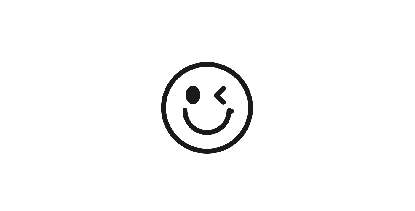
作成したHTMLとCSSのコード
見た目は以下のようになりました。
(デモサイト)
HTMLはdivタグをひたすら重ねています。
<div class="smiley">
  <div class="smiley_eye">
    <div class="smiley_eye_right"></div>
    <div class="smiley_eye_left"></div>
  </div>
  <div class="smiley_mouse">
    <div class="smiley_mouse_border"></div>
  </div>
</div>
リセットCSSはdestyle.cssを使用しています。
<!-- reset.css destyle -->
<link
  rel="stylesheet"
  href="https://cdn.jsdelivr.net/npm/destyle.css@1.0.15/destyle.css"
/>
CSSはこのようになりました。
body {
  height: 100vh;
  display: flex;
  justify-content: center;
  align-items: center;
  background-color: #fff;
}
.smiley {
  display: flex;
  flex-direction: column;
  justify-content: center;
  align-items: center;
  gap: 64px;
  width: 300px;
  height: 300px;
  padding: 40px;
  background-color: #fff;
  border: solid 16px #1a1a1a;
  border-radius: 50%;
}
.smiley_eye {
  display: flex;
  justify-content: center;
  align-items: center;
  gap: 56px;
  width: 100%;
  margin-left: -20px;
}
.smiley_eye_right {
  width: 48px;
  height: 60px;
  background-color: #1a1a1a;
  border-radius: 50%;
}
.smiley_eye_left {
  width: 16px;
  height: 48px;
  background-color: #1a1a1a;
  border-radius: 16px;
  transform: rotate(45deg);
  position: relative;
  margin-top: -20px;
}
.smiley_eye_left:before {
  position: absolute;
  top: 32px;
  left: 0;
  content: "";
  width: 48px;
  height: 16px;
  background-color: #1a1a1a;
  border-radius: 16px;
}
.smiley_mouse {
  height: 20px;
  position: relative;
}
.smiley_mouse_border {
  position: absolute;
  top: -44px;
  left: -80px;
  margin: auto;
  width: 160px;
  height: 81px;
  border: solid 16px #1a1a1a;
  border-radius: 0 0 800px 800px;
  border-top: 0;
}
.smiley_mouse_border:before {
  position: absolute;
  top: -8px;
  left: -16px;
  content: "";
  width: 16px;
  height: 16px;
  background-color: #1a1a1a;
  border-radius: 50%;
}
.smiley_mouse_border:after {
  position: absolute;
  top: -6px;
  right: -24px;
  content: "";
  width: 24px;
  height: 16px;
  background-color: #1a1a1a;
  border-radius: 16px;
  transform: rotate(18deg);
}
コードの解説
特徴的な部分だけ簡単にコードの解説をしていきたいと思います。
左目の<マークをCSSで表現する
左目のウインクマーク(<)のCSS表現について。
逆向きの>マークは、一般的なサイトでもボタンやグローバルナビなどで使われているかと思います。
それを回転させるだけなので、比較的カンタンに実装できるかと。
詳しくは、HTMLとCSSでつくるアイコンの記事が参考になるかと思います。
<div class="smiley_eye_left"></div>
.smiley_eye_left {
  width: 16px;
  height: 48px;
  background-color: #1a1a1a;
  border-radius: 16px;
  transform: rotate(45deg);
  position: relative;
  margin-top: -20px;
}
.smiley_eye_left:before {
  position: absolute;
  top: 32px;
  left: 0;
  content: "";
  width: 48px;
  height: 16px;
  background-color: #1a1a1a;
  border-radius: 16px;
}
口の曲線をCSSで表現する
口の曲線が結構苦戦しました。
ざっくりとした仕組みとしては、円弧の上辺の線を非表示にして、先端を擬似要素で丸くさせる感じです。
まずは、円弧を作成します。

<div class="smiley_mouse">
  <div class="smiley_mouse_border"></div>
</div>
.smiley_mouse {
  height: 20px;
  position: relative;
}
.smiley_mouse_border {
  position: absolute;
  top: -44px;
  left: -80px;
  margin: auto;
  width: 160px;
  height: 81px;
  border: solid 16px #1a1a1a;
  border-radius: 0 0 800px 800px;
}
それをborder-top: 0;にすると曲線に。

でもそれだけだと先端がカクカクなので、疑似要素を使って丸くします。
(スマイリーの左側の口元はちょっと曲がっているのでtransformなどを使って調整しています。)

<div class="smiley_mouse">
  <div class="smiley_mouse_border"></div>
</div>
.smiley_mouse {
  height: 20px;
  position: relative;
}
.smiley_mouse_border {
  position: absolute;
  top: -44px;
  left: -80px;
  margin: auto;
  width: 160px;
  height: 81px;
  border: solid 16px #1a1a1a;
  border-radius: 0 0 800px 800px;
  border-top: 0;
}
.smiley_mouse_border:before {
  position: absolute;
  top: -8px;
  left: -16px;
  content: "";
  width: 16px;
  height: 16px;
  background-color: #1a1a1a;
  border-radius: 50%;
}
.smiley_mouse_border:after {
  position: absolute;
  top: -6px;
  right: -24px;
  content: "";
  width: 24px;
  height: 16px;
  background-color: #1a1a1a;
  border-radius: 16px;
  transform: rotate(18deg);
}
最後に
ということで、HTMLとCSSでつくるスマイリーの紹介でした。
改めてお誕生日おめでとうございます。
スマイリーさんのYouTube動画は基本的に短めでかつ面白いので割りとポンポン見れてしまいます。
みなさんもぜひ見てみてくださいねー。😉
(スマイリーさんのYouTubeチャンネル)
Discussion