🔖
webページ作成(HTML、CSS)〜ヘッダー編〜
ヘッダー部分のHTMLを作成する
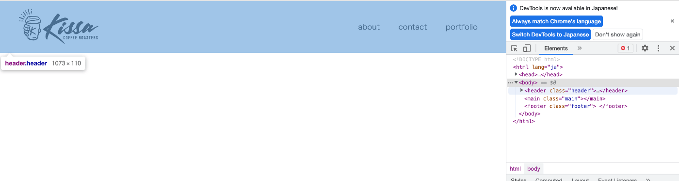
header内にもう一つ箱を作る
common.html
<body>
    <header class="header">
	    <div class="header-inner"></div>
    </header>
・・・(略)
</body>
ロゴを指定する
common.html
<body>
    <header class="header">
	    <div class="header-inner">
		    <img src="./images/・・・・" alt="ロゴ">
	    </div>
    </header>
・・・(略)
</body>
ロゴにトップページのリンクを貼る
common.html
<body>
    <header class="header">
        <div class="header-inner">
            <a class="header-logo" href="./index.html">
                <img src="images/・・・・" alt="ロゴ">
            </a>
                <div>
ナビゲーションを配置する
common.html
<body>
    <header class="header">
        <div class="header-inner">
            <a class="header-logo" href="./index.html">
                <img src="images/・・・・" alt="ロゴ">
            </a>
            <div class="header-site-menu">
                <nav class="site-menu">
                    <ul>
			<li><a href="./about.html">about</a></li>
                        <li><a href="./contact">contact</a></li>
                        <li><a href="./portfolio">portfolio</a></li>
                    </ul>
                </nav>
            </div>
        </div>
    </header>
ヘッダー部分のCSSを書く
ヘッダーのサイズを指定する
common.css
.header-inner{
    max-width: 1200px;
    height: 110px;
    }
→レスポンシブデザインでは、幅をmax-widthで指定しておくとブラウザ幅に合わせて可変する表示にできるためmax-widthを使用する。
ヘッダーの位置を指定する
common.css
.header-inner{
    max-width: 1200px;
    height: 110px;
    margin-left: auto;
    margin-right: auto;
    }
ヘッダーをウェブブラウザの中央に指定する。
中央揃えにするには左右のmarginの値を「auto」にする。
ヘッダーエリアの左右の余白を指定する
common.css
.header-inner{
   max-width: 1200px;
   height: 110px;
   margin-left: auto;
   margin-right: auto;
   padding-left: 40px;
   padding-right:40px;
   }
paddingプロパティを使い、左右にそれぞれ40pxの余白を設定する
ロゴとナビゲーションを横並びにする
common.css
.header-inner{
  max-width: 1200px;
  ・・・(略)・・・
  display:flex;
  }
ロゴとナビゲーションを左右の端に寄せる
common.css
.header-inner{
   max-width: 1200px;
   ・・・(略)・・・
   justify-content: space-between;
   }
→アイテムの配置や感覚を指定するプロパティであるjustify-contentを使用する。
値は「アイテムを均等に配置し、最初のアイテムは先頭に、最後のアイテムは末尾に寄せる」という指定である「apace-between」を指定する。
ロゴとナビゲーションの上下の高さを揃える
common.css
.header-inner{
    max-width: 1200px;
    ・・・(略)・・・
    align-items: center;
    }
ロゴのサイズを指定できるようにする
common.css
.header-logo{
    display: block;
    width: 170px;
    }
→ロゴはa要素でマークアップされるいるため幅の指定が出来ない。
なのでdisplayプロパティで「block」を指定し、幅の指定ができるようにする。
ナビゲーションの項目を横並びにする
common.css
.site-menu ul{
    display: flex;
    }
ナビゲーション項目の余白を設定する
common.css
.site-menu ul li{
    margin-left: 20px;
    margin-right: 20px;
    }
完成形
HTML
common.html
<!DOCTYPE html>
<html lang="ja">
<head>
    <meta charset="UTF-8">
    <meta name="viewport" content="width=device-width, initial-scale=1.0">
    <meta name="description" content="ページの概要を記載します">
    <meta http-equiv="X-UA-Compatible" content="ie=edge">
    <script src="js/toggle-menu.js"></script>
    <link href="css/common.css" rel="stylesheet">
    <title>テンプレ</title>
</head>
<body>
    <header class="header">
        <div class="header-inner">
            <a class="header-logo" href="./index.html">
                <img src="images/logo-header.png" alt="ロゴ">
            </a>
            <button class="toggle-menu-button"></button>
            <div class="header-site-menu">
                <nav class="site-menu">
                    <ul>
                        <li><a href="./about.html">about</a></li>
                        <li><a href="./contact">contact</a></li>
                        <li><a href="./portfolio">portfolio</a></li>
                    </ul>
                </nav>
            </div>
        </div>
    </header>
    <main class="main"></main>
    <footer class="footer"></footer>
</body>
</html>
CSS
common.css
@charset "utf-8";

*,
::before,
::after{
    padding: 0;
    margin: 0;
    box-sizing: border-box;
}

ul,
ol{
    list-style: none;
}

a{
    color: inherit;
    text-decoration: none;
}

body{
    font-family: sans-serif;
    font-size: 16px;
    color: #000000;
    line-height: 1;
    background-color: #ffffff;
}

img{
    max-width: 100%;
}

.header-inner{
    max-width: 1200px;
    height: 110px;
    margin-left: auto;
    margin-right: auto;
    padding-left: 40px;
    padding-right:40px;
    display:flex;
    justify-content: space-between;
    align-items: center;
}

.toggle-menu-button{
    display: none;
}

.header-logo{
    display: block;
    width: 170px;
}

.site-menu ul{
    display: flex;
}

.site-menu ul li{
    margin-left: 20px;
    margin-right: 20px;
}
完成形見た目
Discussion