🛠️
[React]連続表示可能なToastコンポーネントをフルスクラッチで実装してみた
前書き
Toast x React な素晴らしいライブラリは既に幾つか存在しますが、
- 見た目に融通を利かせたい
- ライブラリでは少々機能過多
このような背景があり、Reactの主機能のみで実装を試みました。
要件
- 任意のイベントを契機に、表示される
- 連続で複数表示が可能
- 各Toastは独立してアニメーションをする
前提
ここでは以下の技術を使用して書かれております。
なお、Reactv18以上は必須になります。
- React 18
- TypeScript
- CSS Modules
Point
-
contextを使用する -
useSyncExternalStoreを使用して、独自のStoreを構築する
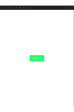
完成系
動作
コード
Githubにて公開しております。
Component
Logics
解説
主要な部分を、以下のステップに分けて解説いたします。
- 表示中のToastデータを管理するStoreを用意する
- Storeを各コンポーネントから参照できるようにするためのContextを用意する
- Toastコンポーネントを実装する
- アニメーションを実装する
1. 表示中のToastデータを管理するStoreを用意する
Motivation
- 再レンダリングの範囲を限定したい(各Toastコンポーネントのみに抑えたい)
- 例えば
useStateで管理してしまうと、各Toastコンポーネントの親ごと再レンダリングが走り、Toastの増減で表示が不自然にチラついてしまいます - ※もしuseStateでもできるよ〜というご提案がありましたらコメントいただけたら幸いです。
- 例えば
Point
-
useSyncExternalStoreを使用して、独自のStoreを構築する- https://react.dev/reference/react/useSyncExternalStore
- Storeを用いれば上記を解決できる、とはいえ、1コンポーネントのためだけにReduxやRecoilのような巨大ライブラリを導入するのは保守性の観点からよろしくないと考えます
- 余談: ライブラリを使用するほどのスケールでない場合に有用です
src/libs/toast/chore/store.ts
import type { ToastType } from '@/components/ui/Toast/type';

type ToastStore = { key: string; type: ToastType; message: string };

let toasts: ToastStore[] = [];
type Notify = () => void;
const listeners = new Set<Notify>();

export const generateToastStore = () => {
  return {
    notify({ key, type, message }: ToastStore) {
      toasts = [...toasts, { key, type, message }];
      emitChange();
    },
    remove(key: string) {
      toasts = toasts.filter((toast) => toast.key !== key);
      emitChange();
    },
    subscribe(listener: Notify) {
      listeners.add(listener);

      return () => {
        listeners.delete(listener);
      };
    },
    getSnapshot() {
      return toasts;
    },
  };
};

const emitChange = () => {
  for (const listener of listeners) {
    listener();
  }
};
扱いやすいようにhookとしてI/Fを用意します。
src/libs/toast/chore/useToastStore.ts
import { useRef, useSyncExternalStore } from 'react';

import { generateToastStore } from '@/libs/toast/chore/store';

export const useToastStore = () => {
  // 初期化 & 永続化
  const { notify, remove, subscribe, getSnapshot } = useRef(generateToastStore()).current;
  const snapshot = useSyncExternalStore(subscribe, getSnapshot, getSnapshot);

  return { snapshot, notify, remove };
};
2. Storeを各コンポーネントから参照できるようにするためのContextを用意する
Motivation
- 各コンポーネントからアクセスできるようにしたい
- 各ビジネスロジック中から呼び出せるようにします
src/libs/toast/ToastProvider.tsx
import { useCallback, type FC } from 'react';
import { createPortal } from 'react-dom';

import { ToastContainer } from '@/libs/toast/chore/ToastContainer';
import { ToastContext } from '@/libs/toast/chore/ToastContext';
import { useToastStore } from '@/libs/toast/chore/useToastStore';

import type { ToastType } from '@/components/ui/Toast/type';

type Props = {
  children: React.ReactNode;
};

const getId = () => {
  return Math.random().toString(36).slice(-8);
};

export const ToastProvider: FC<Props> = ({ children }) => {
  const { notify } = useToastStore();

  // こちらのメソッド経由でトーストを呼び出せます
  const showToast = useCallback(
    ({ type, message }: { type: ToastType; message: string }) => {
      notify({ key: `toast-${getId()}`, type, message });
    },
    [notify],
  );

  return (
    <ToastContext.Provider value={{ showToast }}>
      {children}

      {createPortal(<ToastContainer />, document.body)}
    </ToastContext.Provider>
  );
};
3. Toastコンポーネントを実装する
Point
- アクセシビリティ考慮のため、
role='alert'を付与する- https://developer.mozilla.org/en-US/docs/Web/Accessibility/ARIA/Roles/alert_role
- Toast表示時に内容を読み上げてくれるようになります
※Iconコンポーネントはこの記事の内容に必須ではありません
src/components/ui/Toast/index.tsx
import clsx from 'clsx';
import { forwardRef } from 'react';

import clsx from 'clsx';
import { forwardRef } from 'react';

import { Icon } from '@/components/ui/Icon';
import styles from '@/components/ui/Toast/index.module.css';

import type { ToastState, ToastType } from '@/components/ui/Toast/type';
import type { ComponentProps } from 'react';

type Props = {
  type: ToastType;
  message: string;
  state: ToastState;
};

const getIconProps = (type: Props['type']): Omit<ComponentProps<typeof Icon>, 'size'> => {
  switch (type) {
    case 'success':
      return { name: 'alert-square', colorType: 'green' };
    case 'error':
      return { name: 'alert-square', colorType: 'red' };
    case 'info':
      return { name: 'alert-square', colorType: 'blue' };
    case 'warning':
      return { name: 'alert-square', colorType: 'yellow' };
  }
};

export const Toast = forwardRef<HTMLDivElement, Props>(({ type, message, state }, ref) => {
  return (
    <div
      ref={ref}
      role='alert'
      data-type={type}
      className={clsx(styles.toast, state === 'exiting' ? styles.hide : state === 'exited' ? styles.vanish : '')}
    >
      <Icon {...getIconProps(type)} size={24} />

      {message}
    </div>
  );
});

Toast.displayName = 'Toast';
4. アニメーションを実装する
Motivation
- 複数表示時に、各Toastが重ならないようにしたい
- 1つが消えた時に、まだ表示されている分の表示位置が滑らかに移動するようにしたい
Point
- Toast群の親要素を
positoin: fixed;で固定位置に配置し、各Toastにはposition: relative;を適用する- 各Toastは親要素を起点とした位置、かつ通常の配置ルールに準ずる形となる
- ->
marginでスペースを確保できる
- 表示状態を3つに分ける
-
entering: 入場中 ~ 表示中 -
exiting: 退場中 -
exited: 退場完了
-
- 各表示状態に合わせたアニメーションを定義する
-
entering: 入場アニメーション -
exiting: 退場アニメーション -
exited: ※以下詳細
-
-
exited時のアニメーションについて(それ以外の状態についてはシンプルであるため割愛)- 消える要素の高さをtransition的に狭めることで、要素が完全に消えた時の要素移動の緩急を緩める
-
heightにtransitionを適用する - スタートラインとして仮のheightを適用する
- 最終的に0となるようにする
-
- 消える要素の高さをtransition的に狭めることで、要素が完全に消えた時の要素移動の緩急を緩める
Toast本体のStyle
src/components/ui/Toast/index.module.css
@keyframes fade-in {
  from {
    right: -100%;
  }

  to {
    right: var(--spacing-2);
  }
}

@keyframes fade-out {
  0% {
    right: var(--spacing-2);
  }

  100% {
    right: -100%;
  }
}

@keyframes vanish {
  0% {
    height: 48px;
  }

  100% {
    height: 0;
  }
}

.toast {
  position: relative;
  display: flex;
  gap: var(--spacing-2);
  align-items: center;
  min-width: 240px;
  max-width: 50%;
  padding: var(--spacing-4) var(--spacing-6);
  margin-bottom: var(--spacing-4);
  overflow: hidden;
  color: var(--color-light);
  background-color: var(--color-dark);
  border-radius: var(--border-radius-2);
  box-shadow: var(--box-shadow);
  transition: all 3000ms ease-out;
  animation-name: fade-in;
  animation-duration: 300ms;
  animation-timing-function: ease-out;
  animation-fill-mode: forwards;

  &.hide {
    animation-name: fade-out;
  }

  &.vanish {
    right: -100%;
    padding: 0;
    margin: 0;
    transition: all 500ms ease-out;
    animation-name: vanish;
  }

  @media (481px <= width < 768px) {
    min-width: 400px;
  }

  @media (width <= 400px) {
    min-width: 90%;
    max-width: 90%;
  }
}
Toast群を挿入する親要素
src/libs/toast/chore/ToastContainer.tsx
import { useRef, useState, useLayoutEffect } from 'react';

import { Toast } from '@/components/ui/Toast';
import { useToastStore } from '@/libs/toast/chore';
import styles from '@/libs/toast/chore/toast-container.module.css';

import type { ToastState } from '@/components/ui/Toast/type';
import type { FC, ComponentProps } from 'react';

const ToastWrapper: FC<{ id: string } & Omit<ComponentProps<typeof Toast>, 'state'>> = ({ id, message, type }) => {
  const ref = useRef<HTMLDivElement>(null);
  const [state, setState] = useState<ToastState>('entering');

  const { remove } = useToastStore();

  useLayoutEffect(() => {
    if (ref.current === null) return;

    let timer: NodeJS.Timeout;
    const node = ref.current;
    const onAnimationEnd = () => {
      if (state === 'entering') {
        timer = setTimeout(() => {
          setState('exiting');
        }, 3000);
      } else if (state === 'exiting') {
        timer = setTimeout(() => {
          setState('exited');
        }, 0);
      } else {
        timer = setTimeout(() => {
          remove(id);
        }, 350);
      }
    };
    node.addEventListener('animationend', onAnimationEnd);

    return () => {
      node.removeEventListener('animationend', onAnimationEnd);
      if (timer !== undefined) {
        clearTimeout(timer);
      }
    };
  }, [id, remove, state]);

  return <Toast ref={ref} type={type} message={message} state={state} />;
};

export const ToastContainer: FC = () => {
  const { snapshot } = useToastStore();

  return (
    <div id='toast-container' className={styles.toastContainer}>
      {snapshot.map(({ key, message, type }) => (
        <ToastWrapper key={key} id={key} type={type} message={message} />
      ))}
    </div>
  );
};
Fin.
後書き
- 自分なりのToastコンポーネントの実装について記してみました。
- 現状の形ではまだ、Toastコンポーネントの責務に見た目以外が内包されてしまっている、などの課題も残っておりますが、基礎系として1つの参考していただけたら幸いです。
- ご意見などなど大歓迎です!!
Discussion