🛠️
.NET MAUIでカスタムコントロールを作成する方法4選
はじめに
.NET Maui でカスタムコントロールを作成する方法について、以下4パターンを試してみる。
- 既存コントロール継承
- ContentView(複合コントロール)
- GraphicsView+IDrawable(カスタム描画)
- ハンドラー
環境
Windows 11
Visual Studio 2022
.NET 8.0
CommunityToolkit.Mvvm 8.4.0
1. 既存コントロール継承
概要
- 既存コントロールに機能を追加
- 既存コントロール(例:
Entry)を継承し、バインド可能なプロパティ(BindableProperty)で外部から操作可能なプロパティを追加。 - 値の保持と通知は
BindableProperty、XAML からは アクセサー(Min/Maxなど)を使用してアクセスする。
参考
- BindableProperty (Microsoft Learn)
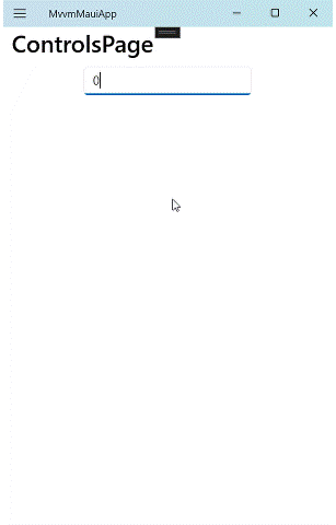
例:Entryを継承
-
Entryに指定範囲の数字のみ入力可能とする機能を追加。 - 確定時に
Textを検証し、有効ならValueに反映。
IntRangeEntry.cs
public class IntRangeEntry : Entry
{
    public static readonly BindableProperty MinProperty =
        BindableProperty.Create(nameof(Min), typeof(int), typeof(IntRangeEntry), 0, propertyChanged: OnRangeChanged);

    public static readonly BindableProperty MaxProperty =
        BindableProperty.Create(nameof(Max), typeof(int), typeof(IntRangeEntry), 100, propertyChanged: OnRangeChanged);

    public static readonly BindableProperty ValueProperty =
        BindableProperty.Create(nameof(Value), typeof(int?), typeof(IntRangeEntry), 0,
            BindingMode.TwoWay, propertyChanged: OnValueChanged);

    public int Min { get => (int)GetValue(MinProperty); set => SetValue(MinProperty, value); }
    public int Max { get => (int)GetValue(MaxProperty); set => SetValue(MaxProperty, value); }
    public int? Value { get => (int?)GetValue(ValueProperty); set => SetValue(ValueProperty, value); }

    bool _updating;
    string _lastValidText = "0";

    public IntRangeEntry()
    {
        Keyboard = Keyboard.Numeric;
        SetMaxLengthFromRange();

        var init = FallbackZeroOrMin();
        _lastValidText = init.ToString();
        Text = _lastValidText;
        Value = init;

        Unfocused += OnUnfocused;
        Completed += OnCompleted;
    }

    void OnUnfocused(object? s, FocusEventArgs e) => CommitFromText();
    void OnCompleted(object? s, EventArgs e) => CommitFromText();

    void CommitFromText()
    {
        int n;
        var t = Text ?? string.Empty;

        if (t.Length == 0)
        {
            n = FallbackZeroOrMin();
        }
        else if (!int.TryParse(t, out n))
        {
            // 数字でない → 最後の有効値へ
            n = int.Parse(_lastValidText);
        }

        n = Math.Clamp(n, Min, Max);
        Commit(n);
    }

    void Commit(int n)
    {
        try
        {
            _updating = true;
            var text = n.ToString();
            Text = text;
            _lastValidText = text;  // 最終有効値を更新
            Value = n;              // Valueへはここで初めて反映
        }
        finally { _updating = false; }
    }

    static void OnRangeChanged(BindableObject b, object oldV, object newV)
    {
        var c = (IntRangeEntry)b;
        c.NormalizeRange();
        c.SetMaxLengthFromRange();

        // 範囲更新時:Value反映はしない(次の確定時に反映)
        var ui = c.TryParseTextOr(c.FallbackZeroOrMin());
        ui = Math.Clamp(ui, c.Min, c.Max);
        c.ApplyUiOnly(ui);
    }

    static void OnValueChanged(BindableObject b, object oldV, object newV)
    {
        var c = (IntRangeEntry)b;
        if (c._updating) return; // 内部更新は無視

        // 外部(VM)→ UI は即時反映(整合性重視)
        if (newV is int n)
        {
            n = Math.Clamp(n, c.Min, c.Max);
            c.ApplyUiOnly(n);
        }
        else
        {
            var fallback = c.FallbackZeroOrMin();
            c.ApplyUiOnly(fallback);
        }
    }

    // ---- ヘルパ ----
    void ApplyUiOnly(int n)
    {
        var text = n.ToString();
        try { _updating = true; Text = text; _lastValidText = text; }
        finally { _updating = false; }
    }

    int FallbackZeroOrMin() => (Min <= 0 && 0 <= Max) ? 0 : Min;

    int TryParseTextOr(int fallback) =>
        int.TryParse(Text ?? "", out var n) ? n : fallback;

    void NormalizeRange()
    {
        if (Min > Max)
        {
            var tmp = Min; Min = Max; Max = tmp;
        }
    }

    void SetMaxLengthFromRange()
    {
        int absMax = Math.Max(Math.Abs(Min), Math.Abs(Max));
        int digits = absMax == 0 ? 1 : (int)Math.Floor(Math.Log10(absMax)) + 1;
        MaxLength = digits;
    }
}
使い方
Valueにバインドする
<controls:IntRangeEntry Grid.Column="0" Value="{Binding InputBatteryLevel}" />
2. ContentView
概要
- 既存コントロールを組み合わせて“部品化”。
ContentはBindablePropertyなのでバインド可。 - ControlTemplate で見た目だけ差し替え、といった拡張も容易。
- VisualStudio 2022 のソリューションエクスプローラーで作成したい場所で 右クリック > 追加 > 新しい項目 でも作成可能。

参考
- ContentView (Microsoft Learn)
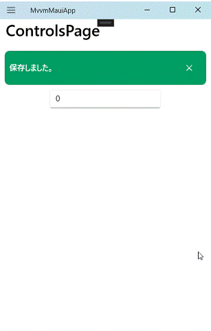
例:ラベルとボタンを組み合わせてバナーを作成
- メッセージや背景色など、外部から設定できるよう
BindablePropertyを定義 - タップ時の処理を外部から設定
- 閉じるボタンで非表示にする
BannerView.xaml
<?xml version="1.0" encoding="utf-8" ?>
<ContentView xmlns="http://schemas.microsoft.com/dotnet/2021/maui"
             xmlns:x="http://schemas.microsoft.com/winfx/2009/xaml"
             x:Class="MvvmMauiApp.Controls.BannerView"
             x:Name="root"
             IsEnabled="True">

    <!--全体をタップで clicked/ICommand を発火-->
    <ContentView.GestureRecognizers>
        <TapGestureRecognizer Tapped="OnTapped" />
    </ContentView.GestureRecognizers>

    <Frame
        Padding="{Binding Source={x:Reference root}, Path=Padding}"
        CornerRadius="{Binding Source={x:Reference root}, Path=CornerRadius}"
        HasShadow="False"
        BackgroundColor="{Binding Source={x:Reference root}, Path=BannerBackground}">

        <Grid ColumnDefinitions="*,Auto" VerticalOptions="Center" >
            <!-- メインテキスト -->
            <Label
                Grid.Column="0"
                Text="{Binding Source={x:Reference root}, Path=Text}"
                TextColor="{Binding Source={x:Reference root}, Path=TextColor}"
                FontAttributes="Bold"
                VerticalTextAlignment="Center" />

            <!-- Close ボタン -->
            <Button
                Grid.Column="1"
                x:Name="CloseBtn"
                Text="✕"
                FontAttributes="Bold"
                BackgroundColor="Transparent"
                TextColor="{Binding Source={x:Reference root}, Path=CloseButtonColor}"
                Padding="6"
                IsVisible="{Binding Source={x:Reference root}, Path=IsCloseButtonVisible}"
                Clicked="OnCloseClicked" />
        </Grid>
    </Frame>
</ContentView>
- タップ時の処理をCommandとイベントハンドラで設定できるようにする。
BannerView.xaml.cs
using System.Windows.Input;

public partial class BannerView : ContentView
{
    // 表示テキスト
    public static readonly BindableProperty TextProperty =
        BindableProperty.Create(nameof(Text), typeof(string), typeof(BannerView), string.Empty);

    // 文字色
    public static readonly BindableProperty TextColorProperty =
        BindableProperty.Create(nameof(TextColor), typeof(Color), typeof(BannerView), Colors.White);

    // 背景色
    public static readonly BindableProperty BannerBackgroundProperty =
        BindableProperty.Create(nameof(BannerBackground), typeof(Color), typeof(BannerView), Colors.SteelBlue);

    // 角丸
    public static readonly BindableProperty CornerRadiusProperty =
        BindableProperty.Create(nameof(CornerRadius), typeof(float), typeof(BannerView), 12f);

    // メインタップの ICommand
    public static readonly BindableProperty CommandProperty =
        BindableProperty.Create(nameof(Command), typeof(ICommand), typeof(BannerView));

    // メインタップのパラメータ
    public static readonly BindableProperty CommandParameterProperty =
        BindableProperty.Create(nameof(CommandParameter), typeof(object), typeof(BannerView));

    // Close ボタンの表示/非表示
    public static readonly BindableProperty IsCloseButtonVisibleProperty =
        BindableProperty.Create(nameof(IsCloseButtonVisible), typeof(bool), typeof(BannerView), true);

    // Close ボタンの色
    public static readonly BindableProperty CloseButtonColorProperty =
        BindableProperty.Create(nameof(CloseButtonColor), typeof(Color), typeof(BannerView), Colors.White);

    // Close の ICommand
    public static readonly BindableProperty CloseCommandProperty =
        BindableProperty.Create(nameof(CloseCommand), typeof(ICommand), typeof(BannerView));

    // Close のパラメータ
    public static readonly BindableProperty CloseCommandParameterProperty =
        BindableProperty.Create(nameof(CloseCommandParameter), typeof(object), typeof(BannerView));

    public string Text { get => (string)GetValue(TextProperty); set => SetValue(TextProperty, value); }
    public Color TextColor { get => (Color)GetValue(TextColorProperty); set => SetValue(TextColorProperty, value); }
    public Color BannerBackground { get => (Color)GetValue(BannerBackgroundProperty); set => SetValue(BannerBackgroundProperty, value); }
    public float CornerRadius { get => (float)GetValue(CornerRadiusProperty); set => SetValue(CornerRadiusProperty, value); }

    public ICommand? Command { get => (ICommand?)GetValue(CommandProperty); set => SetValue(CommandProperty, value); }
    public object? CommandParameter { get => GetValue(CommandParameterProperty); set => SetValue(CommandParameterProperty, value); }

    public bool IsCloseButtonVisible { get => (bool)GetValue(IsCloseButtonVisibleProperty); set => SetValue(IsCloseButtonVisibleProperty, value); }
    public Color CloseButtonColor { get => (Color)GetValue(CloseButtonColorProperty); set => SetValue(CloseButtonColorProperty, value); }

    public ICommand? CloseCommand { get => (ICommand?)GetValue(CloseCommandProperty); set => SetValue(CloseCommandProperty, value); }
    public object? CloseCommandParameter { get => GetValue(CloseCommandParameterProperty); set => SetValue(CloseCommandParameterProperty, value); }

    // イベント: メインタップ & 閉じる
    public event EventHandler? Clicked;
    public event EventHandler? Closed;

    public BannerView()
    {
        InitializeComponent();
    }
    // 全体タップ
    void OnTapped(object? sender, TappedEventArgs e)
    {
        if (!IsEnabled) return;

        Clicked?.Invoke(this, EventArgs.Empty);

        if (Command is { } cmd)
        {
            var param = CommandParameter;
            if (cmd.CanExecute(param)) cmd.Execute(param);
        }
    }

    // Close ボタンクリック
    void OnCloseClicked(object? sender, EventArgs e)
    {
        // 先にイベント・コマンドを発火
        Closed?.Invoke(this, EventArgs.Empty);

        if (CloseCommand is { } cmd)
        {
            var param = CloseCommandParameter;
            if (cmd.CanExecute(param)) cmd.Execute(param);
        }

        // 既定動作: 自分を非表示にする
        this.IsVisible = false;
    }
}
使い方
<controls:BannerView
    Text="{Binding BannerText}"
    TextColor="White"
    BannerBackground="#009D63"
    CornerRadius="8"
    Padding="8"
    IsCloseButtonVisible="True"
    CloseButtonColor="White"
    Command="{Binding BannerTapCommand}"/>
ViewModel
public partial class ControlsPageViewModel : ObservableObject
{
    [ObservableProperty]
    private string bannerText = "保存しました。";

    [RelayCommand]
    public async Task OnBannerTap()
    {
        BannerText = "タップされました。";
    }
}
イベントハンドラを使用する場合
<controls:BannerView
    Text="{Binding BannerText}"
    TextColor="White"
    BannerBackground="#009D63"
    CornerRadius="8"
    Padding="8"
    IsCloseButtonVisible="True"
    CloseButtonColor="White"
    Clicked="BannerView_Clicked"
    />
コードビハインド
private void BannerView_Clicked(object sender, EventArgs e)
{
    ...
}
3. GraphicsView + IDrawable(カスタム描画)
概要
-
GraphicsView.DrawableにIDrawableを割り当て、ICanvasへ図形やテキストを描画。 - 標準コントロールでは難しい表現が可能になる。
- 値が変わったら
Invalidate()で再描画。
参考
- GraphicsView(解説) (Microsoft Learn)
- Graphics(ICanvas での描画) (Microsoft Learn)
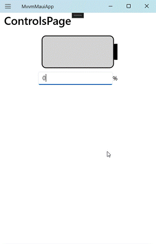
例:バッテリーメーター
-
BindablePropertyとしてバッテリーレベルを定義。 - バッテリー20%毎にブロックを一つ描画する。
BatteryGraphicsView.cs
public class BatteryGraphicsView : GraphicsView
{
    public BatteryGraphicsView()
    {
        Drawable = new BatteryDrawable();
        BackgroundColor = Colors.Transparent;
    }

    // バインド可能なプロパティ
    public static readonly BindableProperty BatteryLevelProperty =
        BindableProperty.Create(
            nameof(BatteryLevel),
            typeof(float),
            typeof(BatteryGraphicsView),
            0.5f,
            propertyChanged: OnBatteryLevelChanged);

    public float BatteryLevel
    {
        get => (float)GetValue(BatteryLevelProperty);
        set => SetValue(BatteryLevelProperty, value);
    }

    private static void OnBatteryLevelChanged(BindableObject bindable, object oldValue, object newValue)
    {
        if (bindable is BatteryGraphicsView view && newValue is float level)
        {
            ((BatteryDrawable)view.Drawable).BatteryLevel = level;
            view.Invalidate(); // 再描画
        }
    }
    private class BatteryDrawable : IDrawable
    {
        // バッテリーレベルをバインド可能プロパティとして持ち、値によって描画する。
        public float BatteryLevel { get; set; } = 0.5f;

        // 描画の実装
        public void Draw(ICanvas canvas, RectF dirtyRect)
        {
            // マージン設定
            float margin = 10f;
            float terminalRatio = 0.08f;
            float blockSpacing = 4f;

            // バッテリー本体の描画領域(余白あり)
            var batteryRect = new RectF(
                dirtyRect.X + margin,
                dirtyRect.Y + margin,
                dirtyRect.Width - margin * 2,
                dirtyRect.Height - margin * 2);

            // 端子サイズ
            float terminalWidth = batteryRect.Width * terminalRatio;
            float terminalHeight = batteryRect.Height * 0.5f;
            float terminalX = batteryRect.Right;
            float terminalY = batteryRect.Y + (batteryRect.Height - terminalHeight) / 2;

            // 端子描画
            canvas.FillColor = Colors.Black;
            canvas.FillRoundedRectangle(new RectF(terminalX, terminalY, terminalWidth, terminalHeight), 3);

            // バッテリー本体描画
            canvas.FillColor = Colors.LightGray;
            canvas.FillRoundedRectangle(batteryRect, 10);
            canvas.StrokeColor = Colors.Black;
            canvas.StrokeSize = 2;
            canvas.DrawRoundedRectangle(batteryRect, 10);

            // 充電ブロック描画
            int maxCount = 5;
            int currentCount = (int)(BatteryLevel * maxCount);
            float blockWidth = (batteryRect.Width - (blockSpacing * (maxCount + 1))) / maxCount;
            float blockHeight = batteryRect.Height - blockSpacing * 2;

            for (int i = 0; i < currentCount; i++)
            {
                float x = batteryRect.X + blockSpacing + i * (blockWidth + blockSpacing);
                float y = batteryRect.Y + blockSpacing;

                var chargeRect = new RectF(x, y, blockWidth, blockHeight);
                canvas.FillColor = Colors.Black;
                canvas.FillRoundedRectangle(chargeRect, 2);
            }
        }
    }
}
使い方
以下の例では、テスト用に 1.で作成したIntRangeEntryの入力値をfloatに変換してバインドしている。
<Grid RowDefinitions="Auto,Auto,*">
    <controls:BatteryGraphicsView Grid.Row="0"
                            HeightRequest="100"
                            WidthRequest="200"
                            BatteryLevel="{Binding BatteryLevel}"
                            />
    <Grid ColumnDefinitions="*,Auto" Grid.Row="1" WidthRequest="200">
        <controls:IntRangeEntry Grid.Column="0" Value="{Binding InputBatteryLevel}" />
        <Label Grid.Column="1" VerticalTextAlignment="Center" Text="%" />
    </Grid>
</Grid>
using CommunityToolkit.Mvvm.ComponentModel;
using CommunityToolkit.Mvvm.Input;

namespace MvvmMauiApp.ViewModels
{
    public partial class ControlsPageViewModel : ObservableObject
    {
        [ObservableProperty]
        private int inputBatteryLevel;

        [ObservableProperty]
        private float batteryLevel = 0.5f;

        partial void OnInputBatteryLevelChanged(int value)
        {
            // 入力値が0以下の場合は0に設定
            if (value <= 0)
            {
                BatteryLevel = 0f;
            }
            else if (value >= 100)
            {
                // 入力値が100以上の場合は100に設定
                BatteryLevel = 1f;
            }
            else
            {
                // 入力値が0から100の範囲内の場合はそのまま設定
                BatteryLevel = value / 100f;
            }
        }
    }
}
4. ハンドラー(既存拡張 / 専用ハンドラー)
概要
-
既存拡張:既存コントロールの Handler の Mapper に
AppendToMapping/ModifyMapping/PrependToMappingを追加して、ネイティブ側の見た目・挙動をグローバルに変更する(全Entry等に適用される点に注意)。 -
専用ハンドラー:派生コントロール+ 独自 Handler を作り、
BindablePropertyを各OSのネイティブAPIへ反映する。
補足
Handler とは?
- .NET MAUI では 仮想的なコントロール(Entry などの共通 API) を、プラットフォームごとの ネイティブ UI(iOS の UITextField / Android の EditText / Windows の TextBox など) にマッピングして表示している。
- この「共通 API → ネイティブ UI」をつなぐのが Handler。
Mapper とは?
- Handler の内部には PropertyMapper という仕組みがあり、
「MAUI のプロパティが変更されたら、ネイティブコントロールのどのプロパティに反映するか」
を管理している。- 例えば、Entry.Text → UITextField.Text という対応付けも Mapper の中で行われている。
参考
- .NET MAUI ハンドラー概要(Mapper/CommandMapper/グローバル性) Microsoft Learn
- 既存コントロールをハンドラーでカスタマイズ(Append/Modify/Prepend、キー指定の注意点) Microsoft Learn
- 専用ハンドラーでカスタムコントロール(Video サンプル手順) Microsoft Learn
4-A. 既存コントロールの拡張(Mapper だけで実現)
- 既存の Handler(EntryHanglerなど) の Mapper に処理を追加して、「全てのコントロール(Entryなど)に影響」を与える。
- 例:アプリ全体で Entry の枠線を消す、フォントを変更する、など。
- メリット: コード量が少なくて簡単。
- デメリット: 全ての Entry に影響するので、特定の場面だけ変えたい場合は向かない。
例:Entry を“枠なし”にする
Mapper のキーでどのイベントでこの処理を走らせるかを指定。任意のキー(今回の例ではBorderless)である場合は初回(マッピング追加時)のみ実行。プロパティ変化に追従したいなら nameof(IEntry.PropertyName) のような既存キーを使う。
MauiProgram.cs
using Microsoft.Maui.Handlers;

    builder.ConfigureMauiHandlers(handlers =>
    {
        // すべての Entry に適用(グローバル)
        EntryHandler.Mapper.AppendToMapping("Borderless", (handler, view) =>
        {
#if ANDROID
            handler.PlatformView.Background = null;
            handler.PlatformView.SetPadding(0, 0, 0, 0);
#elif IOS || MACCATALYST
            handler.PlatformView.BorderStyle = UIKit.UITextBorderStyle.None;
#elif WINDOWS
            handler.PlatformView.BorderThickness = new Microsoft.UI.Xaml.Thickness(0);
#endif
        });
    });
以下の様に特定の型だけに適用することも可能。
MauiProgram.cs
using Microsoft.Maui.Handlers;

    builder.ConfigureMauiHandlers(handlers =>
    {
        // 特定のEntry に適用(グローバル)
        EntryHandler.Mapper.AppendToMapping("Borderless", (handler, view) =>
        {
            // IntRangeEntry の場合のみ適用
            if (view is IntRangeEntry)
            {
#if ANDROID
                handler.PlatformView.Background = null;
                handler.PlatformView.SetPadding(0, 0, 0, 0);
#elif IOS || MACCATALYST
                handler.PlatformView.BorderStyle = UIKit.UITextBorderStyle.None;
#elif WINDOWS
                handler.PlatformView.BorderThickness = new Microsoft.UI.Xaml.Thickness(0);
#endif
            }
        });
    });
4-B. 専用ハンドラー(独自プロパティをネイティブへ)
- 新しいクラス(例:CornerEntry)を作り、専用の Handler を登録。
- PropertyMapper に独自プロパティを紐づけ、各OSの partial でネイティブAPIへ反映する。
- 独自の BindableProperty をネイティブ API にバインドできる。
- 既存
EntryHandler.Mapperをベースにすると、既存の全マッピングもそのまま適用される。 - メリット: カスタムコントロールとして再利用できる。既存コントロールへの影響がない。
- デメリット: 実装コードは少し長めになる。
例:角を丸くできるCornerEntry : Entry
1) 共有(クロスプラットフォーム)側
Controls/CornerEntry.cs
public class CornerEntry : Entry
{
    public static readonly BindableProperty CornerRadiusProperty =
        BindableProperty.Create(nameof(CornerRadius), typeof(float), typeof(CornerEntry), 8f);
    public float CornerRadius
    {
        get => (float)GetValue(CornerRadiusProperty);
        set => SetValue(CornerRadiusProperty, value);
    }
}
2) Handler の登録
MauiProgram.cs
using Microsoft.Maui.Handlers;

builder.ConfigureMauiHandlers(h =>
{
    h.AddHandler(CornerEntry, CornerEntryHandler);
});
3) Handler 本体(共通)
Handlers/CornerEntryHandler.cs
using Microsoft.Maui.Handlers;
using MvvmMauiApp.Controls;

namespace MvvmMauiApp.Handlers
{
    public partial class CornerEntryHandler : EntryHandler
    {
        // 既存 EntryHandler の Mapper をベースに、独自プロパティを追加
        public static readonly IPropertyMapper<CornerEntry, CornerEntryHandler> Mapper =
            new PropertyMapper<CornerEntry, CornerEntryHandler>(EntryHandler.Mapper)
            {
                [nameof(CornerEntry.CornerRadius)] = (handler, view) =>
                {
                    if (handler is CornerEntryHandler h && view is CornerEntry v)
                    {
                        MapCornerRadius(h, v); // ← partial を呼び出す
                    }
                }
            };

        public CornerEntryHandler() : base(Mapper) { }

        // 各プラットフォーム側で実体を用意(partial)
        static partial void MapCornerRadius(CornerEntryHandler handler, CornerEntry view);
    }
}
4) プラットフォーム実装(Android)
Platforms/Android/Handlers/CornerEntryHandler.Android.cs
#if ANDROID
using Android.Graphics.Drawables;
using MvvmMauiApp.Controls;

namespace MvvmMauiApp.Handlers
{
    public partial class CornerEntryHandler
    {
        static partial void MapCornerRadius(CornerEntryHandler handler, CornerEntry view)
        {
            var et = handler.PlatformView;
            if (et is null) return;

            var gd = new GradientDrawable();
            gd.SetColor(Android.Graphics.Color.White);               // 背景色
            gd.SetCornerRadius((float)view.CornerRadius);            // 角丸
            gd.SetStroke(2, Android.Graphics.Color.Gray);            // 枠線
            et.Background = gd;
        }
    }
}
#endif
5) プラットフォーム実装(iOS/Mac Catalyst)
Platforms/iOS/Handlers/CornerEntryHandler.iOS.cs
#if IOS || MACCATALYST
using MvvmMauiApp.Controls;

namespace MvvmMauiApp.Handlers
{
    public partial class CornerEntryHandler
    {
        static partial void MapCornerRadius(CornerEntryHandler handler, CornerEntry view)
        {
            var tf = handler.PlatformView;
            if (tf is null) return;

            tf.Layer.CornerRadius = view.CornerRadius;
            tf.Layer.MasksToBounds = true;
            tf.Layer.BorderWidth = 2;
            tf.Layer.BorderColor = UIKit.UIColor.FromRGB(200, 200, 200).CGColor;
        }
    }
}
#endif
6) プラットフォーム実装(Windows)
Platforms/Windows/Handlers/CornerEntryHandler.windows.cs
#if WINDOWS
using Microsoft.UI.Xaml.Controls;
using MvvmMauiApp.Controls;

namespace MvvmMauiApp.Handlers
{
    public partial class CornerEntryHandler
    {
        static partial void MapCornerRadius(CornerEntryHandler handler, CornerEntry view)
        {
            var tb = handler.PlatformView as TextBox;
            if (tb is null) return;

            // WinUI TextBox の角丸(WinUI 3 は CornerRadius を直接持つ)
            tb.CornerRadius = new Microsoft.UI.Xaml.CornerRadius(view.CornerRadius);
        }
    }
}
#endif
7) 使い方
<controls:CornerEntry CornerRadius="16" />
プラットフォームによって差異はあるが、角が丸くなっている。
| Windows | ios | Android |
|---|---|---|
 |
 |
 |
Entry関連のMAUIのソース(参考)
コア(共通ハンドラー/仮想ビュー)
-
EntryHandler.cs(共通ハンドラーの定義・マッピング)
https://github.com/dotnet/maui/blob/main/src/Core/src/Handlers/Entry/EntryHandler.cs -
Entry.cs(仮想ビュー/共通 API)
https://github.com/dotnet/maui/blob/main/src/Controls/src/Core/Entry/Entry.cs
プラットフォーム別ハンドラー実装
-
Android:
EntryHandler.Android.cs(MapTextなどでAppCompatEditTextを更新)
https://github.com/dotnet/maui/blob/main/src/Core/src/Handlers/Entry/EntryHandler.Android.cs -
iOS / Mac Catalyst:
EntryHandler.iOS.cs
https://github.com/dotnet/maui/blob/main/src/Core/src/Handlers/Entry/EntryHandler.iOS.cs -
Windows:
EntryHandler.Windows.cs
https://github.com/dotnet/maui/blob/main/src/Core/src/Handlers/Entry/EntryHandler.Windows.cs
プラットフォーム側 “ネイティブ View” クラス
-
Android:
MauiAppCompatEditText(AppCompatEditText派生)
https://github.com/dotnet/maui/blob/main/src/Core/src/Platform/Android/MauiAppCompatEditText.cs -
iOS / Mac Catalyst:
MauiTextField(UITextField相当の MAUI ラッパ)
https://github.com/dotnet/maui/blob/main/src/Core/src/Platform/iOS/MauiTextField.cs
プラットフォーム別 “Extension”(実際にプロパティを当て込む所)
-
Android:
EditTextExtensions.cs(UpdateTextなど)
https://github.com/dotnet/maui/blob/main/src/Core/src/Platform/Android/EditTextExtensions.cs -
iOS / Mac Catalyst:
TextFieldExtensions.cs
https://github.com/dotnet/maui/blob/main/src/Core/src/Platform/iOS/TextFieldExtensions.cs -
Windows:
TextBoxExtensions.cs
https://github.com/dotnet/maui/blob/main/src/Core/src/Platform/Windows/TextBoxExtensions.cs
Discussion