左右にスライドイン/アウトするアニメーションを実装する
始めに
要素の入れ替えで左から入って右に出ていくようなスライドアニメーションがあると思います。

スライドするだけのアニメーションはMUIだとSlideコンポーネントを使えば良いのですが、どっち方向に入る/出ていくを設定する必要があり結構頭を悩ませました。
最終的には作ることができましたので、備忘録として実装方法を記事にまとめました。
実装方法
基本的な考え方
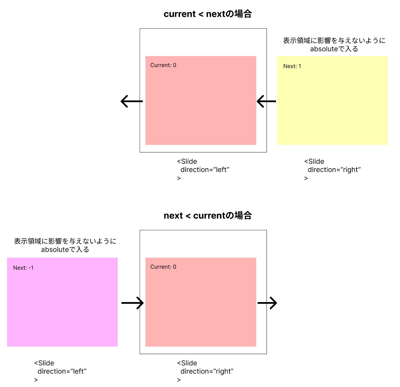
アニメーション対象となるのは2つです。これから出ていくものとこれから入ってくるものです。これが値によって左に出るか右から入ってくるかという設定をします。Slideコンポーネントにはdirectionというpropsがあるので、そこにleftかrightを入れます。またアニメーション中は2つの要素が同時に現れて、何もしないとコンテンツ領域が2倍に増えてしまうので、入ってくる方をabsoluteにしてコンテンツ領域としては出ていく方のものだけがで計算されるようにします。
TransitionGroupを使うパターン
最初は要素の出入りをTransitionGroupで設定するものだと思ったので、それを使ってなんとかin/outを表現しようとしました。ただの場合だとleaveする瞬間にdirectionを設定できないという致命的な問題にぶつかってしまいます。TransitionGroupのleaveトリガーがrenderされなくなった時なので、事前にdirectionを決めておく必要があります。しかしそれは次の要素が確定しないと設定できないので、仕方なくisAnimatingというフラグを別途用意して、そのフラグが立ったときに次の要素をrenderして現在のものがleaveされるようにしています。
ざっとコードの落とすとこんな感じになるのですが、かなり条件分岐がカオスになってしまいました。。
export const SliderTransitonGroup: FC = () => {
  const [currentCount, setCurrentCount] = useState(0);
  const [nextCount, setNextCount] = useState<number | null>(null);
  const [isAnimating, setIsAnimating] = useState(false);

  const handleNextCount = (nextCount: number) => {
    setNextCount(nextCount);
    // nextCountをセットした後にアニメーションを発動する
    setTimeout(() => {
      setIsAnimating(true);
    });
  };

  return (
    // ボタンなどの設定は省略
        <TransitionGroup>
          <Slide
            key={isAnimating ? nextCount ?? currentCount : currentCount}
            direction={
              nextCount == null
                ? undefined
                : isAnimating
                ? currentCount > nextCount
                  ? "right"
                  : "left"
                : currentCount > nextCount
                ? "left"
                : "right"
            }
            appear={isAnimating}
            unmountOnExit
            onEntered={() => {
              setIsAnimating(false);
              setCurrentCount(nextCount ?? currentCount);
            }}
          >
            <Box
              style={
                isAnimating
                  ? {
                      position: "absolute",
                      zIndex: 1,
                      width: "100%"
                    }
                  : {}
              }
            >
              <ContentBox
                count={isAnimating ? nextCount ?? currentCount : currentCount}
              />
            </Box>
          </Slide>
        </TransitionGroup>
  )
}
In Propsを使うパターン
TransitionGroupを使うと変になってしまったので、単純にSlideコンポーネントだけでトランジションを実装すると上手くいきました。renderも現在のもの(これから出ていくパターンも含む)とこれから入ってくるものを分けて書くことができてコードもシンプルになりました。
import { FC, useState } from "react";
import {
  Paper,
  Box,
  Stack,
  Slide,
  Typography,
  IconButton
} from "@mui/material";
import {
  KeyboardArrowLeft as KeyboardArrowLeftIcon,
  KeyboardArrowRight as KeyboardArrowRightIcon
} from "@mui/icons-material";

import { ContentBox } from "./ContentBox";

export const SliderInProps: FC = () => {
  const [currentCount, setCurrentCount] = useState(0);
  const [nextCount, setNextCount] = useState<number | null>(null);

  return (
    <Paper sx={{ p: 1, overflow: "hidden" }}>
      <Stack direction="row" alignItems="center">
        <IconButton
          onClick={() => {
            if (nextCount == null) {
              setNextCount(currentCount - 1);
            } else {
              setCurrentCount(nextCount);
              setNextCount(nextCount - 1);
            }
          }}
        >
          <KeyboardArrowLeftIcon />
        </IconButton>
        <Typography
          sx={{ flexGrow: 1, textAlign: "center", fontWeight: "bold" }}
        >
          InPropsを使う
        </Typography>
        <IconButton
          onClick={() => {
            if (nextCount == null) {
              setNextCount(currentCount + 1);
            } else {
              setCurrentCount(nextCount);
              setNextCount(nextCount + 1);
            }
          }}
        >
          <KeyboardArrowRightIcon />
        </IconButton>
      </Stack>
      <Box sx={{ position: "relative" }}>
        <Slide
          key={currentCount}
          direction={
            nextCount == null
              ? undefined
              : currentCount > nextCount
              ? "left"
              : "right"
          }
          in={nextCount == null}
          appear={false}
        >
          <Box>
            <ContentBox count={currentCount} />
          </Box>
        </Slide>
        {nextCount != null && (
          <Slide
            key={nextCount}
            in
            direction={nextCount > currentCount ? "left" : "right"}
            onEntered={() => {
              setCurrentCount(nextCount);
              setNextCount(null);
            }}
          >
            <Box
              style={{
                position: "absolute",
                zIndex: 1,
                top: 0,
                left: 0,
                width: "100%"
              }}
            >
              <ContentBox count={nextCount} />
            </Box>
          </Slide>
        )}
      </Box>
    </Paper>
  );
};
一つ意識したことがありまして、それはアニメーションでも次へ進めるようにしたことです。バグりやすいのでアニメーション中は操作できなくするケースもありますが、基本的にはUX的には良くないのでさらに追加で次へ進めようとした場合は次のアニメーションを出せるようにしています。
onClick={() => {
  if (nextCount == null) {
    setNextCount(currentCount + 1);
  } else {
    setCurrentCount(nextCount);
    setNextCount(nextCount + 1);
  }
}}
問答無用で次の値を更新するのでトランジションが少し心配でしたが、アニメーション時間を伸ばして動作を確認してみたところ、特に問題なく次の要素をrenderしてくれてました。

余談
renderの書きかた的に最大2つの要素までしか見せられませんが、TransitionGroupを駆使したら制限なしに全ての要素をアニメーション完了するまで描画し続けられたのかなと少しだけ思いました。まぁどっちに出ていくかを指定できないので実装できないと思いますが😅
スライドイン/アウトするロジックをコンポーネントに切り出す
先ほどの実装で機能としては十分ですが、アニメーションするための設定が割と散雑にあってできればコードを切り出したいです。nextCountみたいな情報も本来は必要のないものなのでそれもカプセル化したいです。
次か前かの判定をReactElementのkeyの値で判定すればchildrenに現在の要素を渡すだけでkey変更時にアニメーションで切り替えるコンポーネントを作れそうです。
これをコードに落とすと以下のようになります。現在の要素と次の要素をrefで持っておき、keyが変わったタイミングで次の要素に登録してトランジションが動くようにします。トランジションの設定内容は一つ前のセクションで書いたコードと同じです。
import { FC, ReactElement, useRef, Key as ReactKey, useState } from "react";
import { Box, Slide } from "@mui/material";

/**
 * 基準のキーが比較対象のキーよりも大きいかチェックする
 * @param baseKey - 基準のキー
 * @param compKey - 比較対象のキー
 */
const isLargeKey = (baseKey: ReactKey | null, compKey: ReactKey | null) => {
  if (baseKey == null || compKey == null) {
    return false;
  }
  const parseInteger = (str: string) => {
    return /^-?[0-9]+$/.test(str) ? parseInt(str, 10) : Number.NaN;
  };
  // ReactElementにするとなぜかnumberで渡してもstringになるケースがあったのでとりあえずnumberに変換してみて、変換できたらnumberで比較する
  const baseNumKey =
    typeof baseKey === "number" ? baseKey : parseInteger(baseKey);
  const compNumKey =
    typeof compKey === "number" ? compKey : parseInteger(compKey);
  if (!Number.isNaN(baseNumKey) && !Number.isNaN(compNumKey)) {
    return baseNumKey > compNumKey;
  }
  return baseKey > compKey;
};

export type SliderWrapperProps = {
  timeout?: number;
  children: ReactElement;
};

export const SliderWrapper: FC<SliderWrapperProps> = ({
  timeout,
  children
}) => {
  const currentChildRef = useRef(children);
  const nextChildRef = useRef<ReactElement | null>(null);

  if (currentChildRef.current.key === children.key) {
    currentChildRef.current = children;
  }
  // 現在の子要素とキーが違う場合
  else {
    // まだ次の子要素が決まっていない場合は次の要素としてセットする(同じkeyの場合も更新しておく)
    if (
      nextChildRef.current == null ||
      nextChildRef.current.key === children.key
    ) {
      nextChildRef.current = children;
    }
    // 既に次の子要素が決まっていた場合はそれをcurrentに移動してから次の子要素に最新をセットする
    else {
      currentChildRef.current = nextChildRef.current;
      nextChildRef.current = children;
    }
  }

  return (
    <Box sx={{ position: "relative" }}>
      <Slide
        key={currentChildRef.current.key}
        direction={
          nextChildRef.current == null
            ? undefined
            : isLargeKey(currentChildRef.current.key, nextChildRef.current.key)
            ? "left"
            : "right"
        }
        in={nextChildRef.current == null}
        appear={false}
        timeout={timeout}
      >
        <Box>{currentChildRef.current}</Box>
      </Slide>
      {nextChildRef.current != null && (
        <Slide
          key={nextChildRef.current.key}
          in
          timeout={timeout}
          direction={
            isLargeKey(nextChildRef.current.key, currentChildRef.current.key)
              ? "left"
              : "right"
          }
          onEntered={() => {
            if (nextChildRef.current == null) {
              return;
            }
            currentChildRef.current = nextChildRef.current;
            nextChildRef.current = null;
          }}
        >
          <Box
            style={{
              position: "absolute",
              zIndex: 1,
              top: 0,
              left: 0,
              width: "100%"
            }}
          >
            {nextChildRef.current}
          </Box>
        </Slide>
      )}
    </Box>
  );
};
このコンポーネントを呼ぶようにすると以下のようにコードがかなりスッキリします😄 使い方はTransitionGroupと似たような感じになり、その辺を知っていると使い勝手も良さそうです。keyだけnumber型で渡してもchildrenで参照するときはstringになってしまっていたのは残念ですが。。
 // import文は省略

 export const SliderInProps: FC = () => {
   const [currentCount, setCurrentCount] = useState(0);
-  const [nextCount, setNextCount] = useState<number | null>(null);

   return (
     <Paper sx={{ p: 1, overflow: "hidden" }}>
       <Stack direction="row" alignItems="center">
         <IconButton
           onClick={() => {
-            if (nextCount == null) {
-              setNextCount(currentCount - 1);
-            } else {
-              setCurrentCount(nextCount);
-              setNextCount(nextCount - 1);
-            }
+            setCurrentCount(currentCount - 1);
           }}
         >
           <KeyboardArrowLeftIcon />
         </IconButton>
         <Typography
           sx={{ flexGrow: 1, textAlign: "center", fontWeight: "bold" }}
         >
           InPropsを使う
         </Typography>
         <IconButton
           onClick={() => {
-            if (nextCount == null) {
-              setNextCount(currentCount + 1);
-            } else {
-              setCurrentCount(nextCount);
-              setNextCount(nextCount + 1);
-            }
+            setCurrentCount(currentCount + 1);
           }}
         >
           <KeyboardArrowRightIcon />
         </IconButton>
       </Stack>
-      <Box sx={{ position: "relative" }}>
-        <Slide
-          key={currentCount}
-          direction={
-            nextCount == null
-              ? undefined
-              : currentCount > nextCount
-              ? "left"
-              : "right"
-          }
-          in={nextCount == null}
-          appear={false}
-        >
-          <Box>
-            <ContentBox count={currentCount} />
-          </Box>
-        </Slide>
-        {nextCount != null && (
-          <Slide
-            key={nextCount}
-            in
-            direction={nextCount > currentCount ? "left" : "right"}
-            onEntered={() => {
-              setCurrentCount(nextCount);
-              setNextCount(null);
-            }}
-          >
-            <Box
-              style={{
-                position: "absolute",
-                zIndex: 1,
-                top: 0,
-                left: 0,
-                width: "100%"
-              }}
-            >
-              <ContentBox count={nextCount} />
-            </Box>
-          </Slide>
-        )}
-      </Box>
+      <SliderWrapper>
+        <ContentBox key={currentCount} count={currentCount} />
+      </SliderWrapper>
     </Paper>
   );
 };
終わりに
以上が左右にスライドイン/アウトするアニメーションを実装する方法でした。どちらの方向に進むべきかの設定も必要でどうしても複雑になってしまいますが、それを最終的にはうまくコンポーネント化できたので良かったなと思いました。
冒頭でも書きましたが今回見せたアニメーションはカルーセルとほぼ同じだと思うので、そちらで代用するのも全然アリだと思うので、要件に応じて実装してもらえればと思います。
最後に検証で書いたCodeSandboxを貼りますので、興味がある方はぜひご参照ください。
Discussion