UKIさんのシストレのすすめを正座して読んで手を動かしてみる #2
きっかけ
UKIさんのシストレのすすめを正座して読んで手を動かしてみる #1の続きです。読んで手を動かして学んでいきましょう!
第三回 ストラテジーの設計方針
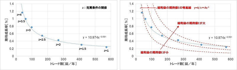
1. トレード数と期待値の関係
まずトレード数
と期待値 N の関係に着目します。左下図はあるストラテジーについて、売買条件の閾値zを変化させてトレード数と期待値の関係をプロットしたものです。 e
このグラフを見ると、トレード条件を厳しくしてトレード数を絞った場合、線形的ではなく累乗関数的(つまり
、 y = c x^\alpha と c は定数)に期待値が向上することが分かります。どのようなストラテジーの指標を使っても同様の特性を示すはずです。もしグラフの形が歪む場合(累乗関数で近似しようとすると掛け離れる場合)は、そのストラテジーは過剰最適化(カーブフィッティング)されている可能性があります。もしくはストップロスなどの設定で分布の一部を強制的に刈り取っている場合です。 \alpha (中略)
等高線の曲線は
であるのに対し、ストラテジーの曲線は e=AN^{-1} となっているため、トレード数 e=cN^\alpha (0>\alpha>-1) が増えれば増えるほど、等高線に対して相対的に「総利益の期待値」曲線が上昇します。つまり、このストラテジーで売買条件の閾値を調整して総利益の期待値を増やそうとした場合、期待値を犠牲にしてトレード数を増やしたほうが理論上有利となります。 N
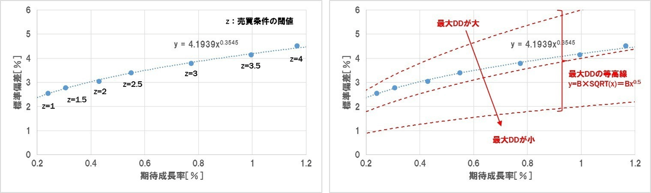
2. 期待値と標準偏差の関係
では次に期待値eと標準偏差σの関係を見てみましょう。
前回のトレード数と期待値の関係と同じく、こちらの関係も累乗関数的となり、
と表すことができます。 (中略) 今回は \sigma = c \cdot e^\beta の範囲となっています。 0 < \beta <0.5 さて、何処のポイントがパフォーマンスに優れるか判断するため、今度はこのグラフ上に「最大DD」の等高線を示しました。
であることから、等高線の式は、 \text {DD}_\text {max} = \frac 9 4 \frac {\sigma^2} e ( \sigma = \frac 2 3 \cdot {\text {DD}_\text {max}}^{\frac 1 2} e^{\frac 1 2} = B e^{\frac 1 2} は定数)となります。この等高線に対して右下に行けば行くほど、最大DDが減少します。 B 等高線の曲線は
であるのに対し、ストラテジーの曲線は \sigma = B e^{\frac 1 2} となっているため、期待値 \sigma = c \cdot e^\beta (0 < \beta <0.5) が増えれば増えるほど(つまりトレード数 e が少なくなればなるほど)、等高線に対して相対的に「最大DD」曲線が小さくなります。 N
総利益の期待値の観点からはトレード数を増やしたほうがよく、最大DDの観点からはトレード数を減らしたほうが良いことになります。では結局どちらが有利なのかを、運用レシオを対象に見ていきたいと思います。
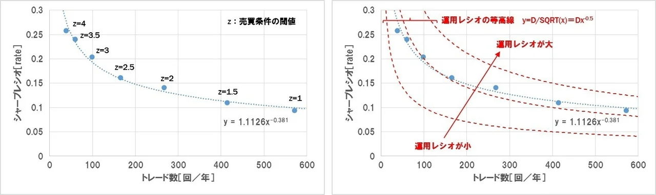
3.トレード数とシャープレシオの関係
最後にトレード数NとシャープレシオSRの関係に注目します。
シャープレシオは
です。トレード数 \frac e \sigma に対して期待値 N と標準偏差 e はそれぞれ累乗関数的な特性を示すため、 \sigma の値も累乗関数的となります。式で表すと、 \frac e \sigma のため、 e = A N^\alpha, \sigma = C N^\gamma となります。 SR = \frac A C N^{\alpha - \gamma} = c N^\delta ストラテジーの総合パフォーマンスを見るため、このグラフに「運用レシオ」 (目標利回り/許容DD) の等高線を示します。
であることから、等高線の式は、 運用レシオ = \frac 4 9 \cdot N \cdot SR^2 ( SR = D N^{-\frac 1 2} は定数)となります。この等高線に対して右上に行けば行くほど、運用レシオが向上します。 D
等高線の曲線は
であるのに対し、ストラテジーの曲線は SR = D N^{-\frac 1 2} となっているため、トレード数 SR = c N^\delta (0 > \delta > -0.5) が増えれば増えるほど、等高線に対して相対的に「運用レシオ」が向上します。 N
ドテンくんを使った実験
Binance永久先物の世界でドテンくんと戯れる #1で作ったドテンくんシミュレーションをちょっと作り変えて、実験してみます。
もともとドテンくんは、現在の時間を含めた過去
今回は
実験に利用したコードの抜粋はこちらです
# df_priceには例によって全銘柄の15分足が入れてあります

@nb.jit
def calc_last_rank(x):
    return np.argsort(np.argsort(x))[-1]

def simulate_dotenkun(window_size = 18, target_symbols = None):
  _list_symbols = target_symbols

  _cols = 3
  _rows = len(_list_symbols)

  # 描画用のfigureとsubplotを用意 (メモリリークを防ぐためにplt.FigureとFigure.subplotsを使う)
  _fig = plt.Figure(figsize = (8 * _cols, 6 * _rows))
  _axs = _fig.subplots(_rows, _cols, squeeze = False)

  _df_statistic = pd.DataFrame()

  for _idx, _symbol in enumerate(tqdm(_list_symbols)):
    _df_analysis = pd.DataFrame()
    _df_analysis['close'] = df_price.loc[df_price['symbol'] == _symbol, 'close'].astype(float)
    _df_analysis['logreturn'] = np.log(_df_analysis['close']).diff()

    _df_analysis['high'] = df_price.loc[df_price['symbol'] == _symbol, 'high'].astype(float)
    _df_analysis['low'] = df_price.loc[df_price['symbol'] == _symbol, 'low'].astype(float)
    _df_analysis['high_rank'] = _df_analysis.loc[:, 'high'].rolling(window_size).apply(calc_last_rank, raw = True, engine = 'numba')
    _df_analysis['low_rank'] = _df_analysis.loc[:, 'low'].rolling(window_size).apply(calc_last_rank, raw = True, engine = 'numba')

    _df_analysis['position'] = np.nan
    _df_analysis.loc[_df_analysis['high_rank'] == 1, 'position'] = 1.0
    _df_analysis.loc[_df_analysis['low_rank'] == window_size, 'position'] = 1.0

    # ブレイクした次の足でポジションをドテンするためにshiftする
    _df_analysis['position'] = _df_analysis['position'].shift(1)

    # ffillしてポジションを次のポジション変換まで維持し、初期のポジションを0クリアしておく
    _df_analysis['position'] = _df_analysis['position'].ffill().fillna(0.0)

    # ドテンなのでトレードを行うごとに手数料は2回分カウントする
    _df_analysis['fee'] = 0
    _df_analysis.loc[_df_analysis['high_rank'] == 1, 'fee'] = 0.08 * 0.01
    _df_analysis.loc[_df_analysis['low_rank'] == window_size, 'fee'] = 0.08 * 0.01

    _df_analysis['profit'] = _df_analysis['logreturn'] * _df_analysis['position'] - _df_analysis['fee']
    _df_analysis['profit_cumsum'] = _df_analysis['profit'].cumsum()

    _df_analysis_tradeonly = _df_analysis[_df_analysis['fee'] != 0].copy()
    _df_analysis_tradeonly['time_trade'] = _df_analysis_tradeonly.index
    _df_analysis_tradeonly['interval_trade'] = (-_df_analysis_tradeonly['time_trade'].diff(-1) / np.timedelta64(1, "h")).fillna(0).astype(float)
    _df_analysis_tradeonly['profit_trade'] = -_df_analysis_tradeonly['profit_cumsum'].diff(-1)
    _df_analysis_tradeonly.sort_values(['interval_trade', 'time_trade'], inplace = True)

    _df_analysis_tradeonly['gain_trade'] = np.where(_df_analysis_tradeonly['profit_trade'] >= 0, _df_analysis_tradeonly['profit_trade'], 0)
    _df_analysis_tradeonly['loss_trade'] = np.where(_df_analysis_tradeonly['profit_trade'] < 0, _df_analysis_tradeonly['profit_trade'], 0)
    _df_analysis_tradeonly.set_index('interval_trade', drop = False, inplace = True)

    _df_statistic.loc[_symbol, 'final_profit'] = _df_analysis['profit_cumsum'].iloc[-1]
    _df_statistic.loc[_symbol, 'trade_count'] = len(_df_analysis_tradeonly)
    _df_statistic.loc[_symbol, 'expected_return_per_trade'] = _df_analysis['profit_cumsum'].iloc[-1] / len(_df_analysis_tradeonly)
    _df_statistic.loc[_symbol, 'sd_per_trade'] = _df_analysis_tradeonly['profit_trade'].std()

    # 累積利益の描画
    _ax = _axs[_idx, 0]
    _ax.plot(_df_analysis.loc[:, 'profit_cumsum'], lw = 0.5)
    _ax.axhline(color = 'red', ls = 'dashed')
    _tm = pd.date_range('2019/1/1 00:00' ,'2022/10/5 00:00')
    _ax.set_xlim(_tm[0], _tm[-1])
    _ax.set_title(f'{_symbol} {window_size} ドテンくん 累積リターン')
    _ax.grid()

    # ホールド時間とリターンのヒストグラムの描画
    _ax = _axs[_idx, 1]
    _interval_trade = _df_analysis_tradeonly['interval_trade']
    _profit_trade = _df_analysis_tradeonly['profit_trade'].fillna(0).astype(float)
    _ax.scatter(_interval_trade, _profit_trade, marker = '.')
    _ax.axvline(_interval_trade.quantile(0.25), color = 'red', ls = 'dashed')
    _ax.axvline(_interval_trade.quantile(0.5), color = 'red', ls = 'dashed')
    _ax.axvline(_interval_trade.quantile(0.75), color = 'red', ls = 'dashed')
    _ax.axhline(_profit_trade.quantile(0.25), color = 'red', ls = 'dashed')
    _ax.axhline(_profit_trade.quantile(0.5), color = 'red', ls = 'dashed')
    _ax.axhline(_profit_trade.quantile(0.75), color = 'red', ls = 'dashed')
    _ax.set_title(f'{_symbol} {window_size} ドテンくん ホールド時間 vs リターン散布図')
    _ax.grid()

    # トレードごとのリターンのヒストグラム (ホールド時間75パーセンタイル以下) の描画
    _ax = _axs[_idx, 2]
    _ax.plot(_df_analysis_tradeonly['gain_trade'].cumsum(), label = 'gain')
    _ax.plot(-1.0 * _df_analysis_tradeonly['loss_trade'].cumsum(), label = 'loss')
    _ax.axvline(_df_analysis_tradeonly['interval_trade'].quantile(0.25), color = 'red', ls = 'dashed')
    _ax.axvline(_df_analysis_tradeonly['interval_trade'].quantile(0.5), color = 'red', ls = 'dashed')
    _ax.axvline(_df_analysis_tradeonly['interval_trade'].quantile(0.75), color = 'red', ls = 'dashed')
    _ax.set_title(f'{_symbol} {window_size} ドテンくん 累積リターン (ホールド時間別)')
    _ax.grid()
    _ax.legend()

  _fig.set_tight_layout(True)
  _fig.savefig(f'threthtune_result_return_window_size_{window_size}.png', transparent = False)


  return _df_statistic

df_tuning_result = pd.DataFrame()
target_symbols = ['BTCUSDT', 'ETHUSDT', 'BNBUSDT', 'XRPUSDT', 'ADAUSDT', 'SOLUSDT', 'DOGEUSDT', 'DOTUSDT', '1000SHIBUSDT', 'MATICUSDT']

for _window_size in np.arange(6, 24 * 7 + 6, 6):
  _df_statistic = simulate_dotenkun(window_size = _window_size, target_symbols = target_symbols)

  for _symbol in target_symbols:
    df_tuning_result = df_tuning_result.append({
      'symbol': _symbol,
      'window_size': _window_size,
      'final_profit': _df_statistic.loc[_symbol, 'final_profit'],
      'trade_count': _df_statistic.loc[_symbol, 'trade_count'],
      'return_per_trade': _df_statistic.loc[_symbol, 'expected_return_per_trade'],
      'std_per_trade': _df_statistic.loc[_symbol, 'sd_per_trade']}, ignore_index = True)

df_tuning_result.to_pickle(f'df_tuning_result.pkl.gz')

def plot_threthtune_result(df_tuning_result):
  _list_symbols = list(df_tuning_result['symbol'].unique())
  _xlim = (0, 3000)
  _cols = 3
  _rows = len(_list_symbols)

  # 描画用のfigureとsubplotを用意 (メモリリークを防ぐためにplt.FigureとFigure.subplotsを使う)
  _fig = plt.Figure(figsize = (8 * _cols, 6 * _rows))
  _axs = _fig.subplots(_rows, _cols, squeeze = False)

  # トレード数とトレードごとの利益の期待値のプロット
  for _idx, _symbol in enumerate(_list_symbols):
    _series_trade_count = df_tuning_result.loc[df_tuning_result['symbol'] == _symbol, 'trade_count']
    _series_return_per_trade = df_tuning_result.loc[df_tuning_result['symbol'] == _symbol, 'return_per_trade']
    _series_std_per_trade = df_tuning_result.loc[df_tuning_result['symbol'] == _symbol, 'std_per_trade']

    _ax = _axs[_idx, 0]

    _ax.scatter(_series_trade_count, _series_return_per_trade, color = 'tab:blue')
    _ax.plot(_series_trade_count, _series_return_per_trade, color = 'tab:blue', label = 'シミュレーション結果')

    _ax.plot(_series_trade_count, 0.12 / _series_trade_count, color = 'tab:green', linestyle = 'dotted', label = '$E = 0.12$の等高線')
    _ax.plot(_series_trade_count, 0.5 / _series_trade_count, color = 'tab:orange', linestyle = 'dotted', label = '$E = 0.5$の等高線')
    _ax.plot(_series_trade_count, 1.0 / _series_trade_count, color = 'tab:pink', linestyle = 'dotted', label = '$E = 1.0$の等高線')

    # 近似曲線のプロット
    _x_linspace = np.linspace(min(_series_trade_count), min(_xlim[1], max(_series_trade_count)), 50)
    if min(_series_return_per_trade) < 0:
      _popt, _pcov = curve_fit(lambda fx, a, b: a * fx ** -b,  _series_trade_count,  _series_return_per_trade - min(_series_return_per_trade))
      _power_y = _popt[0] * _x_linspace ** -_popt[1] + min(_series_return_per_trade)
      _label = '近似曲線: $y = %s x ^{-%s} - {%s}$' % (f'{_popt[0]: .4f}', f'{_popt[1]: .4f}', f'{-min(_series_return_per_trade): .4f}')
    else:
      _popt, _pcov = curve_fit(lambda fx, a, b: a * fx ** -b,  _series_trade_count,  _series_return_per_trade)
      _power_y = _popt[0] * _x_linspace ** -_popt[1]
      _label = '近似曲線: $y = %s x ^{-%s}$' % (f'{_popt[0]: .4f}', f'{_popt[1]: .4f}')
    _ax.plot(_x_linspace, _power_y, label = _label, color = 'tab:blue', linestyle = 'dashed')

    _ax.grid()
    _ax.set_title(f'{_symbol} ドテンくん トレード数調整実験')
    _ax.set_xlabel('トレード数 $N$')
    _ax.set_xlim(_xlim[0], _xlim[1])
    _ax.set_ylabel('トレードごとの利益の期待値 $e$')
    _ax.legend()

    _ax = _axs[_idx, 1]

    _ax.scatter(_series_return_per_trade, _series_std_per_trade, color = 'tab:blue')
    _ax.plot(_series_return_per_trade, _series_std_per_trade, color = 'tab:blue', label = 'シミュレーション結果')
    _ax.plot(_series_return_per_trade, 2 / 3 * np.sqrt(0.12) * np.sqrt(_series_return_per_trade), color = 'tab:green', linestyle = 'dotted', label = '$MAX_{dd} = 0.12$の等高線')
    _ax.plot(_series_return_per_trade, 2 / 3 * np.sqrt(0.5) * np.sqrt(_series_return_per_trade), color = 'tab:orange', linestyle = 'dotted', label = '$MAX_{dd} = 0.5$の等高線')
    _ax.plot(_series_return_per_trade, 2 / 3 * np.sqrt(1.0) * np.sqrt(_series_return_per_trade), color = 'tab:pink', linestyle = 'dotted', label = '$MAX_{dd} = 1.0$の等高線')
    _ax.grid()
    _ax.set_title(f'{_symbol} ドテンくん トレード数調整実験')
    _ax.set_xlabel('トレード当たりの利益の期待値 $e$')
    _ax.set_ylabel('トレードあたりの利益の標準偏差 $\sigma$')
    _ax.legend()

    _ax = _axs[_idx, 2]

    _ax.scatter(_series_trade_count, _series_return_per_trade / _series_std_per_trade, color = 'tab:blue')
    _ax.plot(_series_trade_count, _series_return_per_trade / _series_std_per_trade, color = 'tab:blue', label = 'シミュレーション結果')
    _ax.plot(_series_trade_count, 2 / 3 * np.sqrt(0.5) / np.sqrt(_series_trade_count), color = 'tab:pink', linestyle = 'dotted', label = '運用レシオ = 0.5の等高線')
    _ax.plot(_series_trade_count, 2 / 3 * np.sqrt(1.0) / np.sqrt(_series_trade_count), color = 'tab:green', linestyle = 'dotted', label = '運用レシオ = 1.0の等高線')
    _ax.plot(_series_trade_count, 2 / 3 * np.sqrt(2.0) / np.sqrt(_series_trade_count), color = 'tab:orange', linestyle = 'dotted', label = '運用レシオ = 2.0の等高線')
    _ax.grid()
    _ax.set_title(f'{_symbol} ドテンくん トレード数調整実験')
    _ax.set_xlabel('トレード数 $N$')
    _ax.set_ylabel('シャープレシオ $SR$')
    _ax.legend()

  _fig.set_tight_layout(True)
  _fig.savefig(f'threthtune_result_N_e.png', transparent = False)

plot_threthtune_result(df_tuning_result)
ATRくんを使った実験
Binance永久先物の世界で0.5 * ATRと戯れるで作ったATRくんについても同じ実験をしてみます。
もともとATRくんは、過去18本の足を使ってATRを求め、それを定数
今回は
いくつか実験の都合上変更を加えています
- ATRくんは手数料がある世界では生きていけないことがわかっているので、手数料は0としました
- 純正ATRくんはトレード数
N e
実験に利用したコードの抜粋はこちらです
# df_priceには例によって全銘柄の15分足が入れてあります

@nb.jit
def calc_position_return(buy_limit_hit, sell_limit_hit, buy_limit, sell_limit, close, force_exit_steps):
  position = np.empty(buy_limit_hit.shape, dtype=float)
  position[:] = 0.0

  ret = np.empty(buy_limit_hit.shape, dtype=float)
  ret[:] = 0.0

  _pos = 0.0
  _entry_price = np.nan
  _entry_step = np.nan

  for i in range(position.size):
    _prev_pos = _pos

    if _prev_pos > 0:
      if sell_limit_hit[i] == True:
        # 利確 (手数料は後で計算する)
        _pos = 0.0
        _ret = np.log(sell_limit[i]) - np.log(_entry_price)
      elif force_exit_steps > 0 and i - _entry_step >= force_exit_steps:
        _pos = 0.0
        _ret = np.log(close[i]) - np.log(_entry_price)
      else:
        # ポジションをそのまま維持
        _pos = _prev_pos
        _ret = 0.0
    elif _prev_pos < 0:
      if buy_limit_hit[i] == True:
        # 利確 (手数料は後で計算する)
        _pos = 0.0
        _ret = -(np.log(buy_limit[i]) - np.log(_entry_price))
      elif force_exit_steps > 0 and i - _entry_step >= force_exit_steps:
        _pos = 0.0
        _ret = -(np.log(close[i]) - np.log(_entry_price))
      else:
        # ポジションをそのまま維持
        _pos = _prev_pos
        _ret = 0.0
    else:
      if buy_limit_hit[i] == True:
        # ロングでエントリー
        _pos = 1.0
        _ret = 0.0
        _entry_price = buy_limit[i]
        _entry_step = i
      elif sell_limit_hit[i] == True:
        # ショートでエントリー
        _pos = -1.0
        _ret = 0.0
        _entry_price = sell_limit[i]
        _entry_step = i
      else:
        # ポジションをそのまま維持
        _pos = _prev_pos
        _ret = 0.0

    position[i] = _pos
    ret[i] = _ret

  return position, ret

def simulate_atrkun(window_size = 14, atr_factor = 0.5, fee = 0.02, force_exit_steps = 0, target_symbols = None):
  _list_symbols = target_symbols
  _cols = 3
  _rows = len(_list_symbols)

  # 描画用のfigureとsubplotを用意 (メモリリークを防ぐためにplt.FigureとFigure.subplotsを使う)
  _fig = plt.Figure(figsize = (8 * _cols, 6 * _rows))
  _axs = _fig.subplots(_rows, _cols, squeeze = False)

  _df_statistic = pd.DataFrame()

  for _idx, _symbol in enumerate(tqdm(_list_symbols)):
    _df_analysis = pd.DataFrame()
    _df_analysis['close'] = df_price.loc[df_price['symbol'] == _symbol, 'close'].astype(float)
    _df_analysis['high'] = df_price.loc[df_price['symbol'] == _symbol, 'high'].astype(float)
    _df_analysis['low'] = df_price.loc[df_price['symbol'] == _symbol, 'low'].astype(float)

    # 1本後の時間足で有効な買指値、売指値を計算してデータフレームに追加
    _limit_price_diff = talib.ATR(_df_analysis['high'], _df_analysis['low'], _df_analysis['close'], timeperiod = window_size) * atr_factor
    _df_analysis['buy_limit'] = (_df_analysis['close'] - _limit_price_diff).shift(1)
    _df_analysis['sell_limit'] = (_df_analysis['close'] + _limit_price_diff).shift(1)

    _df_analysis['buy_limit_hit'] = _df_analysis['buy_limit'] > _df_analysis['low']
    _df_analysis['sell_limit_hit'] = _df_analysis['sell_limit'] < _df_analysis['high']

    _df_analysis['position'], _df_analysis['trade_logreturn'] = calc_position_return(_df_analysis['buy_limit_hit'].values, _df_analysis['sell_limit_hit'].values, _df_analysis['buy_limit'].values,  _df_analysis['sell_limit'].values, _df_analysis['close'].values, force_exit_steps)
    _df_analysis['position_diff'] = _df_analysis['position'].diff()
    _df_analysis.dropna(inplace = True)

    # トレードを行うごとに手数料は1回分カウントする
    _df_analysis['fee'] = 0
    _df_analysis.loc[(_df_analysis['position_diff'] != 0.0) & (np.isnan(_df_analysis['position_diff']) == False), 'fee'] = fee * 0.01

    # トレードごとのリターンから手数料を引いて利益を計算
    _df_analysis['profit'] = _df_analysis['trade_logreturn'] - _df_analysis['fee']
    _df_analysis['profit_cumsum'] = _df_analysis['profit'].cumsum()

    # トレードを実行した行のみを抜き出して各種処理を行う
    _df_analysis_tradeonly = _df_analysis[_df_analysis['position_diff'] != 0].copy()
    _df_analysis_tradeonly['time_trade'] = _df_analysis_tradeonly.index
    _df_analysis_tradeonly['interval_trade'] = (_df_analysis_tradeonly['time_trade'].diff() / np.timedelta64(1, "h")).fillna(0).astype(float)
    _df_analysis_tradeonly['profit_trade'] = _df_analysis_tradeonly['profit_cumsum'].diff()

    _df_analysis_tradeonly['gain_trade'] = np.where(_df_analysis_tradeonly['profit_trade'] >= 0, _df_analysis_tradeonly['profit_trade'], 0)
    _df_analysis_tradeonly['loss_trade'] = np.where(_df_analysis_tradeonly['profit_trade'] < 0, _df_analysis_tradeonly['profit_trade'], 0)

    #display(_df_analysis_tradeonly)

    _df_analysis_tradeonly.sort_values(['interval_trade', 'time_trade'], inplace = True)
    _df_analysis_tradeonly.set_index('interval_trade', drop = False, inplace = True)

    # イグジットしたトレードだけを残す
    _df_analysis_tradeonly = _df_analysis_tradeonly.loc[_df_analysis_tradeonly['position'] == 0, :]

    _df_statistic.loc[_symbol, 'final_profit'] = _df_analysis['profit_cumsum'].iloc[-1]
    _df_statistic.loc[_symbol, 'trade_count'] = len(_df_analysis_tradeonly)
    _df_statistic.loc[_symbol, 'expected_return_per_trade'] = _df_analysis['profit_cumsum'].iloc[-1] / len(_df_analysis_tradeonly)
    _df_statistic.loc[_symbol, 'sd_per_trade'] = _df_analysis_tradeonly['profit_trade'].std()

    # 累積利益の描画
    _ax = _axs[_idx, 0]
    _ax.plot(_df_analysis.loc[:, 'profit_cumsum'], lw = 0.5)
    _ax.axhline(color = 'red', ls = 'dashed')
    _tm = pd.date_range('2019/1/1 00:00' ,'2022/10/5 00:00')
    _ax.set_xlim(_tm[0], _tm[-1])
    _ax.set_title(f'{_symbol} {atr_factor:.1f}ATRくん 累積リターン')
    _ax.grid()

    # ホールド時間とリターンのヒストグラムの描画
    _ax = _axs[_idx, 1]
    _interval_trade = _df_analysis_tradeonly['interval_trade']
    _profit_trade = _df_analysis_tradeonly['profit_trade'].fillna(0).astype(float)
    _ax.scatter(_interval_trade, _profit_trade, marker = '.')
    _ax.axvline(_interval_trade.quantile(0.25), color = 'red', ls = 'dashed')
    _ax.axvline(_interval_trade.quantile(0.5), color = 'red', ls = 'dashed')
    _ax.axvline(_interval_trade.quantile(0.75), color = 'red', ls = 'dashed')
    _ax.axhline(_profit_trade.quantile(0.25), color = 'red', ls = 'dashed')
    _ax.axhline(_profit_trade.quantile(0.5), color = 'red', ls = 'dashed')
    _ax.axhline(_profit_trade.quantile(0.75), color = 'red', ls = 'dashed')
    _ax.set_title(f'{_symbol} {atr_factor:.1f}ATRくん ホールド時間 vs リターン散布図')
    _ax.grid()

    # トレードごとのリターンのヒストグラム (ホールド時間75パーセンタイル以下) の描画
    _ax = _axs[_idx, 2]
    _ax.plot(_df_analysis_tradeonly['gain_trade'].cumsum(), label = 'gain')
    _ax.plot(-1.0 * _df_analysis_tradeonly['loss_trade'].cumsum(), label = 'loss')
    _ax.axvline(_df_analysis_tradeonly['interval_trade'].quantile(0.25), color = 'red', ls = 'dashed')
    _ax.axvline(_df_analysis_tradeonly['interval_trade'].quantile(0.5), color = 'red', ls = 'dashed')
    _ax.axvline(_df_analysis_tradeonly['interval_trade'].quantile(0.75), color = 'red', ls = 'dashed')
    _ax.set_title(f'{_symbol} {atr_factor:.1f}ATRくん 累積リターン (ホールド時間別)')
    _ax.grid()
    _ax.legend()

  _fig.set_tight_layout(True)
  _fig.savefig(f'threthtune_result_return_{atr_factor:.2f}_fee_{fee:.2f}_force_exit_{force_exit_steps}.png', transparent = False)
  return _df_statistic

fee = 0.0
force_exit_steps = 4

df_tuning_result = pd.DataFrame()
target_symbols = ['BTCUSDT', 'ETHUSDT', 'BNBUSDT', 'XRPUSDT', 'ADAUSDT', 'SOLUSDT', 'DOGEUSDT', 'DOTUSDT', '1000SHIBUSDT', 'MATICUSDT']

for _atr_factor in np.arange(0.2, 5.2, 0.2):
  _df_statistic = simulate_atrkun(target_symbols = target_symbols, window_size = 14, atr_factor = _atr_factor, fee = fee, force_exit_steps = force_exit_steps)

  for _symbol in target_symbols:
    df_tuning_result = df_tuning_result.append({
        'symbol': _symbol,
        'atr': _atr_factor,
        'final_profit': _df_statistic.loc[_symbol, 'final_profit'],
        'trade_count': _df_statistic.loc[_symbol, 'trade_count'],
        'return_per_trade': _df_statistic.loc[_symbol, 'expected_return_per_trade'],
        'std_per_trade': _df_statistic.loc[_symbol, 'sd_per_trade']}, ignore_index = True)

df_tuning_result.to_pickle(f'df_tuning_result_fee_{fee:.2f}_force_exit_{force_exit_steps}.pkl.gz')

def plot_threthtune_result(df_tuning_result):
  _list_symbols = list(df_tuning_result['symbol'].unique())
  _xlim = (0, 3000)
  _cols = 3
  _rows = len(_list_symbols)

  # 描画用のfigureとsubplotを用意 (メモリリークを防ぐためにplt.FigureとFigure.subplotsを使う)
  _fig = plt.Figure(figsize = (8 * _cols, 6 * _rows))
  _axs = _fig.subplots(_rows, _cols, squeeze = False)

  # トレード数とトレードごとの利益の期待値のプロット
  for _idx, _symbol in enumerate(_list_symbols):
    _series_trade_count = df_tuning_result.loc[df_tuning_result['symbol'] == _symbol, 'trade_count']
    _series_return_per_trade = df_tuning_result.loc[df_tuning_result['symbol'] == _symbol, 'return_per_trade']
    _series_std_per_trade = df_tuning_result.loc[df_tuning_result['symbol'] == _symbol, 'std_per_trade']

    _ax = _axs[_idx, 0]

    _ax.scatter(_series_trade_count, _series_return_per_trade, color = 'tab:blue')
    _ax.plot(_series_trade_count, _series_return_per_trade, color = 'tab:blue', label = 'シミュレーション結果')

    _ax.plot(_series_trade_count, 0.12 / _series_trade_count, color = 'tab:green', linestyle = 'dotted', label = '$E = 0.12$の等高線')
    _ax.plot(_series_trade_count, 0.5 / _series_trade_count, color = 'tab:orange', linestyle = 'dotted', label = '$E = 0.5$の等高線')
    _ax.plot(_series_trade_count, 1.0 / _series_trade_count, color = 'tab:pink', linestyle = 'dotted', label = '$E = 1.0$の等高線')

    # 近似曲線のプロット
    _x_linspace = np.linspace(min(_series_trade_count), min(_xlim[1], max(_series_trade_count)), 50)
    if min(_series_return_per_trade) < 0:
      _popt, _pcov = curve_fit(lambda fx, a, b: a * fx ** -b,  _series_trade_count,  _series_return_per_trade - min(_series_return_per_trade))
      _power_y = _popt[0] * _x_linspace ** -_popt[1] + min(_series_return_per_trade)
      _label = '近似曲線: $y = %s x ^{-%s} + {%s}$' % (f'{_popt[0]: .4f}', f'{_popt[1]: .4f}', f'{-min(_series_return_per_trade): .4f}')
    else:
      _popt, _pcov = curve_fit(lambda fx, a, b: a * fx ** -b,  _series_trade_count,  _series_return_per_trade)
      _power_y = _popt[0] * _x_linspace ** -_popt[1]
      _label = '近似曲線: $y = %s x ^{-%s}$' % (f'{_popt[0]: .4f}', f'{_popt[1]: .4f}')
    _ax.plot(_x_linspace, _power_y, label = _label, color = 'tab:blue', linestyle = 'dashed')

    _ax.grid()
    _ax.set_title(f'{_symbol} ATRくん トレード数調整実験')
    _ax.set_xlabel('トレード数 $N$')
    _ax.set_xlim(_xlim[0], _xlim[1])
    _ax.set_ylabel('トレードごとの利益の期待値 $e$')
    _ax.legend()

    _ax = _axs[_idx, 1]

    _ax.scatter(_series_return_per_trade, _series_std_per_trade, color = 'tab:blue')
    _ax.plot(_series_return_per_trade, _series_std_per_trade, color = 'tab:blue', label = 'シミュレーション結果')
    _ax.plot(_series_return_per_trade, 2 / 3 * np.sqrt(0.12) * np.sqrt(_series_return_per_trade), color = 'tab:green', linestyle = 'dotted', label = '$MAX_{dd} = 0.12$の等高線')
    _ax.plot(_series_return_per_trade, 2 / 3 * np.sqrt(0.5) * np.sqrt(_series_return_per_trade), color = 'tab:orange', linestyle = 'dotted', label = '$MAX_{dd} = 0.5$の等高線')
    _ax.plot(_series_return_per_trade, 2 / 3 * np.sqrt(1.0) * np.sqrt(_series_return_per_trade), color = 'tab:pink', linestyle = 'dotted', label = '$MAX_{dd} = 1.0$の等高線')

    # 近似曲線のプロット
    _x_linspace = np.linspace(min(_series_return_per_trade), max(_series_return_per_trade), 50)
    if min(_series_return_per_trade) < 0:
      _popt, _pcov = curve_fit(lambda fx, a, b: a * fx ** b, _series_return_per_trade - min(_series_return_per_trade), _series_std_per_trade)
      _power_y = _popt[0] * (_x_linspace - min(_series_return_per_trade)) ** _popt[1]
      _label = '近似曲線: $y = %s {(x + {%s})}^{%s}$' % (f'{_popt[0]: .4f}', f'{-min(_series_return_per_trade): .4f}', f'{_popt[1]: .4f}')
    else:
      _popt, _pcov = curve_fit(lambda fx, a, b: a * fx ** b, _series_return_per_trade,  _series_std_per_trade)
      _power_y = _popt[0] * _x_linspace ** _popt[1]
      _label = '近似曲線: $y = %s x ^{%s}$' % (f'{_popt[0]: .4f}', f'{_popt[1]: .4f}')
    _ax.plot(_x_linspace, _power_y, label = _label, color = 'tab:blue', linestyle = 'dashed')

    _ax.grid()
    _ax.set_title(f'{_symbol} ATRくん トレード数調整実験')
    _ax.set_xlabel('トレード当たりの利益の期待値 $e$')
    _ax.set_ylabel('トレードあたりの利益の標準偏差 $\sigma$')
    _ax.legend()

    _ax = _axs[_idx, 2]

    _ax.scatter(_series_trade_count, _series_return_per_trade / _series_std_per_trade, color = 'tab:blue')
    _ax.plot(_series_trade_count, _series_return_per_trade / _series_std_per_trade, color = 'tab:blue', label = 'シミュレーション結果')
    _ax.plot(_series_trade_count, 2 / 3 * np.sqrt(0.5) / np.sqrt(_series_trade_count), color = 'tab:pink', linestyle = 'dotted', label = '運用レシオ = 0.5の等高線')
    _ax.plot(_series_trade_count, 2 / 3 * np.sqrt(1.0) / np.sqrt(_series_trade_count), color = 'tab:green', linestyle = 'dotted', label = '運用レシオ = 1.0の等高線')
    _ax.plot(_series_trade_count, 2 / 3 * np.sqrt(2.0) / np.sqrt(_series_trade_count), color = 'tab:orange', linestyle = 'dotted', label = '運用レシオ = 2.0の等高線')

    # 近似曲線のプロット
    _x_linspace = np.linspace(min(_series_trade_count), min(_xlim[1], max(_series_trade_count)), 50)
    if min(_series_return_per_trade / _series_std_per_trade) < 0:
      _popt, _pcov = curve_fit(lambda fx, a, b: a * fx ** -b, _series_trade_count, _series_return_per_trade / _series_std_per_trade - min(_series_return_per_trade / _series_std_per_trade))
      _power_y = _popt[0] * _x_linspace ** -_popt[1] + min(_series_return_per_trade / _series_std_per_trade)
      _label = '近似曲線: $y = %s x ^{-%s} - {%s}$' % (f'{_popt[0]: .4f}', f'{_popt[1]: .4f}', f'{-min(_series_return_per_trade / _series_std_per_trade): .4f}')
    else:
      _popt, _pcov = curve_fit(lambda fx, a, b: a * fx ** -b, _series_trade_count, _series_return_per_trade / _series_std_per_trade)
      _power_y = _popt[0] * _x_linspace ** -_popt[1]
      _label = '近似曲線: $y = %s x ^{-%s}$' % (f'{_popt[0]: .4f}', f'{_popt[1]: .4f}')
    _ax.plot(_x_linspace, _power_y, label = _label, color = 'tab:blue', linestyle = 'dashed')

    _ax.grid()
    _ax.set_title(f'{_symbol} ATRくん トレード数調整実験')
    _ax.set_xlim(_xlim[0], _xlim[1])
    _ax.set_xlabel('トレード数 $N$')
    _ax.set_ylabel('シャープレシオ $SR$')
    _ax.legend()

  _fig.set_tight_layout(True)
  _fig.savefig(f'threthtune_result_N_e_fee_{fee:.02f}_force_exit_steps_{force_exit_steps}.png', transparent = False)

plot_threthtune_result(df_tuning_result)
おわりに
この章についてはここまでです。UKIさんの記事を読んで実験をすることで、以下のことを理解できました。
- トレードの回数
N e - 順張りロジックは、トレードの回数
N E - 逆張りロジックは、トレードの回数
N E - 損切にはテールを削りパフォーマンスを安定させる効果がありそうなこと
引き続きUKIさんの記事を読んで勉強していきます。
Discussion