📖
Next.js 14にStorybookを導入
はじめに
Next.js 14(バージョン14.0.2)にStorybookを導入した時の手順とざっくりとしたStorybookの構成の理解についてまとめました。
Storybookのインストール
下記のコマンドをNext.jsのプロジェクトルートで実行。
npx storybook@latest init
実行後は2つのディレクトリが作成された。
.storybook/stories/
% tree .storybook
.storybook
├── main.ts
└── preview.ts

1 directory, 2 files
% tree stories
stories
├── Button.stories.ts
├── Button.tsx
├── Configure.mdx
├── Header.stories.ts
├── Header.tsx
├── Page.stories.ts
├── Page.tsx
├── assets
│   ├── accessibility.png
│   ├── accessibility.svg
│   ├── addon-library.png
│   ├── assets.png
│   ├── avif-test-image.avif
│   ├── context.png
│   ├── discord.svg
│   ├── docs.png
│   ├── figma-plugin.png
│   ├── github.svg
│   ├── share.png
│   ├── styling.png
│   ├── testing.png
│   ├── theming.png
│   ├── tutorials.svg
│   └── youtube.svg
├── button.css
├── header.css
└── page.css

2 directories, 26 files
Storybookの起動
npm run storybook
http://localhost:6006/ にアクセス
試してみる
左のサイドメニューからExample > Button > Docsをクリックすると、Buttonが表示される。

Propsの変更
下の画像の箇所でButtonのPropsの変化が確認できる。

-
primary:trueorfalseの設定 -
label*: ボタンラベルの文言が変更できる
この部分は./stories/Button.tsxのinterface ButtonPropsの項目を読み込んでいる模様。
interface ButtonProps {
  /**
   * Is this the principal call to action on the page?
   */
  primary?: boolean;
  /**
   * What background color to use
   */
  backgroundColor?: string;
  /**
   * How large should the button be?
   */
  size?: 'small' | 'medium' | 'large';
  /**
   * Button contents
   */
  label: string;
  /**
   * Optional click handler
   */
  onClick?: () => void;
}
コンポーネントの比較
ページの更に下の部分には。Primary, Secondary, Large, SmallというButtonがそれぞれ表示されている。
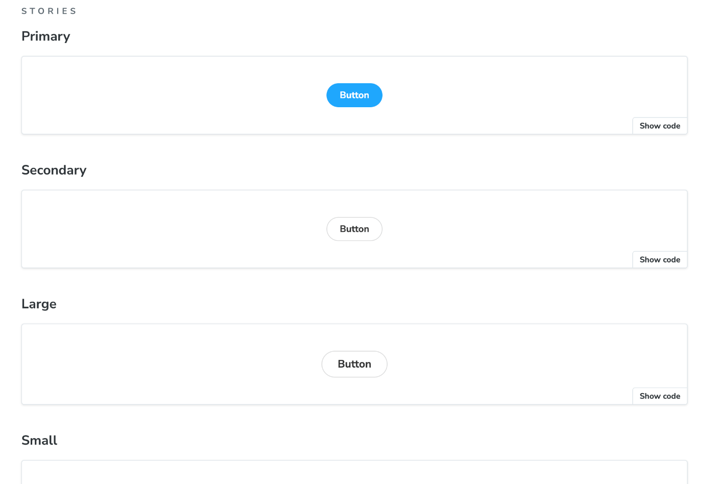
./stories/Button.stories.tsにexportしている箇所がある。
// More on writing stories with args: https://storybook.js.org/docs/writing-stories/args
export const Primary: Story = {
  args: {
    primary: true,
    label: 'Button',
  },
};

export const Secondary: Story = {
  args: {
    label: 'Button',
  },
};

export const Large: Story = {
  args: {
    size: 'large',
    label: 'Button',
  },
};

export const Small: Story = {
  args: {
    size: 'small',
    label: 'Button',
  },
};
試しにSmallDangerという赤いボタンを追加してみる。
export const SmallDanger: Story = {
  args: {
    size: "small",
    label: "Danger",
    backgroundColor: "red",
  },
};

これだけで追加された。
CSSについて
buttonのCSSは./stories/Button.tsxの2行目で./stories/button.css読み込んでいる。
import "./button.css";
./stories/Button.tsxでButtonのclassNameを指定している。
また、background-colorに関しては<style jsx>を使って指定している。
/**
 * Primary UI component for user interaction
 */
export const Button = ({
  primary = false,
  size = "medium",
  backgroundColor,
  label,
  ...props
}: ButtonProps) => {
  const mode = primary
    ? "storybook-button--primary"
    : "storybook-button--secondary";
  return (
    <button
      type="button"
      className={["storybook-button", `storybook-button--${size}`, mode].join(
        " "
      )}
      {...props}
    >
      {label}
      <style jsx>{`
        button {
          background-color: ${backgroundColor};
        }
      `}</style>
    </button>
  );
};
Tailwind CSSの利用
すでにNext.JSでTailwind CSSが導入済みであれば、下記の設定でTailwind CSSを利用可能になる。
.storybook/preview.ts内でcssをimport
import "../app/globals.css";
./tailwind.config.tsに./storiesディレクトリを追加
const config: Config = {
  content: [
    "./pages/**/*.{js,ts,jsx,tsx,mdx}",
    "./components/**/*.{js,ts,jsx,tsx,mdx}",
    "./app/**/*.{js,ts,jsx,tsx,mdx}",
    "./stories/**/*.{js,ts,jsx,tsx,mdx}", # 追加
  ],
Discussion