この記事は?
SwiftUIを導入する話とそれを基に得た知見などをまとめていきます。
SwiftUIの発表から約3年が経ちそろそろSwiftUIを導入しなきゃな〜とお考えの皆さんの参考になったら幸いです!
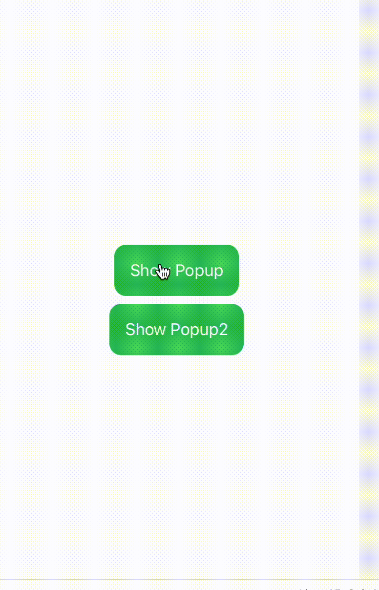
ポップアップの表示
アプリではよくポップアップのような表示を利用することがあると思います。こちらを作成してみました。
そもそもですがiOSの標準ではポップアップの表示はなくモーダルのような感じで下から表示する方法がよく採用されています。
つまりポップアップの見た目をカスタムし制御してあげる必要があります
サンプルコード解説
簡単に解説していきたいと思います。
まずはサンプルコードです。
import UIKit
import SwiftUI
import PlaygroundSupport


struct ContentView: View {
    @State var isFirstPresented = false
    @State var isSecondPresented = false

    var body: some View {
        ZStack {
            VStack {
                Button(action: {
                    self.isFirstPresented = true
                }, label: {
                    Text("Show Popup")
                        .padding()
                        .background(Color.green)
                        .foregroundColor(.white)
                        .cornerRadius(12)
                })
                Button(action: {
                    self.isSecondPresented = true
                }, label: {
                    Text("Show Popup2")
                        .padding()
                        .background(Color.green)
                        .foregroundColor(.white)
                        .cornerRadius(12)
                })
            }
            if isFirstPresented {
                PopupView(isPresented: $isFirstPresented)
            }
            if isSecondPresented {
                PopupImageView(isPresented: $isSecondPresented)
            }
        }.frame(width: 375, height: 700)
    }

}

struct PopupView: View {
    @Binding var isPresented: Bool

    var body: some View {
        GeometryReader { geometry in

            ZStack {
                PopupBackgroundView(isPresented: isPresented)
                    .transition(.opacity)
                PopupContentsView(isPresented:$isPresented)
                    .frame(width: geometry.size.width * 0.8, height: geometry.size.height * 0.3)
                    .background(Color.gray)
                    .cornerRadius(20)
            }

        }
    }
}

struct PopupImageView: View {
    @Binding var isPresented: Bool
    var body: some View {
        GeometryReader { geometry in

            ZStack {
                PopupBackgroundView(isPresented: isPresented)
                    .transition(.opacity)
                PopupImageContentsView(isPresented: $isPresented)
                    .frame(width: geometry.size.width * 0.8, height: geometry.size.height * 0.3)
                    .background(Color.gray)
                    .cornerRadius(20)
            }

        }
    }
}

struct PopupBackgroundView: View {
    @State var isPresented: Bool

    var body: some View {
        Color.black.opacity(0.3)
            .onTapGesture {
                self.isPresented = false
            }
            .edgesIgnoringSafeArea(.all)
    }
}

struct PopupContentsView: View {
    @Binding var isPresented: Bool
    var body: some View {
        VStack {
            Text("Hello, World!")
                .font(.largeTitle)
                .foregroundColor(.white)
            Button(action: {
                isPresented = false
            }, label: {
                Text("Close")
                    .font(.headline)
                    .foregroundColor(.white)
                    .padding()
                    .frame(maxWidth: .infinity)
                    .background(Color.blue)
                    .cornerRadius(12)
            })
        }

    }
}

struct PopupImageContentsView: View {
    @Binding var isPresented: Bool
    var body: some View {
        VStack {
            Image(systemName: "star.fill")
                .font(.system(size: 50))
            Button(action: {
                isPresented = false
            }, label: {
                Text("Close")
                    .font(.headline)
                    .foregroundColor(.white)
                    .padding()
                    .frame(maxWidth: .infinity)
                    .background(Color.blue)
                    .cornerRadius(12)
            })
        }

    }
}


PlaygroundPage.current.liveView = UIHostingController(rootView: ContentView())
ポップアップのUI作成
背景とポップアップの中身を作成します。
さまざまなポップアップが追加されることを想定し分けて作成しました。
背景は画面の全面になるように edgesIgnoringSafeArea(.all) をつけています。
PopupContentsView では @Binding によってisPresentedを連携させ Button操作で閉じることができるようにします
struct PopupBackgroundView: View {
    @State var isPresented: Bool

    var body: some View {
        Color.black.opacity(0.3)
            .onTapGesture {
                self.isPresented = false
            }
            .edgesIgnoringSafeArea(.all)
    }
}

struct PopupContentsView: View {
    @Binding var isPresented: Bool
    var body: some View {
        VStack {
            Text("Hello, World!")
                .font(.largeTitle)
                .foregroundColor(.white)
            Button(action: {
                isPresented = false
            }, label: {
                Text("Close")
                    .font(.headline)
                    .foregroundColor(.white)
                    .padding()
                    .frame(maxWidth: .infinity)
                    .background(Color.blue)
                    .cornerRadius(12)
            })
        }

    }
}
ポップアップのUI表示と親ビューとの調整
PopupViewで PopupBackgroundView と PopupContentsViewを連携させています。
ポイントGeometryReaderを使用して、親ビューのサイズに応じてポップアップのサイズを調整します。そうすることで親がどんな表示でもポップアップになるようにしています。
struct PopupView: View {
    @Binding var isPresented: Bool

    var body: some View {
        GeometryReader { geometry in

            ZStack {
                PopupBackgroundView(isPresented: isPresented)
                    .transition(.opacity)
                PopupContentsView(isPresented:$isPresented)
                    .frame(width: geometry.size.width * 0.8, height: geometry.size.height * 0.3)
                    .background(Color.gray)
                    .cornerRadius(20)
            }

        }
    }
}
呼び出し元からの表示
呼び出し元からは下記のようにPopupViewを呼び出して表示します。
今回はSwiftUIから呼び出しましたが、UIViewControllerからaddSubViewしても同じような表示になると思います。
struct ContentView: View {
    @State var isFirstPresented = false
    @State var isSecondPresented = false

    var body: some View {
        ZStack {
            VStack {
                Button(action: {
                    self.isFirstPresented = true
                }, label: {
                    Text("Show Popup")
                        .padding()
                        .background(Color.green)
                        .foregroundColor(.white)
                        .cornerRadius(12)
                })
                Button(action: {
                    self.isSecondPresented = true
                }, label: {
                    Text("Show Popup2")
                        .padding()
                        .background(Color.green)
                        .foregroundColor(.white)
                        .cornerRadius(12)
                })
            }
            if isFirstPresented {
                PopupView(isPresented: $isFirstPresented)
            }
            if isSecondPresented {
                PopupImageView(isPresented: $isSecondPresented)
            }
        }.frame(width: 375, height: 700)
    }

}
ここまでをGitHubにも上げたのでよかったらこちらでも確認してください!
Discussion