【Vuetify 3】ログイン/登録 画面作成


目標
- ログイン画面の追加
- ルーティングの追加
- 入力項目の作成
事前準備
vue3に事前準備uetify3が導入されたProject
記事では下記Git hub Repositoryを使用する
ログイン画面の追加
/src/viewsにLoginView.vueファイルを作成する
ルーティング設定用に必要最低限だけ記述する
<template>ログイン画面</template>

<script>
import { defineComponent } from "vue";

// Components
export default defineComponent({
  name: "LoginView",
});
</script>
ルーティングの追加
ログイン画面を表示できるようにルーティングを設定する
既に記述されているaboutのルーティング設定を参考に設定する
 const routes = [
   {
     path: "/",
     name: "home",
     component: HomeView,
   },
   {
     path: "/about",
     name: "about",
     // route level code-splitting
     // this generates a separate chunk (about.[hash].js) for this route
     // which is lazy-loaded when the route is visited.
     component: () =>
       import(/* webpackChunkName: "about" */ "../views/AboutView.vue"),
   },
+  {
+    // ログイン画面
+    path: "/login",
+    name: "login",
+    component: () => import("../views/LoginView.vue"),
+  },
 ];
実行結果
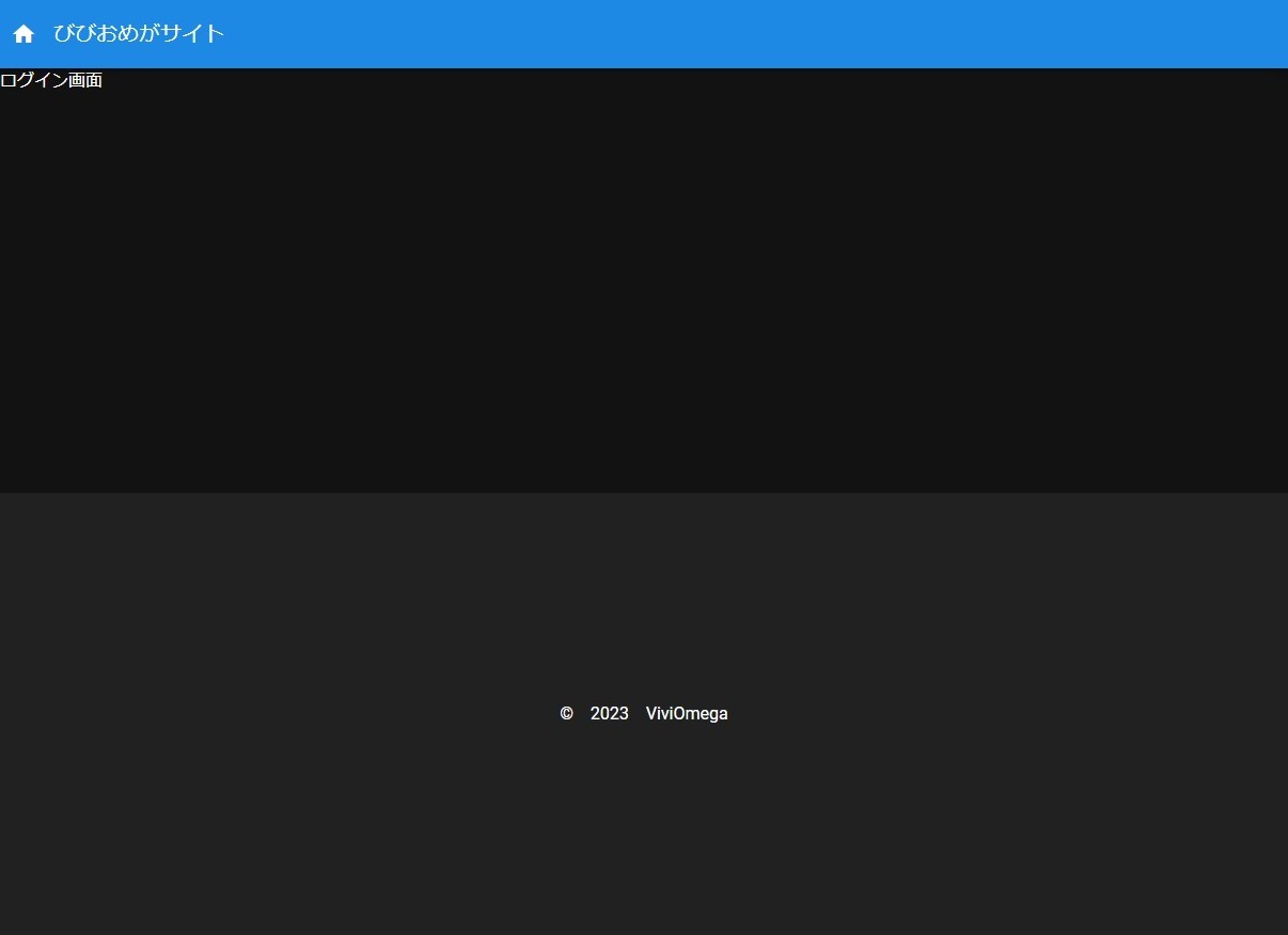
ログイン画面の文字が表示されていれば成功です
入力項目の作成
<template>
  <v-container>
    <v-card max-width="500" class="mx-auto">
      <v-card-actions>
        <v-col>
          <v-text-field v-model="email" :label="constant.email" type="email">
          </v-text-field>
          <v-text-field
            v-model="password"
            :label="constant.password"
            type="password"
            :append-inner-icon="show ? 'mdi-eye' : 'mdi-eye-off'"
            @click:append-inner="show = !show1"
          >
          </v-text-field>
          <v-btn color="primary" variant="tonal">
            {{ constant.signin }}
          </v-btn>
          <v-btn color="primary" variant="tonal">
            {{ constant.sinup }}
          </v-btn>
        </v-col>
      </v-card-actions>
    </v-card>
  </v-container>
</template>
コンテンツ要素
コンテンツ要素をv-containerで指定する
適切なコンテンツの幅を設定できるVuetifyのコンポーネントの一つでレスポンシブにも対応している
サインイン/サインアップの大枠
v-cardコンポーネントを使います
カードコンポーネントは汎用性が高く、多様することになると思います
コンテンツ要素いっぱいいっぱいに横幅を伸ばすとPCでバランスが悪くなるので最大幅を500に設定しています
また、カード要素を中央に寄せるためにmx-autoをclassに指定しています。
他にも便利なclassが存在しているので公式ドキュメントのUTILITY CLASSESを参照してください
入力項目
テキストフィールドのコンポーネントを活用します
基本要素
| 要素 | 概要 |
|---|---|
| v-model | 入力値 |
| label | 入力項目のラベル |
入力タイプをemailに設定する
こうすることでブラウザのクッキー情報をもとにしたサジェストが表示される
password
入力タイプを目のアイコンの状態でpasswordとtextを切り替えるに設定することができるようにしている
password状態では入力した値が伏せ字になる
サインイン/サインアップボタン
色はサイトのメインカラーを使用する
ボタンのデザインはtonalを使用
import { defineComponent } from "vue";

// Components
export default defineComponent({
  name: "LoginView",
  data: () => ({
    //パスワードのブラインド切り替え用の値
    show: false,

    // 定数
    constant: {
      email: "メールアドレス",
      password: "パスワード",
      signin: "サインイン",
      sinup: "サインアップ",
    },

    // サインイン/サインアップデータ
    email: "",
    password: "",
  }),
});
コンポーネントの宣言でdefineComponentを使う事で型推論ができますが、TSではないので特に必要はないです
data()
テンプレート要素に直でテキストを入れる事をせずにdataで管理することで今後のメンテナンス性を考慮する
| 変数 | 概要 |
|---|---|
| show | パスワードの表示状態 |
| constant | ラベルやテキストなどの定数 |
| 入力されたメールアドレス | |
| password | 入力されたパスワード |
実行結果
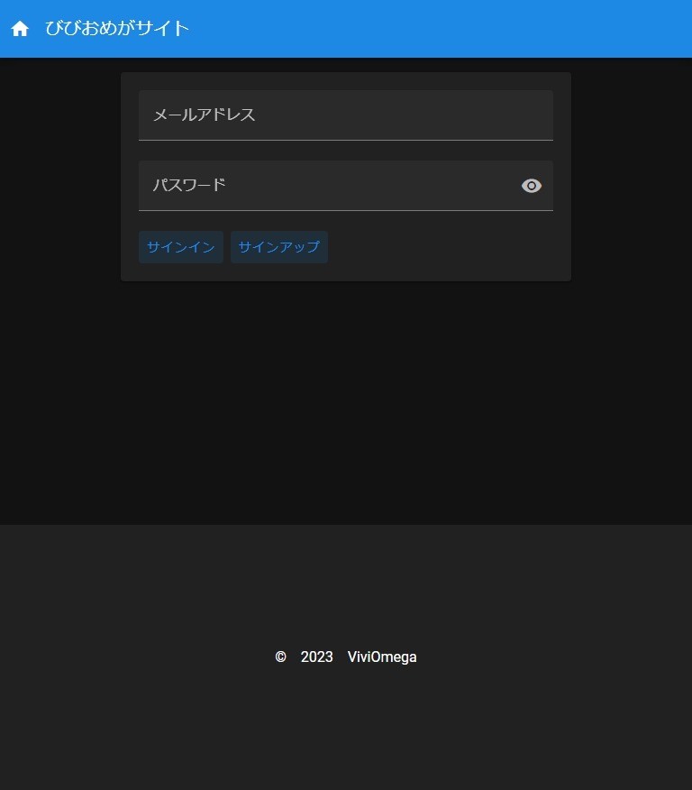
定数にはあえて英語表記は残さず全部日本語に置き換えている。
1コンテンツ内に英語と日本語を混在させると見栄えが悪くなる場合があるので基本的にはどちらか片方を使うようにする
Git commit情報
| SHA | commit message |
|---|---|
| d2b22c3 | 【Vuetify 3】ログイン/登録 画面作成 |
あとがき
レイアウトだけを構築したので次はボタンなどに処理を追加したり、Firebaseとの連携でサインインとサインアップの処理を追加していきます
Discussion