こんにちは、田中です。今日のテーマはDifyアプリの実行画面におけるUI変更についてです。Difyアプリの実行画面におけるUI変更は、その活用範囲を大きく広げ、ユーザー体験を向上させる鍵となります。本稿では、DifyのUIをどのようにカスタマイズできるかを具体的な実装例を交えて解説します。CSSの専門知識がなくても取り組める内容ですので、ぜひご自身のDifyアプリを最適化してみてください。
UI変更のメリット
1. ユーザー体験(UX)の向上
Difyの汎用的なデフォルトUIに対し、特定の用途に合わせた調整はユーザーの操作を劇的にスムーズにします。例えば、FAQボットでは質問入力欄を強調し、回答履歴を簡潔に表示することで、直感的な操作と高い利用率を促します。
2. 企業ブランドに合わせたデザインが可能
UIをカスタマイズすることで、企業のブランドカラーやロゴを統合したデザインを実現できます。これは、顧客向けチャットや社内ポータル組み込み時において、企業の信頼性とプロフェッショナリズムを視覚的に訴求する上で不可欠です。
Difyの複製方法
DifyアプリのUIをカスタマイズするには、まずDifyのWebアプリリポジトリを複製し、ローカル環境で編集できるように準備します。
-
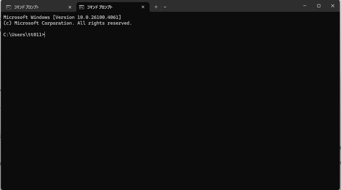
まずはコマンドプロンプトを開いてください
下のタスクバーの検索からコマンドプロンプトと調べると出てきます
-
まずはgit clone git@github.com:langgenius/webapp-conversation.git と入力してください

-
コマンドラインの操作は一旦終わりです
自分のエクスプローラーからwebapp-conversationを見つけます
-
そこに.env.localファイルを作成します
※このファイルはただのローカルファイルである必要があります。つまり.txtなどの拡張子のつかないものにしてください
-
そのファイルに以下の情報を貼り付けます
NEXT_PUBLIC_APP_ID=
NEXT_PUBLIC_APP_KEY=
NEXT_PUBLIC_API_URL=
NEXT_PUBLIC_APP_IDはアプリの編集画面に表示されるURLになります。一般的にはappとworlflowに囲まれた部分になります。
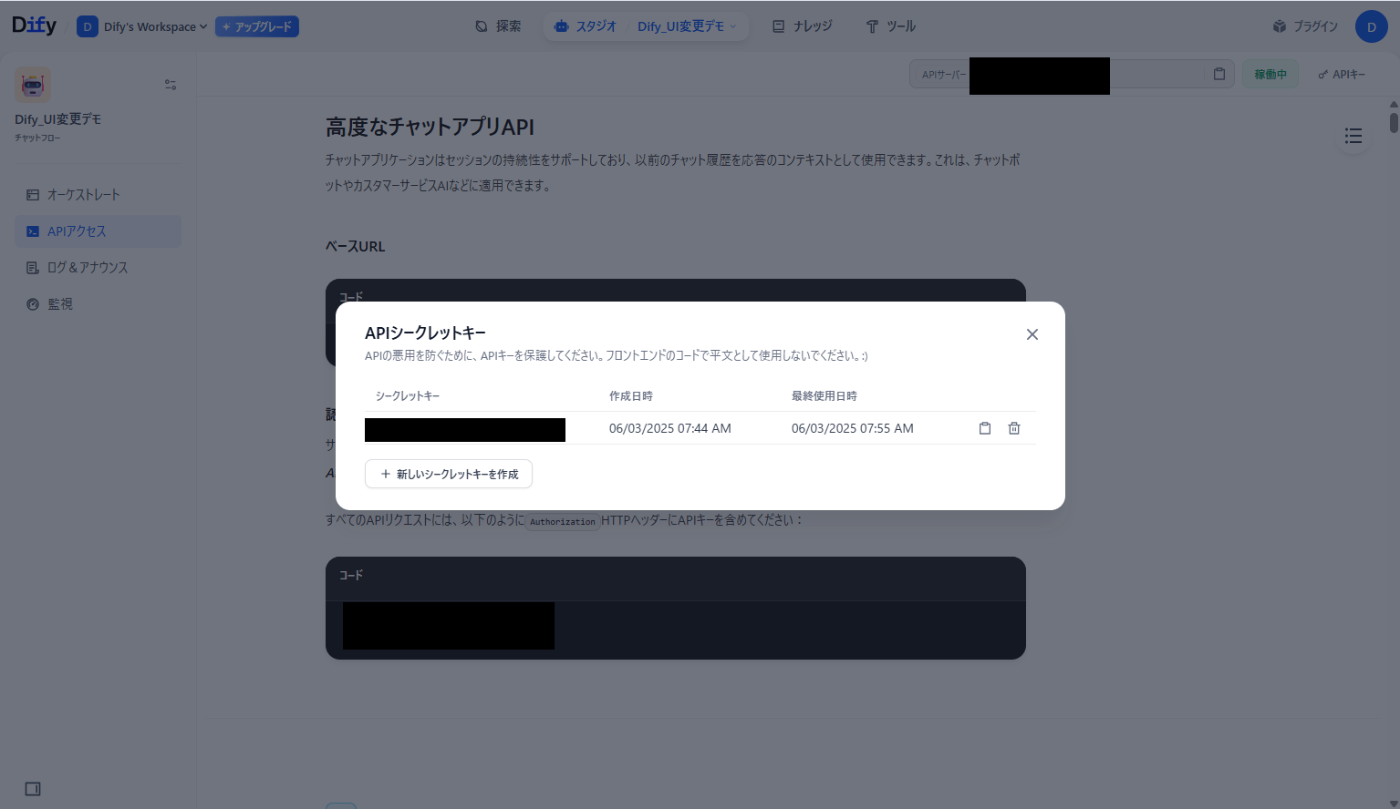
NEXT_PUBLIC_API_URLは左側のサイドバーのAPIアクセスのベースURLです
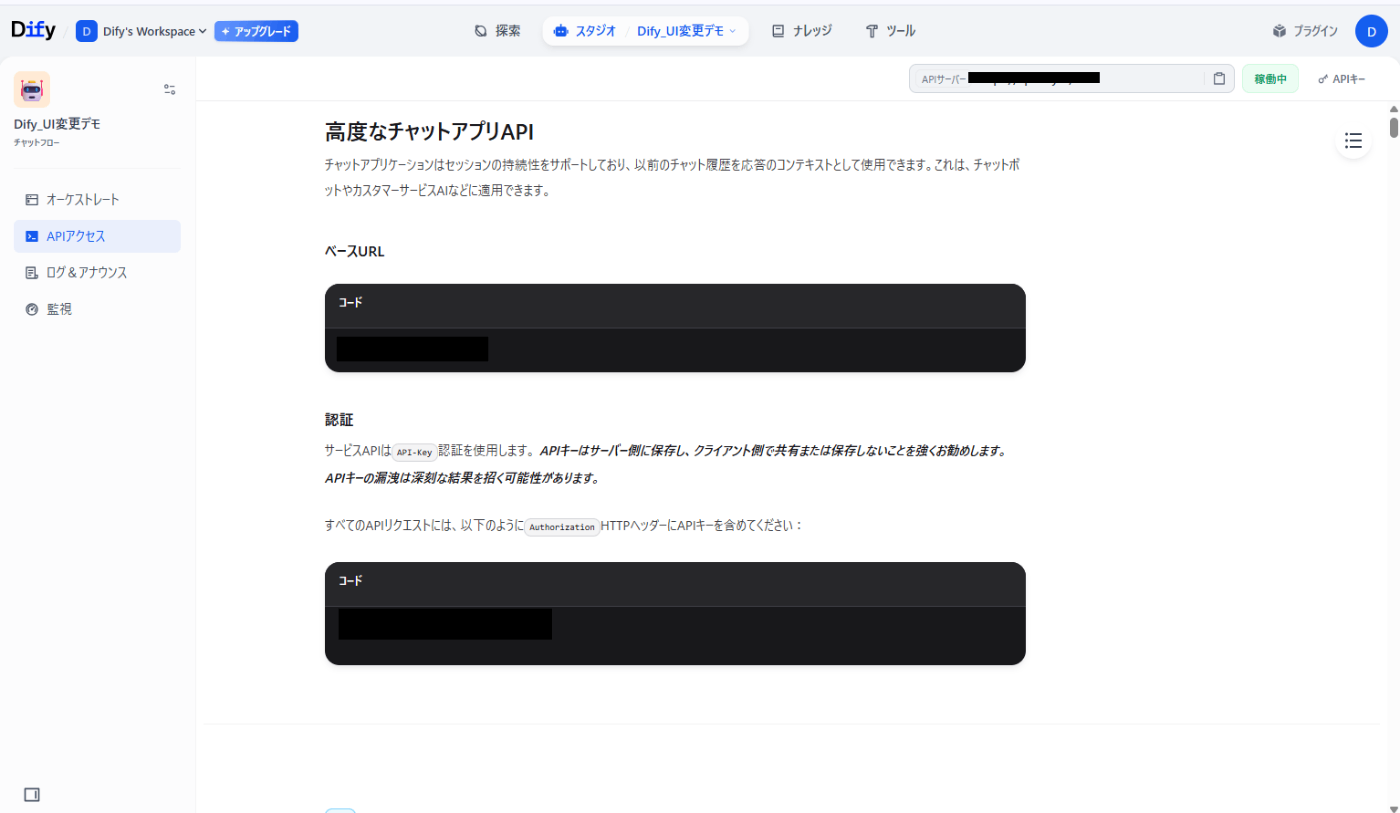
NEXT_PUBLIC_APP_KEYはそのページの右上のAPIキーから作成してください
-
次にコマンドラインの操作に戻ります。
webapp-conversationのディレクトリに移動してください

-
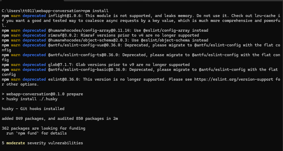
次にnpm installと打ちnpmをインストールします
-
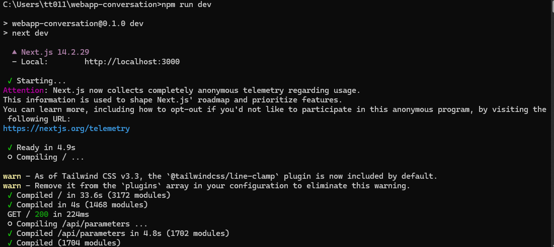
そしてnpm run devを打ちます
-
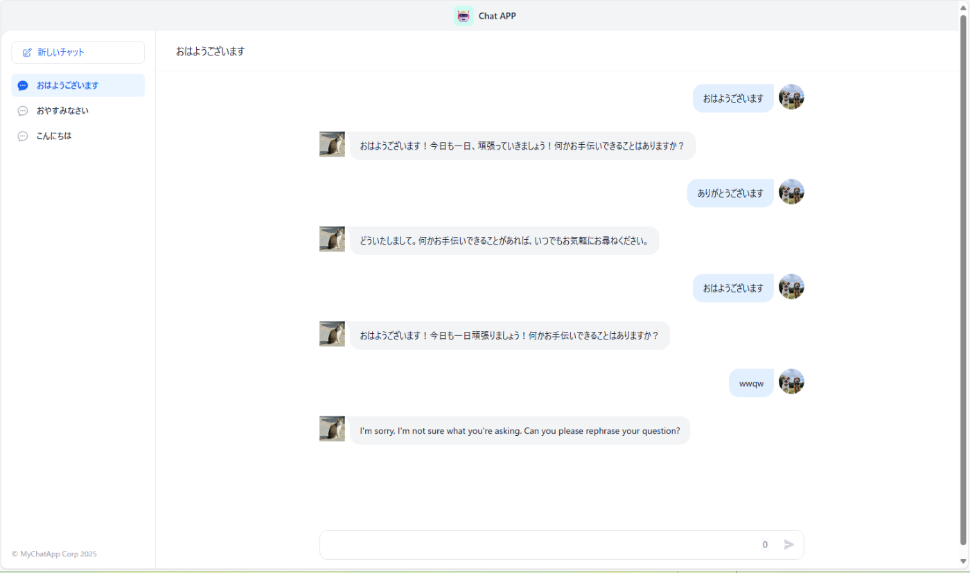
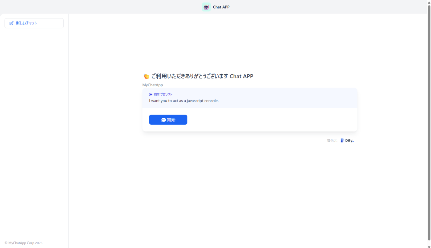
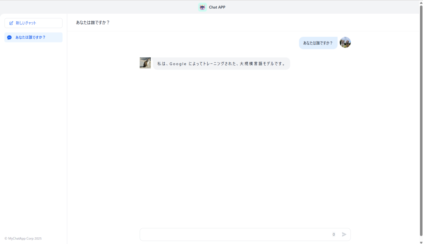
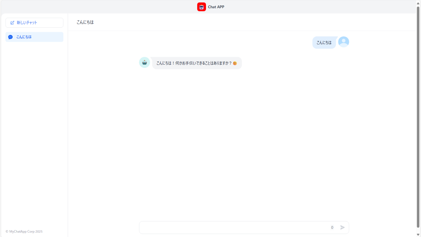
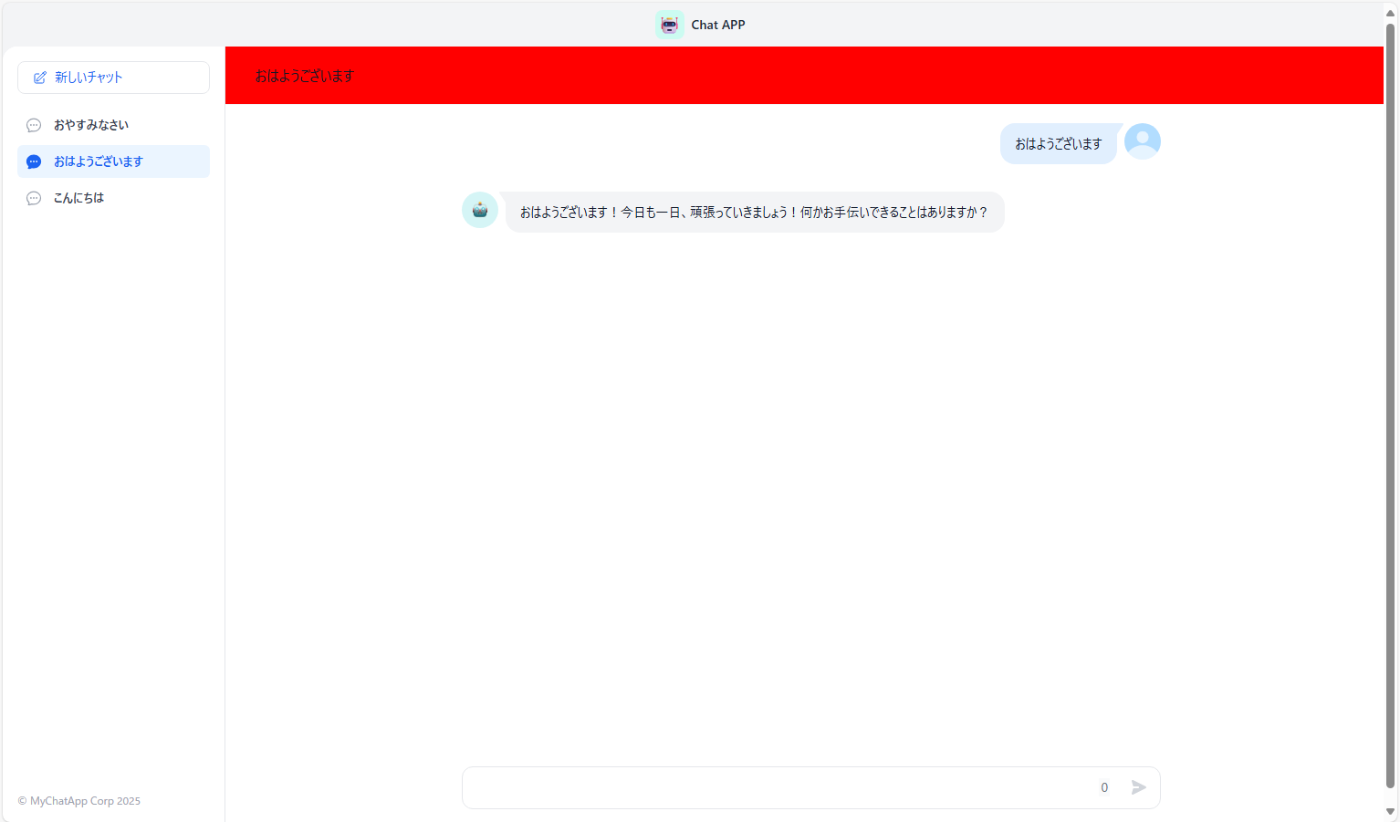
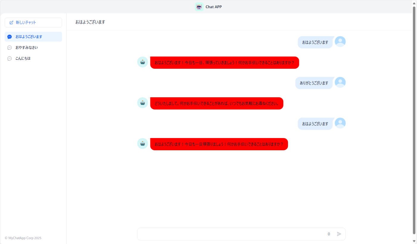
localhost:3000を開きます。以下のような画面になれば成功です

以上でアプリの複製は完了です
CSS変更方法
主に変更できるCSSファイルは三種類存在して、page.css,layout.css,global.cssが存在します
今回は基本的にlayout.cssを編集して操作を行っていきます。
layout.cssはwebapp-conversion>.next>static>css>app>layout.cssに、page.cssはwebapp-conversion>.next>static>css>app>page.cssに格納されています。これらのファイルを開き、既存のスタイル定義に影響を与えないよう、ファイルの一番下にカスタムCSSを追加してください。
まずは簡単にCSSの基本ルールから説明したいと思います。
.class{
background-color:red;
}
以上の書き方がCSSの基本的な書き方となっていて赤文字の部分がクラス名と呼ばれるものでどこの部分のUIを変更するかを指定するものとなっています。青文字の部分がプロパティと値の組み合わせで、実際にどのようにUIを変更するかを定義します。
注意点:
子要素にスタイルが設定されている場合、親要素からの変更が反映されないことがあります。その際は、子要素に対して直接スタイルを適用することを試みてください。特に「2. テキストとフォント」の項目では、できるだけ子要素に設定することをお勧めします。
まずは青文字の部分ですがどのような書き方があるか基本的なものを紹介したいと思います。
1. レイアウトと配置 (Layout & Positioning)
要素の配置、サイズ、表示方法などを制御します。以下のような設定方法があります。代表的なもののみ上げているので他にも方法は様々あります。
-
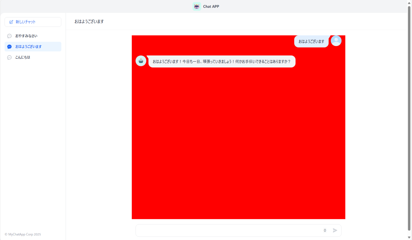
display: 要素の表示形式 (block,inline,inline-block,flex,grid,noneなど)例
ヘッダーの部分を非表示にする
   .shrink-0.flex.items-center.justify-between.h-12.px-3.bg-gray-100{
     display:none;
   }
Before
After

-
position: 要素の配置方法 (static,relative,absolute,fixed,sticky)top,right,bottom,left:positionプロパティと組み合わせて要素の位置を決定 -
margin: 要素の外側の余白(900px,30vwなど数値で表現)-
margin-top,margin-right,margin-bottom,margin-leftのように上側、右側、下側、左側のみを設定することも可能
例
ヘッダーの部分の余白を増やす
   .shrink-0.flex.items-center.justify-between.h-12.px-3.bg-gray-100{
     margin-bottom:100px
   }
Before
After
-
-
padding: 要素の内側の余白 (900px,30vwなど数値で表現)-
padding-top,padding-right,padding-bottom,padding-leftのように上側、右側、下側、左側のみを設定することも可能
例
ヘッダーの部分の余白を増やす
   .shrink-0.flex.items-center.justify-between.h-12.px-3.bg-gray-100{
     padding-bottom:100px;
   }
Before
After
-
-
width,height: 要素の幅と高さ (900px,30vwなど数値で表現)例
会話ボックスの幅を半分にしています
   .ml-2.py-3.px-4.bg-gray-100.rounded-tr-2xl.rounded-b-2xl.undefined{
     width:50%;
   }
Before

After
-
**
min-width,max-width,min-height,max-height**要素の幅と高さの最大値及び最小値 (900px,30vwなど数値で表現)例
会話ボックスの最大幅を半分にしています
   .ml-2.py-3.px-4.bg-gray-100.rounded-tr-2xl.rounded-b-2xl.undefined{
     max-width:50%;
   }
Before
After
-
float: 要素を左右に寄せる (left,right,none) -
clear:floatされた要素の回り込みを解除 (left,right,both,none) -
overflow: 要素のコンテンツがはみ出した場合の挙動 (visible,hidden,scroll,auto) -
Flexbox (
display: flex):-
flex-direction,justify-content,align-items,flex-wrap,gapなど
-
-
CSS Grid (
display: grid):-
grid-template-columns,grid-template-rows,grid-gap,grid-areaなど
-
-
z-index: 重なり合う要素の前後関係(数値が多き方が重なった際に上に表示される)
2. テキストとフォント (Text & Font)
文字の見た目や配置を制御します。
-
font-size: フォントのサイズ(10px,3vwなど数値で指定)例
上の題目の部分の文字の大きさを変更しています
   .absolute.top-0.left-0.right-0.flex.items-center.justify-between.border-b.border-gray-100 > .text-gray-900{
     font-size:40px
   }
Before

After

-
font-weight: フォントの太さ (bold,normal, 数字など)例
上の部分の文字を太字にします
   .absolute.top-0.left-0.right-0.flex.items-center.justify-between.border-b.border-gray-100 > .text-gray-900{
     font-weight:bold;
   }
Before
After

-
font-style: フォントのスタイル (normal,italic,oblique)例
上の題目の部分の文字を斜体に変更しています
   .absolute.top-0.left-0.right-0.flex.items-center.justify-between.border-b.border-gray-100 > .text-gray-900{
     font-style:italic;
   }
Before
After

-
color: テキストの色例
上の題目の部分の文字の色を変更しています
   .absolute.top-0.left-0.right-0.flex.items-center.justify-between.border-b.border-gray-100 > .text-gray-900{
     color:red;
   }
Before
After

-
text-align: テキストの水平方向の配置 (left,right,center,justify) -
text-decoration: テキストの装飾 (none,underline,overline,line-through)例
上の題目の部分に下線を追加しています
   .absolute.top-0.left-0.right-0.flex.items-center.justify-between.border-b.border-gray-100 > .text-gray-900{
     text-decoration:underline;
   }
Before
After

-
line-height: 行の高さ例
会話部分の行の高さを設定しています
   .absolute.top-0.left-0.right-0.flex.items-center.justify-between.border-b.border-gray-100 > .text-gray-900{
     line-height:100px;
   }
Before
After
-
letter-spacing: 文字間の間隔例
会話部分の文字間の隙間を設定しています
   .ml-2.py-3.px-4.bg-gray-100.rounded-tr-2xl.rounded-b-2xl.undefined > .markdown-body{
      letter-spacing:3px;
      }
Before
After
-
word-spacing: 単語間の間隔例
会話部分の英語の単語の間の隙間を設定しています
   .ml-2.py-3.px-4.bg-gray-100.rounded-tr-2xl.rounded-b-2xl.undefined > .markdown-body{
      word-spacing:3px;
      }
Before
After
-
white-space: 空白文字の扱い (normal,nowrap,pre,pre-wrap,pre-line) -
text-shadow: テキストの影(text-shadow: [水平方向のオフセット] [垂直方向のオフセット] [ぼかしの半径(オプション)] [影の色(オプション)];)例
会話部分の文字に影を付けます
   .ml-2.py-3.px-4.bg-gray-100.rounded-tr-2xl.rounded-b-2xl.undefined > .markdown-body{
     text-shadow: 2px 2px 4px red;
   }
Before
After

3. 色と背景 (Colors & Backgrounds)
要素の色や背景に関する設定です。
-
background-color: 背景色例
上の題目の部分の色を変更しました
   .absolute.top-0.left-0.right-0.flex.items-center.justify-between.border-b.border-gray-100.bg-white{
     background-color:red;
   }
Before
After

-
background-image: 背景画像例
上の題目の部分の背景画像を変更しました
   .absolute.top-0.left-0.right-0.flex.items-center.justify-between.border-b.border-gray-100.bg-white{
      background-image: url(/_next/static/media/32459331_m.jpg);
   }
Before
After

-
background-repeat: 背景画像の繰り返し (no-repeat,repeat-x,repeat-y,repeat) -
background-position: 背景画像の位置 -
background-size: 背景画像のサイズ -
background-attachment: 背景画像のスクロール挙動 (scroll,fixed,local) -
opacity: 要素の透明度例
上の題目の部分の透明度を変更しました
   .absolute.top-0.left-0.right-0.flex.items-center.justify-between.border-b.border-gray-100.bg-white{
      opacity:0.3;
   }
Before
After
4. ボーダーとアウトライン (Borders & Outlines)
要素の境界線に関する設定です。
-
border: 境界線のスタイル、幅、色を一括で設定 (border-width,border-style,border-color)例
上の題目の部分の境界線を追加しました
   .absolute.top-0.left-0.right-0.flex.items-center.justify-between.border-b.border-gray-100.bg-white{
      border: 3px solid red;
   }
Before
After

-
border-radius: 角丸の半径例
上の題目の部分の境界線に丸みをつけました
   .absolute.top-0.left-0.right-0.flex.items-center.justify-between.border-b.border-gray-100.bg-white{
     border: 3px solid red;
     border-radius:30px;
   }
Before
After
layout.cssからの編集
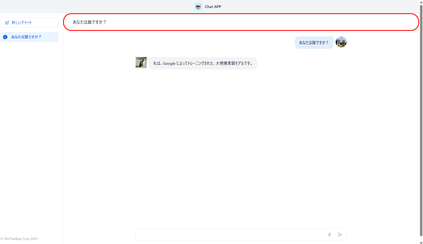
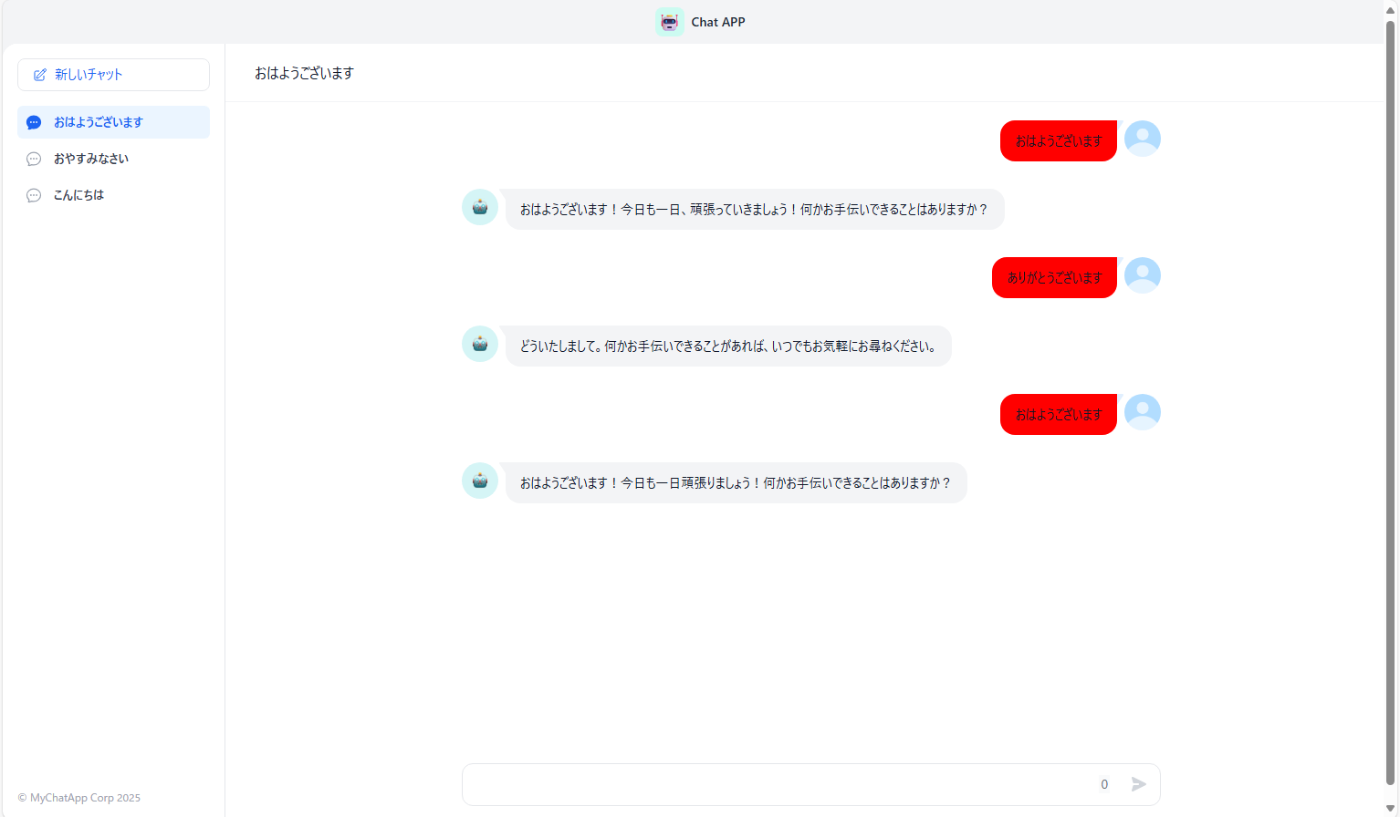
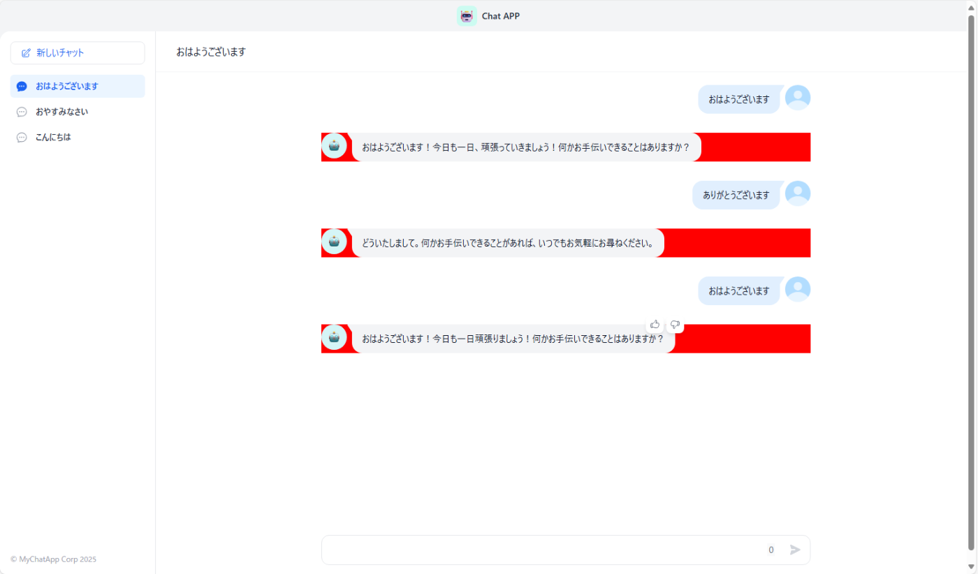
ここでは、layout.cssを編集する際に、それぞれのCSSクラスがDifyアプリのどのUI要素に影響を与えるかを具体的な画像とコード例で示します。
以下の画像で赤色の部分が、指定したCSSクラスによって変更可能な領域です。
1 .shrink-0.flex.items-center.justify-between.h-12.px-3.bg-gray-100

コード例
.shrink-0.flex.items-center.justify-between.h-12.px-3.bg-gray-100{
background-color:red ;
}
2 .flex.items-center.space-x-2

コード例
    .flex.items-center.space-x-2{
      background-color:red;
    }
3 .style_appIcon__qLtEt.style_small__SH1g5
(アイコンの大きさの設定はfont-sizeで行う)
コード例
    .style_appIcon__qLtEt.style_small__SH1g5{
      background-color:red ;
    }
4 .text-sm.text-gray-800.font-bold

コード例
    .text-sm.text-gray-800.font-bold{
      background-color:red ;
    }
5 .flex.flex-shrink-0.p-4

コード例
    .flex.flex-shrink-0.p-4{
      background-color:red ;
    }
6 .mt-4.flex-1.space-y-1.bg-white.p-4

コード例
    .mt-4.flex-1.space-y-1.bg-white.p-4{
      background-color:red ;
    }
7 .bg-primary-50.text-primary-600.group.flex.items-center.rounded-md.px-2.py-2.text-sm.font-medium.cursor-pointer(現在表示されている質問事項です)
コード例
    .bg-primary-50.text-primary-600.group.flex.items-center.rounded-md.px-2.py-2.text-sm.font-medium.cursor-pointer{
      background-color:red ;
    }
8 .text-gray-700.group.flex.items-center.rounded-md.px-2.py-2.text-sm.font-medium.cursor-pointer(それ以外の質問事項です)

コード例
    .text-gray-700.group.flex.items-center.rounded-md.px-2.py-2.text-sm.font-medium.cursor-pointer{
      background-color:red ;
    }
9 .flex.flex-shrink-0.pr-4.pb-4.pl-4
コード例
    .flex.flex-shrink-0.pr-4.pb-4.pl-4{
      background-color:red;
    }
10 .text-gray-400.font-normal.text-xs
コード例
    .text-gray-400.font-normal.text-xs{
      background-color:red ;
    }
11 .absolute.top-0.left-0.right-0.flex.items-center.justify-between.border-b.border-gray-100.bg-white
コード例
    .absolute.top-0.left-0.right-0.flex.items-center.justify-between.border-b.border-gray-100.bg-white{
      background-color:red;
    }
12 .absolute.top-0.left-0.right-0.flex.items-center.justify-between.border-b.border-gray-100 > .text-gray-90

コード例
    .absolute.top-0.left-0.right-0.flex.items-center.justify-between.border-b.border-gray-100 > .text-gray-900{
      background-color:red;
    }
13 .flex-grow.flex.flex-col.overflow-y-auto

コード例
    .flex-grow.flex.flex-col.overflow-y-auto{
      background-color:red;
    }
14 .h-full.overflow-y-auto
コード例
    .h-full.overflow-y-auto{
      background-color:red;
    }
15 .flex.items-start.justify-end(質問者の部分)

コード例
    .flex.items-start.justify-end{
      background-color:red ;
    }
16 .mr-2.py-3.px-4.bg-blue-500.rounded-tl-2xl.rounded-b-2xl
コード例
    .mr-2.py-3.px-4.bg-blue-500.rounded-tl-2xl.rounded-b-2xl{
      background-color:red;
    }
17 .mr-2.py-3.px-4.bg-blue-500.rounded-tl-2xl.rounded-b-2xl > .markdown-body

コード例
    .mr-2.py-3.px-4.bg-blue-500.rounded-tl-2xl.rounded-b-2xl > .markdown-body{
      background-color:red;
    }
18 .flex.items-start:not(.justify-end)
コード例
    .flex.items-start.justify-end{
      background-color:red;
    }
19 .ml-2.py-3.px-4.bg-gray-100.rounded-tr-2xl.rounded-b-2xl.undefined
コード例
    .ml-2.py-3.px-4.bg-gray-100.rounded-tr-2xl.rounded-b-2xl.undefined{
      background-color:red;
    }
20 .ml-2.py-3.px-4.bg-gray-100.rounded-tr-2xl.rounded-b-2xl.undefined > .markdown-body

コード例
    .ml-2.py-3.px-4.bg-gray-100.rounded-tr-2xl.rounded-b-2xl.undefined > .markdown-body{
      background-color:red
    }
21 .bg-white.border-gray-200.rounded-xl.overflow-y-auto

コード例
    .bg-white.border-gray-200.rounded-xl.overflow-y-auto{
      background-color:red;
    }
22 .rc-textarea
コード例
    .rc-textarea{
      background-color:red;
    }
23 .absolute.bottom-2.right-2.flex.items-center.h-8

コード例
    .absolute.bottom-2.right-2.flex.items-center.h-8{
      background-color:red;
    }
24 .style_count___G2R1.mr-4.h-5.leading-5.text-sm.bg-gray-50.text-gray-500
コード例
    .style_count___G2R1.mr-4.h-5.leading-5.text-sm.bg-gray-50.text-gray-500{
      background-color:red;
    }
25 .style_count___G2R1.mr-4.h-5.leading-5.text-sm.bg-gray-50.text-gray-500(送信ボタンのアイコンの変え方については後程紹介します)

コード例
    .style_sendBtn__Wtuom.w-8.h-8.cursor-pointer.rounded-md.style_count___G2R1.mr-4.h-5.leading-5.text-sm.bg-gray-50.text-gray-500{
      background-color:red;
    }
page.cssからの編集
具体的には質問者及び回答者のアイコンの変更並びに送信ボタンの変更を行えます。
webapp-conversion>.next>static>css>app>page.cssから編集してください。
1 質問者のアイコンの変更方法
page.cssの116行目(ずれる可能性あり)の以下の赤文字の部分に扱いたい画像のURLを張り付けてください.
※画像のURLの設定はwebapp-conversion>.next>static>mediaに設定したい画像ファイルを設置することで行えます
※/_next/static/media/(ファイル名)という形になりますが、ファイル名の後ろに拡張子をつけることを忘れないでください。
.style_answerIcon__D6k_k {
  position: relative;
  background: url(/_next/static/media/robot.5143b80e.svg);
}
2 回答者のアイコンの変更方法
page.cssの135行目(ずれる可能性あり)の以下の赤文字の部分に扱いたい画像のURLを貼り付けてください
.style_questionIcon__0mjYB {
  background: url(/_next/static/media/default-avatar.bda71a7e.jpg);
  background-size: contain;
  border-radius: 50%;
}
例

3 送信ボタンの変更方法
page.cssの191行目(ずれる可能性あり)の以下の赤文字の部分に扱いたい画像のURLを貼り付けてください
.style_sendBtn__Wtuom {
  background: url(/_next/static/media/send.e769d299.svg) center center no-repeat;
}
4 送信ボタンホバー時(カーゾルがボタンの上にある状態)の時の変更方法
page.cssの195行目(ずれる可能性あり)の以下の赤文字の部分に扱いたい画像のURLを貼り付けてください
.style_sendBtn__Wtuom:hover {
  background-image: url(/_next/static/media/send-active.19705276.svg);
  background-color: #EBF5FF;
}
5 会話の吹き出しの三角部分の画像を変更する方法
page.cssの163行目(ずれる可能性あり)の以下の赤文字の部分に扱いたい画像のURLを貼り付けてください。
以下の部分です。

ない場合吹き出しは以下のようになります

.style_question__FodiS::before {
  right: 0;
  background: url(/_next/static/media/question.d2745457.svg) no-repeat;
}
画像の変更以外にもアイコンや送信ボタンのサイズなどを変更したい場合はCSSを追加して行ってください
例
    .style_questionIcon__0mjYB {
      background: url(/_next/static/media/32459331_m.jpg);
      background-size: cover;
      border-radius: 50%;
      width:100px;
      height:100px;
    }

HTMLの追加
DifyアプリのUIにカスタムHTML要素を追加することも可能です。
webapp-conversion>app のlayout.tsxというテキストファイルを開きます。13行目からHTMLがあるのでそこを編集することでHTMLを追加できます。しかし{children}の中身は編集できないので編集可能な部分は少なくなっています。
実装例


コード例
    <html lang={locale ?? 'en'} className="h-full">
          <body className="h-full">
            <div>これはHTMLを編集したものです①①</div>
            <div className="overflow-x-auto">
              <div className="w-screen h-screen min-w-[300px]">
                {children}
              </div>
            </div>
            <div>これはHTMLを編集したものです②</div>
          </body>
        </html>
まとめ
以上のようにCSSファイルを直接変更を行うことによって、DifyアプリにおいてUIを自由にカスタマイズすることができます。このカスタマイズを活用することによってユーザー体験を大幅に向上させることができます。変更の多様性は本ブログで記載されているもの以外にも多岐にわたるため実際に試してみながらこのカスタマイズの有用性を試してみてください。

株式会社アップグレードは、エンタープライズ企業の生成AI活用における戦略立案から実装までを一貫して支援する専門企業です。本ブログでは、AI Workflow設計、AI Agent開発、RAGシステム構築、各種LLMの実践的活用手法など、技術的知見を共有します。| Dify公式パートナー
Discussion