📈
【matplotlib】plotをサクッとカスタマイズする
はじめに
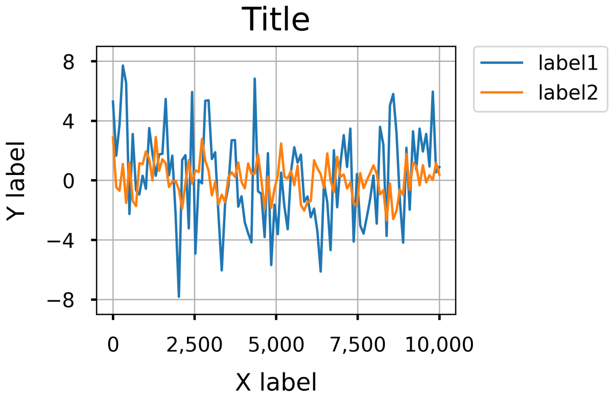
本記事では、matplotlibで作成したグラフをどう調整するかについて、折れ線グラフを例にご紹介します。今回は基本的な調整(文字の大きさや目盛りの間隔など)を行い、下図の右側のplotを作成します。

環境
- python: 3.12.0
- matplotlib: 3.8.2
- numpy: 1.26.3
スクリプト
ライブラリのimport
import matplotlib as mpl
import matplotlib.pyplot as plt
%matplotlib inline
import numpy as np
データの準備
plotに使用するデータを作成します。
np.random.seed(0)
x = np.linspace(0, 10000, 100)
y1 = np.sin(x) + np.random.randn(100)*3
y2 = np.cos(x) + np.random.randn(100)
デフォルト設定で描画
まずは細かい調整はせずにplotを作成します。
fig, ax = plt.subplots(figsize=(4, 3))
# plot
ax.plot(x, y1, label='label1')
ax.plot(x, y2, label='label2')
# タイトル
ax.set_title('Title')
# 軸ラベル
ax.set_xlabel('X label')
ax.set_ylabel('Y label')
# 凡例
ax.legend()
# グリッド
ax.grid()

fig.show()

調整を加えて描画
続いて、細かい調整を加えてplotを作成します。数値等は一例なので、適宜調整していただければと思います。
fig, ax = plt.subplots(figsize=(4, 3))
# plot
ax.plot(x, y1, label='label1')
ax.plot(x, y2, label='label2')
# タイトルとラベル
ax.set_title('Title', fontsize=20, pad=10)
ax.set_xlabel('X label', fontsize=15, labelpad=10, weight='normal')
ax.set_ylabel('Y label', fontsize=15, labelpad=10, weight='normal')
# 軸の範囲
ax.set_xlim(-500, 10500)
ax.set_ylim(-9, 9)
# 目盛りの書式
ax.xaxis.set_tick_params(direction='out', labelsize=12.5, width=1.5, pad=10)
ax.yaxis.set_tick_params(direction='out', labelsize=12.5, width=1.5, pad=10)
# 目盛りの間隔
ax.xaxis.set_major_locator(mpl.ticker.MultipleLocator(2500))
ax.yaxis.set_major_locator(mpl.ticker.MultipleLocator(4))
# 3桁ごとにカンマをつける(1000→1,000)
ax.xaxis.set_major_formatter(plt.FuncFormatter(lambda x, loc: "{:,}".format(int(x))))
# 凡例(bbox_to_anchorで位置を指定)
ax.legend(bbox_to_anchor=(1.05, 1), loc='upper left', borderaxespad=0, fontsize=12.5)
# グリッド
ax.grid()

fig.show()
終わりに
matplotlibでplotを作成する際の基本的な設定方法についてご紹介しました。簡単ですが以上で終わります。この記事が少しでも皆さんの助けになれば幸いです!
参考
- matplotlib API Reference,
matplotlib.axis: https://matplotlib.org/stable/api/axis_api.html
Discussion