【Chakra UI】themeでコンポーネントのスタイルを変えようとして詰まった話


バージョン
{
  "dependencies": {
    "@chakra-ui/react": "^2.1.2",
  }
}
結論
Chakra UIのthemeでコンポーネントのスタイルを変更する場合は、以下の2点に注意する。
- そのコンポーネントが single part component / multipart component のどちらか
- スタイルの優先度
問題
「themeでInputコンポーネントの背景色を変更できない...」
Chakra UIを学習しつつ使ってみていました。
以下の公式サイトを参考に、themeでコンポーネントのスタイルをカスタマイズしようとしました。
「ふむふむ、以下のようにButtonコンポーネントのスタイル変更するんだな、楽勝じゃん!」
const theme = extendTheme({
  components: {
    // Buttonコンポーネントのカスタマイズを記述
    Button: {
      baseStyle: {
        color: 'red.500', // テキストを赤に変更
      },
    },
  },
});

export default function App() {
  return (
    <ChakraProvider theme={theme}>
      <Button>ボタンです</Button>
    </ChakraProvider>
  );
}
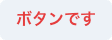
Buttonの文字色を赤に変更
「できた。じゃあ次はInputコンポーネントのスタイルを変更してみよう!」
const theme = extendTheme({
  components: {
    // Inputコンポーネントのカスタマイズを記述
    Input: {
      baseStyle: {
        bg: 'red.100', // 背景色を赤に変更
      },
    },
  },
});

export default function App() {
  return (
    <ChakraProvider theme={theme}>
      <Input placeholder="Inputです" variant="filled" />
    </ChakraProvider>
  );
}

Inputの背景色が赤にならない
「あれ?スタイルが当たらない...」
原因① multipart component の書き方になっていない
single part component と multipart component
Chakra UIのコンポーネントには大きく分けて2種類あります。
- single part component
- multipart component
Most components we build today are either single part components (e.g. Button, Badge) or multipart components (e.g. Tabs, Menu, Modal).
(現在、私たちが作っているほとんどのコンポーネントは、シングルパートコンポーネント(例:ボタン、バッジ)か、マルチパートコンポーネント(例:タブ、メニュー、モーダル)のどちらかです。)
single part component と multipart component ではスタイルの定義の仕方が異なります。
single part component のスタイルの定義例
export default {
  baseStyle: {
    // baseStyleなどの直下でスタイルを定義
    boxShadow: 'lg',
    rounded: 'lg',
    flexDirection: 'column',
    py: '2',
  },
}
multipart component のスタイルの定義例
You'll need to provide styles for each part, baseStyle, sizes, and variants.
(各パーツのスタイル、baseStyle、サイズ、バリアントを提供する必要があります。)
export default {
  baseStyle: {
    menu: {
      // baseStyleの直下ではなく、partsごとにスタイルを定義
      boxShadow: 'lg',
      rounded: 'lg',
      flexDirection: 'column',
      py: '2',
    },
    item: {
      // baseStyleの直下ではなく、partsごとにスタイルを定義
      fontWeight: 'medium',
      lineHeight: 'normal',
      color: 'gray.600',
    },
  },
}
single part component / multipart component の見分け方
今回スタイルをカスタマイズしたいInputコンポーネントはどちらなのかを確認します。
確認方法については以下の multipart component についての記載が参考になるようです。
If you're looking for a list of parts of a multipart component you can check it by clicking on the "View theme source" button at the top of the documentation page for that certain component.
(マルチパートコンポーネントのパーツ一覧を探している場合は、その特定のコンポーネントのドキュメントページの上部にある「テーマソースを見る」ボタンをクリックすることで確認できます。)
Inputコンポーネントのテーマソースを見に行きます。
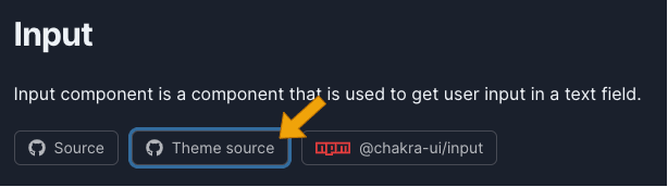
Inputコンポーネントのドキュメントにアクセスし、「Theme source」をクリック
この時点でbaseStyleの記述がfieldpartsに対してスタイルを定義しているのでmultipart componentであるとわかるのですが、せっかくなのでもう少し詳しくみてみます。
baseStyleの型がPartsStyleObjectに設定されています。
ドキュメントには(おそらく)記載はありませんが、ソースの方に
single part componentとmultipart componentで型の定義が異なる旨の記述があります。
- single part component で使用される型
SystemStyleObjectSystemStyleFunction
- multipart component で使用される型
PartsStyleObjectPartsStyleFunction
InputコンポーネントではPartsStyleObjectが使用されていたため、multipart componentであると判断できます。
multipart component で定義されているpartsの確認
multipart componentであることが分かったので、次は使用可能なpartsを確認します。
上記のPartsStyleObjectにジェネリクスでinputAnatomyが渡されているため、そちらのソースを確認します。
inputAnatomyの記述から、Inputコンポーネントには addon, field, element の3つのpartsが定義されていることがわかりました。
各パーツがどのように使用されるかは各コンポーネントのドキュメントを読んで確認します。
themeの記述を multipart component の形式に書き換える
今回スタイルを当てたいのは入力フィールドのため、fieldpartsに対してthemeでスタイルを上書きしていきます。
const theme = extendTheme({
  components: {
    Input: {
      baseStyle: {
        // field partsに対してスタイルを指定
        field: {
          bg: 'red.100',
        },
      },
    },
  },
});
Inputの背景色が赤にならない
「あれ...これでもまだスタイルが当たらない...」
原因② スタイルの優先度で負けている
2つ目の原因はスタイルの優先度でした。
Most component style consists of base or default styles and modifier styles that alter its size or visual style based on some properties or state.
(ほとんどのコンポーネントのスタイルは、基本スタイルまたはデフォルトスタイルと、いくつかのプロパティまたは状態に基づいてサイズやビジュアルスタイルを変更するモディファイアスタイルで構成されています。)
variant="filled"の場合のデフォルトの背景色は以下で定義されています。
variantsで定義されたスタイルの方がbaseStyleより優先されるため、スタイルが当たっていなかったようです。
themeで記述するスタイルをbaseStyleからvariantsに変更します。
const theme = extendTheme({
  components: {
    Input: {
      // variants の filled に対してスタイルを指定
      variants: {
        filled: {
          field: {
            bg: 'red.100',
          },
        },
      },
    },
  },
});

Inputの背景色が赤になった
これで無事スタイルが当たりました!
Discussion