Reactでドラッグ&ドロップで編集可能な画面を作るReact-Grid-Layoutについて
React-Grid-Layoutについて
ダッシュボードなどでユーザによって配置などの編集可能な画面を作成したい要件が出た場合などに、非常に有用なモジュールになります。
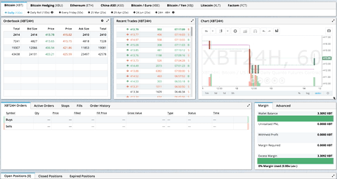
かなり凝った実装になりますが、公式のイメージは以下となります。
また、デモも公開されています。
試した内容
基本、今時はレスポンシブで使用すると思うので、レスポンシブに対応した形で実装をしています。
レスポンシブ用のエレメントをimportする
import { Responsive as ResponsiveGridLayout } from "react-grid-layout";
GridLayoutというのもあるのですが、レスポンシブにしたい場合はこちらが推奨のようです。
ResponsiveGridLayoutのプロパティ
今回使用したプロパティは以下になります。
      <ResponsiveGridLayout
        style={{ backgroundColor: "grey" }}
        breakpoints={{ lg: 1140, sm: 580, xs: 0 }}
        cols={{ lg: 12, sm: 9, xs: 3 }}
        margin={{ lg: [10, 10], md: [8, 8], xs: [5, 5] }}
        width={width}
        rowHeight={300}
        containerPadding={[34, 20]}
        isDraggable={isDesktop}
        draggableHandle=".draggable"
        layouts={layout}
        isResizable={false}
        onLayoutChange={(_curent, all) => {
          setLayout(all);
        }}
      >
設定したプロパティの解説
        breakpoints={{ lg: 1140, sm: 580, xs: 0 }}
        cols={{ lg: 12, sm: 9, xs: 3 }}
        margin={{ lg: [10, 10], md: [8, 8], xs: [5, 5] }}
        width={width}
	rowHeight={300}
breakpointsでは幅に合わせて、breakpointを設定できます。1140pxより大きい場合、lgと判定され、col(カラム)が12となります。
breakpointに合わせてmarginも設定できます。※[X、Y]になります。
ここでのポイントはbreakpointsは画面の実際の幅ではなく、ResponsiveGridLayoutの横幅で決まります。(つまりwidth)
なので、ResponsiveGridLayoutの親要素にmarginなどが設定されている場合などは、必要に応じて考慮を入れてください。
rowHeightは、後述しますが、アイテムのh(height)1つの高さのpxを指定するものになります。
isDraggableはアイテムのドラッグができるかどうかを設定するものです。ここで、isDesktop(デスクトップのみ)を設定しているのは、スマホ(タッチ式のデバイス)だとドラッグ時に画面のスクロールが発生しないため、使いにくことが原因です。
2023/5/14時点ではissueは上がっているものの、対応がされていない状態です。
        isDraggable={isDesktop}
        draggableHandle=".draggable"
        layouts={layout}
        isResizable={false}
        onLayoutChange={(_curent, all) => {
          setLayout(all);
        }}
draggableHandleはアイテム全体をドラッグ可能(つかむことができる範囲)としてしまうと、アイテムの中のボタンなどのクリック時にもドラッグしようとしてしまうため、draggableHandleに設定したclassを設定したアイテムの中の要素だけをドラッグ可能(つかむことができる範囲)にしています。
layoutsは後述しますが、breakpoint毎のレイアウトを設定できます。
isResizableはアイテムのサイズ変更の可否の設定です。今回は不可にしています。
onLayoutChangeはレイアウトの変更が走った際のコールバックを設定可能です。
_currentはlayoutsの中の現在適用されているlayoutの変更後の値を取得できます。
allは現在適用されていないもの含めたlayoutsの変更後の値を取得できます。
レイアウトの設定
const defaultLayout: ReactGridLayout.Layouts = {
  lg: [
    { x: 0, y: 0, w: 8, h: 2, i: "a" },
    { x: 8, y: 0, w: 4, h: 1, i: "b" },
    { x: 8, y: 0, w: 4, h: 1, i: "c" },
    { x: 0, y: 0, w: 8, h: 1, i: "d" },
    { x: 8, y: 0, w: 4, h: 1, i: "e" }
  ],
  sm: [
    { x: 0, y: 0, w: 6, h: 2, i: "a" },
    { x: 6, y: 0, w: 3, h: 1, i: "b" },
    { x: 6, y: 0, w: 3, h: 1, i: "c" },
    { x: 0, y: 3, w: 6, h: 1, i: "d" },
    { x: 6, y: 0, w: 3, h: 1, i: "e" }
  ],
  xs: [
    { x: 0, y: 0, w: 3, h: 1, i: "a" },
    { x: 1, y: 0, w: 3, h: 1, i: "b" },
    { x: 2, y: 0, w: 3, h: 1, i: "c" },
    { x: 3, y: 0, w: 3, h: 1, i: "d" },
    { x: 4, y: 0, w: 4, h: 1, i: "e" }
  ]
};
レイアウトはこのように設定しました。x,yはx軸、y軸をどこから始めるか設定するものです。
wは横幅のcolの設定になります。hは縦幅の設定になります。(上述の通り、h一つでなんpxになるかはrowHeightの設定になります。)
今回はレスポンシブということでResponsiveGridLayoutで設定したcolsに合わせてレイアウトを組んでいます。(lgはcolは12のため、12を使い切るように設定)
実装内容とコード全量

  "dependencies": {
    "@emotion/react": "11.11.0",
    "@emotion/styled": "11.11.0",
    "@mui/material": "5.13.0",
    "@types/react-grid-layout": "1.3.2",
    "loader-utils": "3.2.1",
    "react": "18.2.0",
    "react-device-detect": "2.2.3",
    "react-dom": "18.2.0",
    "react-grid-layout": "1.3.4",
    "react-scripts": "5.0.1"
  },
import { useEffect, useRef, useState } from "react";
import { Responsive as ResponsiveGridLayout } from "react-grid-layout";
import { isDesktop } from "react-device-detect";

import { Alert, Box, Button, Card, Snackbar, Typography } from "@mui/material";

const defaultLayout: ReactGridLayout.Layouts = {
  lg: [
    { x: 0, y: 0, w: 8, h: 2, i: "a" },
    { x: 8, y: 0, w: 4, h: 1, i: "b" },
    { x: 8, y: 0, w: 4, h: 1, i: "c" },
    { x: 0, y: 0, w: 8, h: 1, i: "d" },
    { x: 8, y: 0, w: 4, h: 1, i: "e" }
  ],
  sm: [
    { x: 0, y: 0, w: 6, h: 2, i: "a" },
    { x: 6, y: 0, w: 3, h: 1, i: "b" },
    { x: 6, y: 0, w: 3, h: 1, i: "c" },
    { x: 0, y: 3, w: 6, h: 1, i: "d" },
    { x: 6, y: 0, w: 3, h: 1, i: "e" }
  ],
  xs: [
    { x: 0, y: 0, w: 3, h: 1, i: "a" },
    { x: 1, y: 0, w: 3, h: 1, i: "b" },
    { x: 2, y: 0, w: 3, h: 1, i: "c" },
    { x: 3, y: 0, w: 3, h: 1, i: "d" },
    { x: 4, y: 0, w: 4, h: 1, i: "e" }
  ]
};

function App() {
  const [width, setWidth] = useState(0);
  const [layout, setLayout] = useState(defaultLayout);
  const [isOpen, setIsopen] = useState(false);

  const boxRef = useRef<HTMLDivElement>(null);

  useEffect(() => {
    const storagedLayout = window.localStorage.getItem("layout");
    if (storagedLayout) {
      setLayout(JSON.parse(storagedLayout));
    }
    function handleResize() {
      setWidth(boxRef.current?.clientWidth ?? 0);
    }
    window.addEventListener("resize", handleResize);
    handleResize();
    return () => window.removeEventListener("resize", handleResize);
  }, []);

  return (
    <Box ref={boxRef} sx={{ margin: { xs: "10px", md: "20px", lg: "30px" } }}>
      <Typography variant="h3">React-Grid-Layout sample</Typography>
      <Button
        sx={{ display: isDesktop ? "block" : "none" }}
        onClick={() => {
          window.localStorage.setItem("layout", JSON.stringify(layout));
          setIsopen(true);
        }}
      >
        現在のレイアウトを保存する
      </Button>
      <ResponsiveGridLayout
        style={{ backgroundColor: "grey" }}
        breakpoints={{ lg: 1140, sm: 580, xs: 0 }}
        cols={{ lg: 12, sm: 9, xs: 3 }}
        margin={{ lg: [10, 10], md: [8, 8], xs: [5, 5] }}
        width={width}
        rowHeight={300}
        containerPadding={[34, 20]}
        isDraggable={isDesktop}
        draggableHandle=".draggable"
        layouts={layout}
        isResizable={false}
        onLayoutChange={(_curent, all) => {
          setLayout(all);
        }}
      >
        <Card key="a">
          <Box margin={1}>
            <Typography style={{ cursor: "move" }} className="draggable">
              A
            </Typography>
            <Button onClick={() => alert("ts")}>テスト</Button>
          </Box>
        </Card>

        <Card key="b">
          <Box margin={1}>
            <Typography style={{ cursor: "move" }} className="draggable">
              B
            </Typography>
            <Button onClick={() => alert("ts")}>テスト</Button>
          </Box>
        </Card>

        <Card key="c">
          <Box margin={1}>
            <Typography style={{ cursor: "move" }} className="draggable">
              C
            </Typography>
            <Button onClick={() => alert("ts")}>テスト</Button>
          </Box>
        </Card>
        <Card key="d">
          <Box margin={1}>
            <Typography style={{ cursor: "move" }} className="draggable">
              D
            </Typography>
            <Button onClick={() => alert("ts")}>テスト</Button>
          </Box>
        </Card>
        <Card key="e">
          <Box margin={1}>
            <Typography style={{ cursor: "move" }} className="draggable">
              E
            </Typography>
            <Button onClick={() => alert("ts")}>テスト</Button>
          </Box>
        </Card>
      </ResponsiveGridLayout>
      <Snackbar
        open={isOpen}
        autoHideDuration={3000}
        onClose={() => setIsopen(false)}
      >
        <Alert
          onClose={() => setIsopen(false)}
          severity="success"
          sx={{ width: "100%" }}
        >
          This is a success message!
        </Alert>
      </Snackbar>
    </Box>
  );
}

export default App;
Discussion