こんにちは!テラーノベルとテラードラマでiOS/Android/Webとフロントエンド周りを担当している @kazutoyoです!
React NativeでTailwindライクにスタイリングする方法として、NativeWindが有名だと思います。
また新たな選択肢として、React Native Unistylesの開発チームが、Uniwindを発表しました。
Uniwindは、React Native Unistylesと同様に、パフォーマンスに重点を置いて開発されているようです。
無料版とPro版
無料版でも十分パフォーマンスが高いですが、Pro版はより高速なエンジンを搭載し、優先的なサポートをうけることができます。
| 機能 | 無料版 | Pro版 |
|---|---|---|
| Tailwind CSS サポート | ✅ 完全サポート | ✅ 完全サポート |
| テーマシステム | ✅ ライト、ダーク、カスタム | ✅ ライト、ダーク、カスタム |
| プラットフォームセレクター | ✅ iOS、Android、Web | ✅ iOS、Android、Web |
| CSSパーサー | ✅ 含まれる | ✅ 含まれる |
| Expo Go 互換性 | ✅ あり | ❌ dev clientが必要 |
| パフォーマンス | ⚡ Unistyles 3.0と同等 | 🚀 クラス最高 |
| エンジン | JavaScriptベース | Unistylesエンジン搭載C++ |
| シャドウツリー更新 | 標準的な再レンダリング | ✨ 再レンダリングなし |
| アニメーションサポート | ❌ 変換レイヤーなし、styleプロパティの使用が必要 |
✨ className経由でReanimated 4をサポート |
| ネイティブ更新 | ❌ RNフック内蔵 | ✨ C++からのすべてのプラットフォーム固有値 |
| Props自動マッピング | ✅ すべてのRNコンポーネント | ✅ すべてのRNコンポーネント |
| ライセンス | MIT & 商用 | 商用 |
| サポート | コミュニティ | ✨ 優先サポート |
| プロジェクト制限 | 無制限 | 無制限 |
https://docs.uniwind.dev/pro-version より
まずは無料版で開発を行い、より高いパフォーマンスが必要になったときにProにアップグレードすると良いらしいです。
現在、Pro版は$99/年を予定しているようです。(2025年10月10日時点)
パフォーマンス
Uniwindはパフォーマンスも売りにしています。
React NativeのStylesheet API、Unistyles 3、Uniwind、Nativewind 4のパフォーマンス比較すると、Nativewindよりもかなりレンダリングパフォーマンスが良いようです。

*https://github.com/Unistyles-OSS/uniwind-benchmarks&
試してみる
Expoで新たにプロジェクトを作成し、Uniwindを導入してみましょう!
1. プロジェクトの作成とUniwindの追加
Expoのプロジェクトを作成し、Uniwindを追加します。(ここでは uniwind-sample というプロジェクトを作成)
npx create-expo-app@latest uniwind-sample
cd uniwind-sample
npm install uniwind@beta tailwindcss
2. global.cssファイルを追加
app/ 配下に global.css ファイルを追加します。
そこに以下のCSSを追加します。
@import 'tailwindcss';
@import 'uniwind';
3. global.cssファイルをインポートする
Expo Routerを使っているプロジェクトでは、 app/_layout.tsx で global.css ファイルをimportします。
次の一文を追加します。
import "./global.css";
4. Metroの設定を追加
metro.config.jsを追加します。
プロジェクトにない場合 npx expo customize metro.config.js を実行し、作成します。
次のように、 withUniwindConfig でconfigをラップし、cssEntryFileとdtsFileのパスを指定します。
const { getDefaultConfig } = require('expo/metro-config');
const { withUniwindConfig } = require('uniwind/metro');

const config = getDefaultConfig(__dirname);

// your metro modifications

module.exports = withUniwindConfig(config, {
  cssEntryFile: './app/global.css',
  dtsFile: './app/uniwind-types.d.ts'
});
5. 起動する
アプリケーションをビルドし、Expoを起動しましょう!
この際、ビルドされて ./app/uniwind-types.d.ts に型定義ファイルが出力されます。
npm run start
6. Uniwindでスタイリングする
型定義ファイルが生成されると、 View コンポーネントなどに、 className Propsを渡せるようになります。
これでTailwindライクにスタイリングすることが可能です!
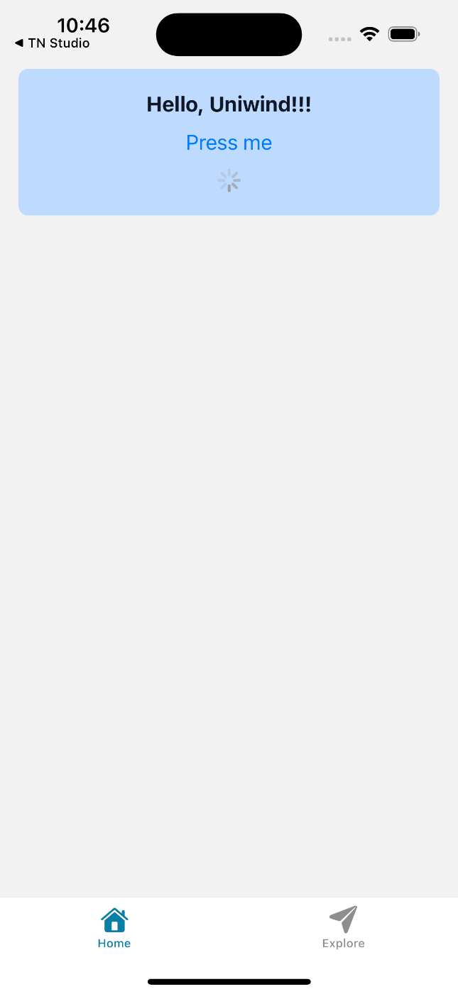
import { ActivityIndicator, Button, Text, View } from "react-native";
import { SafeAreaView } from "react-native-safe-area-context";

export default function HomeScreen() {
  return (
    <SafeAreaView>
      <View className="flex-col px-4 gap-4">
        <View className="p-4 rounded-lg bg-blue-200 dark:bg-blue-800">
          <Text
            className="text-center text-lg font-bold text-gray-900 dark:text-white"
            selectionColorClassName="accent-bg-blue-500"
          >
            Hello, Uniwind!!!
          </Text>

          <Button
            title="Press me"
            colorClassName="accent-bg-blue-500 dark:accent-bg-blue-400"
            onPress={() => console.log("Pressed")}
          />

          <ActivityIndicator
            className="my-1"
            size="small"
            colorClassName="accent-bg-blue-500 dark:accent-bg-blue-400"
          />
        </View>
      </View>
    </SafeAreaView>
  );
}
7. 結果
無事スタイリングが反映されました!
セットアップはかなり簡潔ですね!
API
Uniwindで用意されているAPIをご紹介します。
withUniwind
サードパーティのライブラリなどで、直接 className を指定できない場合があります。
withUniwind を使うことで、サードパーティのライブラリでもUniwindでスタイリングを可能にすることができます。
例えば、expo-imageを対応する場合、以下のように行います。
import { Image } from "expo-image";
import { withUniwind } from "uniwind";

const UniImage = withUniwind(Image);

/// ...


    <UniImage
      source={{
        uri: "https://~",
      }}
      className="w-10 h-10 object-cover rounded-full"
    />
これにより、以下のアイコンのようにスタイリングが可能になります。
useUniwind
useUniwind フックにより、現在のテーマ情報を取得することができます。
たとえば、次のようにテーマを取得し、それによって分岐を行うなどの処理を行えます。
import { useUniwind } from 'uniwind'
import { View, Text } from 'react-native'

export const ThemedIcon = () => {
  const { theme } = useUniwind()

  return (
    <View className="p-4">
      {theme === 'dark' ? (
        <MoonIcon className="text-white" />
      ) : (
        <SunIcon className="text-yellow-500" />
      )}
    </View>
  )
}
CSSパーサー
UniwindにはCSSパーサーが搭載されています。
それにより、カスタムなCSSを定義し、コンポーネントに反映することができます。
.card {
    background-color: white;
    border-radius: 8px;
    box-shadow: 0 2px 4px rgba(0, 0, 0, 0.1);
}
<View className="card p-4 m-2">
    <View className="flex-row justify-center mb-4">
        <UniImage
          source={{
            uri: "https://~",
          }}
          className="w-10 h-10 object-cover rounded-full self-center"
        />

        <Text className="text-sm font-bold text-gray-900 dark:text-white ml-2 self-center">
          Kazutoyo Tokai
        </Text>
    </View>
    <View className="flex-1">
      <Text>I love React Native</Text>
    </View>
</View>
カスタムCSSは次のようなときに役立ちます
- ユーティリティでは冗長になる複雑で再利用可能なコンポーネントスタイル
- 既存のWebコードベースをReact Nativeに移行する
- 一貫したスタイルでデザインシステムコンポーネントを定義する
- 高度なアニメーションとトランジション
Platformセレクター
プラットフォームごとにスタイルを変えたい場合に、こちらのPlatformセレクターが利用できます。
次のように、 ios: のようなprefixを追加することで、それぞれのプラットフォームごとの設定が可能です。
<View className="ios:bg-red-500 android:bg-blue-500 web:bg-green-500 p-2 rounded-2xl">
    <Text className="ios:text-white android:text-white web:text-black">
      This component has different styles on each platform
    </Text>
</View>
テーマ
Tailwind v4と同じく、テーマの設定はCSSで行います。
global.css に次のように定義します。
@import 'tailwindcss';
@import 'uniwind';

@theme {
  /* Customize base font size */
  --font-size-base: 15px;

  /* Customize spacing scale */
  --spacing-1: 4px;
  --spacing-2: 8px;
  --spacing-3: 12px;
  --spacing-4: 16px;

  /* Customize border radius */
  --radius-sm: 4px;
  --radius-md: 8px;
  --radius-lg: 12px;
  --radius-xl: 16px;

  /* Add custom colors */
  --color-primary: #3b82f6;
  --color-secondary: #8b5cf6;
  --color-accent: #ec4899;
}
次のように、 useUniwind フックで現在のテーマを取得し、 Uniwind.setTheme() でテーマの設定が可能です。
また、 dark: プレフィクスで、ダーク時のスタイルが定義できます。
import { View, Pressable, Text } from 'react-native'
import { Uniwind, useUniwind } from 'uniwind'

export const ThemeSwitcher = () => {
  const { theme } = useUniwind()

  const themes = [
    { name: 'light', label: 'Light', icon: '☀️' },
    { name: 'dark', label: 'Dark', icon: '🌙' },
    { name: 'system', label: 'System', icon: '⚙️' },
  ]

  return (
    <View className="flex-row gap-2 p-4">
      {themes.map((t) => (
        <Pressable
          key={t.name}
          onPress={() => Uniwind.setTheme(t.name)}
          className={`
            px-4 py-2 rounded-lg
            ${theme === t.name ? 'bg-blue-500' : 'bg-gray-200 dark:bg-gray-700'}
          `}
        >
          <Text className={theme === t.name ? 'text-white' : 'text-gray-900 dark:text-white'}>
            {t.icon} {t.label}
          </Text>
        </Pressable>
      ))}
    </View>
  )
}
まとめ
Uniwindは、セットアップの簡単さとパフォーマンスの高さに加え、Tailwindと同じ記法が使えることで、ウェブ開発者がReact Nativeに挑戦しやすくなる新しいスタイリングツールとして登場しました。
また、Tailwindライクなスタイリングで現在最も使われているNativewindもv5が登場し、ExpoもCSSパーサーとTailwindサポートを進めているなど、各プロジェクトがしのぎを削っています。
今後、Tailwindライクなスタイリングを行う覇権はどこになるのでしょうか?
それぞれが競い合って、良いものになると良いなと思います。
それではよいReact Nativeライフを!
今回のサンプルプロジェクト
Discussion