🛸
Flutter 入門 最低限覚えたいWidget 7選

初めに
flutterで最低限のUI(見た目)を組むために、必要なよく使うWidgetを7つ記述します。
自分なりの理解しやすい解釈で書いています。
◎Scaffold
UIを組んでいくスタート地点。このScaffoldの中に色々なパーツを配置して、UIを作っていく。
Scaffoldは足場という意味。
  @override
  Widget build(BuildContext context) {
    return Scaffold(
    //この中にパーツを配置していく
    );
  }
◎AppBar
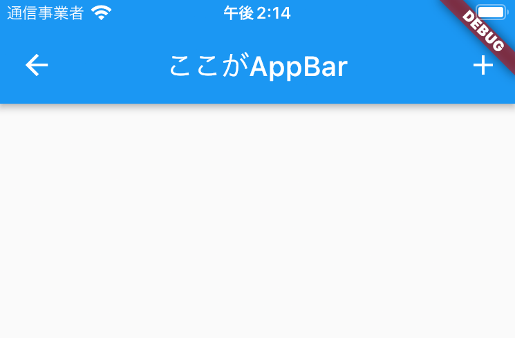
アプリでよく見る画面上部のタイトル等が配置されている部分。
下記画像の青い部分
⚪︎AppBarでよく使うプロパティ
| プロパティ名 | 説明 |
|---|---|
| leading | AppBarの一番左の部分。アイコンを配置する事が多いが、Textや画像なども配置する事ができる |
| title | タイトルを表示する |
| actions | widgetを配置できる。アイコンボタンを設置する事が多い |
    return Scaffold(
      appBar: AppBar(
        //左側のアイコン
        leading: Icon(Icons.arrow_back),
	//タイトル
        title: Text('ここがAppBar'),
        //右側のアイコン
        actions: [
          IconButton(
            onPressed: (){},
            icon: Icon(Icons.add),
          ),
        ],
      ),
◎Container
Containerは,文字通りコンテナで、色々な部品を入れていく箱のようなイメージ。
HTMLのdiv要素のように領域確保したり他のWidgetを入れたりする。
色や、高さ、横幅の設定も色々できる。
⚪︎Containerでよく使うプロパティ
| プロパティ名 | 説明 |
|---|---|
| width | コンテナの横幅を指定 |
| height | コンテナの縦幅を指定 |
| color | コンテナの色を指定 |
| margin | マージン幅を指定 |
| padding | パディング幅を指定 |
| child | 子Widgetを1つ指定(childの中に色々設置できる) |
| decoration | ボーダーのスタイルを変更したい場合などに使用する |
    return Scaffold(
      appBar: AppBar(
      ),
      body: Container(
        color: Colors.yellow,
        width: double.infinity,
        height: double.infinity,
        child: Row(
◎Column
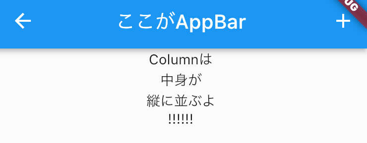
Columnの中に配置されているWidgetを縦に並べることができます。
⚪︎Columnでよく使うプロパティ
mainAxisAlignmentとcrossAxisAlignmentはHTML,CSSのFlexBOXのようなもの。
| プロパティ名 | 説明 |
|---|---|
| children | 複数のWidgetを配列にして並べる |
| mainAxisAlignment | y軸の表示方法を指定 |
| crossAxisAlignment | x軸の表示方法を指定 |
| textDirection | y軸の開始位置を指定 |
child: Column(
  children: [
    Text('Columnは'),
    Text('中身が'),
    Text('縦に並ぶよ'),
    Text('!!!!!!'),
  ],
),
◎Row
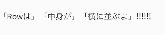
Rowの中に配置されているWidgetを横に並べることができます。
⚪︎Rowでよく使うプロパティ
mainAxisAlignmentとcrossAxisAlignmentはHTML,CSSのFlexBOXのようなもの。
| プロパティ名 | 説明 |
|---|---|
| children | 複数のWidgetを配列にして並べる |
| mainAxisAlignment | x軸の表示方法を指定 |
| crossAxisAlignment | y軸の表示方法を指定 |
| textDirection | x軸の開始位置を指定 |
child: Row(
  children: [
    Text('「Rowは」'),
    Text('「中身が」'),
    Text('「横に並ぶよ」'),
    Text('!!!!!!'),
  ],
),
◎Text
テキストを表示できる。スタイルや表示位置を変えることもできる。
Textの下(子)にはWidgetは追加できない。
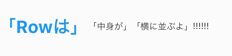
⚪︎Textでよく使うプロパティ
| プロパティ名 | 説明 |
|---|---|
| style | テキストの色や大きさ等を指定 TextStyleを使う |
| textAlign | テキストの位置を指定 TextAlignを使う |
TextStyleでよく使うプロパティ
| プロパティ名 | 説明 |
|---|---|
| fontSize | テキストのサイズを指定 |
| color | テキストの色を指定 |
| fontStyle | テキストのスタイルを指定 |
| fontWeight | テキストの太さを指定 |
| letterSpacing | テキスト間のスペースを指定 |
textAlignでよく使うプロパティ
| プロパティ名 | 説明 |
|---|---|
| left | 左寄せ |
| center | 中央寄せ |
| right | 右寄せ |
  children: [
    Text('「Rowは」',
    style: TextStyle(
      fontSize: 28,
      color: Colors.blue,
      fontWeight: FontWeight.bold,
    ),
    ),
    Text('「中身が」'),
    Text('「横に並ぶよ」'),
    Text('!!!!!!'),
◎Center
Centerの中に配置されているWidgetを中央に配置できる。
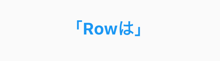
⚪︎Centerでよく使うプロパティ
| プロパティ名 | 説明 |
|---|---|
| child | 子Widgetを1つ指定(childの中に色々設置できる) |
body: Center(
 child: Text(
   '「Rowは」',
 style: TextStyle(
   fontSize: 28,
   color: Colors.blue,
   fontWeight: FontWeight.bold,
  ),
 ),
),
終わりに
Twitterでも情報発信しておりますので、ぜひフォローお願い致します!
Discussion