Swapyでdashboardを作ろう
Swapyとは
Swapyとは下記に示した通り、ドラックでレイアウトを変更できるツールです。
英語
A simple JavaScript tool for converting any layout you have to drag-to-swap layout
日本語
あらゆるレイアウトをドラッグ・トゥ・スワップ・レイアウトに変換するシンプルなJavaScriptツール
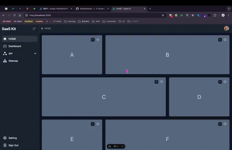
今回作成するもの
下記のGIF通りにコンテンツを自分で選択でき、尚且つ並べ替えができるレイアウトのダッシュボードを作成します。
また並べ替えた結果をlocal storageに保存することによって、次にページに訪れた際も自分が並べ替えた状態で描画されるようにします。
使用技術
- "vue": "latest" (Nuxt3)
- "@nuxtjs/tailwindcss": "^6.12.1"
- "swapy": "^0.0.6"
- "flowbite": "^2.4.1"
- "vue3-apexcharts": "^1.5.3"
- "@vueuse/core": "^10.11.0"
- "@vueuse/nuxt": "^10.11.0"
環境構築
まずはNuxtのプロジェクトを作ります。
プロジェクトを作りたいディレクトリに移動して、下記コマンドを実行します。
pnpm dlx nuxi@latest init swapy-project
※swapy-projectの部分は自分の好きなプロジェクト名でOKです
続いて、ライブラリをインストールしていきます。
tailwind
pnpm i -D @nuxtjs/tailwindcss
また、nuxt.config.tsのmodulesに追加します。
export default defineNuxtConfig({
  ...,
  modules: [
+    "@nuxtjs/tailwindcss",
  ],

+  tailwindcss: {
+    cssPath: ["~/assets/css/tailwind.css", { injectPosition: "first" }],
+    configPath: "tailwind.config",
+    exposeConfig: {
+      level: 2,
+    },
+    config: {},
+    viewer: true,
+  },
  ...
});
VueUse
pnpm i -D @vueuse/nuxt @vueuse/core
また、nuxt.config.tsのmodulesに追加します。
export default defineNuxtConfig({
  ...,
  modules: [
    "@nuxtjs/tailwindcss",
+   "@vueuse/nuxt"
  ],
  ...
});
swapy
pnpm install swapy
apexcharts
pnpm i -D apexcharts vue3-apexcharts
またplugins/apexchart.client.tsファイルを作り、下記を記載します。
import VueApexCharts from "vue3-apexcharts";
export default defineNuxtPlugin((nuxtApp) => {
  nuxtApp.vueApp.use(VueApexCharts);
});
flowbite
pnpm install flowbite
またcomposables/useFlowbite.tsファイルを作り、下記を記載します。
export function useFlowbite(callback: any) {
  if (process.client) {
    import("flowbite").then((flowbite) => {
      callback(flowbite);
    });
  }
}
こちらで準備が整いましたので、実装に移っていきます。
実装
実装はサイドバーとヘッダーを除いたdashboard部分です。
pages/index.vue
コード詳細
<script setup lang="ts">
import Card from "@/components/dashboard/Card.vue";
import { createSwapy } from "swapy";

definePageMeta({
  title: "HOME",
});

useHead({
  title: "HOME",
});

const isReady = ref(false);

type CardDataType = {
  title: string;
  content: string;
  dataSwapyItem: string;
};

// card data
const cardData = ref<Record<string, CardDataType>>({
  a: { title: "Card A", content: "A", dataSwapyItem: "a" },
  b: { title: "Card B", content: "B", dataSwapyItem: "b" },
  c: { title: "Card C", content: "C", dataSwapyItem: "c" },
  d: { title: "Card D", content: "D", dataSwapyItem: "d" },
  e: { title: "Card E", content: "E", dataSwapyItem: "e" },
  f: { title: "Card F", content: "F", dataSwapyItem: "f" },
  g: { title: "Card E", content: "G", dataSwapyItem: "g" },
  h: { title: "Card F", content: "H", dataSwapyItem: "h" },
});

type SlotItemType = "a" | "b" | "c" | "d" | "e" | "f" | "g" | "h" | null;

// default slot items
const DEFAULT: Record<string, SlotItemType> = {
  "1": "a",
  "2": "b",
  "3": "c",
  "4": "d",
  "5": "e",
  "6": "f",
  "7": "g",
  "8": "h",
};

// slot items
const slotItems = ref<Record<string, SlotItemType>>(DEFAULT);

// emit updateCardData event
const updateCardData = (dataSwapyItem: string, newContent: string) => {
  if (dataSwapyItem in cardData.value) {
    cardData.value[dataSwapyItem].content = newContent;
    localStorage.setItem("cardDataItems", JSON.stringify(cardData.value));
  }
};

// initialize slot items
onMounted(async () => {
  const slotItem = localStorage.getItem("slotItem");
  const cardDataItems = localStorage.getItem("cardDataItems");

  if (slotItem) {
    slotItems.value = JSON.parse(slotItem);
  }

  if (cardDataItems) {
    cardData.value = JSON.parse(cardDataItems);
  }

  isReady.value = true;

  await nextTick();

  const container = document.querySelector(".container");

  if (container) {
    try {
      const swapy = createSwapy(container, {
        animation: "dynamic",
      });

      if (!swapy) {
        throw new Error("Swapy instance is undefined");
      }

      swapy.onSwap(({ data }) => {
        if (data?.object) {
          localStorage.setItem("slotItem", JSON.stringify(data.object));
        }
      });
    } catch (error) {
      console.error("Error creating Swapy:", error);
    }
  } else {
    console.error("Container element not found");
  }
});

function getItemById(itemId: SlotItemType) {
  if (itemId && itemId in cardData.value) {
    return { component: Card, props: cardData.value[itemId] };
  }
  return { component: null, props: {} };
}

const slotClasses = {
  "1": "col-start-1 col-end-2 bg-gray-100",
  "2": "col-start-2 col-end-4 bg-slate-400",
  "3": "col-start-1 col-end-3 bg-slate-400",
  "4": "col-start-3 col-end-4 bg-gray-100",
  "5": "col-start-1 col-end-2 bg-gray-100",
  "6": "col-start-2 col-end-4 bg-slate-400",
  "7": "col-start-1 col-end-3 bg-slate-400",
  "8": "col-start-3 col-end-4 bg-gray-100",
};
</script>

<template>
  <div
    v-if="isReady"
    class="container relative z-10 grid h-full max-w-none grid-cols-3 grid-rows-[1fr_1fr_1fr] gap-5"
  >
    <div
      v-for="slotId in Object.keys(slotItems)"
      :key="slotId"
      :class="[
        'slot min-h-64 rounded-md border border-gray-200 bg-gray-300 dark:border-gray-700 dark:bg-gray-800',
        slotClasses[slotId as keyof typeof slotClasses],
      ]"
      :data-swapy-slot="slotId"
    >
      <component
        :is="getItemById(slotItems[slotId]).component"
        v-bind="getItemById(slotItems[slotId]).props"
        @updateCardData="updateCardData"
      />
    </div>
  </div>
</template>
components/dashboard/Card.vue
コード詳細
<script setup lang="ts">
import { ref, watch } from "vue";
import Dropdown from "@/components/dashboard/Dropdown.vue";
import ColumnChart from "@/components/dashboard/ColumnChart.vue";
import News from "@/components/dashboard/News.vue";

const props = defineProps<{
  title: string;
  content: string;
  dataSwapyItem: string;
}>();

const emit = defineEmits<{
  (e: "updateCardData", dataSwapyItem: string, content: string): void;
}>();

const setContent = ref(props.content);

const updateContent = (content: string) => {
  setContent.value = content;
  emit("updateCardData", props.dataSwapyItem, content);
};

// watch for content changes
watch(
  () => props.content,
  (newContent) => {
    setContent.value = newContent;
  },
);
</script>

<template>
  <div
    class="item relative flex h-full w-full select-none items-center justify-center rounded-md bg-white text-4xl text-gray-700 dark:bg-slate-500 dark:text-gray-300"
    :data-swapy-item="props.dataSwapyItem"
  >
    <div
      class="handle absolute right-4 top-4 z-10 h-6 w-6 cursor-pointer"
      data-swapy-handle
    >
      <svg
        xmlns="http://www.w3.org/2000/svg"
        width="100%"
        height="100%"
        viewBox="0 0 24 24"
      >
        <path
          fill="none"
          stroke="currentColor"
          stroke-linecap="round"
          stroke-linejoin="round"
          stroke-width="1.5"
          d="M12 3v6m-9 3h6m12 0h-6m-3 9v-6.5M9 6l1.705-1.952C11.315 3.35 11.621 3 12 3c.38 0 .684.35 1.295 1.048L15 6m0 12l-1.705 1.952C12.685 20.65 12.379 21 12 21c-.38 0-.684-.35-1.295-1.048L9 18m9-9l1.952 1.705C20.65 11.315 21 11.621 21 12c0 .38-.35.684-1.048 1.295L18 15M6 15l-1.952-1.705C3.35 12.685 3 12.379 3 12c0-.38.35-.684 1.048-1.295L6 9"
          color="currentColor"
        />
      </svg>
    </div>
    <Dropdown @updateContent="updateContent" />
    <div
      v-if="setContent === 'API Usage'"
      class="item-card started relative h-full w-full px-1 pt-8"
    >
      <ColumnChart />
    </div>
    <div
      v-if="setContent === 'News'"
      class="relative h-full max-h-64 w-full overflow-scroll px-6 pb-6 pt-16"
    >
      <News />
    </div>
    <div v-if="setContent === 'Profile'">
      <div class="text-4xl">Profile</div>
    </div>
    <div
      v-if="
        setContent !== 'API Usage' &&
        setContent !== 'News' &&
        setContent !== 'Profile'
      "
      class="relative flex h-full min-h-52 w-full items-center justify-center overflow-hidden px-6 py-6"
    >
      <div class="text-4xl">{{ setContent }}</div>
    </div>
  </div>
</template>
components/dashboard/Dropdown.vue
コード詳細
<script setup lang="ts">
import { onClickOutside } from "@vueuse/core";

// open/close dropdown
const isOpen = ref(false);
const emit = defineEmits(["updateContent"]);
const toggleDropdown = () => {
  isOpen.value = !isOpen.value;
};

// emit event to parent for updating content
const updateContent = (content: string) => {
  emit("updateContent", content);
};

// outside click to close dropdown
const target = ref(null);
onClickOutside(target, (event) => (isOpen.value = false));

// select items
const selectItems = ref([
  { id: 1, name: "News" },
  { id: 2, name: "API Usage" },
  { id: 3, name: "Profile" },
]);
</script>

<template>
  <button
    id="multiLevelDropdownButton"
    data-dropdown-toggle="multi-dropdown"
    class="absolute right-12 top-4 z-10 rounded-lg border border-gray-200 bg-white px-2 py-2 text-sm font-medium text-gray-900 hover:bg-gray-100 hover:text-blue-700 focus:z-10 focus:outline-none focus:ring-4 focus:ring-gray-100 dark:border-gray-600 dark:bg-gray-800 dark:text-gray-400 dark:hover:bg-gray-700 dark:hover:text-white dark:focus:ring-gray-700"
    type="button"
    @click="toggleDropdown"
    ref="target"
  >
    <svg
      class="h-2 w-2"
      aria-hidden="true"
      xmlns="http://www.w3.org/2000/svg"
      fill="none"
      viewBox="0 0 10 6"
    >
      <path
        stroke="currentColor"
        stroke-linecap="round"
        stroke-linejoin="round"
        stroke-width="2"
        d="m1 1 4 4 4-4"
      />
    </svg>
  </button>

  <!-- Dropdown menu -->
  <div
    id="multi-dropdown"
    class="absolute right-12 top-14 z-10 w-44 divide-y divide-gray-100 rounded-lg bg-white shadow dark:bg-gray-700"
    :class="isOpen ? 'block' : 'hidden'"
  >
    <ul
      class="py-2 text-sm text-gray-700 dark:text-gray-200"
      aria-labelledby="multiLevelDropdownButton"
    >
      <li
        v-for="items in selectItems"
        @click="updateContent(`${items.name}`)"
        :key="items.id"
      >
        <span
          class="block px-4 py-2 hover:bg-gray-100 dark:hover:bg-gray-600 dark:hover:text-white"
        >
          {{ items.name }}
        </span>
      </li>
    </ul>
  </div>
</template>
components/dashboard/ColumnChart.vue
コード詳細
<script setup lang="ts">
// ref: https://stackblitz.com/edit/nuxt-starter-mmn2ed?file=nuxt.config.ts,app.vue,plugins%2Fapexchart.client.ts

type ChartOptions = {
  chart: {
    type: string;
  };
  plotOptions: {
    bar: {
      borderRadius: number;
      borderRadiusApplication: string;
    };
  };
  xaxis?: {
    categories: (string | number)[];
  };
};

type SeriesData = {
  name: string;
  data: number[];
};

const options = ref<ChartOptions>({
  chart: {
    type: "bar",
  },
  plotOptions: {
    bar: {
      borderRadius: 5,
      borderRadiusApplication: "around",
    },
  },
});

const series = ref<SeriesData[]>([
  {
    name: "Score",
    data: [],
  },
]);

const updateChart = () => {
  //generate array of random numbers of length 10
  const data = Array.from({ length: 10 }, () =>
    Math.floor(Math.random() * 100),
  );
  options.value = {
    ...options.value,
    xaxis: {
      categories: Array.from(
        { length: 10 },
        (_, i) => new Date().getFullYear() - i,
      ),
    },
  };
  series.value = [
    {
      name: "Score",
      data: data,
    },
  ];
};

onMounted(() => {
  //generate array of random numbers of length 10
  setTimeout(() => {
    updateChart();
  }, 500);
});
</script>

<template>
  <h3 class="absolute left-4 top-3 text-2xl">API Usage</h3>
  <apexchart
    :key="series"
    height="100%"
    width="100%"
    :options="options"
    :series="series"
  ></apexchart>
</template>

<style>
.apexcharts-toolbar {
  display: none !important;
}
</style>
components/dashboard/News.vue
コード詳細
<script setup lang="ts"></script>

<template>
  <h3 class="absolute top-4 mb-4 text-2xl">News</h3>
  <p class="text-base text-gray-500 dark:text-white">
    Track work across the enterprise through an open, collaborative platform.
    Link issues across Jira and ingest data from other software development
    tools, so your IT support and operations teams have richer contextual
    information to rapidly respond to requests, incidents, and changes.
  </p>
  <hr class="my-4 h-px border-0 bg-gray-200 dark:bg-white" />
  <p class="text-base text-gray-500 dark:text-white">
    Deliver great service experiences fast - without the complexity of
    traditional ITSM solutions.Accelerate critical development work, eliminate
    toil, and deploy changes with ease, with a complete audit trail for every
    change.
  </p>
</template>
最後に
今回はコードの説明などは省きますが、基本的に環境構築のところで触れたURLを見ながら作成しました。
またlocalstorageへの保存のタイミングなどは下記GitHubを参考に作成しました。
module系は少し変な設定をしていますが、調べた限りだとそのように設定するしかありませんでした。
(apexchartsとか)
このウィジェットのような管理画面は、エンドユーザーが自分の欲しい情報を自分の見たいところに表示できるというのがいい点だと思います。
また、今後はrowやcolumnもエンドユーザーで変更できるようにすれば、また自由度が上がっていいのかなとも思ってます。
進化させていきます〜!
Discussion