Unity で作った WebGL のアプリを React + MUI で良い感じに置く
はじめに
GitHub Pages を使ってサイトを公開する方法を共著で記事を書いた。
この記事を作るためにいろいろ調べていたとき「Unity で作ったちょっとしたものをどうやってデプロイするのか」という話が出てきたので、やってみた。
イメージがわかるように以下に成果物としてページリンクを貼っておく。
なお、GitHub Pages を使って公開する方法は冒頭に載せた二つの記事を参考にするか、調べてみてほしい。
Unity で作った WebGL のアプリをどうやって React で扱うか
ありがたいことに React Unity WebGL という神ツールがすでにあるのでこれを使う。
package.jsonと同じ階層にpublicディレクトリを作り、そこに Unity からビルドしたファイル群を入れる。あとはpublicディレクトリ以降のパスを React Unity WebGL 側に渡してあげれば良い。公式にある例であればpublic/buildディレクトリに入れる。
import React from "react";
import { Unity, useUnityContext } from "react-unity-webgl";

function App() {
  const { unityProvider } = useUnityContext({
    loaderUrl: "build/myunityapp.loader.js",
    dataUrl: "build/myunityapp.data",
    frameworkUrl: "build/myunityapp.framework.js",
    codeUrl: "build/myunityapp.wasm",
  });

  return <Unity unityProvider={unityProvider} />;
}
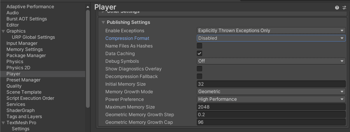
ただし、Unityでの出力設定には注意が必要で、Player Settings > Playerにある WebGLのタブを開いた中のPulishing Settings > Compression FormatをDisabledにしておく。Brotliなどが設定されている場合、ビルドファイルが圧縮ファイルとなり、React Unity WebGL 側で読み込んでくれなかった。
読み込み中はローディング画面を表示する
無圧縮のファイルを読み込んでこなければならないため、それに少し時間がかかる。また読み込んでくる間は何も表示されず、フィードバックがないためユーザー体験としては悪い。
そこで MUI の<CircularProgress/>を利用して読み込んでいる間はローディング中であることを明示し、読み込み終わったら Unity の画面を表示できれば良い。
まずは以下のような<AppLoading/>を用意する。
import { Box, CircularProgress, SxProps, Theme } from "@mui/material";

export type AppLoadingProps = {
  sx?: SxProps<Theme>;
  loadingSize?: string | number;
};

export function AppLoading({ sx, loadingSize = 100 }: AppLoadingProps) {
  return (
    <Box
      sx={sx}
      width="100%"
      height="100%"
      color="#ffffff"
      display="flex"
      justifyContent="center"
      alignItems="center"
    >
      <CircularProgress size={loadingSize} color="inherit" />
    </Box>
  );
}
あとはローディング中は<AppLoading/>を表示するようにすれば良い。React Unity WebGL のuseUnityContextからローディングの状態を取得できるようになっていて、今回はisLoadedを使って調整する。
ここで、ただ単純にisLoaded ? <AppLoading/> : <Unity/>のような構図でやってしまうとうまくいかなかった。どうやら<Unity/>コンポーネントは条件によらず常にDOM上に存在しないといけないらしい。ということで重ねて表示して、visibilityをisLoadedでオンオフできれば良い。意外と"重ねて表示"に手こずったが、親要素にposition: "relative", 子要素にはposition: "absolute"で場所を指定することで成功した。
import { Box, SxProps, Theme } from "@mui/material";
import { Unity, useUnityContext } from "react-unity-webgl";
import { AppLoading } from "./AppLoading";

export type UnityAppProps = {
  sx?: SxProps<Theme>;
};

export function UnityApp({ sx }: UnityAppProps) {
  const { unityProvider, isLoaded } = useUnityContext({
    loaderUrl: "build/myunityapp.loader.js",
    dataUrl: "build/myunityapp.data",
    frameworkUrl: "build/myunityapp.framework.js",
    codeUrl: "build/myunityapp.wasm",
  });

  return (
    <Box sx={sx} bgcolor={"#000000"} position="relative">
      <AppLoading
        sx={{
          position: "absolute",
          top: 0,
          left: 0,
          visibility: isLoaded ? "hidden" : "visible",
        }}
      />
      <Unity
        unityProvider={unityProvider}
        style={{
          position: "absolute",
          top: 0,
          left: 0,
          width: "100%",
          height: "100%",
          zIndex: 1,
          visibility: isLoaded ? "visible" : "hidden",
        }}
      />
    </Box>
  );
}
フルスクリーンモードに対応する 【2024/02/25 追記】
React Unity WebGL にはゲーム画面をフルスクリーンで表示する機能が提供されている。requestFullscreenを使えば良い。
- import { Box, SxProps, Theme } from "@mui/material";
+ import { Box, Stack, Button, SxProps, Theme } from "@mui/material";
+ import FullscreenIcon from "@mui/icons-material/Fullscreen";
  import { Unity, useUnityContext } from "react-unity-webgl";
  import { AppLoading } from "./AppLoading";

  export type UnityAppProps = {
    sx?: SxProps<Theme>;
  };

  export function UnityApp({ sx }: UnityAppProps) {
-   const { unityProvider, isLoaded } = useUnityContext({
+   const { unityProvider, isLoaded, requestFullscreen } = useUnityContext({
      loaderUrl: "build/myunityapp.loader.js",
      dataUrl: "build/myunityapp.data",
      frameworkUrl: "build/myunityapp.framework.js",
      codeUrl: "build/myunityapp.wasm",
    });

+   function handleOnFullScreenRequest() {
+     requestFullscreen(true);
+   }

    return (
+     <Stack gap={2}>
        <Box sx={sx} bgcolor={"#000000"} position="relative">
          <AppLoading
            sx={{
              position: "absolute",
              top: 0,
              left: 0,
              visibility: isLoaded ? "hidden" : "visible",
            }}
          />
          <Unity
            unityProvider={unityProvider}
            style={{
              position: "absolute",
              top: 0,
              left: 0,
              width: "100%",
              height: "100%",
              zIndex: 1,
              visibility: isLoaded ? "visible" : "hidden",
            }}
          />
        </Box>
+       <Stack width="100%" justifyContent="center" alignItems="flex-end">
+         <Box>
+           <Button
+             variant="outlined"
+             color="secondary"
+             startIcon={<FullscreenIcon />}
+             disabled={!isLoaded}
+             onClick={() => handleOnFullScreenRequest()}
+           >
+             Full Screen
+           </Button>
+         </Box>
+       </Stack>
+     </Stack>
    );
  }
ローディング進捗を表示する 【2024/12/14 追記】
Unityを表示するまでに容量によってはそれなりに時間がかかる。グルグルが続くと仮に内部でローディングが進んでいたとしてもサイト離脱率が上がるかもしれない。
ということで、useUnityContextフックにはローディングの進捗をloadingProgressionという値で取得できるので、それを利用して進捗を表示できるようにする。
まずは<AppLoading/>コンポーネントを以下のように修正する。
- import { Box, CircularProgress, SxProps, Theme } from "@mui/material";
+ import {
+   Box,
+   CircularProgress,
+   SxProps,
+   Theme,
+   Typography,
+ } from "@mui/material";

  export type AppLoadingProps = {
    sx?: SxProps<Theme>;
    loadingSize?: string | number;
+   loadingProgression?: number;
+   progressVariant?: "determinate" | "indeterminate";
  };

- export function AppLoading({ sx, loadingSize = 100 }: AppLoadingProps) {
+ export function AppLoading({
+   sx,
+   loadingSize = 100,
+   loadingProgression,
+   progressVariant = "determinate",
+ }: AppLoadingProps) {
+   const enableProgress = loadingProgression != undefined;
+   const value = 100 * (loadingProgression ?? 0);
    return (
      <Box
        sx={sx}
        width="100%"
        height="100%"
        color="#ffffff"
        display="flex"
        justifyContent="center"
        alignItems="center"
      >
-       <CircularProgress size={loadingSize} color="inherit" />
+       <CircularProgress
+         size={loadingSize}
+         color="inherit"
+         variant={enableProgress ? progressVariant : "indeterminate"}
+         value={value}
+       />
+       <Box
+         sx={{
+           top: 0,
+           left: 0,
+           bottom: 0,
+           right: 0,
+           position: "absolute",
+           display: "flex",
+           alignItems: "center",
+           justifyContent: "center",
+         }}
+       >
+         <Typography variant="caption" component="div">
+           {enableProgress ? `${Math.round(value)}%` : ""}
+         </Typography>
+       </Box>
      </Box>
    );
  }
この修正によって、loadingProgressionをパーセントで枠内中央に表示できるようになった。
あとはこれを<UnityApp/>コンポーネント側からloadingProgressionを与えるようにすれば良い。
  import { Box, Stack, Button, SxProps, Theme } from "@mui/material";
  import FullscreenIcon from "@mui/icons-material/Fullscreen";
  import { Unity, useUnityContext } from "react-unity-webgl";
  import { AppLoading } from "./AppLoading";

  export type UnityAppProps = {
    sx?: SxProps<Theme>;
  };

  export function UnityApp({ sx }: UnityAppProps) {
-   const { unityProvider, isLoaded, requestFullscreen } = useUnityContext({
+   const { unityProvider, isLoaded, loadingProgression, requestFullscreen } = useUnityContext({
      loaderUrl: "build/myunityapp.loader.js",
      dataUrl: "build/myunityapp.data",
      frameworkUrl: "build/myunityapp.framework.js",
      codeUrl: "build/myunityapp.wasm",
    });

    function handleOnFullScreenRequest() {
      requestFullscreen(true);
    }
    return (
      <Stack gap={2}>
        <Box sx={sx} bgcolor={"#000000"} position="relative">
          <AppLoading
            sx={{
              position: "absolute",
              top: 0,
              left: 0,
              visibility: isLoaded ? "hidden" : "visible",
            }}
+           loadingProgression={loadingProgression}
          />
          <Unity
            unityProvider={unityProvider}
            style={{
              position: "absolute",
              top: 0,
              left: 0,
              width: "100%",
              height: "100%",
              zIndex: 1,
              visibility: isLoaded ? "visible" : "hidden",
            }}
          />
        </Box>
        <Stack width="100%" justifyContent="center" alignItems="flex-end">
          <Box>
            <Button
              variant="outlined"
              color="secondary"
              startIcon={<FullscreenIcon />}
              disabled={!isLoaded}
              onClick={() => handleOnFullScreenRequest()}
            >
              Full Screen
            </Button>
          </Box>
        </Stack>
      </Stack>
    );
  }
Discussion