Next.js と Tailwind CSS でライトモードとダークモードを切り替えるボタンを作成
はじめに
ダークモードに対応しているサイトが多くなってきているなと感じています。
それに伴って、ライトモードとダークモードを切り替えるボタンよく見ます。
今回はそれを Tailwind CSS を使って作ってみたいと思います。
今回のゴール
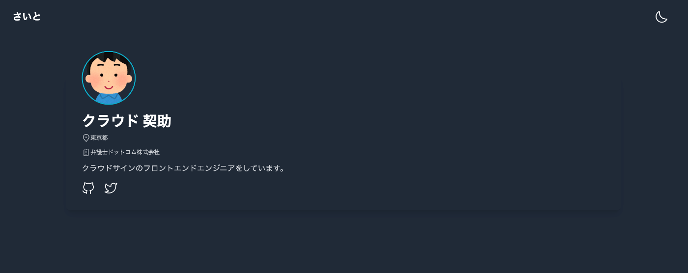
クラウド契助さんの WEB サイト(架空)にライトモードとダークモードを切り替えるボタンを設置します。

Next.js のプロジェクト作成
create-next-appを使って、プロジェクトを新規作成します。
npx create-next-app@latest --typescript
next-themesをインストールします。
npm install next-themes
_app.tsxを編集します。
ThemeProviderをインポートしてattributeにはclassを指定します。
import '../styles/globals.css'
import type { AppProps } from 'next/app'
import { ThemeProvider } from 'next-themes'

function MyApp({ Component, pageProps }: AppProps) {
  return (
    // ライトモードをデフォルトに設定
    <ThemeProvider attribute="class" defaultTheme="light">
      <Component {...pageProps} />
    </ThemeProvider>
  )
}

export default MyApp
<body>タグにスタイルを設定したいので_document.tsxを新規作成します。
import { Html, Head, Main, NextScript } from 'next/document'

const MyDocument = () => {
  return (
    <Html lang="ja-JP">
      <Head>
        <meta name="application-name" content="MyApp" />
      </Head>
      <body className="dark:bg-gray-800">
        <Main />
        <NextScript />
      </body>
    </Html>
  )
}

export default MyDocument
Tailwind CSS をインストール
tailwindcssをインストールして、tailwind.config.jsファイルを作成します。
npm install -D tailwindcss
npx tailwindcss init
tailwind.config.jsのdarkModeにclassを設定します。
mediaを指定した場合は、OS の環境設定に基づいて設定されます。
module.exports = {
  content: [
    "./pages/**/*.{js,ts,jsx,tsx}",
    "./components/**/*.{js,ts,jsx,tsx}",
  ],
  darkMode: 'class', //ダークモードを有効化(ON/OFFの切り替え)
  theme: {
    extend: {},
  },
  plugins: [],
}
ボタンコンポーネントの作成
ボタンにアイコンを使用したいので、今回はiconoirをインストールします。
npm install iconoir-react
インストールしたら、下記のようにインポートして簡単に使用できます。
詳細は下記 README をご覧ください。
import React from 'react'
import { SunLight } from 'iconoir-react'

const App = () => {
  return <SunLight />
}

export default App
ライトモードとダークモードを切り替えるボタンのコンポーネントを作成します。
useThemeフックでテーマ情報を受け取ることができます。
import React, { useState, useEffect, VFC } from 'react'
import { useTheme } from 'next-themes'
import { SunLight, HalfMoon } from 'iconoir-react'

export const ChangeThemeButton: VFC = () => {
  const { theme, setTheme } = useTheme()
  const [mounted, setMounted] = useState<boolean>(false)

  useEffect(() => setMounted(true), [])

  return (
    <>
      <button
        aria-label="DarkModeToggle"
        type="button"
        onClick={() => setTheme(theme === 'dark' ? 'light' : 'dark')}
      >
        {mounted && <>{theme === 'dark' ? <HalfMoon /> : <SunLight />}</>}
      </button>
    </>
  )
}
ボタンを配置する
あとは、先ほど作成したボタンをインポートして配置します。
今回は、Header.tsxを作成してその中に配置しています。
import React, { VFC } from 'react'
import { ChangeThemeButton } from '../ChangeThemeButton'

export const Header: VFC = () => {
  return (
    <header className="space-y-4 p-4 sm:px-8 sm:py-4 lg:p-4 xl:px-8 xl:py-4">
      <div className="flex items-center justify-between">
        <h2 className="font-semibold text-gray-800 dark:text-white text-xl">さいと</h2>
        <span className="group inline-flex items-center text-xl font-medium pl-2 pr-3 py-2">
          <ChangeThemeButton />
        </span>
      </div>
    </header>
  )
}
おわりに
Tailwind CSS を使って、ライトモードとダークモードを切り替えるボタンを作成しました。
今回は新規作成し比較的簡単にできました。
これを使って、自分のサイトも作ってみたりもしました。
参考記事
Discussion