Storybook があれば何でもできる


業務でちゃんと Storybook を活用し始めて約1年が経過したので、今の自分なりの Storybook 活用方法について書き残しておきます。本記事では React を使いつつ説明していきますが、考え方や使い方としては React に限らず他ライブラリでも流用できるかなと思います。
Storybook を使ってやってること
Storybook の主な使い方としては以下の通りです。
- コンポーネントカタログ
- VRT[Visual Regression Testing] (with Chromatic)
- interaction を使ったロジックのテスト
Chromatic を使った VRT
Chromatic を使って以下のことをやっています。
- built storybook hosting
- Visual Tests (実行環境は Google Chrome のみ)
- GitHub Actions を使った CI/CD 連携
Visual Tests は業務要件上(実際には他ブラウザもサポートしてますが、VRTでは) Google Chrome だけでいいので、 STARTER plan を使っています。 Firefox や IE11 もVRTでサポートしたいということであれば上位プランへの加入が必要です(プランについての詳細は公式サイト参照)
hosting については git branch / chromatic build 毎に hosting できます。実態としては
{appId-hash}.chromatic.com domain で公開されて、サブドメインでどの build かを振り分けているようです。もちろんこの hosting は、 chromatic が GitHub やその他 Git プラットフォームを AuthProvider として使用しているため、連携している Git プラットフォームのチームメンバーのみがアクセスできるように設定可能ですし、public に公開することも可能です(デフォルトでは private )。チーム内でUIコンポーネントのレビュー・共有する時なんかは便利です。
cf. https://www.chromatic.com/docs/collaborators
GitHub PR でのUIレビューをしやすくするためにも公式の GitHub Action を使用し、CIに組み込んでいます。実際のPR check status はこんな感じになります(Chromatic 上で approve すれば success status に変化します)
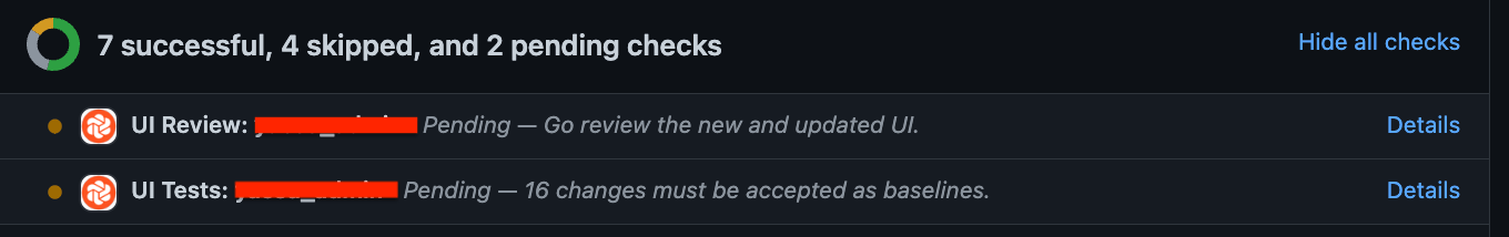
基本的には Chromatic 上でのUIレビューを必須とし、Visual Regression を防いでいます。また、 pull_requestフックだけじゃなくて dev, main 等のブランチでは push をトリガーに workflow を実行して、最新の Storybook をChromatic上で公開するようにしてます。
ちなみに、chromatic に関して使用する parameter に対して補完を効かせたいため、以下のような型定義して、使っていたりします。
import { JSXElementConstructor } from 'react';
import { ComponentStoryFn } from '@storybook/react';

type MyComponentStory<
  T extends keyof JSX.IntrinsicElements | JSXElementConstructor<any>
> = ComponentStoryFn<T> & {
  parameters?: {
    chromatic?: {
      viewports?: number[];
      disableSnapshot?: boolean;
      pauseAnimationAtEnd?: boolean;
      delay?: number; // ms
      diffThreshold?: number;
    };
  };
};

const Template: MyComponentStory<typeof TargetComponent> = (args) => {
  return <TargetComponent {...args} />
}

export const Default = Template.bind({});

export const IgnoreThis = Template.bind({});
IgnoreThis.parameters = {
  chromatic: {
    disableSnapshot: true,  // これが補完できる
  },
};

Interaction tests
Storybook を使えばコンポーネントのUIに関してはテストできますが、 interaction addon を使用することで振る舞いに関してもテストが可能です。(詳しくは公式ドキュメント参照)
例えば、自作した Button component が正しく clickable かどうかテストするには以下のようにします。
type ButtonProps = {
  children?: React.ReactNode;
  onClick?: React.ButtonHTMLAttributes<HTMLButtonElement>["onClick"];
};

export function Button(props: ButtonProps) {
  return <button {...props} />;
}
import { userEvent, within } from "@storybook/testing-library";
import { expect } from "@storybook/jest";
import { ComponentMeta, ComponentStoryFn } from "@storybook/react";
import { Button } from "./Button";

export default {
  component: Button,
} as ComponentMeta<typeof Button>;

const Template: ComponentStoryFn<typeof Button> = (args) => {
  return <Button {...args} />;
};

export const Default = Template.bind({});
Default.args = {
  children: "ぼたん",
};
Default.play = async ({ args, canvasElement }) => {
  const canvas = within(canvasElement);
  await userEvent.click(canvas.getByRole("button", { name: /^ぼたん$/ }));
  await expect(args.onClick).toBeCalled();
};

1つ捕捉しておきたいのが、ここで args.onClick が自動的に mock されることです。公式ドキュメントにもこう書かれてます。
Any args that have been marked as an Action, either using the argTypes annotation or the argTypesRegex, will be automatically converted to a Jest mock function (spy). This allows you to make assertions about calls to these functions.
storybook init で生成される雛形で生成される .storybook/preview.cjs をそのまま使う場合、on から始まる compoenent props は自動で mock されるようになってます。
export const parameters = {
  actions: { argTypesRegex: "^on[A-Z].*" }, // <-
  controls: {
    matchers: {
      color: /(background|color)$/i,
      date: /Date$/,
    },
  },
}
もちろん明示的に mock fn を渡すことも可能です。
import { expect, jest } from "@storybook/jest";

export const Default = Template.bind({});
const mockedOnClick = jest.fn(); // mock fn
Default.args = {
  children: "ぼたん",
  onClick: mockedOnClick, // pass as prop
};
Default.play = async ({ args, canvasElement }) => {
  const canvas = within(canvasElement);
  await userEvent.click(canvas.getByRole("button", { name: /^ぼたん$/ }));
  await expect(args.onClick).toBeCalled();
};
が、できればそういうボイラープレートは無くしたいと思うので、preview でグローバル指定した action の平仄に合わせるか、component 単位での指定をする方がいいと思います。
export default {
  component: Button,
  argTypes: {
    onClick: { action: true },
  },
} as ComponentMeta<typeof Button>;
ここまでUIコンポーネントの振る舞いのテストについて書きましたが、msw と組み合わせることで、 API を呼び出すようなより上位なコンポーネントのテストも可能です。公式から storybook addon が提供されているので、それを使うと便利です。
例えば以下のようなコンポーネントを実装した時(あくまで例なので input は描画してないし適当な request body をハードコードしてます)
export function UserCreateForm() {
  const onSubmit: React.FormEventHandler = async (e) => {
    e.preventDefault();
    await fetch("/api/user", {
      method: "POST",
      headers: {
        "Content-Type": "application/json",
      },
      body: JSON.stringify({ username: "foo" }),
    });
  };

  return (
    <form onSubmit={onSubmit}>
      <button type="submit">Create</button>
    </form>
  );
}
msw を使って期待通りに HTTP Request がpostされたかテストができます。
import { rest } from "msw";
import { userEvent, waitFor, within } from "@storybook/testing-library";
import { expect, jest } from "@storybook/jest";
import { ComponentMeta, ComponentStoryFn } from "@storybook/react";
import { UserCreateForm } from "./UserCreateForm";
export default {
component: UserCreateForm,
} as ComponentMeta<typeof UserCreateForm>;
const Template: ComponentStoryFn<typeof UserCreateForm> = (args) => {
return <UserCreateForm />;
};
export const Default = Template.bind({});
const mockApi = jest.fn();
Default.parameters = {
msw: {
handlers: [
rest.post("/api/user", async (req, res, ctx) => {
const reqBody = await req.json();
mockApi(reqBody);
return res(ctx.status(200));
}),
],
},
};
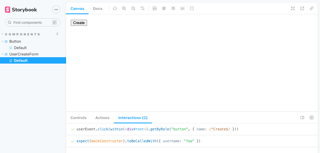
Default.play = async ({ args, canvasElement }) => {
const canvas = within(canvasElement);
await userEvent.click(canvas.getByRole("button", { name: /^Create$/ }));
await waitFor(async () => {
await expect(mockApi).toBeCalledWith({
username: "foo",
});
});
};
実際に業務でちゃんと書くとなると、msw handler は再利用しやすいように
function createUserSuccessHandler({
  callback,
}: { callback?: (body: unknown) => void } = {}) {
  return rest.post("/api/user", async (req, res, ctx) => {
    callback?.(await req.json());
    return res(ctx.status(200));
  });
}

const mockApi = jest.fn();
Default.parameters = {
  msw: {
    handlers: [createUserSuccessHandler({ callback: mockApi })],
  },
};
というようにした方がいい気がします。
これらの interection は storybook server をローカル起動している時に storybook 毎に interections addon で実行(テスト)きますが、@storybook/test-runner を使用して全ての story に対してテストすることもできます。
cf. https://storybook.js.org/blog/interaction-testing-with-storybook/#interaction-test-example
CIに組み込むには storybook server を起動して、それを対象に test-runner を動かす必要があるため、以下のような npm script を定義して、CI で実行しています。(built storybook をパブリックに hosting する server を用意し、それに向けて test-runner を実行することも可能ですし、アクセス制限したプライベートな server に対し、認証しつつ test-runner を実行することでもテスト可能ですが、少し面倒なため、毎回 storybook build + http-server 起動 + test-runner 実行という風にしています。そのため、オーバーヘッドがあるのでトータル実行時間は長くなってしまいます)
"scripts": {
  "test-storybook:ci": "concurrently -k -s first -n \"SB,TEST\" -c \"magenta,blue\" \"npm run build-storybook --quiet && npx http-server storybook-static --port 6066 --silent\" \"wait-on tcp:6066 && test-storybook --url http://localhost:6066\""
}
npm run test-storybook:ci
ログ
react-storybook-example@0.0.0 test-storybook:ci
concurrently -k -s first -n "SB,TEST" -c "magenta,blue" "npm run build-storybook --quiet && npx http-server storybook-static --port 6066 --silent" "wait-on tcp:6066 && test-storybook --url http://localhost:6066"
[SB]
[SB] > react-storybook-example@0.0.0 build-storybook
[SB] > build-storybook
[SB]
[SB] info @storybook/react v6.5.15
[SB] info
[SB] info => Cleaning outputDir: /Users/rikukobayashi/swallowtail62/react-storybook-example/storybook-static
[SB] info => Loading presets
[SB] info => Copying static files: /Users/rikukobayashi/swallowtail62/react-storybook-example/public at /Users/rikukobayashi/swallowtail62/react-storybook-example/storybook-static/
[SB] info => Compiling manager..
[SB] vite v4.0.4 building for production...
[SB] transforming...
[SB] Use of eval in "node_modules/telejson/dist/esm/index.js" is strongly discouraged as it poses security risks and may cause issues with minification.
[SB] Use of eval in "node_modules/telejson/dist/esm/index.js" is strongly discouraged as it poses security risks and may cause issues with minification.
[SB] Use of eval in "node_modules/@storybook/components/dist/esm/index-681e4b07.js" is strongly discouraged as it poses security risks and may cause issues with minification.
[SB] ✓ 2537 modules transformed.
[SB] info => Manager built (17 s)
[SB] rendering chunks...
[SB] computing gzip size...
[SB] storybook-static/iframe.html 13.84 kB
[SB] storybook-static/assets/es.number.is-nan-42c2e969.js 0.29 kB │ gzip: 0.25 kB │ map: 0.62 kB
[SB] storybook-static/assets/string-d2fe5096.js 0.29 kB │ gzip: 0.24 kB │ map: 0.59 kB
[SB] storybook-static/assets/es.map.constructor-31374911.js 0.33 kB │ gzip: 0.27 kB │ map: 0.76 kB
[SB] storybook-static/assets/es.string.from-code-point-58bcde39.js 0.62 kB │ gzip: 0.46 kB │ map: 2.19 kB
[SB] storybook-static/assets/client-0e8170b1.js 0.72 kB │ gzip: 0.47 kB │ map: 0.91 kB
[SB] storybook-static/assets/es.regexp.flags-1d1a3b30.js 0.75 kB │ gzip: 0.51 kB │ map: 2.75 kB
[SB] storybook-static/assets/make-decorator-c06de8e1.js 0.94 kB │ gzip: 0.56 kB │ map: 3.07 kB
[SB] storybook-static/assets/preview-805abc0b.js 1.00 kB │ gzip: 0.61 kB │ map: 7.42 kB
[SB] storybook-static/assets/jsx-runtime-fff760ec.js 1.15 kB │ gzip: 0.71 kB │ map: 2.19 kB
[SB] storybook-static/assets/es.number.is-integer-134515cb.js 1.63 kB │ gzip: 0.94 kB │ map: 8.60 kB
[SB] storybook-static/assets/es.number.to-fixed-b2c601f9.js 1.78 kB │ gzip: 1.09 kB │ map: 8.21 kB
[SB] storybook-static/assets/Button.stories-dd4e6d4a.js 2.17 kB │ gzip: 1.09 kB │ map: 0.51 kB
[SB] storybook-static/assets/preview-4bc11410.js 2.31 kB │ gzip: 1.23 kB │ map: 7.30 kB
[SB] storybook-static/assets/preview-dbe2eb49.js 2.39 kB │ gzip: 0.82 kB │ map: 4.31 kB
[SB] storybook-static/assets/index-4cb24bae.js 2.40 kB │ gzip: 1.03 kB │ map: 5.47 kB
[SB] storybook-static/assets/UserCreateForm.stories-3a554827.js 2.75 kB │ gzip: 1.30 kB │ map: 1.05 kB
[SB] storybook-static/assets/renderDocs-b8dae53b.js 2.83 kB │ gzip: 1.40 kB │ map: 9.77 kB
[SB] storybook-static/assets/preview-a06f672a.js 4.12 kB │ gzip: 1.96 kB │ map: 14.21 kB
[SB] storybook-static/assets/index-2e51f6a4.js 4.63 kB │ gzip: 1.83 kB │ map: 18.12 kB
[SB] storybook-static/assets/preview-981c56d5.js 4.78 kB │ gzip: 1.88 kB │ map: 17.19 kB
[SB] storybook-static/assets/config-0ce28ddc.js 6.10 kB │ gzip: 2.45 kB │ map: 20.74 kB
[SB] storybook-static/assets/index-70cc1d38.js 7.49 kB │ gzip: 3.09 kB │ map: 15.81 kB
[SB] storybook-static/assets/preview-fb897c3f.js 8.34 kB │ gzip: 1.81 kB │ map: 17.26 kB
[SB] storybook-static/assets/preview-942407b3.js 9.93 kB │ gzip: 3.52 kB │ map: 39.72 kB
[SB] storybook-static/assets/preview-adfb1158.js 10.61 kB │ gzip: 4.13 kB │ map: 43.74 kB
[SB] storybook-static/assets/GlobalScrollAreaStyles-8793ce4a-4989a976.js 10.68 kB │ gzip: 2.48 kB │ map: 20.88 kB
[SB] storybook-static/assets/index-144cf39d.js 25.81 kB │ gzip: 8.43 kB │ map: 98.54 kB
[SB] storybook-static/assets/index-107c78a3.js 30.75 kB │ gzip: 10.06 kB │ map: 133.69 kB
[SB] storybook-static/assets/Color-f953d088-978f3f87.js 34.58 kB │ gzip: 13.13 kB │ map: 133.94 kB
[SB] storybook-static/assets/WithTooltip-167e9982-109fcdee.js 41.30 kB │ gzip: 13.93 kB │ map: 181.29 kB
[SB] storybook-static/assets/es.object.get-own-property-descriptor-e414535c.js 60.89 kB │ gzip: 25.96 kB │ map: 329.87 kB
[SB] storybook-static/assets/index-5c550ed3.js 61.03 kB │ gzip: 22.31 kB │ map: 274.06 kB
[SB] storybook-static/assets/OverlayScrollbars-1355f44c-f78346a2.js 64.84 kB │ gzip: 27.55 kB │ map: 443.89 kB
[SB] storybook-static/assets/web.url.constructor-2430ebcf.js 99.23 kB │ gzip: 37.67 kB │ map: 461.17 kB
[SB] storybook-static/assets/syntaxhighlighter-b07b042a-a682dbeb.js 117.48 kB │ gzip: 48.92 kB │ map: 468.49 kB
[SB] storybook-static/assets/index-7d4688c3.js 138.60 kB │ gzip: 45.68 kB │ map: 336.09 kB
[SB] storybook-static/assets/iframe-671c8474.js 261.36 kB │ gzip: 70.74 kB │ map: 654.57 kB
[SB] storybook-static/assets/config-1c0a2328.js 302.30 kB │ gzip: 91.42 kB │ map: 1,106.71 kB
[SB] storybook-static/assets/index-c8fa1f77.js 343.68 kB │ gzip: 103.24 kB │ map: 1,384.24 kB
[SB] storybook-static/assets/index-681e4b07-34cd7446.js 383.78 kB │ gzip: 114.40 kB │ map: 778.08 kB
[SB] storybook-static/assets/index-19ba8d7e.js 640.86 kB │ gzip: 183.66 kB │ map: 1,862.76 kB
[SB] storybook-static/assets/formatter-0d5cb0eb-4809cb0f.js 742.51 kB │ gzip: 239.90 kB │ map: 1,796.12 kB
[SB]
[SB] (!) Some chunks are larger than 500 kBs after minification. Consider:
[SB] - Using dynamic import() to code-split the application
[SB] - Use build.rollupOptions.output.manualChunks to improve chunking: https://rollupjs.org/guide/en/#outputmanualchunks
[SB] - Adjust chunk size limit for this warning via build.chunkSizeWarningLimit.
[SB] info => Output directory: /Users/rikukobayashi/swallowtail62/react-storybook-example/storybook-static
[SB] (node:21437) [DEP0066] DeprecationWarning: OutgoingMessage.prototype._headers is deprecated
[SB] (Use node --trace-deprecation ... to show where the warning was created)
[TEST] PASS browser: chromium src/components/Button/Button.stories.tsx
[TEST] PASS browser: chromium src/components/UserCreateForm/UserCreateForm.stories.tsx
[TEST]
[TEST] Test Suites: 2 passed, 2 total
[TEST] Tests: 2 passed, 2 total
[TEST] Snapshots: 0 total
[TEST] Time: 2.287 s
[TEST] Ran all test suites.
[TEST] wait-on tcp:6066 && test-storybook --url http://localhost:6066 exited with code 0
--> Sending SIGTERM to other processes..
[SB] npm run build-storybook --quiet && npx http-server storybook-static --port 6066 --silent exited with code SIGTERM
さいごに
ここまで、Storybook の活用法について書いてきましたが、ことテストに関して言うと、testing-library を使ってほぼ同様のことが実現できますし、私も以前は vitest + testing library (*.test.tsx) & storybook (*.stories.tsx) の二刀流でやってました。
ただ、ちょっと複雑な操作を伴うコンポーネントのテストの場合、jsdom (or happy-dom, etc) + testing-library だと、どのステップがどういう理由でコケたのか、パッと分からないことがある一方で、 storybook interaction を使うと視覚的に確認が可能だしデバッグもしやすいです。その点が個人的には良いポイントの1つです。
またテスト実行環境がブラウザなので、jsdom 等が未実装な web API に依存したロジックのテストが可能です。(半年前くらいの調べでは File API なんかはまだ十分にサポートされていなかったような気がする)
あとは、container/presentational で責務分割した container component にしても多少 UI に関心がある場合に、*.test.tsx のみなのか *.storybook.tsx も作ってUIの確認をすべきなのか、人によってブレることもあり、そこら辺の厳密な規約を決めるのが難しかったのも、 storybook にまとめた理由の1つでした。
ちなみに公式でもこう書かれてたりしますね。
Interaction tests integrate Jest and Testing Library into Storybook. The biggest benefit is the ability to view the component you're testing in a real browser. That helps you debug visually, instead of getting a dump of the (fake) DOM in the command line or hitting the limitations of how JSDOM mocks browser functionality. It's also more convenient to keep stories and tests together in one file than having them spread across files.
ちなみに、 これを使って storybook を再利用しながら、vitest[jest] でテストを実行することもできます。私もこの先テスト実行時間がネックに感じるようになった場合、このスタイルに移行するかもしれません。
いずれにせよ、だいたい似たようなことは実現できるので、 pros, cons 比較した上で好きなスタイルでテストを書けばいいと思います。
本記事に沿った簡単なソースコードを、GitHub Repository にあげてますので、もし必要であれば参照ください。
Discussion