Closed10
React + Typescript with styled-components
 sunao
sunaomuiのパレット追加
公式
sunaostyled-components
sunao俺なりのstyled-components
import styled from "styled-components";

// 独自定義のプロパティ
type CustomProps = {
  h?: string;
  w?: string;
  minw?: string;
  minh?: string;
  maxw?: string;
  maxh?: string;
  ms42w?: string;
  bg?: string;
  border?: string;
  br?: string;
  ff?: string;
  jc?: string;
  ai?: string;
  gap?: string;
  top?: number;
  right?: number;
  bottom?: number;
  left?: number;
  fs?: string;
  fw?: string;
  mb?: string;
  mt?: string;
  color?: string;
};

// 初期値がない書き方
// export const Spacer = styled.div<CustomProps>`
//   margin-top: ${(props) => `${props.mt}`};
// `;

export const Spacer = styled.div<CustomProps>`
  margin-top: ${(props) => (props.mt ? `${props.mt}` : "8px")};
`;

export const FormBox = styled.div<CustomProps>`
  width: ${(props) => (props.w ? `${props.w}` : "400px")};
  min-width: ${(props) => (props.minw ? `${props.w}` : "320px")};
  padding: 0px 16px;
  @media screen and (max-width: 420px) {
    width: ${(props) => (props.ms42w ? `${props.ms42w}` : "100%")};
  }
`;

export const DivBox = styled.div<CustomProps>`
  height: ${(props) => (props.h ? `${props.h}` : "100%")};
  width: ${(props) => (props.w ? `${props.w}` : "100%")};
  min-height: ${(props) => (props.minh ? `${props.w}` : "100%")};
  min-width: ${(props) => (props.minw ? `${props.w}` : "100%")};
  max-height: ${(props) => (props.maxh ? `${props.w}` : "100%")};
  max-width: ${(props) => (props.maxw ? `${props.w}` : "100%")};
  background-color: ${(props) => (props.bg ? `${props.bg}` : "white")};
  border: ${(props) => (props.border ? `${props.border}` : "none")};
  border-radius: ${(props) => (props.br ? `${props.br}` : "0px")};
`;

export const Center = styled.div`
  text-align: center;
  margin: 0 auto;
  vertical-align: middle;
`;

export const Flex = styled.div<CustomProps>`
  display: flex;
  flex-flow: ${(props) => (props.ff ? `${props.ff}` : "row wrap")};
  justify-content: ${(props) => (props.jc ? `${props.jc}` : "start")};
  align-items: ${(props) => (props.ai ? `${props.ai}` : "center")};
  gap: ${(props) => (props.gap ? `${props.gap}` : "0px 0px")};
  width: "100%";
  height: 100%;
`;

export const Padding = styled.div<CustomProps>`
  padding-top: ${(props) => `${props.top}`}px;
  padding-right: ${(props) => `${props.right}`}px;
  padding-bottom: ${(props) => `${props.bottom}`}px;
  padding-left: ${(props) => `${props.left}`}px;
`;

export const Margin = styled.div<CustomProps>`
  margin-top: ${(props) => `${props.top}`}px;
  margin-right: ${(props) => `${props.right}`}px;
  margin-bottom: ${(props) => `${props.bottom}`}px;
  margin-left: ${(props) => `${props.left}`}px;
`;

export const HeadingText = styled.h3<CustomProps>`
  font-size: ${(props) => (props.fs ? `${props.fs}` : "16px")};
  font-weight: ${(props) => (props.fw ? `${props.fw}` : "bold")};
  margin-bottom: ${(props) => `${props.mb}`};
  color: ${(props) => (props.color ? `${props.color}` : "#1e1e1e")};
  line-height: 1.7;
  font-family: "YuGothic", "游ゴシック体", sans-serif;
  letter-spacing: 0.125rem;
`;

export const Text = styled.div<CustomProps>`
  font-size: ${(props) => (props.fs ? `${props.fs}` : "12px")};
  font-weight: ${(props) => (props.fw ? `${props.fw}` : "nomal")};
  color: ${(props) => (props.color ? `${props.color}` : "#1e1e1e")};
  white-space: pre-wrap;
  line-height: 1.7;
  font-family: "YuGothic", "游ゴシック体", sans-serif;
  letter-spacing: 0.125rem;
`;
exportしたコンポーネントにpropsを渡すときはinterfaceでpropsに入ってくる値の型を指定する
import React from "react";
import Button from "@mui/material/Button";
import { styled } from "@mui/material/styles";
import AddCircleIcon from "@mui/icons-material/AddCircle";
import Stack from "@mui/material/Stack";

const CustomButton = styled(Button)({
  backgroundColor: "#5a5ce9",
  color: "#FFF",
  fontSize: 12,
  height: 35,
  marginButtom: 16,
  width: 200,
});

interface AddButtonProps {
  onClick: () => void;
  label: string;
}

const AddButton: React.FC<AddButtonProps> = (props) => {
  return (
    <Stack direction="row" spacing={2}>
      <CustomButton variant="contained" startIcon={<AddCircleIcon fontSize="small" />} onClick={() => props.onClick()}>
        {props.label}
      </CustomButton>
    </Stack>
  );
};
export default AddButton;
メディアクエリ
const StyledFooter = styled.footer`
  padding: 30px;
  background-color: #333;
  @media screen and (max-width: 767px) {
    padding: 20px;
  }
`
入力ストレスの少ないinpuデザインを考える
Start 9:00
コンセプト
- 視認性などは考慮するが、最優先には置かない。
- 俯瞰して見た時に全体がスッキリしていて視覚的ストレスに配慮したデザインにしたい(自分がそういうの好きだから)
概要設計
コンセプトを踏まえると、フォーム自体は背景色と同化させて、下線やヘルパーテキストで視認性を手助けしてやると良いかも
sunaoこんな感じのstyled-components用意して
import styled from "styled-components";

// 独自定義のプロパティ
type CustomProps = {
  h?: string;
  w?: string;
  minw?: string;
  minh?: string;
  maxw?: string;
  maxh?: string;
  ms42w?: string;
  bg?: string;
  border?: string;
  bb?: string;
  br?: string;
  ff?: string;
  jc?: string;
  ai?: string;
  gap?: string;
  top?: number;
  right?: number;
  bottom?: number;
  left?: number;
  fs?: string;
  fw?: string;
  mb?: string;
  mt?: string;
  color?: string;
  flex?: string;
  padding?: string;
};

export const Input = styled.input<CustomProps>`
  font-size: ${(props) => (props.fs ? `${props.fs}` : "12px")};
  height: ${(props) => (props.h ? `${props.h}` : "auto")};
  width: ${(props) => (props.w ? `${props.w}` : "100%")};
  padding: ${(props) => (props.padding ? `${props.padding}` : "3px 7px")};
  border-radius: ${(props) => (props.br ? `${props.br}` : "0px")};
  border: ${(props) => (props.border ? `${props.border}` : "1px solid #ccc;")};
  border-bottom: ${(props) => `${props.bb}`};
  background-color: ${(props) => (props.bg ? `${props.bg}` : "white")};
  line-height: 1;
  &:focus {
    outline: none;

`;
Input.shouldForwardProp = (prop) => prop !== "fs" + "h" + "w" + "pd" + "br" + "border" + "bb" + "bg";
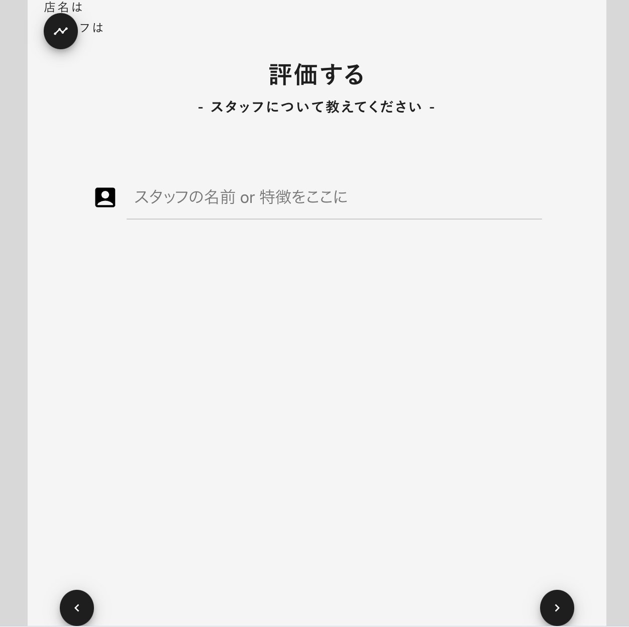
こんな感じで呼び出して使うと
import React, { useCallback, useRef, useState, useEffect } from "react";
import { StaffSelectProps } from "interfaces/review";
import AccountBoxIcon from "@mui/icons-material/AccountBox";
import styled from "styled-components";
import { createTheme, ThemeProvider } from "@mui/material/styles";
import { Button, CircularProgress, TextField } from "@mui/material";
import { GoogleMap, Libraries, Marker, useLoadScript } from "@react-google-maps/api";
import { MiniButton, CustomInput, TextInput, MapSearchInput } from "components/UIkit";
import { Padding, Text, HeadingText, Spacer, Flex, DivBox, Center, ImageBox, CustomButton, Input } from "../style";

const StaffSelect: React.FC<StaffSelectProps> = (props) => {
  const [staffName, setStaffName] = useState("");

  return (
    <>
      <Center>
        <Padding padding="0px 48px">
          <Text fs={"14px"} fw={"bold"}>
            - スタッフについて教えてください -
          </Text>
          <Spacer h={"48px"} />
          <Flex ff="row" gap="8px">
            <AccountBoxIcon fontSize={"large"} />
            <Input
              type="text"
              name="staff_name"
              value={staffName}
              onChange={(e) => setStaffName(e.target.value)}
              placeholder="スタッフの名前 or 特徴をここに"
              padding="12px 8px"
              border="none"
              bb="1px solid #ccc;"
              bg="transparent"
              fs="16px"
            />
          </Flex>
          <Spacer h={"24px"} />
        </Padding>
      </Center>
    </>
  );
};

export default StaffSelect;
sunaoうん。嫌いじゃない
このスクラップは2024/04/10にクローズされました