Godot の UI開発をWeb技術 (HTML + CSS + JS) と比較
 submax
昨今では、おしゃれなUIは大体が HTML + CSS (+JS) で作られている。
GodotでUIを実装するにあたって、Web技術での実装を参考にすることができると表現の幅が広がると思うので、それらの対応を探していく。
| Web | Godot | |
|---|---|---|
| 要素 | DOM | Control Node |
| 要素の取得 | dom.querySelector() |
node.get_node() |
| スタイリング | CSS | Theme, Theme Overrides |
| アニメーション | CSS 宣言的 |
AnimationPlayer, Tween 手続き的 |
| スクリプティング | JavaScript | GDScript |
| コンポーネント化 | UIライブラリ(React, Vue, Svelte...) | Scene |
| レイアウト | flex, grid | H/VBoxContainer, GridContainer |
submaxスタイリング
HTML + CSS と Godot で似たような見た目のボタンを作ってみた
- 影がついてる
- ホバー時、押したときに色が変わる
- 押したときに影を消し、そのぶんボタンを下に押し下げる
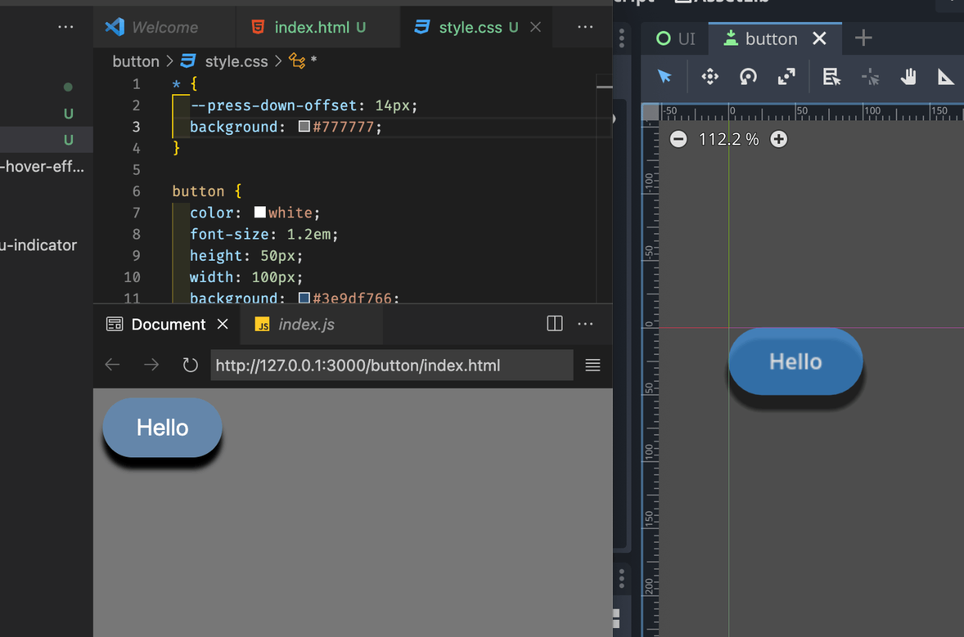
CSS
* {
  --press-down-offset: 14px;
}

button {
  height: 50px;
  width: 100px;
  background: #3e9df7a0;
  box-shadow: 0 10px 4px 0 rgba(0.8, 0.8, 0.8, 0.5);
  border-radius: 25px;
  border-color: transparent;
}

button:hover {
  background: #3e9df7;
}
button:active {
  color: white;
  background: blue;
  box-shadow: none;
  transform: translateY(var(--press-down-offset));
}
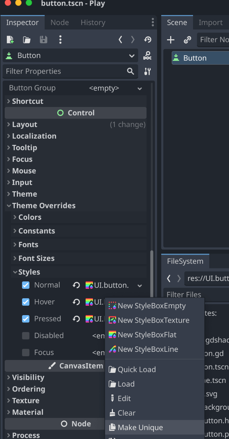
Godot (StyleBoxFlat)
CSSで言うところの :hover, :active 擬似クラスのようなものはないので、ホバー時・プレス時の StyleBoxFlat もそれぞれ作成する。
normal スタイルを作成したあと。ドラッグ&ドロップでコピーしてMake Unique すると、とスタイルを引き継いだリソースファイルを手早く複製できる
// normal.tres
[gd_resource type="StyleBoxFlat" format=3 uid="uid://do7j44v1uqb4"]

[resource]
bg_color = Color(0.243137, 0.615686, 0.968627, 0.627451)
border_color = Color(0.2821, 0.67977, 0.91, 1)
border_blend = true
corner_radius_top_left = 25
corner_radius_top_right = 25
corner_radius_bottom_right = 25
corner_radius_bottom_left = 25
shadow_size = 4
shadow_offset = Vector2(2.08165e-12, 10)

// hover.tres
+ bg_color = Color(0.243137, 0.615686, 0.968627, 1)


// pressed.tres
+ bg_color = Color(0.0666667, 0.164706, 0.258824, 1)
- shadow_size = 4
- shadow_offset = Vector2(2.08165e-12, 10)
あと、CSSの transform: translateY(); のようなプロパティも無いので、GDScriptでプレス時の位置を押し下げるように記述しないといけない。
extends Button

@onready var normal_style: StyleBoxFlat = self.get("theme_override_styles/normal")
@onready var press_down_distance: float = normal_style.shadow_size + normal_style.shadow_offset.y


func _ready():
  self.button_down.connect(on_pressed)
  self.button_up.connect(on_released)

func on_pressed():
  self.position.y += (press_down_distance)

func on_released():
  self.position.y -= (press_down_distance)
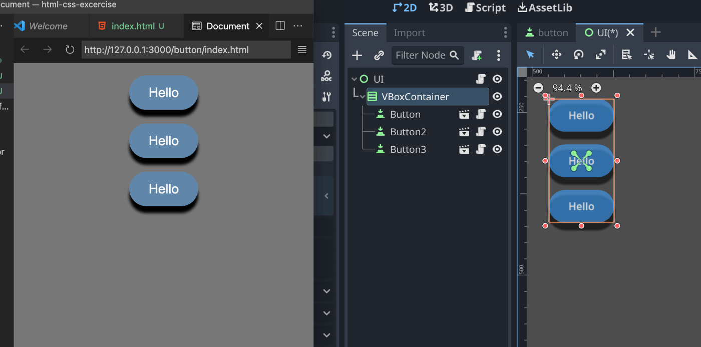
レイアウト
画面の中央に寄せて縦並びで3つ配置したものを、CSSとGodotでそれぞれ実装してみる。
- ボタンの間は20px
CSS
<div class="boxList">
  <button>Hello</button>
  <button>Hello</button>
  <button>Hello</button>
</div>
button {
+  margin: 10px;
}

+ .buttonList {
+   display: flex;
+   flex-direction: column;
+   justify-content: center;
+   align-items: center;
+   height: 100%;
+ }
Godot (VBoxContainer)
VBoxContainer ノードにボタンを3つ子要素として入れるだけ。
子要素の位置は親要素である VBoxContainer が計算する。
H/VBoxContainer は Theme Constant の separation 値を使って要素のスキマを設定する。
CSSでは margin: 10px で上下にマージンを取り (10+10) = 20px を実現しているので方法が違うことに注意。
[gd_scene format=3 uid="uid://c80ftobtauujk"]

[node name="VBoxContainer" type="VBoxContainer"]
anchors_preset = 8
...
theme_override_constants/separation = 20
子要素のボタン押下時の押し下げ移動はGDScriptで手続き的な操作でやっているので、押してる最中にVBoxContainer の大きさが変わって位置を再計算したりしたらどうなるのか気になる。
submaxButton の Style差分(hover, pressed)を GDScript で作る
CSS の button:hover, button:active 擬似クラスのようにボタンの通常スタイルに差分を上書きすることは Godot のTheme Override ではできず、Button の状態の数だけ StyleBoxFlat リソースを作成しておく必要がある。
これにはいくつか不便な点がある。
- 差分だけではなく、通常時と変更がない部分のstyle値まで複製する必要がある。
- 通常時スタイルを変更しても、hover や pressed スタイルに反映されない
そこで思いついたのが、GDScriptで_ready()時にStyleBoxFlatリソースを複製・差分を適用してセットすること。
これにより、通常スタイルの変更を派生に反映できる。
extends Button

@onready var normal_style: StyleBoxFlat = self.get("theme_override_styles/normal")
@onready var press_down_distance: float = normal_style.shadow_size + normal_style.shadow_offset.y


+ func hover_style(normal: StyleBoxFlat):
+   var style := normal.duplicate() as StyleBoxFlat
+   style.bg_color = Color.hex(0x3e9df7)
+   return style

+ func pressed_style(normal: StyleBoxFlat):
+   var style := normal.duplicate() as StyleBoxFlat
+   style.bg_color = Color.hex(0x112a42ff)
+   style.shadow_size = 0
+   return style

func _ready():
+   self.set("theme_override_styles/hover", hover_style(normal_style))
+   self.set("theme_override_styles/pressed", pressed_style(normal_style))
  ...
Inspectorでスタイルのプレビューを見ることができなくなるのがネック。
GodotではUIノードも単体実行可能なSceneに切り分けることができるので、それで確認しよう。
submaxアニメーション
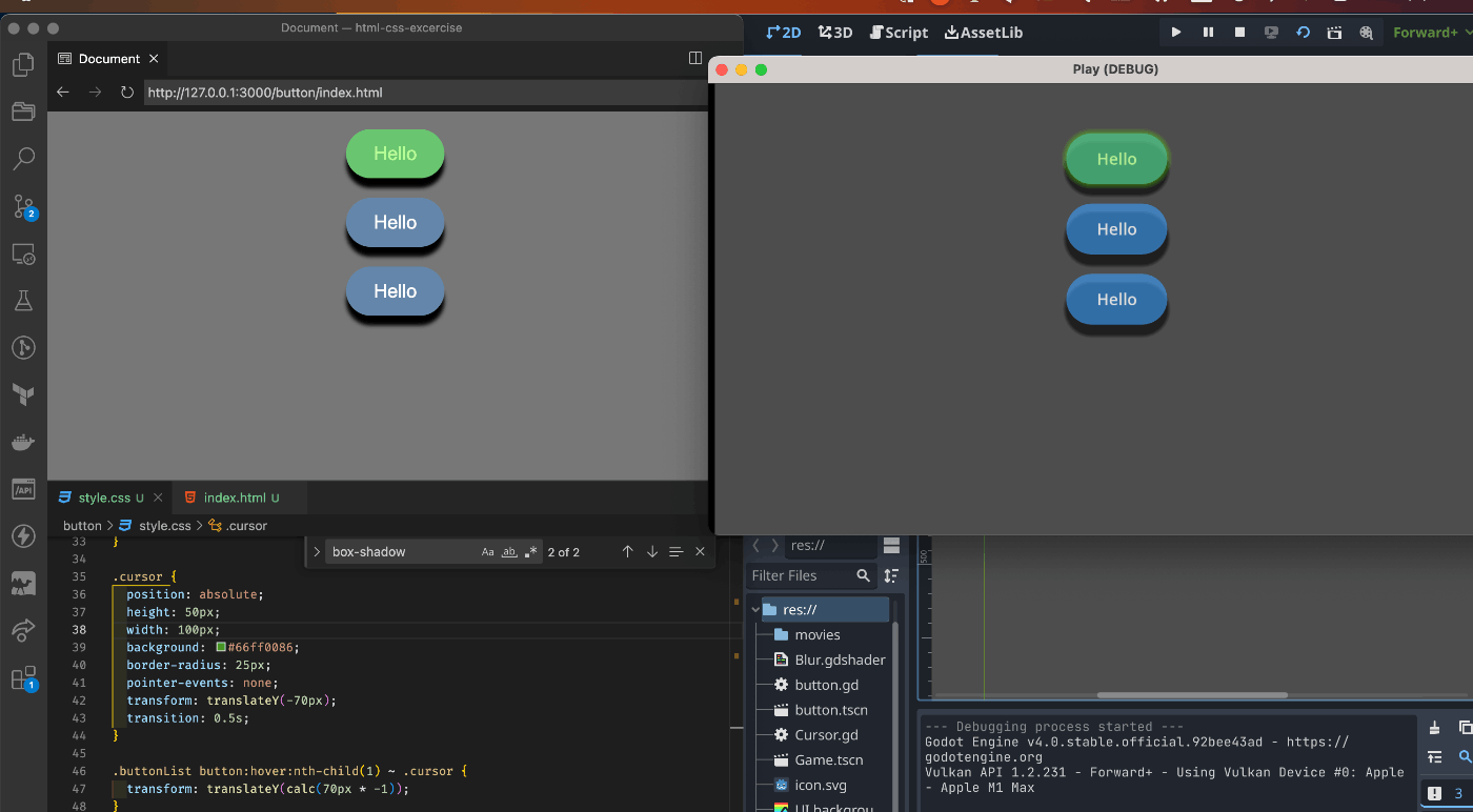
黄緑色のカーソルを、マウスホバーしているボタンにオーバーレイする。
別のボタンにマウスホバーしたら、Linear Interpolation で移動する。
CSS
:hover:nth-child(n) の兄弟要素にあるカーソルにtranslateY()を適用し、カーソルのノーマルクラスにtransition: 0.5s; を設定しておくことで自動でいい感じにアニメーションする。
割と簡単だが、ページ上の任意のDOMの位置を取得し相対的に移動させたり、移動した状態を保持しておくことはできない。(JSでのプログラミングが必要になる)
純粋なCSSアニメーションは若干つらみが出てくるが、シンプルなものならこれくらいはできる。
(これ以上行くとCSS芸の領域な気がする)
  <div class="buttonList">
    <button>Hello</button>
    <button>Hello</button>
    <button>Hello</button>
+   <div class="cursor"></div>
  </div>
.cursor {
  position: absolute;
  height: 50px;
  width: 100px;
  background: #66ff0086;
  border-radius: 25px;
  pointer-events: none;
  transform: translateY(-70px);
  transition: 0.5s;
}

.buttonList button:hover:nth-child(1) ~ .cursor {
  transform: translateY(calc(70px * -1));
}
.buttonList button:hover:nth-child(2) ~ .cursor {
  transform: translateY(calc(70px * 0));
}
.buttonList button:hover:nth-child(3) ~ .cursor {
  transform: translateY(calc(70px * 1));
}
Godot
コードを書かずに(またはコードを書けば更に強力に)何でもアニメーションさせられる強力な機能ということAnimationPlayerが紹介されることが多いが、UIの要素を移動させる程度だったらオーバースペックなことが多い。
CSSアニメーションくらいの機能の代替として使うにはTweenが最適。
AnimationPlayerより軽量で、Fire&Forgetで使い捨てたり、ループさせたりもできる。
一般的なタスクや最終的な値がわからないようなアニメーションにはTweenのほうが向いている。
(UIアニメーション、カメラのフォローなど)
ちなみに、このScrapで使っているGodot の version は 4.0系で、3.x系と若干書き方が違うので注意。
(以前はNodeだったが、現在は単なるObjectで get_tree().create_tween()で作成したものしか有効にならない)
extends Panel

@export var button_list: Node

# Called when the node enters the scene tree for the first time.
func _ready():
  button_list.get_children().map(func(b):
    b.hovered.connect(self._on_hover)
  )

func _on_hover(btn):
  var to_target: Vector2 = (btn.global_position - self.global_position)
  var distance = to_target.length()
  var speed = 400;
  var tween = get_tree().create_tween()
  tween.set_ease(Tween.EASE_IN_OUT)
  tween.tween_property(self, "global_position", btn.global_position, distance/speed)
Panel>Mouse>Filter>Ignore を設定しておく(オーバーレイするとイベントが吸われてホバー判定が出ない)
Cntrol ノードには mouse_entered シグナルが定義されているが、どのNodeにホバーされたかを渡せないので、それを拡張したhovered(Button) シグナルを作成しておく
extends Button

+ signal hovered(Button)

func _ready():
  ...
+  self.mouse_entered.connect(_on_mouse_enter)

+ func _on_mouse_enter():
+   self.hovered.emit(self)
Godot UI と CSS の比較 (スタイリング・アニメーションの観点)
試した結果、頑張ればCSSでできることはGodotでもできそうな気がしてきた。
微妙に互換性は無いものの、GodotのUIシステムはWebのシステムに踏襲・インスパイアされているようにも思える。
CSS の良い点
- CSSのほうがプロパティの値指定がやりやすい。
- px, %, vh, vw, rem, em, など豊富な指定方法がある
- Godot は px のみ
- CSSにはプロパティ名のショートハンドがある。
- 例えば、CSSは
border-radius: 25pxとやれば一気に4つの角に適用されるが、Godotのほうはそれぞれ個別に指定する必要がある
- 例えば、CSSは
- 擬似クラスで
:hover,:activeなどの差分スタイルが簡単に書ける
Godot の良い点
- Anchor による位置指定
- 値の%指定ができない分、グラフィカルに調整するのにはこちらのほうが向いている
- Tween によるシンプルで軽量なアニメーション
- Node同士の相対的な位置を使ったアニメーションはControlノードのほうがやりやすい
(2Dゲームのtransformロジックとほぼ同じものを使えるため) - GDScriptによってゲームロジックとUIアニメーションの連携がしやすい
(CSS + JS との比較になるが) - エディタで確認しながらの微調整
共通点
- レイアウト
- flex = H/VBoxContainer
- grid = GridContainer
- スタイルのプロパティ
- margin
- background-color = bg_color
- shadow
- border
- border-radius = corner_radius
- blur = anti_aliasing