🧬
Rust と Dioxus でデスクトップアプリを作る
Rust と Dioxus でデスクトップアプリを作る
はじめに
Dioxus でデスクトップアプリを作る方法を紹介します。
Dioxus の公式ガイドと例に大抵のことは書かれているので、この記事は公式ガイドと例に載っていない内容を中心に書きたいと思います。
Dioxus とは
Rust で React ライクにマルチプラットフォームのアプリを作成することができます。
また、アプリ開発に必要な状態管理, ルーターが備わっています。
公式情報
環境
- Windows10 Pro
- rustc 1.64.0 (a55dd71d5 2022-09-19)
- cargo 1.64.0 (387270bc7 2022-09-16)
- Dioxus 0.2.4
セットアップ
- Rust をインストールします。
- アプリを作成します。
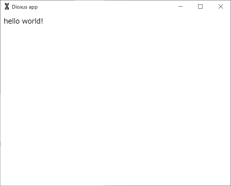
- 作成したアプリを実行します。
cargo run - 新しいウィンドウが立ち上がって hello world! が表示されます。
フリーアイコンを使用する
- 依存関係に dioxus-free-icons を追加します。features は Support features から使用したいアイコンを記述します。
# \Cargo.toml [dependencies] dioxus-free-icons = { version = "0.5.1", features = ["font-awesome-brands"] } - アイコンの使用するために必要な物を読み込みます。
// src\main.rs use dioxus_free_icons::icons::fa_brands_icons::FaRust; use dioxus_free_icons::Icon; -
アイコンを使用します。
// src\main.rs fn app(cx: Scope) -> Element { cx.render(rsx! ( div { "Hello, world!" } Icon { width: 30, height: 30, fill: "black", icon: FaRust, } )) } - アプリを実行してアイコンが表示されることを確認します。

ファイルダイアログを使用する
- 依存関係に rfd を追加します。
# \Cargo.toml [dependencies] rfd = "0.10.0" - ファイルダイアログを使用するために必要な物を読み込みます。
// src\main.rs use rfd::FileDialog; - ファイルダイアログを開くためのボタンを記述します。
// src\main.rs fn app(cx: Scope) -> Element { cx.render(rsx! ( button { onclick: move |_| {}, "Pick folder" } )) } - ボタンをクリックしたらファイルダイアログを開きます。フォルダを選択する場合は pick_folder を使用します。
// src\main.rs fn app(cx: Scope) -> Element { cx.render(rsx! ( button { onclick: move |_| { let path = FileDialog::new() .set_directory("/") .pick_folder(); println!("picked folder: {:?}", path); }, "Pick folder" } )) } - ファイルを1つだけ選択する場合は pick_file を使用します。
// src\main.rs button { onclick: move |_| { let path = FileDialog::new() .set_directory("/") .pick_file(); println!("picked file: {:?}", path); }, "Pick file" } - 複数のファイルを選択する場合は pick_files を使用します。
// src\main.rs button { onclick: move |_| { let path = FileDialog::new() .set_directory("/") .pick_files(); println!("picked files: {:?}", path); }, "Pick files" } - ファイルの種類にフィルターを設定する場合は add_filter を使用します。
// src\main.rs
      button {
            onclick: move |_| {
               let path = FileDialog::new()
               .add_filter("image", &["png", "jpg", "jpeg", "gif"])
               .set_directory("/")
               .pick_files();

               println!("picked images: {:?}", path);
            },
            "Pick images"
      }
タイトルバーのタイトルを変更する
dioxus-examples/titlebar-title
- main 関数で DesktopConfig.with_window に任意のタイトルを設定します。
// src\main.rs fn main() { dioxus::desktop::launch_cfg(app, |c| c.with_window(|w| w.with_title("Custom title"))); } - アプリを実行してタイトルバーのタイトルが Custom title に変わっていることを確認します。

タイトルバーのアイコンを変更する
dioxus-examples/titlebar-icon ( tao/examples/window_icon を参考にしています。)
-
src\assets\iconsにタイトルバー用のアイコンを保存します。 - 依存関係に image を追加します。
cargo add image - アイコンを読み込む関数を作成します。
// src\main.rs fn load_icon(path: &Path) -> Icon { let (icon_rgba, icon_width, icon_height) = { let image = image::open(path) .expect("Failed to open icon path") .into_rgba8(); let (width, height) = image.dimensions(); let rgba = image.into_raw(); (rgba, width, height) }; Icon::from_rgba(icon_rgba, icon_width, icon_height).expect("Failed to open icon") } - main 関数でアイコンを読み込んで、 DesktopConfig.with_icon に読み込んだアイコンを設定します。
// src\main.rs fn main() { let path = "src/assets/icons/titlebar.png"; let icon = load_icon(Path::new(path)); dioxus::desktop::launch_cfg(app, |c| c.with_icon(icon)) } - アプリを実行してタイトルバーのアイコンが変わっていることを確認します。

タイトルバーをカスタマイズする
dioxus-examples/titlebar-custom ( wry/examples/custom_titlebar を参考にしています。)
ベーシックなタイトルバーを作成する
最小化ボタン、最大化ボタン、閉じるボタンがあるベーシックなタイトルバーを作成します。
- タスクバーで使用するアイコンを
src\assets\iconsに保存します。- 最小化ボタン: codicon_chrome-minimize.svg
- 最大化ボタン: codicon_chrome-maximize.svg
- 閉じるボタン: codicon_close.svg
- ブラウザのデフォルトスタイルを打ち消すための reset.css を
src\assets\stylesに保存します。 - タスクバーのスタイルを作成します。
/* src\assets\styles\titlebar.css */ .titlebar { height: 44px; display: grid; grid-auto-flow: column; grid-template-columns: 1fr max-content max-content max-content; align-items: center; background: #0099FF; color: white; user-select: none; } .title { margin-left: 10px; font-size: 12px; font-weight: bold; } .titlebar-button { display: inline-flex; justify-content: center; align-items: center; color: #333333; width: 34px; height: 30px; } .titlebar-button:hover { background: #015c993c; } .titlebar-button:nth-child(3):hover { background: #da3d3d; } .titlebar-button img { filter: invert(100%); } -
with_custom_headで head タグにスタイルを設定し、with_decorationsでデフォルトのタイトルバーを無効にします。// src\main.rs fn main() { let script = r#" <link rel="stylesheet" href="src/assets/styles/reset.css"> <link rel="stylesheet" href="src/assets/styles/titlebar.css"> "#; dioxus::desktop::launch_cfg(app, |cfg| { cfg.with_custom_head(script.to_string()) .with_window(|w| w.with_decorations(false)) }); } - タイトルバーを作成します。
// src\main.rs fn app(cx: Scope) -> Element { let window = dioxus::desktop::use_window(&cx); cx.render(rsx! ( div { class: "titlebar", div { class: "drag-region left title", onmousedown: move |_| { window.drag(); }, span {"Custom titlebar"} } div { class: "right", button { class: "titlebar-button", id: "minimize", onclick: |_| { window.set_minimized(true); }, img { src: "src/assets/icons/codicon_chrome-minimize.svg", alt: "—", } } button { class: "titlebar-button", id: "maximize", onclick: |_| { window.toggle_maximized(); }, img { src: "src/assets/icons/codicon_chrome-maximize.svg", alt: "+", } } button { class: "titlebar-button", id: "close", onclick: |_| { window.close(); }, img { src: "src/assets/icons/codicon_close.svg", alt: "x", } } } } div { "Hello, world!" } )) } - アプリを実行してタイトルバーを確認します。

タイトルバーにボタンを追加する
最小化ボタンの左側に設定ボタンを追加します。
- アイコンを
src\assets\iconsに保存します。- 設定ボタン: codicon_settings-gear.svg
- 設定ボタンのスタイルを追記します。
/* src\assets\styles\titlebar.css */ .setting-button { display: inline-flex; justify-content: center; align-items: center; color: #333333; width: 34px; height: 30px; margin-right: 10px; } .setting-button:hover { background: #015c993c; } .setting-button img { filter: invert(100%); } - 閉じるボタンをホバーした時のスタイルを微調整します。
/* src\assets\styles\titlebar.css */ .titlebar-button:nth-child(4):hover { background: #da3d3d; } - app 関数の cx.render 内にボタンを追加します。
// src\main.rs button { class: "setting-button", id: "setting", onclick: |_| { println!("setting!") }, img { src: "src/assets/icons/codicon_settings-gear.svg", } } - アプリを実行してタイトルバーを確認します。

Discussion