入門 Jetpack Compose Animation part1
はじめに
Animationについて詳しくなるために、公式ドキュメントを読んで写経した内容をまとめていきます
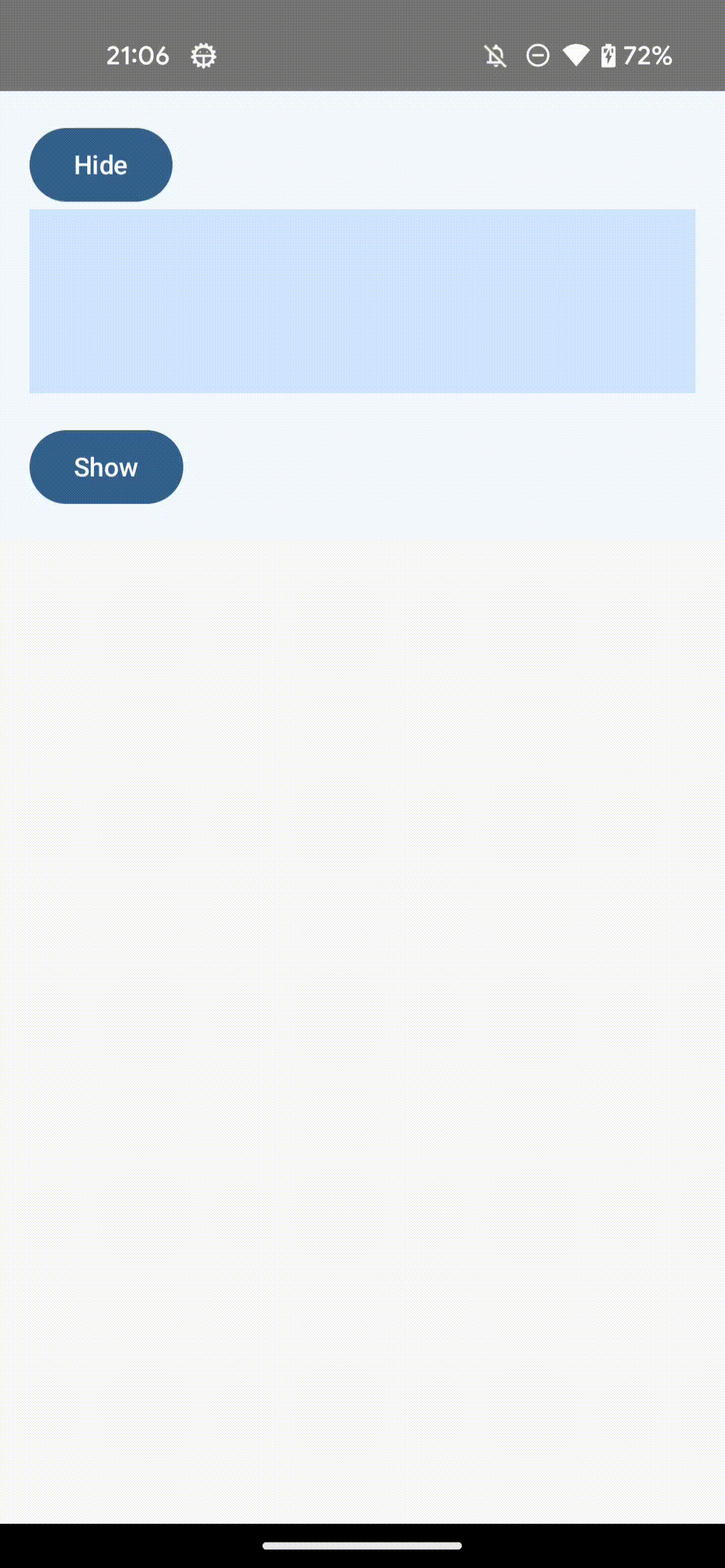
AnimatedVisibility
要素の表示・非表示にアニメーションをつけるためのComposable関数
シンプルな使い方
@Composable
fun SimpleAnimatedVisibility(modifier: Modifier = Modifier) {
    var visible by remember { mutableStateOf(true) }
    Column(modifier) {
        Button({ visible = !visible }) {
            Text(if (visible) "Hide" else "Show")
        }
        AnimatedVisibility(
            visible = visible,
        ) {
            Box(
                Modifier
                    .fillMaxWidth()
                    .height(100.dp)
                    .background(MaterialTheme.colorScheme.primaryContainer)
            )
        }
    }
}
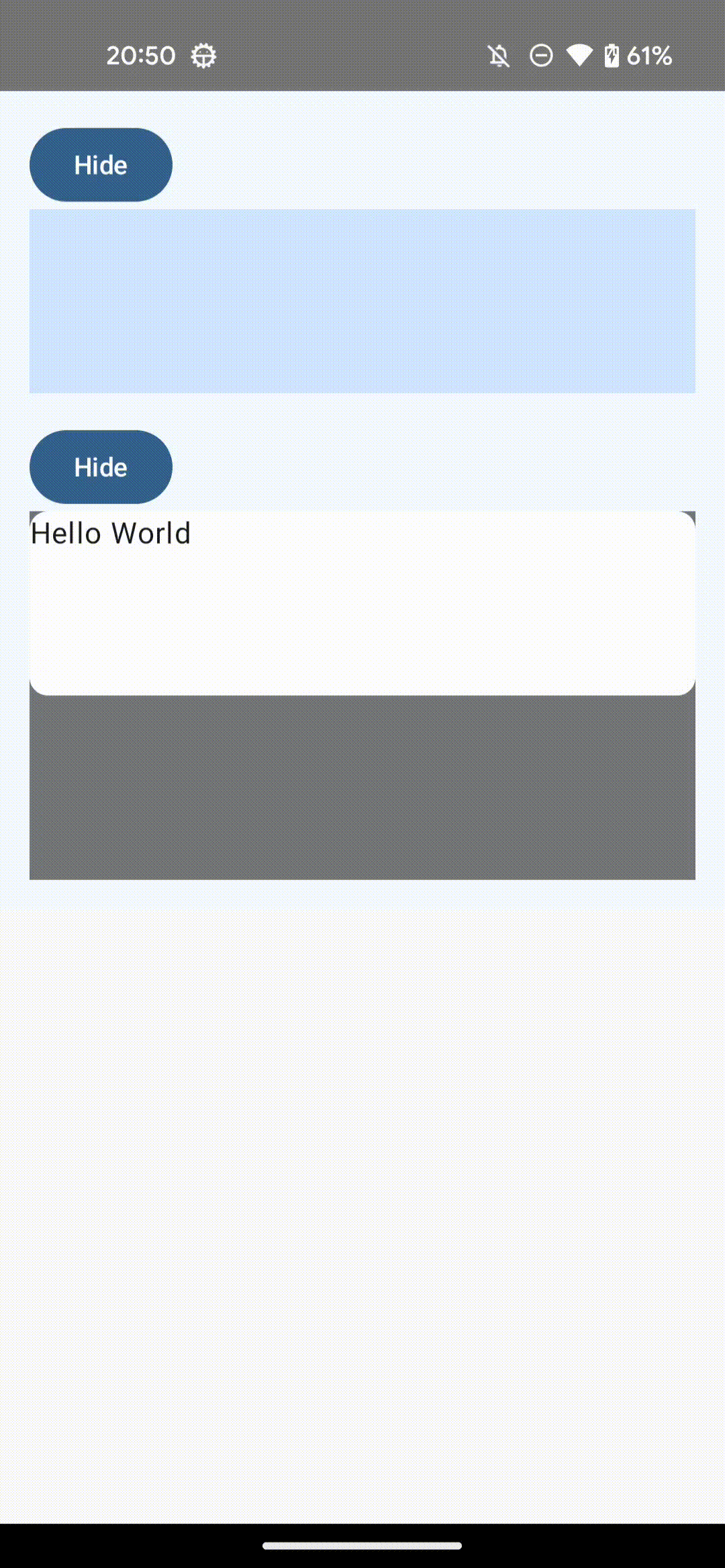
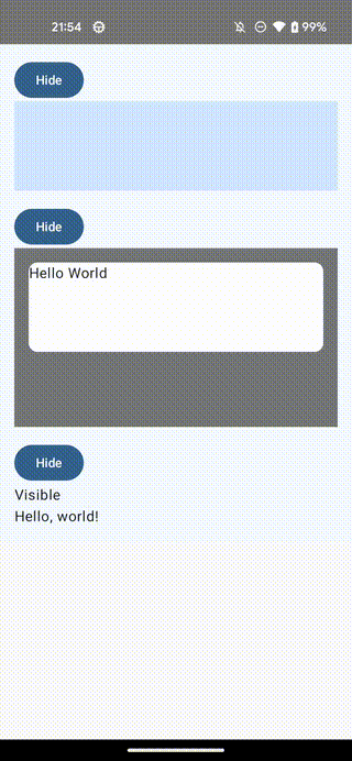
Modifier.animateEnterExit
AnimatedVisibilityの中では Modifier.animateEnterExit() が利用でき、これによって子要素のEnter/Exitアニメーションをカスタマイズすることができます
/**
 * Enter animation
 *   親が先に表示されて、遅れて子がfadeInする
 * Exit animation
 *   子が先にfadeOutして、その後、親も非表示になる
 */
@Composable
fun AnimatedVisibilityWithAnimateEnterExit(modifier: Modifier = Modifier) {
    var visible by remember { mutableStateOf(true) }
    Column(modifier) {
        Button({ visible = !visible }) {
            Text(if (visible) "Hide" else "Show")
        }
        AnimatedVisibility(
            visible = visible,
            exit = fadeOut(
                animationSpec = tween(delayMillis = 300)
            ) + shrinkVertically(
                animationSpec = tween(delayMillis = 300)
            ),
        ) {
            Box(
                Modifier
                    .fillMaxWidth()
                    .height(200.dp)
                    .background(Color(0x88000000))
                    .padding(16.dp)
            ) {
                Box(
                    Modifier
                        .animateEnterExit(
                            enter = fadeIn(
                                animationSpec = tween(delayMillis = 300)
                            )
                        )
                        .clip(RoundedCornerShape(10.dp))
                        .requiredHeight(100.dp)
                        .fillMaxWidth()
                        .background(Color.White)
                ) {
                    Text("Hello World")
                }
            }
        }
    }
}
MutableTransitionState
AnimatedVisibilityはMutableTransitionStateを受け取ることもでき、これを使うことでアニメーション状態の制御ができるほか、AnimatedVisibilityがCompositionに追加されたのち直ちにアニメーションを開始するのにも利用できます
@Composable
fun AnimatedVisibilityWithMutableTransitionState(modifier: Modifier = Modifier) {
    val state = remember {
        MutableTransitionState(false).apply {
            // アニメーションを直ちに開始する
            targetState = true
        }
    }

    Column(modifier) {
        Button({ state.targetState = !state.targetState }) {
            Text(if (state.currentState) "Hide" else "Show")
        }
        Text(
            text = when {
                state.isIdle && state.currentState -> "Visible"
                !state.isIdle && state.currentState -> "Disappearing"
                state.isIdle && !state.currentState -> "Invisible"
                else -> "Appearing"
            }
        )
        AnimatedVisibility(
            visibleState = state,
            enter = fadeIn(
                animationSpec = tween(delayMillis = 300)
            ) + expandHorizontally(
                animationSpec = tween(delayMillis = 300)
            ),
            exit = shrinkHorizontally(
                animationSpec = tween(delayMillis = 300)
            ) + fadeOut(
                animationSpec = tween(delayMillis = 300)
            )
        ) {
            Text(text = "Hello, world!")
        }
    }
}
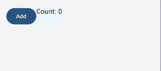
AnimatedContnet
状態の変更を起点にアニメーションを発生させるComposable
シンプルな使い方
@Composable
fun SimpleAnimatedContent(modifier: Modifier = Modifier) {
    Row(modifier) {
        // targetState
        var count by remember { mutableIntStateOf(0) }
        Button(onClick = { count++ }) {
            Text("Add")
        }
        AnimatedContent(
            targetState = count,
            label = "animated content"
        ) { targetCount ->
            // lambdaパラメータを使う必要がある
            Text(text = "Count: $targetCount")
        }
    }
}
アニメーションのカスタマイズ
AnimatedVisibilityではenter, exitパラメータを用いて、アニメーションをカスタマイズできましたが、AnimatedContentの場合は、transitionSpecパラメータを用いでカスタマイズします
transitionSpec: AnimatedContentTransitionScope<S>.() -> ContentTransform = {
    (fadeIn(animationSpec = tween(220, delayMillis = 90)) +
        scaleIn(initialScale = 0.92f, animationSpec = tween(220, delayMillis = 90)))
        .togetherWith(fadeOut(animationSpec = tween(90)))
},
AnimatedVisibilityと同じ要領でEnterTransitionとExitTransitionを作成し、両者を togetherWith で合成して、ContentTransitionにします
さらにSizeTransformを使うことで、コンテンツのサイズについてのアニメーションも制御できます
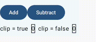
Column {
    var count by remember { mutableIntStateOf(0) }

    Row {
        Button(onClick = { count++ }) {
            Text("Add")
        }
        Button(onClick = { count-- }) {
            Text("Subtract")
        }
    }
    Row(
        verticalAlignment = Alignment.CenterVertically
    ) {
        Text("clip = true")
        AnimatedContent(
            targetState = count,
            transitionSpec = {
                val contentTransform = if (targetState > initialState) {
                    val enter = slideInVertically(tween(500)) { it } + fadeIn(tween(500))
                    val exit = slideOutVertically(tween(500)) { -it } + fadeOut(tween(500))
                    enter togetherWith exit
                } else {
                    // デクリメントの際は、上から下にアニメーション
                    val enter = slideInVertically(tween(500)) { -it } + fadeIn(tween(500))
                    val exit = slideOutVertically(tween(500)) { it } + fadeOut(tween(500))
                    enter togetherWith exit
                }
                // clip = false にすることで、コンテンツの領域をはみ出してアニメーションする
                // そのままの状態だと、クリッピングされるのでコンテンツ領域外になると見えなくなる
                contentTransform
            },
            label = "animated content",
            modifier = Modifier
                .padding(8.dp)
                .border(1.dp, Color.Black),
        ) { targetCount ->
            Text(
                text = "$targetCount",
            )
        }

        Text("clip = false")
        AnimatedContent(
            targetState = count,
            transitionSpec = {
                val contentTransform = if (targetState > initialState) {
                    val enter = slideInVertically(tween(500)) { it } + fadeIn(tween(500))
                    val exit = slideOutVertically(tween(500)) { -it } + fadeOut(tween(500))
                    enter togetherWith exit
                } else {
                    val enter = slideInVertically(tween(500)) { -it } + fadeIn(tween(500))
                    val exit = slideOutVertically(tween(500)) { it } + fadeOut(tween(500))
                    enter togetherWith exit
                }
                // clip = false にすることで、コンテンツの領域をはみ出してアニメーションする
                // そのままの状態だと、クリッピングされるのでコンテンツ領域外になると見えなくなる
                val sizeTransform = SizeTransform(false)
                contentTransform using sizeTransform
            },
            label = "animated content",
            modifier = Modifier
                .padding(8.dp)
                .border(1.dp, Color.Black),
        ) { targetCount ->
            Text(
                text = "$targetCount",
            )
        }
    }
}
余談
EnterTransitionとExitTransitionを合成する関数名はかつてはwithでしたが、現在ではtogetherWithになっているようでした。変更になった理由は定かではないですが、Kotlinにwith関数が元々あるのでそれと混同しないようにするために変更になったんですかね
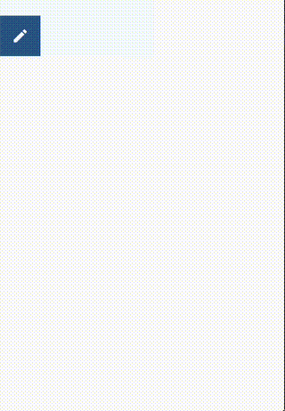
SizeTransformを使ったアニメーション
SizeTransformを用いることでサイズのアニメーション制御を細かく行えます
下の例では、コンテンツの伸縮アニメーションをカスタマイズしています
広げる際はまず横方向に広げたのち、縦方向に広げ、畳む際は逆にしています
var expanded by remember { mutableStateOf(false) }
Surface(
    color = MaterialTheme.colorScheme.primary,
    onClick = { expanded = !expanded },
) {
    AnimatedContent(
        contentAlignment = Alignment.TopStart,
        targetState = expanded,
        transitionSpec = {
            fadeIn() togetherWith
                    fadeOut() using
                    SizeTransform(false) { initialSize, targetSize ->
                        if (targetState) {
                            // expand
                            keyframes {
                                // まず横に伸ばす
                                IntSize(targetSize.width, initialSize.height) at 150
                                durationMillis = 300
                                // その後縦に伸ばす
                            }
                        } else {
                            // shrink
                            keyframes {
                                // まず縦に縮める
                                IntSize(initialSize.width, targetSize.height) at 150
                                durationMillis = 300
                                // その後横に縮める
                            }
                        }
                    }
        },
        label = "size transform",
        modifier = Modifier.padding(16.dp)
    ) { targetExpanded ->
        if (targetExpanded) {
            Text(
                """
                EnterTransition defines how the target content should appear, and ExitTransition defines how the initial content should disappear. In addition to all of the EnterTransition and ExitTransition functions available for AnimatedVisibility, AnimatedContent offers slideIntoContainer and slideOutOfContainer. These are convenient alternatives to slideInHorizontally/Vertically and slideOutHorizontally/Vertically that calculate the slide distance based on the sizes of the initial content and the target content of the AnimatedContent content.

                SizeTransform defines how the size should animate between the initial and the target contents. You have access to both the initial size and the target size when you are creating the animation. SizeTransform also controls whether the content should be clipped to the component size during animations.
            """.trimIndent()
            )
        } else {
            Icon(Icons.Default.Edit, null)
        }
    }
}
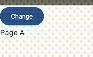
Crossfade
異なる2つのレイアウト変更にクロスフェードアニメーションを追加するComposable
@Composable
fun CrossfadeSample(modifier: Modifier = Modifier) {
    var currentPage by remember { mutableStateOf("A") }
    Column(modifier) {
        Button({
            currentPage = when (currentPage) {
                "A" -> "B"
                else -> "A"
            }
        }) {
            Text("Change")
        }
        Crossfade(targetState = currentPage, label = "cross fade") { screen ->
            when (screen) {
                "A" -> Text("Page A")
                "B" -> Text("Page B")
            }
        }
    }
}
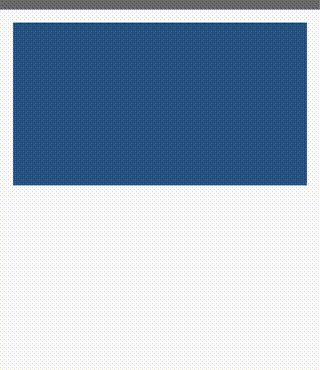
Modifier.animateContentSize
コンテンツのサイズ変更にアニメーションをつけてくれるModifier
注意: サイズ変更を正確に伝搬させるために、サイズ系のModifier(sizeやdefaultMinSizeなど)よりも先に呼び出す
@Composable
fun AnimateContentSizeSample(modifier: Modifier = Modifier) {
    var expanded by remember { mutableStateOf(false) }
    Box(
        modifier = modifier
            .background(MaterialTheme.colorScheme.primary)
            .animateContentSize()
            .height(if (expanded) 400.dp else 200.dp)
            .fillMaxWidth()
            .clickable {
                expanded = !expanded
            }
    )
}
参考文献
Discussion