🎨
【Android】Composeで横スクロールできる登録画像リストを作成する


概要
どの様なものかは👇こちらの動画を見て頂ければイメージしやすいと思います。これをAndroid向けにComposeを使って実装していきたいと思います。
機能としては
- リストを横スクロールできる
- リストに画像を追加できる
- リストの画像を削除できる
上記の機能を持つ前提で実装していきます。
動作環境
- Android Studio Ladybug | 2024.2.1 Patch 2
- MBA M3 Sonoma 14.6.1
- kotlin 2.1.0
- compose-bom 2024.12.01
必要なライブラリ追加
今回は画像表示する部分に Coil の AsyncImage を使うのでそちらを追加していきます。
gradle/libs.versions.toml に以下を追加します。
[versions]
coil = "2.7.0"

[libraries]
coil-compose = { module = "io.coil-kt:coil-compose", version.ref = "coil" }
build.gradle.kts に以下を追加します。
dependencies {
  implementation(libs.coil.compose)
}
シンプルな横スクロール実装
適当にAndroidアプリ用にプロジェクトを作成し HorizontalImageList.kt としてファイルを作成します。まずはシンプルに横スクロール表示を実装していきたいと思います。
@Composable
fun HorizontalImageList(images: List<String>) {
    LazyRow {
        items(images.size, key = { it }) {
            val image = images[it]
            AsyncImage(
                model = image,
                contentDescription = null,
                modifier = Modifier
                    .size(150.dp)
                    .background(Color.Gray),

                )
        }
    }
}

@Preview
@Composable
fun HorizontalImageListPreview() {
    // なるべくランダムな画像になるようにidを連番にしない様にしてます
    val images = List(10) { "https://picsum.photos/id/${it * 10}/150/150" }
    Box(
        Modifier
            .background(Color.White)
            .padding(16.dp)
    ) {
        HorizontalImageList(images)
    }
}
Previewの実行結果が👇になります。(※ Run Previewしてエミュレータで実行しています)

最後に画像追加できるように「+」をリストの最後に表示する
横スクロールの最後に、画像を追加できるような「+」ボタンを設置してみたいと思います。
HorizontalImageList を少し修正します。
@Composable
fun HorizontalImageList(images: List<String>) {
    LazyRow {
        items(images.size + 1, key = { it }) {
            if (images.size > it) {
                val image = images[it]
                AsyncImage(
                    model = image,
                    contentDescription = null,
                    modifier = Modifier
                        .size(150.dp)
                        .background(Color.Gray),

                    )

            } else {
                IconButton(
                    modifier = Modifier
                        .size(150.dp)
                        .background(
                            color = Color.Gray,
                            shape = RoundedCornerShape(8.dp)
                        ),
                    onClick = {}
                ) {
                    Icon(
                        imageVector = Icons.Filled.Add,
                        contentDescription = "Add",
                        tint = Color.White
                    )
                }
            }
        }
    }
}
Previewの実行結果が👇になります。
各画像に削除用のボタンを表示する
さらにHorizontalImageList を修正して、各画像の上に削除用のボタンを設置します。
@Composable
fun HorizontalImageList(images: List<String>) {
    LazyRow {
        items(images.size + 1, key = { it }) {
            if (images.size > it) {
                val image = images[it]
                Box {
                    AsyncImage(
                        model = image,
                        contentDescription = null,
                        modifier = Modifier
                            .size(150.dp)
                            .background(Color.Gray),

                        )
                    // ここからIconButton追加
                    IconButton(
                        modifier = Modifier
                            .align(Alignment.TopEnd)
                            .padding(2.dp)
                            .clip(CircleShape)
                            .size(25.dp, 25.dp)
                            .background(Color.White),
                        onClick = {}
                    ) {
                        Icon(
                            imageVector = Icons.Filled.Close,
                            contentDescription = "Delete",
                            tint = Color.Unspecified
                        )
                    }
                }
            } else {
                IconButton(
                    modifier = Modifier
                        .size(150.dp)
                        .background(
                            color = Color.Gray,
                            shape = RoundedCornerShape(8.dp)
                        ),
                    onClick = {}
                ) {
                    Icon(
                        imageVector = Icons.Filled.Add,
                        contentDescription = "Add",
                        tint = Color.White
                    )
                }
            }
        }
    }
}
Previewの実行結果が👇になります。

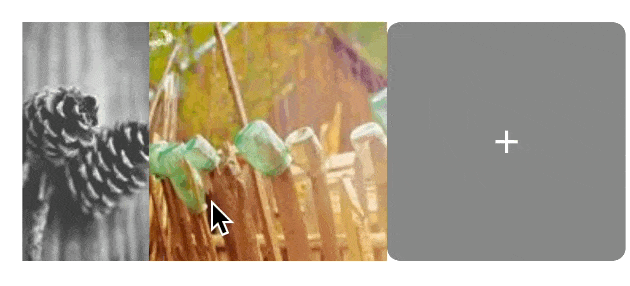
完成版
最後に各画像間にスペースを入れたり、画像を角丸にした完成形が以下になります。
@Composable
fun HorizontalImageList(images: List<String>) {
    LazyRow {
        items(images.size + 1, key = { it }) {
            if (images.size > it) {
                val image = images[it]
                Box(modifier = Modifier.padding(end = 6.dp)) { // スペース追加
                    // 各画像を角丸に
                    AsyncImage(
                        model = image,
                        contentDescription = null,
                        contentScale = ContentScale.Crop,
                        modifier = Modifier
                            .size(150.dp)
                            .clip(RoundedCornerShape(8.dp))
                            .background(Color.Gray),

                        )
                    IconButton(
                        modifier = Modifier
                            .align(Alignment.TopEnd)
                            .padding(2.dp)
                            .clip(CircleShape)
                            .size(25.dp, 25.dp)
                            .background(Color.White),
                        onClick = {}
                    ) {
                        Icon(
                            imageVector = Icons.Filled.Close,
                            contentDescription = "Delete",
                            tint = Color.Unspecified
                        )
                    }
                }
            } else {
                IconButton(
                    modifier = Modifier
                        .size(150.dp)
                        .background(
                            color = Color.Gray,
                            shape = RoundedCornerShape(8.dp)
                        ),
                    onClick = {}
                ) {
                    Icon(
                        imageVector = Icons.Filled.Add,
                        contentDescription = "Add",
                        tint = Color.White
                    )
                }
            }
        }
    }
}
Previewの実行結果が👇になります。(冒頭の動画と同じです)
参考URL
Discussion