styled-componentsをv5からv6に上げる時に躓いたところ


React + TypeScriptのプロジェクトで、styled-componentsをv5からv6に上げていたいた時に気づいたことです。
一応、公式でstyled-components v6へのマイグレーション手順を提供していてくれていますが、見逃してしまったところがあるので、備忘録として残しておきます。
詳細なマイグレーション手順の方は公式からどうぞ。
【解決策1】 transient propsでwarning回避
それまでは、styled componentを書く時に、次のように書いていました。
import styled from 'styled-components'

export const Page = () => (
  <>
    <Button height='100px'>ボタン</Button>
  </>
)

type Props = {
  isDisabled?: boolean
  onClick?: () => void
  height: string
  children: string
}

export const Button = ({ isDisabled, onClick, height, children }: Props) => (
  <StyledButton
    type='button'
    disabled={isDisabled}
    onClick={onClick}
    height={height}
  >
    {children}
  </StyledButton>
)

const StyledButton = styled.button<{
  height: string
}>`
  display: flex;
  justify-content: center;
  align-items: center;
  height: ${({ height }) => height};
`
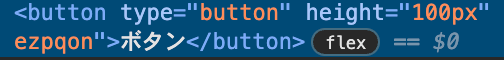
ただ、このように書いていると、heightがbutton要素に属性として露出してしまっています。
HTML属性として露出しないように、今度はcamel caseで書いてみます。
import styled from 'styled-components'

export const Page = () => (
  <>
    <Button height='100px'>ボタン</Button>
  </>
)

type Props = {
  isDisabled?: boolean
  onClick?: () => void
  height: string
  children: string
}

export const Button = ({ isDisabled, onClick, height, children }: Props) => (
  <StyledButton
    type='button'
    disabled={isDisabled}
    onClick={onClick}
-   height={height}
+   buttonHeight={height}
  >
    {children}
  </StyledButton>
)

const StyledButton = styled.button<{
- height: string
+ buttonHeight: string
}>`
  display: flex;
  justify-content: center;
  align-items: center;
- height: ${({ height }) => height};
+ height: ${({ buttonHeight }) => buttonHeight};`
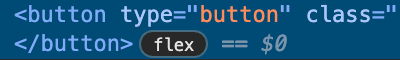
今度はHTML属性は表示されなくなりました。
ただ、キャメルケースで命名するコストがかかるのと、なんだか見通しが悪いです。
また、v6に上げるとキャメルケースでも次のような警告メッセージが出てしまいます。
そこで便利なのが、styled-components v5.1から導入されたtransient propsです。
import styled from 'styled-components'

export const Page = () => (
  <>
    <Button height='100px'>ボタン</Button>
  </>
)

type Props = {
  isDisabled?: boolean
  onClick?: () => void
  height: string
  children: string
}

export const Button = ({ isDisabled, onClick, height, children }: Props) => (
  <StyledButton
    type='button'
    disabled={isDisabled}
    onClick={onClick}
-   height={height}
+   $height={height}
  >
    {children}
  </StyledButton>
)

const StyledButton = styled.button<{
- height: string
+ $height: string
}>`
  display: flex;
  justify-content: center;
  align-items: center;
- height: ${({ height }) => height};
+ height: ${({ $height }) => $height};
`
styled-componentsに渡されるpropsが$サインで区別されて、それ以外のReactコンポーネント由来のprops・HTML要素の属性と見分けがつくようになり、コードの見通しがよくなりました。
If you want to prevent props meant to be consumed by styled components from being passed to the underlying React node or rendered to the DOM element, you can prefix the prop name with a dollar sign ($), turning it into a transient prop.
と公式で説明があるように、ReactNodeやDOM要素へ渡されることを避けるために、この書き方が推奨されています。
【解決策2】 StyleSheetManagerの設定でwarning回避
コードベースを全てtransient propsで書き換えるのが大変な場合はどうでしょう?
上記のstyled-components v6へのマイグレーション手順をちゃんと読むと、次のように書いてあります。
If haven't migrated your styling to use transient props ($prefix), you might notice React warnings about styling props getting through to the DOM in v6. To restore the v5 behavior, use StyleSheetManager:
v6に上げると、既に述べたattribute warningが出てしまうので、StyleSheetManagerで設定する必要があると、下記のコードと一緒に書いてあります。
import isPropValid from '@emotion/is-prop-valid';
import { StyleSheetManager } from 'styled-components';

function MyApp() {
    return (
        <StyleSheetManager shouldForwardProp={shouldForwardProp}>
            {/* other providers or your application's JSX */}
        </StyleSheetManager>
    )
}

// This implements the default behavior from styled-components v5
function shouldForwardProp(propName, target) {
    if (typeof target === "string") {
        // For HTML elements, forward the prop if it is a valid HTML attribute
        return isPropValid(propName);
    }
    // For other elements, forward all props
    return true;
}
TypeScriptで書き直してあげると、次のようなutilityコンポーネントが用意できました。
import { PropsWithChildren } from 'react'
import { ShouldForwardProp, StyleSheetManager } from 'styled-components'
import isPropValid from '@emotion/is-prop-valid'

const shouldForwardProp: ShouldForwardProp<'web'> = (propName, target) => {
  if (typeof target === 'string') {
    // For HTML elements, forward the prop if it is a valid HTML attribute
    return isPropValid(propName)
  }
  // For other elements, forward all props
  return true
}

export const CustomStyleSheetManager = ({ children }: PropsWithChildren) => (
  // enableVendorPrefixes: vendor prefixが省略されないようにする(v6ではvendor prefixがデフォルトで省略される)
  // shouldForwardProp: styled componentのpropsが有効なHTML要素である場合のみ、DOM要素にフォワードされるようにする
  <StyleSheetManager enableVendorPrefixes shouldForwardProp={shouldForwardProp}>
    {children}
  </StyleSheetManager>
)
これを使い回してあげれば、ライブラリのコンポーネントを拡張しているものでない限り(例えば、react-router-domのNavLinkをextendしているstyled componentなど)、attribute warningは回避できるようです。
まとめ
styled-components v5.1.0以降では、transient propsで書くのがよいでしょう。
v5.1.0のリリースノートがわかりやすいです。
Think of transient props as a lightweight, but complementary API to shouldForwardProp. Because styled-components allows any kind of prop to be used for styling (a trait shared by most CSS-in-JS libraries, but not the third party library ecosystem in general), adding a filter for every possible prop you might use can get cumbersome.
Transient props are a new pattern to pass props that are explicitly consumed only by styled components and are not meant to be passed down to deeper component layers. Here's how you use them:
const Comp = styled.div`
  color: ${props => props.$fg || 'black'};
`;

render(<Comp $fg="red">I'm red!</Comp>);
Note the dollar sign ($) prefix on the prop; this marks it as transient and styled-components knows not to add it to the rendered DOM element or pass it further down the component hierarchy.
Discussion