【React】無限スクロール + 検索機能付きSelect Boxを作ろう
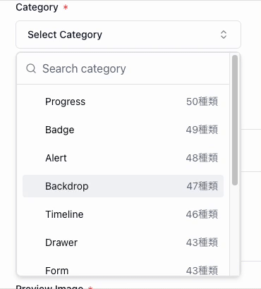
無限スクロールと検索機能を持つセレクトボックスを作成していきます。
他の UI コンポーネントにも応用できると思います。
完成イメージ
はじめに
GitHub と完成コード
完成コード(UI 側)
'use client';

import { Category } from '@prisma/client';
import { AlertTriangle, Check, ChevronsUpDown, Loader2 } from 'lucide-react';
import React, { Suspense, memo } from 'react';

import { useSearchCategories } from '@/components/category-selecter/use-search-categories';
import { Button } from '@/components/ui/button';
import {
  Command,
  CommandEmpty,
  CommandGroup,
  CommandInput,
  CommandItem,
} from '@/components/ui/command';
import {
  Popover,
  PopoverContent,
  PopoverTrigger,
} from '@/components/ui/popover';
import { Skeleton } from '@/components/ui/skeleton';
import { cn } from '@/lib/utils';

// 検索中のローディングを表示するコンポーネント
function SearchingLoader({ type }: { type: 'command' | 'item' }) {
  switch (type) {
    case 'command':
      return (
        <>
          <CommandInput disabled isLoading placeholder="Searching..." />
          <SearchingLoader type="item" />
        </>
      );
    case 'item':
      return (
        <div className="grid gap-2 p-2">
          {Array.from({ length: 5 }).map((_, i) => (
            <Skeleton key={`searching-loader-${i}`} className="h-8 w-full" />
          ))}
        </div>
      );
    default:
      return null;
  }
}

type CategoryItemProps = {
  category: Pick<Category, 'name'>;
  setOpen?: (value: boolean) => void;
  setCategory: (value: string) => void;
  value: string;
};

// カテゴリーアイテムを表示するコンポーネント
const CategoryItem = memo(
  ({ category, setOpen, setCategory, value }: CategoryItemProps) => {
    return (
      <CommandItem
        key={category.name}
        className="mt-2 flex items-center justify-between text-sm capitalize first:mt-0"
        onSelect={(currentValue) => {
          setCategory(currentValue);
          setOpen?.(false);
        }}
        value={category.name}
      >
        <div className="flex items-center">
          <Check
            className={cn(
              'mr-2 h-4 w-4',
              category.name === value ? 'opacity-100' : 'opacity-0'
            )}
          />
          <span>{category.name}</span>
        </div>
      </CommandItem>
    );
  }
);

// カテゴリー一覧を表示するコンポーネント
function Categories({
  setOpen,
  setCategory,
  value,
}: {
  setOpen?: (value: boolean) => void;
  setCategory: (value: string) => void;
  value: string;
}) {
  const {
    categories,
    hasMore,
    onChangeQuery,
    isSearching,
    inputValue,
    setInputValue,
    fetchNextPage,
  } = useSearchCategories();

  return (
    <>
      <CommandInput
        isLoading={isSearching}
        onValueChange={(v) => {
          onChangeQuery(v);
          setInputValue(v);
        }}
        placeholder="Search category"
      />
      <CommandEmpty className="py-0 text-left text-sm">
        {isSearching ? (
          <SearchingLoader type="item" />
        ) : (
          // 検索結果がない場合のコンポーネント
          <div className="flex w-full flex-col  gap-4 overflow-hidden px-2 py-4">
            <div className="flex justify-center">
              <AlertTriangle className="size-8 text-muted-foreground" />
            </div>

            <div className="grid gap-2">
              <p className="text-center text-muted-foreground">Not Found for</p>
              <code className="line-clamp-1 max-w-full rounded-md bg-secondary p-2 text-destructive ">
                {inputValue}
              </code>
            </div>
            <Button className="flex items-center" variant="default">
              <span className="mx-2 line-clamp-1 max-w-44 flex-1">
                {inputValue}
              </span>
              <span>を作成する</span>
            </Button>
          </div>
        )}
      </CommandEmpty>
      <CommandGroup className="p-2">
        {categories.map((category) => (
          <CategoryItem
            key={category.name}
            category={category}
            setCategory={setCategory}
            setOpen={setOpen}
            value={value}
          />
        ))}
      </CommandGroup>
      // 無限スクロールのボタン
      {hasMore && (
        <div className="mb-2 border-t border-border px-2 pt-6">
          <Button
            className="w-full rounded-full"
            disabled={isSearching}
            onClick={() => fetchNextPage()}
            size="sm"
            variant="default"
          >
            {isSearching && <Loader2 className="mr-4 size-5 animate-spin" />}
            {isSearching ? 'Loading...' : 'Load more'}
          </Button>
        </div>
      )}
    </>
  );
}

export function CategorySelector() {
  // Popoverの開閉状態を管理
  const [open, setOpen] = React.useState(false);
  // 選択されたカテゴリーを管理
  const [value, setCategory] = React.useState('');

  return (
    <Popover onOpenChange={setOpen} open={open}>
      <PopoverTrigger asChild>
        <div className="group inline-block">
          <Button
            aria-expanded={open}
            className="mt-3 w-72 justify-between capitalize group-hover:bg-accent group-hover:text-accent-foreground sm:w-80"
            role="combobox"
            type="button"
            variant="outline"
          >
            {value || 'Select category'}
            <ChevronsUpDown className="ml-2 size-4 shrink-0 opacity-50" />
          </Button>
        </div>
      </PopoverTrigger>
      <PopoverContent className="max-h-80 min-h-48 w-72 overflow-auto p-0 sm:w-80">
        <Command>
          <Suspense fallback={<SearchingLoader type="command" />}>
            <Categories
              setCategory={setCategory}
              setOpen={setOpen}
              value={value}
            />
          </Suspense>
        </Command>
      </PopoverContent>
    </Popover>
  );
}
完成コード(ロジック側)
import { Category } from '@prisma/client';
import { useSuspenseInfiniteQuery } from '@tanstack/react-query';
import { useMemo, useState, useTransition } from 'react';
import { useDebouncedCallback } from 'use-debounce';

type Params = {
  q: string;
  offset: number;
};

type FetchResult = {
  categories: Pick<Category, 'name'>[];
  hasMore: boolean;
};

async function fetchCategories(params: Params): Promise<FetchResult> {
  const searchParams = new URLSearchParams();
  // クエリパラメータをセット
  Object.entries(params).forEach(([key, value]) => {
    searchParams.set(key, value.toString());
  });

  const res = await fetch(`/api/categories?${searchParams.toString()}`);
  const data = (await res.json()) as FetchResult;

  return data;
}

function useQueryCategory(q: string) {
  const { data, isPending, hasNextPage, fetchNextPage, isFetchingNextPage } =
    useSuspenseInfiniteQuery({
      queryKey: ['categories', 'search', { q }],
      queryFn: ({ pageParam }: { pageParam: Params }) => {
        return fetchCategories(pageParam);
      },
      // 初期ページパラメータ
      initialPageParam: { q, offset: 0 },
      // 次のページパラメータ
      getNextPageParam: (lastPage, _, lastPageParam) => {
        // カテゴリーがない場合はundefinedを返す
        if (lastPage.categories.length === 0) return undefined;
        // もうページがない場合はundefinedを返す
        if (!lastPage.hasMore) return undefined;

        // 10件ずつ取得する
        return {
          q: lastPageParam.q,
          offset: lastPageParam.offset + 10,
        };
      },
    });

  // UI側で処理しやすいように二重配列をフラットにする
  const categories = useMemo(() => {
    return data?.pages.flatMap((page) => page.categories) ?? [];
  }, [data?.pages]);

  return {
    isPending: isPending || isFetchingNextPage,
    categories,
    hasMore: hasNextPage,
    fetchNextPage,
  };
}

export function useSearchCategories() {
  // 入力している値を表示する状態
  const [inputValue, setInputValue] = useState('');
  // 検索文字列の状態
  const [q, setQ] = useState('');
  const [isTransition, startTransition] = useTransition();

  const { hasMore, categories, isPending, fetchNextPage } = useQueryCategory(q);

  // すぐにリクエストを送信しないようにするために、useDebouncedCallback を使用
  const onChangeQuery = useDebouncedCallback((val: string) => {
    startTransition(() => {
      setQ(val.toLowerCase());
    });
  }, 500);

  // 検索中の状態を管理
  const isSearching =
    isPending || isTransition || inputValue.toLowerCase() !== q.toLowerCase();

  return {
    onChangeQuery,
    isSearching,
    inputValue,
    setInputValue,
    categories,
    hasMore,
    fetchNextPage,
  };
}
使用しているライブラリ
必要な部品 (UI 側)
1. 検索ボックスのトリガー
2. 無限スクロール付きセレクトボックス
- Commandをデータの状態に応じて表示するようにします。
3. データのアイテムを表示するコンポーネント
- 検索欄に文字を入力するたびに、再レンダリングされると、無限スクロールでアイテムが追加された際に、非常に処理が重くなります。これらを考慮しながら作成していきます。
必要な部品 (ロジック側)
1. 入力値とロード状態の管理
- 検索文字列の状態、入力文字列の状態、ロード状態の状態を管理します。また、
useDebouncedCallbackを使用して、過剰にリクエストを送信しないようにします。
2. Tanstack Query を使用した無限スクロールの実装
- 無限スクロールの状態管理を行う。
3. サーバーにリクエストを送る処理
- 検索文字列が変更された際にサーバーにリクエストを送る処理を実装します。
上記の必要な部品を 1 つずつ実装していきます。
実装
完成コード(UI 側)
'use client';

import { Category } from '@prisma/client';
import { AlertTriangle, Check, ChevronsUpDown, Loader2 } from 'lucide-react';
import React, { Suspense, memo } from 'react';

import { useSearchCategories } from '@/components/category-selecter/use-search-categories';
import { Button } from '@/components/ui/button';
import {
  Command,
  CommandEmpty,
  CommandGroup,
  CommandInput,
  CommandItem,
} from '@/components/ui/command';
import {
  Popover,
  PopoverContent,
  PopoverTrigger,
} from '@/components/ui/popover';
import { Skeleton } from '@/components/ui/skeleton';
import { cn } from '@/lib/utils';

// 検索中のローディングを表示するコンポーネント
function SearchingLoader({ type }: { type: 'command' | 'item' }) {
  switch (type) {
    case 'command':
      return (
        <>
          <CommandInput disabled isLoading placeholder="Searching..." />
          <SearchingLoader type="item" />
        </>
      );
    case 'item':
      return (
        <div className="grid gap-2 p-2">
          {Array.from({ length: 5 }).map((_, i) => (
            <Skeleton key={`searching-loader-${i}`} className="h-8 w-full" />
          ))}
        </div>
      );
    default:
      return null;
  }
}

type CategoryItemProps = {
  category: Pick<Category, 'name'>;
  setOpen?: (value: boolean) => void;
  setCategory: (value: string) => void;
  value: string;
};

// カテゴリーアイテムを表示するコンポーネント
const CategoryItem = memo(
  ({ category, setOpen, setCategory, value }: CategoryItemProps) => {
    return (
      <CommandItem
        key={category.name}
        className="mt-2 flex items-center justify-between text-sm capitalize first:mt-0"
        onSelect={(currentValue) => {
          setCategory(currentValue);
          setOpen?.(false);
        }}
        value={category.name}
      >
        <div className="flex items-center">
          <Check
            className={cn(
              'mr-2 h-4 w-4',
              category.name === value ? 'opacity-100' : 'opacity-0'
            )}
          />
          <span>{category.name}</span>
        </div>
      </CommandItem>
    );
  }
);

// カテゴリー一覧を表示するコンポーネント
function Categories({
  setOpen,
  setCategory,
  value,
}: {
  setOpen?: (value: boolean) => void;
  setCategory: (value: string) => void;
  value: string;
}) {
  const {
    categories,
    hasMore,
    onChangeQuery,
    isSearching,
    inputValue,
    setInputValue,
    fetchNextPage,
  } = useSearchCategories();

  return (
    <>
      <CommandInput
        isLoading={isSearching}
        onValueChange={(v) => {
          onChangeQuery(v);
          setInputValue(v);
        }}
        placeholder="Search category"
      />
      <CommandEmpty className="py-0 text-left text-sm">
        {isSearching ? (
          <SearchingLoader type="item" />
        ) : (
          // 検索結果がない場合のコンポーネント
          <div className="flex w-full flex-col  gap-4 overflow-hidden px-2 py-4">
            <div className="flex justify-center">
              <AlertTriangle className="size-8 text-muted-foreground" />
            </div>

            <div className="grid gap-2">
              <p className="text-center text-muted-foreground">Not Found for</p>
              <code className="line-clamp-1 max-w-full rounded-md bg-secondary p-2 text-destructive ">
                {inputValue}
              </code>
            </div>
            <Button className="flex items-center" variant="default">
              <span className="mx-2 line-clamp-1 max-w-44 flex-1">
                {inputValue}
              </span>
              <span>を作成する</span>
            </Button>
          </div>
        )}
      </CommandEmpty>
      <CommandGroup className="p-2">
        {categories.map((category) => (
          <CategoryItem
            key={category.name}
            category={category}
            setCategory={setCategory}
            setOpen={setOpen}
            value={value}
          />
        ))}
      </CommandGroup>
      // 無限スクロールのボタン
      {hasMore && (
        <div className="mb-2 border-t border-border px-2 pt-6">
          <Button
            className="w-full rounded-full"
            disabled={isSearching}
            onClick={() => fetchNextPage()}
            size="sm"
            variant="default"
          >
            {isSearching && <Loader2 className="mr-4 size-5 animate-spin" />}
            {isSearching ? 'Loading...' : 'Load more'}
          </Button>
        </div>
      )}
    </>
  );
}

export function CategorySelector() {
  // Popoverの開閉状態を管理
  const [open, setOpen] = React.useState(false);
  // 選択されたカテゴリーを管理
  const [value, setCategory] = React.useState('');

  return (
    <Popover onOpenChange={setOpen} open={open}>
      <PopoverTrigger asChild>
        <div className="group inline-block">
          <Button
            aria-expanded={open}
            className="mt-3 w-72 justify-between capitalize group-hover:bg-accent group-hover:text-accent-foreground sm:w-80"
            role="combobox"
            type="button"
            variant="outline"
          >
            {value || 'Select category'}
            <ChevronsUpDown className="ml-2 size-4 shrink-0 opacity-50" />
          </Button>
        </div>
      </PopoverTrigger>
      <PopoverContent className="max-h-80 min-h-48 w-72 overflow-auto p-0 sm:w-80">
        <Command>
          <Suspense fallback={<SearchingLoader type="command" />}>
            <Categories
              setCategory={setCategory}
              setOpen={setOpen}
              value={value}
            />
          </Suspense>
        </Command>
      </PopoverContent>
    </Popover>
  );
}
完成コード(ロジック側)
import { Category } from '@prisma/client';
import { useSuspenseInfiniteQuery } from '@tanstack/react-query';
import { useMemo, useState, useTransition } from 'react';
import { useDebouncedCallback } from 'use-debounce';

type Params = {
  q: string;
  offset: number;
};

type FetchResult = {
  categories: Pick<Category, 'name'>[];
  hasMore: boolean;
};

async function fetchCategories(params: Params): Promise<FetchResult> {
  const searchParams = new URLSearchParams();
  // クエリパラメータをセット
  Object.entries(params).forEach(([key, value]) => {
    searchParams.set(key, value.toString());
  });

  const res = await fetch(`/api/categories?${searchParams.toString()}`);
  const data = (await res.json()) as FetchResult;

  return data;
}

function useQueryCategory(q: string) {
  const { data, isPending, hasNextPage, fetchNextPage, isFetchingNextPage } =
    useSuspenseInfiniteQuery({
      queryKey: ['categories', 'search', { q }],
      queryFn: ({ pageParam }: { pageParam: Params }) => {
        return fetchCategories(pageParam);
      },
      // 初期ページパラメータ
      initialPageParam: { q, offset: 0 },
      // 次のページパラメータ
      getNextPageParam: (lastPage, _, lastPageParam) => {
        // カテゴリーがない場合はundefinedを返す
        if (lastPage.categories.length === 0) return undefined;
        // もうページがない場合はundefinedを返す
        if (!lastPage.hasMore) return undefined;

        // 10件ずつ取得する
        return {
          q: lastPageParam.q,
          offset: lastPageParam.offset + 10,
        };
      },
    });

  // UI側で処理しやすいように二重配列をフラットにする
  const categories = useMemo(() => {
    return data?.pages.flatMap((page) => page.categories) ?? [];
  }, [data?.pages]);

  return {
    isPending: isPending || isFetchingNextPage,
    categories,
    hasMore: hasNextPage,
    fetchNextPage,
  };
}

export function useSearchCategories() {
  // 入力している値を表示する状態
  const [inputValue, setInputValue] = useState('');
  // 検索文字列の状態
  const [q, setQ] = useState('');
  const [isTransition, startTransition] = useTransition();

  const { hasMore, categories, isPending, fetchNextPage } = useQueryCategory(q);

  // すぐにリクエストを送信しないようにするために、useDebouncedCallback を使用
  const onChangeQuery = useDebouncedCallback((val: string) => {
    startTransition(() => {
      setQ(val.toLowerCase());
    });
  }, 500);

  // 検索中の状態を管理
  const isSearching =
    isPending || isTransition || inputValue.toLowerCase() !== q.toLowerCase();

  return {
    onChangeQuery,
    isSearching,
    inputValue,
    setInputValue,
    categories,
    hasMore,
    fetchNextPage,
  };
}
UI 側
1. 検索ボックスのトリガー
完成コード
export function CategorySelector() {
  // popoverの開閉状態を管理
  const [open, setOpen] = React.useState(false);

  // 選択されたカテゴリーを管理
  const [value, setCategory] = React.useState('');

  return (
    <Popover onOpenChange={setOpen} open={open}>
      <PopoverTrigger asChild>
        <div className="group inline-block">
          <Button
            aria-expanded={open}
            className="mt-3 w-72 justify-between capitalize group-hover:bg-accent group-hover:text-accent-foreground sm:w-80"
            role="combobox"
            type="button"
            variant="outline"
          >
            {value || 'Select category'}
            <ChevronsUpDown className="ml-2 size-4 shrink-0 opacity-50" />
          </Button>
        </div>
      </PopoverTrigger>
      <PopoverContent className="max-h-80 min-h-48 w-72 overflow-auto p-0 sm:w-80">
        <Command>
          <Suspense fallback={<SearchingLoader type="command" />}>
            <Categories
              setCategory={setCategory}
              setOpen={setOpen}
              value={value}
            />
          </Suspense>
        </Command>
      </PopoverContent>
    </Popover>
  );
}
UI に関しては基本的に shadcn のCombobox の Examplesを参考にしています。
openのuseStateは Popover の開閉状態を管理するために、valueは Select Box で選択された値を管理するために使用しています。
Select Box の開閉状態と選択された値の管理
export function CategorySelector() {
  // popoverの開閉状態を管理
  const [open, setOpen] = React.useState(false);

  // 選択されたカテゴリーを管理
  const [value, setCategory] = React.useState("");

  // ...
2. 無限スクロール付きセレクトボックス
完成コード
function Categories({
  setOpen,
  setCategory,
  value,
}: {
  setOpen?: (value: boolean) => void;
  setCategory: (value: string) => void;
  value: string;
}) {
  const {
    categories,
    hasMore,
    onChangeQuery,
    isSearching,
    inputValue,
    setInputValue,
    fetchNextPage,
  } = useSearchCategories();

  return (
    <>
      <CommandInput
        isLoading={isSearching}
        onValueChange={(v) => {
          onChangeQuery(v);
          setInputValue(v);
        }}
        placeholder="Search category"
      />
      <CommandEmpty className="py-0 text-left text-sm">
        {isSearching ? (
          <SearchingLoader type="item" />
        ) : (
          // 検索結果がない場合のコンポーネント
          <div className="flex w-full flex-col  gap-4 overflow-hidden px-2 py-4">
            <div className="flex justify-center">
              <AlertTriangle className="size-8 text-muted-foreground" />
            </div>

            <div className="grid gap-2">
              <p className="text-center text-muted-foreground">Not Found for</p>
              <code className="line-clamp-1 max-w-full rounded-md bg-secondary p-2 text-destructive ">
                {inputValue}
              </code>
            </div>
            <Button className="flex items-center" variant="default">
              <span className="mx-2 line-clamp-1 max-w-44 flex-1">
                {inputValue}
              </span>
              <span>を作成する</span>
            </Button>
          </div>
        )}
      </CommandEmpty>
      <CommandGroup className="p-2">
        {categories.map((category) => (
          <CategoryItem
            key={category.name}
            category={category}
            setCategory={setCategory}
            setOpen={setOpen}
            value={value}
          />
        ))}
      </CommandGroup>
      // 無限スクロールのボタン
      {hasMore && (
        <div className="mb-2 border-t border-border px-2 pt-6">
          <Button
            className="w-full rounded-full"
            disabled={isSearching}
            onClick={() => fetchNextPage()}
            size="sm"
            variant="default"
          >
            {isSearching && <Loader2 className="mr-4 size-5 animate-spin" />}
            {isSearching ? 'Loading...' : 'Load more'}
          </Button>
        </div>
      )}
    </>
  );
}
CommandInputをカスタマイズする
const CommandInput = React.forwardRef<
  React.ElementRef<typeof CommandPrimitive.Input>,
  React.ComponentPropsWithoutRef<typeof CommandPrimitive.Input> & {
    isLoading?: boolean;
  }
>(({ className, isLoading = false, ...props }, ref) => (
  <div className="flex items-center border-b px-3" cmdk-input-wrapper="">
    // isLoadingがtrueの場合はロード中のアイコンを表示する
    {isLoading ? (
      <Loader2 className="mr-2 size-4 shrink-0 animate-spin opacity-50" />
    ) : (
      <Search className="mr-2 size-4 shrink-0 opacity-50" />
    )}
    <CommandPrimitive.Input
      ref={ref}
      className={cn(
        'flex h-11 w-full rounded-md bg-transparent py-3 text-[16px] outline-none placeholder:text-muted-foreground disabled:cursor-not-allowed disabled:opacity-50',
        className
      )}
      {...props}
    />
  </div>
));
まず、上記のように shadcn のCommandInputを修正して、isLoadingがtrueの場合はロード中のアイコンを表示するようにします。
検索中はぐるぐるマークが表示され、検索中でない場合は検索アイコンが表示されます。
ロード中と検索結果がない場合のコンポーネント
function SearchingLoader() {
  return (
    <div className="grid gap-2 p-2">
      {Array.from({ length: 5 }).map((_, i) => (
        <Skeleton key={`searching-loader-${i}`} className="h-8 w-full" />
      ))}
    </div>
  );
}
<CommandEmpty className="py-0 text-left text-sm">
  {isSearching ? (
    <SearchingLoader type="item" />
  ) : (
    // 検索結果がない場合のコンポーネント
    <div className="flex w-full flex-col  gap-4 overflow-hidden px-2 py-4">
      <div className="flex justify-center">
        <AlertTriangle className="size-8 text-muted-foreground" />
      </div>

      <div className="grid gap-2">
        <p className="text-center text-muted-foreground">Not Found for</p>
        <code className="line-clamp-1 max-w-full rounded-md bg-secondary p-2 text-destructive ">
          {inputValue}
        </code>
      </div>
      <Button className="flex items-center" variant="default">
        <span className="mx-2 line-clamp-1 max-w-44 flex-1">{inputValue}</span>
        <span>を作成する</span>
      </Button>
    </div>
  )}
</CommandEmpty>
useSearchCategoriesは後述しますが、検索文字列の状態、入力文字列の状態、ロード状態の状態を管理します。
useSearchCategoriesの isSearching がtrueの場合は上記のローディングを表示します。
CommandEmptyは検索結果がない場合に表示されるコンポーネントです。
検索結果がない場合かつ、検索中でない場合に 作成するボタンが表示されます。
3. データのアイテムを表示するコンポーネント
完成コード
const CategoryItem = memo(
  ({ category, setOpen, setCategory, value }: CategoryItemProps) => {
    return (
      <CommandItem
        key={category.name}
        className="mt-2 flex items-center justify-between text-sm capitalize first:mt-0"
        onSelect={(currentValue) => {
          setCategory(currentValue);
          setOpen?.(false);
        }}
        value={category.name}
      >
        <div className="flex items-center">
          <Check
            className={cn(
              'mr-2 h-4 w-4',
              category.name === value ? 'opacity-100' : 'opacity-0'
            )}
          />
          <span>{category.name}</span>
        </div>
      </CommandItem>
    );
  }
);
memoを使用する
const CategoryItem = memo(() => {
  // ...
});
useMemoを使用することにより、入力欄に文字を入力するたびに再レンダリングされることを防ぎます。
useMemoを使用していない場合、無限ローディングでアイテムが追加された際に、非常に処理が重くなります。
ロジック側
1. 入力値とロード状態の管理
完成コード
export function useSearchCategories() {
  // 入力値の状態を管理
  const [inputValue, setInputValue] = useState('');
  // 検索文字列の状態を管理
  const [q, setQ] = useState('');
  const [isTransition, startTransition] = useTransition();

  const { hasMore, categories, isPending, fetchNextPage } = useQueryCategory(q);

  // すぐにリクエストを送信しないようにするために、useDebouncedCallback を使用
  const onChangeQuery = useDebouncedCallback((val: string) => {
    startTransition(() => {
      setQ(val.toLowerCase());
    });
  }, 500);

  // 検索中の状態を管理
  const isSearching =
    isPending || isTransition || inputValue.toLowerCase() !== q.toLowerCase();

  return {
    onChangeQuery,
    isSearching,
    inputValue,
    setInputValue,
    categories,
    hasMore,
    fetchNextPage,
  };
}
// 入力値の状態を管理
const [inputValue, setInputValue] = useState('');
// 検索文字列の状態を管理
const [q, setQ] = useState('');
const [isTransition, startTransition] = useTransition();

// すぐにリクエストを送信しないようにするために、useDebouncedCallback を使用
const onChangeQuery = useDebouncedCallback((val: string) => {
  startTransition(() => {
    setQ(val.toLowerCase());
  });
}, 500);
入力値と検索文字列の状態を分ける理由は、useDebouncedCallbackを使用しているため、stateに反映する時間が遅れ、ユーザーに表示するまで遅延が発生するためです。
そのため、ユーザーに表示するための stateとリクエストを送信するための stateを分けています。
useTransitionは、処理を遅延させるために使用しています。今回の場合はあまり恩恵がありませんが、入力文字列をURL クエリに変換する際などに使用することにより、反映中かどうかをisTransitionで管理することができます。
検索中の状態を管理
const isSearching =
  isPending || isTransition || inputValue.toLowerCase() !== q.toLowerCase();
上記のコードの、inputValue.toLowerCase() !== q.toLowerCase();は、入力文字列と検索文字列が異なる場合は検索中の(まだ結果がわからない)状態なので、isSearchingをtrueにしています。
2. Tanstack Query を使用した無限スクロールの実装
完成コード
function useQueryCategory(q: string) {
  const { data, isPending, hasNextPage, fetchNextPage, isFetchingNextPage } =
    useSuspenseInfiniteQuery({
      queryKey: ['categories', 'search', { q }],
      queryFn: ({ pageParam }: { pageParam: Params }) => {
        return fetchCategories(pageParam);
      },
      initialPageParam: { q, offset: 0 },
      getNextPageParam: (lastPage, _, lastPageParam) => {
        if (lastPage.categories.length === 0) return undefined;
        if (!lastPage.hasMore) return undefined;

        return {
          q: lastPageParam.q,
          offset: lastPageParam.offset + 10,
        };
      },
    });

  const categories = useMemo(() => {
    return data?.pages.flatMap((page) => page.categories) ?? [];
  }, [data?.pages]);

  return {
    isPending: isPending || isFetchingNextPage,
    categories,
    hasMore: hasNextPage,
    fetchNextPage,
  };
}
key などに関しては、通常のuseQueryと同じです。
initialPageParamとgetNextPageParamについて
useSuspenseInfiniteQuery({
  // ...
  initialPageParam: { q, offset: 0 },
  getNextPageParam: (lastPage, _, lastPageParam) => {
    if (lastPage.categories.length === 0) return undefined;
    if (!lastPage.hasMore) return undefined;

    return {
      q: lastPageParam.q,
      offset: lastPageParam.offset + 10,
    };
  },
});
initialPageParamは 1 回目のqueryFnに渡されるパラメータです。
getNextPageParamは 2 回目以降のqueryFnに渡されるパラメータです。10 件ずつ取得するためにoffsetを10ずつ増やしています。getNextPageParamの型はfetchFnの引数と同じです。
getNextPageParamでundefinedを返すと、useSuspenseInfiniteQueryのhasNextPageがfalseになります。
今回の場合は、サーバー側から返ってくるhasMoreがfalseか最後に取得したデータが0件の場合にundefinedを返しています。
その他の引数については以下のリンクを参照してください。
UI 側で処理しやすいように二重配列をフラットにする
const categories = useMemo(() => {
  return data?.pages.flatMap((page) => page.categories) ?? [];
}, [data?.pages]);
useInfiniteQueryのdata.pagesには値が格納されますが、二重配列になっているため、flatMapを使用して一つの配列に変換しています。これにより、UI 側で処理が単純化して見やすくなります。
3. サーバーにリクエストを送る処理
完成コード
async function fetchCategories(params: Params): Promise<FetchResult> {
  const searchParams = new URLSearchParams();
  Object.entries(params).forEach(([key, value]) => {
    searchParams.set(key, value.toString());
  });

  const res = await fetch(`/api/categories?${searchParams.toString()}`);
  const data = (await res.json()) as FetchResult;

  return data;
}
クエリパラメータをセット
const searchParams = new URLSearchParams();
Object.entries(params).forEach(([key, value]) => {
  searchParams.set(key, value.toString());
});
受け取ったパラメータをURL クエリに変換しています。
意外と Next.js でパラメータを追加する際に使用することが多いです。
まとめ
useInfiniteQueryを使用することで、無限スクロールの実装し、useDebouncedCallbackを使用することで、検索欄に入力がある場合に毎回リクエストを送るのではなく、入力が終わってからリクエストを送ることができます。
今回はボタンで更にデータを取得するようにしていますが、スクロールに合わせてデータを取得することも可能です。
Tanstack QueryのuseInfiniteQueryは無限スクロールの実装に非常に便利です。
さいごに
このコンポーネント以外にも、色々なコンポーネントの記事を書いていこうと想います。
もし、間違いや改善点や質問があれば、コメントで教えていただけると嬉しいです。
以下のようにどんどんコンポーネントの記事を書いていく予定です。
ありがとうございました。
Discussion