Open6
Mantine v7でBottom Navigation Tabを実装
 シロ
シロ環境
- Bun: 1.0.1
- Next.js: 13.4.4
- Mantine: 7.0.1
使用するコンポーネント
AppShell
Group
Stack
Text
参考資料
シロアプリ作成
- アプリ名: mantine-sample
$ bunx create-next-app@latest --example https://github.com/mantinedev/next-app-min-template
✔ What is your project named? … mantine-sample
アイコン
$ bun a @tabler/icons-react
bun add v1.0.1 (31aec4eb)

 installed @tabler/icons-react@2.38.0

 2 packages installed [3.65s]
ディレクトリ構成
$ cd mantine-sample
$ tree -I node_modules/
.
├── README.md
├── app
│   ├── layout.tsx
│   └── page.tsx
├── next-env.d.ts
├── next.config.js
├── package-lock.json
├── package.json
├── postcss.config.js
├── public
│   └── favicon.svg
├── theme.ts
├── tsconfig.json
└── yarn.lock

3 directories, 12 files
AppShellのサンプルをまずは適用。useDisclosureを使用する際、'use client';が必要。
app/page.tsx
'use client';
import { useDisclosure } from '@mantine/hooks';
import { AppShell, Burger } from '@mantine/core';

export default function HomePage() {
  const [opened, { toggle }] = useDisclosure();

  return (
    <AppShell
      header={{ height: 60 }}
      navbar={{ width: 300, breakpoint: 'sm', collapsed: { mobile: !opened } }}
      padding="md"
    >
      <AppShell.Header>
        <Burger opened={opened} onClick={toggle} hiddenFrom="sm" size="sm" />
        <div>Logo</div>
      </AppShell.Header>

      <AppShell.Navbar p="md">Navbar</AppShell.Navbar>

      <AppShell.Main>Main</AppShell.Main>
    </AppShell>
  );
}
v7.0.0 の変更点
AppShell changes
-
AppShellnow uses compound components pattern:Navbar,Aside,HeaderandFooterare no longer exported from@mantine/corepackage. Instead, useAppShell.Navbar,AppShell.Aside, etc.
Other changes
-
Stackcomponentspacingprop was renamed togap
シロ雑な実装
- page.tsx
'use client';
import { useDisclosure } from '@mantine/hooks';
import { AppShell, Burger, Group, Stack, Text } from '@mantine/core';
import { IconCalendarEvent } from '@tabler/icons-react';

export function BottomNavigation(): JSX.Element {
  return (
    <AppShell.Footer>
      <Group grow gap={0}>
        <Stack h={60} align='center' justify='center' gap={0}>
          <IconCalendarEvent />
          <Text
            size='xs'
          >
            Events
          </Text>
        </Stack>
        <Stack h={60} align='center' justify='center' gap={0}>
          <IconCalendarEvent />
          <Text
            size='xs'
          >
            Events
          </Text>
        </Stack>
        <Stack h={60} align='center' justify='center' gap={0}>
          <IconCalendarEvent />
          <Text
            size='xs'
          >
            Events
          </Text>
        </Stack>
      </Group>
    </AppShell.Footer>
  );
}

export default function HomePage() {
  const [opened, { toggle }] = useDisclosure();

  return (
    <AppShell
      header={{ height: 60 }}
      navbar={{ width: 300, breakpoint: 'sm', collapsed: { mobile: !opened } }}
      footer={{ height: 60 }}
      padding="md"
    >
      <AppShell.Header>
        <Burger opened={opened} onClick={toggle} hiddenFrom="sm" size="sm" />
        <div>Logo</div>
      </AppShell.Header>

      <AppShell.Navbar p="md">Navbar</AppShell.Navbar>

      <AppShell.Main>Main</AppShell.Main>

      <BottomNavigation />
    </AppShell>
  );
}
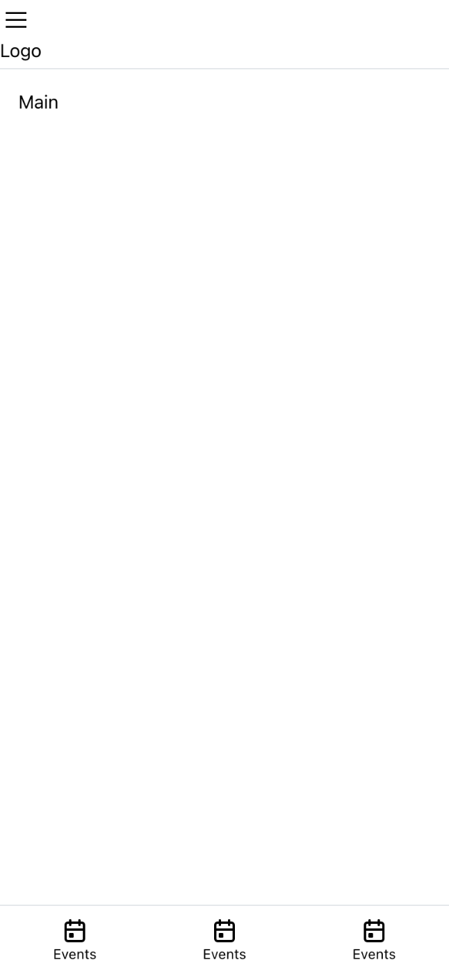
モバイル表示

モバイル以外での表示

シロモバイルとモバイル以外で出し分ける
- page.tsx
'use client';
import { useDisclosure, useMediaQuery } from '@mantine/hooks';
import { AppShell, Burger, Group, Stack, Text, useMantineTheme } from '@mantine/core';
import { IconCalendarEvent } from '@tabler/icons-react';

export function BottomNavigation(): JSX.Element {
  return (
    <AppShell.Footer>
      <Group grow gap={0}>
        <Stack h={60} align='center' justify='center' gap={0}>
          <IconCalendarEvent />
          <Text
            size='xs'
          >
            Events
          </Text>
        </Stack>
        <Stack h={60} align='center' justify='center' gap={0}>
          <IconCalendarEvent />
          <Text
            size='xs'
          >
            Events
          </Text>
        </Stack>
        <Stack h={60} align='center' justify='center' gap={0}>
          <IconCalendarEvent />
          <Text
            size='xs'
          >
            Events
          </Text>
        </Stack>
      </Group>
    </AppShell.Footer>
  );
}

export default function HomePage() {
  const theme = useMantineTheme()
  const isMobile = useMediaQuery(`(max-width: ${theme.breakpoints.sm})`)

  const [opened, { toggle }] = useDisclosure();

  return (
    <AppShell
      header={{ height: 60 }}
      navbar={{ width: 300, breakpoint: 'sm', collapsed: { mobile: !opened } }}
      footer={isMobile ? ({ height: 60 }) : undefined}
      padding="md"
    >
      <AppShell.Header>
        <Burger opened={opened} onClick={toggle} hiddenFrom="sm" size="sm" />
        <div>Logo</div>
      </AppShell.Header>

      <AppShell.Navbar p="md">Navbar</AppShell.Navbar>

      <AppShell.Main>Main</AppShell.Main>

      {isMobile && <BottomNavigation />}
    </AppShell>
  );
}
モバイル表示
モバイル以外での表示
