tailwindのコンフィグの設定方法調べてみるぞ
 島袋恵
島袋恵tailwindのコンフィグの設定方法調べてみるぞ
島袋恵shadui も使う
$ pnpm create next-app@latest tailwind-nextjs --typescript --tailwind --eslint
$ cd tailwind-nextjs
$ pnpm dlx shadcn-ui@latest init
島袋恵shadcn-ui の ボタンを追加する
$ pnpm dlx shadcn-ui@latest add button
app/page.tsx にボタン表示
import { Button } from "@/components/ui/button"

export default function Home() {
  return (
    <main className="flex flex-col items-center justify-between p-24">
      <div>hello</div>
      <div className="pt-24">
        <Button>Click me</Button>
      </div>
    </main>
  )
}
まずデフォルトのテーマの設定がどうなってるか調べる。
We provide a sensible default theme with a very generous set of values to get you started, but don’t be afraid to change it or extend it; you’re encouraged to customize it as much as you need to fit the goals of your design.
私たちは、始めるための非常に豊富な値セットを持つ合理的なデフォルトのテーマを提供していますが、それを変更したり拡張したりすることを恐れないでください。デザインの目的に合わせて必要な限りカスタマイズすることを奨励しています。
デフォルトのテーマ
defaultTheme は require('tailwindcss/defaultTheme') で取得できる。
import { Button } from "@/components/ui/button"
const defaultTheme = require('tailwindcss/defaultTheme')

export default function Home() {
  console.log("defaultTheme", defaultTheme)
  return (
    <main className="flex flex-col items-center justify-between p-24">
      <div>hello</div>
      <div className="pt-24">
        <Button>Click me</Button>
      </div>
    </main>
  )
}
既存のテーマを上書きするためには、extend で拡張、上書きする。
テーマオプションのデフォルト値を保持しながら新しい値を追加したい場合、設定ファイル内のtheme.extendキーの下に拡張機能を追加します。このキーの下の値は既存のテーマ値と結合され、新しいクラスとして自動的に利用可能になります。
tailwind.config.js
/** @type {import('tailwindcss').Config} */
module.exports = {
  darkMode: ["class"],
  content: [
    "./pages/**/*.{ts,tsx}",
    "./components/**/*.{ts,tsx}",
    "./app/**/*.{ts,tsx}",
    "./src/**/*.{ts,tsx}",
  ],
  theme: {
    container: {
      center: true,
      padding: "2rem",
      screens: {
        "2xl": "1400px",
      },
    },
    extend: {
      colors: {
        border: "hsl(var(--border))",
        input: "hsl(var(--input))",
        ring: "hsl(var(--ring))",
        background: "hsl(var(--background))",
        foreground: "hsl(var(--foreground))",
        primary: {
          DEFAULT: "hsl(var(--primary))",
          foreground: "hsl(var(--primary-foreground))",
        },
        secondary: {
          DEFAULT: "hsl(var(--secondary))",
          foreground: "hsl(var(--secondary-foreground))",
        },
        destructive: {
          DEFAULT: "hsl(var(--destructive))",
          foreground: "hsl(var(--destructive-foreground))",
        },
        muted: {
          DEFAULT: "hsl(var(--muted))",
          foreground: "hsl(var(--muted-foreground))",
        },
        accent: {
          DEFAULT: "hsl(var(--accent))",
          foreground: "hsl(var(--accent-foreground))",
        },
        popover: {
          DEFAULT: "hsl(var(--popover))",
          foreground: "hsl(var(--popover-foreground))",
        },
        card: {
          DEFAULT: "hsl(var(--card))",
          foreground: "hsl(var(--card-foreground))",
        },
      },
      borderRadius: {
        lg: "var(--radius)",
        md: "calc(var(--radius) - 2px)",
        sm: "calc(var(--radius) - 4px)",
      },
      keyframes: {
        "accordion-down": {
          from: { height: 0 },
          to: { height: "var(--radix-accordion-content-height)" },
        },
        "accordion-up": {
          from: { height: "var(--radix-accordion-content-height)" },
          to: { height: 0 },
        },
      },
      animation: {
        "accordion-down": "accordion-down 0.2s ease-out",
        "accordion-up": "accordion-up 0.2s ease-out",
      },
    },
  },
  plugins: [require("tailwindcss-animate")],
};
color に カスタムカラーを追加してみる。
-
globals.cssに カスタムプロパティで--green: 159, 100%, 50%;を追加する。 -
tailwind.config.jsの extend.colors にgreen: "hsl(var(--green))",を追加する。 - jsx側でclassNameに指定する
      <div className="bg-green">こちらはgreenカラーの背景を持ったdiv要素です</div>
      <div className="text-green">こちらはgreenカラーの背景を持ったdiv要素です</div>
      <div className="text-green-500">こちらはgreenカラーの背景を持ったdiv要素です</div>
      <div className="text-blue-500">こちらはgreenカラーの背景を持ったdiv要素です</div>
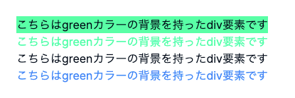
extend したら default の green は使えなくなるっぽい。
変更点
島袋恵デフォルトのテーマを拡張するか、上書きするか。
theme.extend 直下に追加すると拡張されて、theme 直下だと上書きされる。
島袋恵テーマ内の他の値を参照する場合
テーマ内の別の値を参照する必要がある場合、静的な値の代わりにクロージャ(関数)を提供することでそれを実現できます。このクロージャは、ドット記法を使用してテーマ内の他の値を検索するためのtheme()関数を含むオブジェクトを受け取ります。
/** @type {import('tailwindcss').Config} */
module.exports = {
  theme: {
    spacing: {
      // ...
    },
    backgroundSize: ({ theme }) => ({
      auto: 'auto',
      cover: 'cover',
      contain: 'contain',
      ...theme('spacing')
    })
  }
}
島袋恵フォントサイズのデフォルト値
    fontSize: {
      xs: ['0.75rem', { lineHeight: '1rem' }],
      sm: ['0.875rem', { lineHeight: '1.25rem' }],
      base: ['1rem', { lineHeight: '1.5rem' }],
      lg: ['1.125rem', { lineHeight: '1.75rem' }],
      xl: ['1.25rem', { lineHeight: '1.75rem' }],
      '2xl': ['1.5rem', { lineHeight: '2rem' }],
      '3xl': ['1.875rem', { lineHeight: '2.25rem' }],
      '4xl': ['2.25rem', { lineHeight: '2.5rem' }],
      '5xl': ['3rem', { lineHeight: '1' }],
      '6xl': ['3.75rem', { lineHeight: '1' }],
      '7xl': ['4.5rem', { lineHeight: '1' }],
      '8xl': ['6rem', { lineHeight: '1' }],
      '9xl': ['8rem', { lineHeight: '1' }],
    },
島袋恵noto sans jp を追加する
変更差分
島袋恵font-sizeをカスタムした
    extend: {
      fontFamily: {
        sans: ["var(--font-noto)"],
      },
      fontSize: {
        xxxs: ["0.65rem", { lineHeight: "1.6", letterSpacing: "0.05em" }],
        xxs: ["0.75rem", { lineHeight: "1.6", letterSpacing: "0.05em" }],
        xs: ["0.8125rem", { lineHeight: "1.6", letterSpacing: "0.05em" }],
        s: ["0.875rem", { lineHeight: "1.6", letterSpacing: "0.05em" }],
        m: ["1rem", { lineHeight: "1.6", letterSpacing: "0.05em" }],
        l: ["1.125rem", { lineHeight: "1.6", letterSpacing: "0.05em" }],
        xl: ["1.25rem", { lineHeight: "1.6", letterSpacing: "0.05em" }],
        xxl: ["1.5rem", { lineHeight: "1.6", letterSpacing: "0.05em" }],
        xxxl: ["1.625rem", { lineHeight: "1.6", letterSpacing: "0.05em" }],
        xxxxl: ["2rem", { lineHeight: "1.6", letterSpacing: "0.05em" }],
      },
     ...
変更差分
島袋恵shadcn の typography を使ってみる。
変更差分
島袋恵breakpoints をカスタマイズしたい
デフォルト値
   screens: {
      sm: '640px',
      md: '768px',
      lg: '1024px',
      xl: '1280px',
      '2xl': '1536px',
    },
sm:hoge で 640px〜 指定したスタイルが当たる(次のブレークポイントでスタイルが変わる指定があるまで適用される)
md:hoge で 768px〜 指定したスタイルが当たる(次のブレークポイントでスタイルが変わる指定があるまで適用される)
lg:hoge で 1024px〜 指定したスタイルが当たる(次のブレークポイントでスタイルが変わる指定があるまで適用される)
例. 640px - 768px までは、背景青、768px - は背景緑
      <div className="bg-red-100 mt-8 sm:bg-blue-100 md:bg-green">
        このテキストは、mdブレークポイントで緑色の背景になります。
      </div>
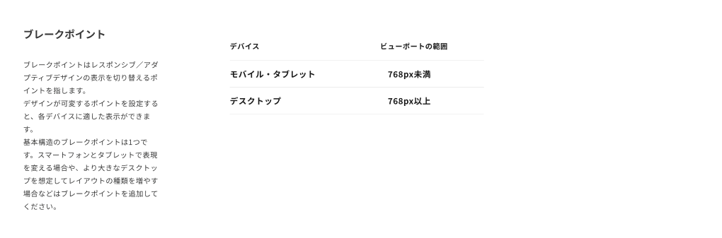
デジタル庁デザインシステムのブレークポイント
島袋恵レスポンシブでハンバーガーメニューのだし訳したりしてるheaderの実装参考。SPベースで作ってて、lg:hoge でスタイル切り替えてるっぽい。