NuxtプロジェクトにStorybookを導入してみた


背景
コンポーネントは開発につれどんどん増えていくとコンポーネントUIライブラリを導入したくなるのは結構ある話かと思います。特にプロジェクトに参入したばかりの開発メンバーにとってコンポーネント一覧いみたいなものがあれば開発時に多少ストレスを軽減できるはずです。
ということで今回はNuxtにStorybookを導入して、基礎的の使い方や所感などを共有しようと思います。
当記事のざっくり内容
- 導入手順(nuxt/storybookを利用)
- 設定について
- ストーリーの書き方とハマったところ
- 子コンポーネントを含めたコンポーネントのストーリーについて
導入手順
NuxtにStorybookを導入する方法は主に2つあります。
- Storybookの公式サイトのinstall手順を参考する方法
- Nuxt Storybookをinstall方法
1の方法に関してはstorybookの設定をいじる時.storybook/main.jsや .storybook/preview.jsで色々と設定しなきゃいけないのでちょっと面倒くさいなぁと感じましたので、今回は2の方法を採用しました。
nuxtjs/storybookを導入することでstorybookの設定はnuxt.config.jsにて完結できるのと、storybookに関連するファイル(上述のmain.jsやpreview.jsとか)を全部自動で生成してくれるので便利です。
開発環境は以下です
nuxt: 2.15.8
nuxt/storybook: 4.2 (中身はstorybook 6.3を使ってます)
導入方法は公式サイトに書いたとおりに下記コマンドを叩けばインストール完了です。
yarn add --dev @nuxtjs/storybook postcss@latest
次に.gitignoreに下記を追加してください。
.nuxt-storybook
storybook-static
これでbuildで生成されるファイルがgitに引っかからなくなります。
後は下記コマンドを叩けばstorybookを起動できます。
yarn nuxt storybook
StoryBookの設定
今回はnuxt/storybookを利用してるので基本的に設定は全部nuxt.config.jsにまとめて書けますが、そうではなかったら公式サイトを参考してください。
実際設定できるoptions一覧はこちらです。
実際に設定したoptionsは下記です。
// nuxt.config.js
storybook: {
    // 追加のアドオン
    // デフォルトではstorybook/addon-essentialsが含まれてます、含まれてるaddonは下記リンクを参照
    // https://storybook.js.org/docs/react/essentials/introduction
    addons: [],
    // storybookのポート指定
    port: 4000,
    // 背景色や表示位置、デバイスの設定など
    parameters: {
      // 背景色:デフォルトの色を使う場合
      backgrounds: {
        default: 'light', // light or dark
      },
      // Description, Default, Controlsカラムの表示
      controls: {
        expanded: true,
      },
      // 表示位置
      // centered:中央表示, padded:コンポーネントに余白付与, fullscreen:幅いっぱい
      layout: 'centered',
    },
  },
上記の設定でhttp://localhost:4000/にアクセスすると下記スクショ通りにstorybookが表示されます。

それではストーリーの書き方を見ていきましょう。
ストーリーを書く
まずslot付きのコンポーネントのストーリーを書きます。
コンポーネントのコードは下記です。(スタイルの部分は割愛します)
SelectBox.vue
<template>
  <span>
    <select :value="value" @input="selected">
      <option v-for="option in options" :key="option.code" :value="option.code">
        {{ option.name }}
      </option></select
    ><span class="slot-text"><slot></slot></span>
  </span>
</template>

<script>
export default {
  props: {
    id: {
      type: String,
      default: '',
    },
    value: {
      type: String,
      default: '',
      required: true,
    },
    options: {
      type: Array,
      required: true,
    },
  },
  methods: {
    selected($event) {
      this.$emit('selected', $event.target.value, this.id);
    },
  },
};
</script>
コンポーネントのストーリーのコードは下記です。
SelectBox.stories.js
import SelectBox from '~/components/atoms/SelectBox';
export default {
  title: 'Design System/Atoms/SelectBox',
  component: SelectBox,
  // 下記のparametersの設定はコンポーネントにあるすべてのemitイベントをロギングすることができます
  // parameters: { actions: { argTypesRegex: '.*' } },
  argTypes: {
    id: {
      description: 'セレクトボックスのID',
      control: 'text',
      defaultValue: 'chinryouMin',
    },
    value: {
      description: 'セレクトボックスの値',
      control: 'text',
      defaultValue: '0',
    },
    options: {
      description: 'セレクトボックスの選択肢',
      control: {
        type: 'object',
      },
      defaultValue: [
        { code: '0', name: '下限なし' },
        { code: '1', name: '上限なし' },
        { code: '2', name: '3万円' },
      ],
    },
    // 個別にコンポーネントのemitイベントを定義する
    selected: {
      description: 'emitイベント',
      action: 'item selected',
    },
  },
};

export const DefaultSelectBox = (args, { argTypes }) => ({
  components: { SelectBox },
  props: Object.keys(argTypes),
  template: `<SelectBox @selected="selected" v-bind="$props" />`,
});

export const SelectBoxWithSlot = (args, { argTypes }) => ({
  components: { SelectBox },
  props: Object.keys(argTypes),
  template: `<div><SelectBox @selected="selected" v-bind="$props">〜</SelectBox><SelectBox @selected="selected" v-bind="$props"/></div>`,
});
ストーリーのコードを解説
nuxt/storybookの基本設定ではcomponentフォルダー内の全ての.storiesファイルを読み込みます。それ以外のフォルダーに置いてる場合は別途設定が必要です。
今回導入するプロジェクトではアトミックデザインを使っていて、SelectBox.stories.jsは /components/stories/atomsに置いてます。
import SelectBox from '~/components/atoms/SelectBox';

export default {
  title: 'Design System/Atoms/SelectBox',
  component: SelectBox,
  ...以下略
};
~チルダ記法でrootDir内のcomponents/atoms/SelectBoxをimportします。
export defaultではストーリーのmeta dataを設定できます。
title
ストーリーファイルのタイトルを指定することで、storybookの画面上に指定されたタイトル通りに左のナビゲーションバーに表示されます。/で値を区切ると階層を定義することができます。特にアトミックデザインを使ってるプロジェクトはatomsやorganismsなどフォルダーごとコンポーネントを分けてるので、ストーリー上で階層を定義することで同じような構造で分けることができます。
上記の例ではstorybookのナビゲーションバーではこのように表示されます。

下記みたいに他のストーリーファイルの階層を定義すると
title: 'Design System/Molecules/PC/BreadCrumb',
title: 'Design System/Organisms/Paginator',
下記みたいにストーリーを分けることができます。

component
componentにコンポーネントを指定することで、後で解説するArgTypesをコンポーネントのprops情報から抽出してよしなに設定してくれます。一旦深く考えなくてコンポーネントを設定すればいいですが、興味ある方は公式サイトのドキュメントを参考してください。
argTypes
では次に一番肝のargTypesを解説します。もう一度コードを見ましょう。
export default {
  ...略
  argTypes: {
    id: {
      description: 'セレクトボックスのID',
      control: 'text',
      defaultValue: 'chinryouMin',
    },
    value: {
      description: 'セレクトボックスの値',
      control: 'text',
      defaultValue: '0',
    },
    options: {
      description: 'セレクトボックスの選択肢',
      control: {
        type: 'object',
      },
      defaultValue: [
        { code: '0', name: '下限なし' },
        { code: '1', name: '上限なし' },
        { code: '2', name: '3万円' },
      ],
    },
    // 個別にコンポーネントのemitイベントを定義する
    selected: {
      description: 'emitイベント',
      action: 'item selected',
    },
  },
};
argTypesはコンポーネントのpropsやemitするイベント(methods)を定義することで、storybookのcontrol addon機能により画面上にpropsをリアルタイムで編集できて、コンポーネントも即編集結果通りに反映されます。
下記みたいにstorybookのcontrol panelでpropsを編集できます。

argTypesにpropsを定義する時下記のシンタックスで書きます。
[props名]: {
      description: 'セレクトボックスのID', //control panelのdescriptionに表示する文言
      control: 'text', // controlのtype
      defaultValue: 'chinryouMin', // デフォルトの値
    },
全てのpropsをいちいち書かなきゃいけないのではと疑問を感じますが、実はargTypesを何も定義しなくても、前述のcomponentをちゃんと設定してあれば、propsの値は自動的に設定してくれます。
例えば、idを設定しないでどうなるのか見てみましょう。
argTypes: {
    value: {
      description: 'セレクトボックスの値',
      control: 'text',
      defaultValue: '0',
    },
    options: {
      description: 'セレクトボックスの選択肢',
      control: {
        type: 'object',
      },
      defaultValue: [
        { code: '0', name: '下限なし' },
        { code: '1', name: '上限なし' },
        { code: '2', name: '3万円' },
      ],
    },
    // 個別にコンポーネントのemitイベントを定義する
    selected: {
      description: 'emitイベント',
      action: 'item selected',
    },
  },
そうすると、下記みたいに定義されてないidは表示できてます。ただ、descriptionとかcontrolのところは変わってるのを注目してください。

自動生成してくれますが、見る人にも分かるように一個一個propsを定義したほうが良いかと思います。
あともう気づいてる方はいるかも知れませんが、argTypesでは特にpropsのrequired(必要かどうか)を定義してないのに、下記みたいに必須のアスタリスクをつけてくれます。

なぜでしょう?
これもcomponentを指定することでselectBoxのprops情報を自動抽出してくれたおかげです。
props: {
    id: {
      type: String,
      default: '',
    },
    value: {
      type: String,
      default: '',
      required: true, <= これが必須props
    },
    options: {
      type: Array,
      required: true, <= これが必須props
    },
  },
続けてargTypesを解説します。
options: {
      description: 'セレクトボックスの選択肢',
      control: {
        type: 'object',
      },
      defaultValue: [
        { code: '0', name: '下限なし' },
        { code: '1', name: '上限なし' },
        { code: '2', name: '3万円' },
      ],
    },
controlの指定にはまず2つ疑問が湧きます。
- typeの種類はなにかあるのか?
- typeはコンポーネントに合わせる必要はあるのか?
まず1の回答としては、controlのtypeの種類はここのテーブルを参照してください。
2の回答としては、合わせる必要はないです、control typeはあくまでpropsの値を編集しやすくのが目的なので、propsの型に合わせて適宜のtypeを指定してください。例えばpropsの型はbooleanでしたらcontrolのtypeをbooleanを設定するでしょう、propsはカラーでしたら(#fffとか)、control typeはcolorを設定した方が編集しやすいです。
ちなみに今回の例ではpropsのoptionsの型はarrayですが、control typeはobjectで指定してます。テーブルを見るとarrayというtypeは特にないので、ここは最初同設定すれば良いのかわからずに詰まってました。
実際にcontrol panelからデータを編集してリアルタイムに反映されます。(gifの画質が荒くてすみません)

次にコンポーネントがemitするイベントですが、シンタックスは下記です。
argTypes: {
...略
    [emitするイベント名]: {
      description: 'emitイベント',
      action: 'item selected', // control panelのaction tabに表示するログ
    },
}
コンポーネントからemitするイベントは下記です。
methods: {
    selected($event) {
      this.$emit('selected', $event.target.value, this.id);
    },
},
公式サイトのドキュメントの書き方が悪いか、僕の理解力が悪いのか、色んな記事を漁って色んな書き方を試してこのシンタックスに辿り着くまで結構詰んでました...
色々と調査した結果こんな感じに考えばいいです。
- コンポーネントからemitイベント名を確認
- argTypesに上記のシンタクスで定義する
- actionの値はログの文字列なので割と何でもいいです。
- emitするイベントの引数(上記の例では$event.target.valueとthis.id)は気にしなくていいので、action tagでちゃんと表示してくれます。(action addonは有能すぎる....)
上記みたいにイベントを定義すれば下記みたいにaction tabからログやemitイベントから渡される引数も確認できます。

emitイベントをもっと簡単に定義する方法
emitイベントいちいち書くのが面倒を感じたら、parametersでactionsを設定すれば全てのemitイベントを抽出してくれます。
書き方はこんな感じです。
export default {
  ...略
  // parametersの設定はコンポーネントにあるすべてのemitイベントをロギングすることができます
  parameters: { actions: { argTypesRegex: '.*' } },
  // 上記の設定さえあれば下記の設定とほぼ同じです。
  argTypes: {
    ...略
    // 個別にコンポーネントのemitイベントを定義する
    selected: {
      description: 'emitイベント',
      action: 'item selected',
    },
  },
};
コンポーネントのストーリー
ストーリーはコンポーネントの外見的のパターンとして考えればイメージしやすいです。
例えば今回は通常のセレクトボックスとslot付きのセレクトボックスという2つのパターンがあります。
ストーリーを作成するのはかなり簡単で、export付き変数を下記みたいに宣言すればいいです。
それぞれのストーリーを書くと下記になります。
export const DefaultSelectBox = (args, { argTypes }) => ({
  components: { SelectBox },
  props: Object.keys(argTypes),
  template: `<SelectBox @selected="selected" v-bind="$props" />`,
});

export const SelectBoxWithSlot = (args, { argTypes }) => ({
  components: { SelectBox },
  props: Object.keys(argTypes),
  template: `<div><SelectBox @selected="selected" v-bind="$props">〜</SelectBox><SelectBox @selected="selected" v-bind="$props"/></div>`,
});
ストーリーの書き方はCSFを則って書いてます。CSFはなんぞや?と思ったあなた、深く考えずにとりあえず定型文みたいなものを考えればいいです。
上記のコードをよく見ると、templateの値だけ違くて、他の部分はほぼ一緒ですね。
componentsはコンポーネントを指定するのも、propsの値もほぼ定型文のように書けばいいです。
templateは実際コンポーネントを利用する時と同じく、emitするイベントを指定します。v-bind="$props"のところも定型文で覚えればいいです。
DefaultSelectBoxはデフォルトのセレクトボックスというストーリーで、SelectBoxWithSlotはslot付きのセレクトボックスというストーリーなので、それぞれのtemplateが違います。
ちなみにストーリーの変数名はstorybookのナビゲーションバーのタイトルとして表示されます。
上記の例ですと
-
DefaultSelectBoxは
Default Select Box

-
SelectBoxWithSlotは
Select Box With Slot

templateの設定で詰まったところ
storybookでよくある書き方としては、同じ設定をTemplateという変数として宣言して、ストーリー変数をそれに引き継いでから、ストーリーのargsを設定して違うストーリーを作成していくのですが、templateはargs経由で設定できないことを知らなくて詰まってしまいました。
どういうことかというと
// 下記みたいにTemplate変数を定義する
const Template = (args, { argTypes }) => ({
  components: { SelectBox },
  props: Object.keys(argTypes),
  template: `<SelectBox @selected="selected" v-bind="$props" />`,
});

// こう書けばTemplateの設定を引き継ぎます。
export const DefaultSelectBox = Template.bind({});

export const SelectBoxWithSlot = Template.bind({});
// argsを設定することで、templateの内容を変更しようとしても効果はなかった....
SelectBoxWithSlot.args = {
  template: `<div><SelectBox @selected="selected" v-bind="$props">〜</SelectBox><SelectBox @selected="selected" v-bind="$props"/></div>`,
};
実際試したらslot付きのセレクトボックスのはずなのに、Template変数で定義された内容のままです...

なので、ストーリーのtemplateの内容は違う場合は注意しましょう。
ネストコンポーネントのストーリー
下記の子コンポーネント(FirstPageLinkとLastPageLink)を持つコンポーネントのストーリーを作成します。
paginatorはページを表示するコンポーネントで、中のFirstPageLinkとLastPageLinkはそれぞれ最初と最後のページリンクのコンポーネントです。
paginator.vue (スタイルは割愛します)
<template>
  <ul class="paginator">
    <template v-if="totalPages !== 0 && pageNumberItems.length > 1">
      <FirstPageLink
        :page-link-path="pageLinkPath"
        :current-page="currentPage"
      />

      <li v-for="pageNumber in pageNumberItems" :key="pageNumber">
        <template v-if="currentPage === pageNumber">
          <span>{{ currentPage }}</span>
        </template>
        <template v-else>
          <a :href="`${pageLinkPath}/${pageNumber}`">{{ pageNumber }}</a>
        </template>
      </li>

      <LastPageLink
        :page-link-path="pageLinkPath"
        :current-page="currentPage"
        :total-pages="totalPages"
      />
    </template>
  </ul>
</template>

<script>
export default {
  props: {
    pageLinkPath: {
      type: String,
      required: true,
    },
    currentPage: {
      type: Number,
      required: true,
    },
    totalPages: {
      type: Number,
      required: true,
    },
    windowSize: {
      type: Number,
      default: 3,
    },
  },
  data() {
    return {
      pageNumberItems: [],
    };
  },
  mounted() {
    const windowSize =
      this.totalPages > this.windowSize ? this.windowSize : this.totalPages;
    const pageOffset = Math.floor(windowSize / 2);
    let startPageNumber = 0;
    if (this.currentPage - pageOffset <= 0) {
      startPageNumber = 1;
    } else if (this.currentPage + pageOffset > this.totalPages) {
      startPageNumber = this.totalPages - windowSize + 1;
    } else {
      startPageNumber = this.currentPage - pageOffset;
    }
    this.buildPageNumbers(startPageNumber, windowSize);
  },
  methods: {
    buildPageNumbers(startPageNumber, windowSize) {
      for (let i = 0; i < windowSize; i++) {
        this.pageNumberItems.push(startPageNumber + i);
      }
    },
  },
};
</script>
FirstPageLink.vue (スタイルは割愛します)
<template>
  <li v-if="currentPage !== 1" class="first-page-link">
    <a :href="`${pageLinkPath}/1`">{{ firstPageText }}</a>
  </li>
</template>

<script>
export default {
  props: {
    pageLinkPath: {
      type: String,
      required: true,
    },
    firstPageText: {
      type: String,
      default: '<<最初',
    },
    currentPage: {
      type: Number,
      required: true,
    },
  },
};
</script>
LastPageLink.vue (スタイルは割愛します)
<template>
  <li
    v-if="currentPage !== totalPages && totalPages !== 0"
    class="last-page-link"
  >
    <a :href="`${pageLinkPath}/${totalPages}`">{{ lastPageText }}</a>
  </li>
</template>

<script>
export default {
  props: {
    pageLinkPath: {
      type: String,
      required: true,
    },
    currentPage: {
      type: Number,
      required: true,
    },
    totalPages: {
      type: Number,
      required: true,
    },
    lastPageText: {
      type: String,
      default: '最後>>',
    },
  },
};
</script>
Paginator.stories.js
import Paginator from '~/components/organisms/Paginator';
export default {
  title: 'Design System/Organisms/Paginator',
  component: Paginator,
  argTypes: {
    pageLinkPath: {
      description: 'ページリンクのパス',
      control: 'text',
      defaultValue: '"/specific/sitemap/tokyo/13113/13113000029"',
    },
    currentPage: {
      description: '現在のページ',
      control: 'number',
      defaultValue: 2,
    },
    totalPages: {
      description: '総ページ数',
      control: 'number',
      defaultValue: 9,
    },
    windowSize: {
      description: 'ページリンクの表示数',
      control: 'number',
      defaultValue: 5,
    },
  },
};

const Template = (args, { argTypes }) => ({
  components: { Paginator },
  props: Object.keys(argTypes),
  template: `<Paginator v-bind="$props" />`,
});

export const DefaultPaginator = Template.bind({});
DefaultPaginator.storyName = '5ページのページネーター';

export const TenPage = Template.bind({});

TenPage.storyName = '10ページのページネーター';
TenPage.args = {
  totalPages: 10,
  windowSize: 10,
};

export const FirstPage = Template.bind({});
FirstPage.storyName = '現在ページは1ページ目';
FirstPage.args = {
  currentPage: 1,
};

export const LastPage = Template.bind({});
LastPage.storyName = '現在ページは最後のページ';
LastPage.args = {
  currentPage: 9,
};
ネストコンポーネントのストーリーを作成する際に感じた疑問はいくつかあります。
- ストーリー名を日本語に変更できるのか?
- それぞれのストーリーに違うpropを指定するにはどうすればいいのか?
ストーリーのコードを説明しながら上記の疑問を回答していきます。
ストーリー名を日本語に変更できるのか?
ページネーターのストーリーを四種類作成しました。
- 総ページ数は5ページあるページネーター
- 総ページ数は10ページあるページネーター
- 現在ページは1ページ目の場合
- 現在ページは最後のページの場合
しかし、前述の説明ではstorybookのナビゲーションバーのタイトルはストーリー変数名を使ってますので、上記4種類の英語の変数名を考えるのが難しいですね...少なくとも僕にとっては難しかったです。
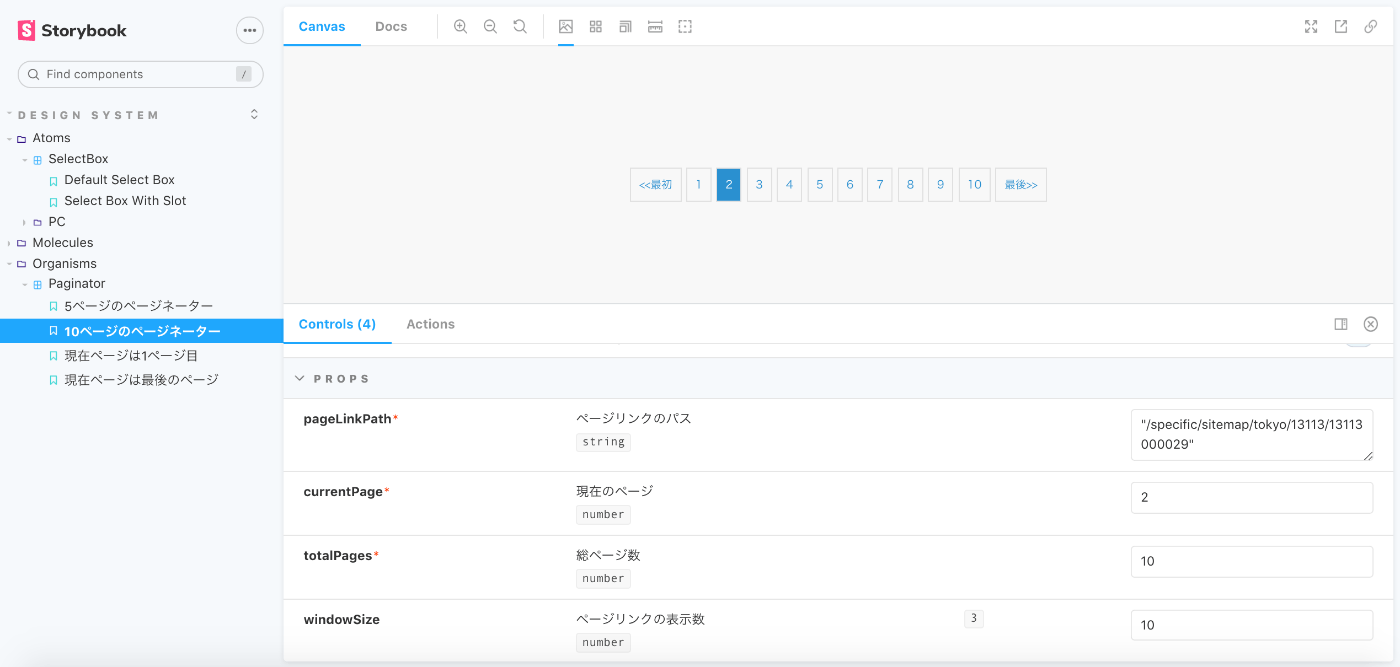
そこで朗報です!storybookではstoryNameプロパティでストーリーのタイトルを自由に変えます。早速日本語に変更しましょう。
...略
DefaultPaginator.storyName = '5ページのページネーター';
TenPage.storyName = '10ページのページネーター';
FirstPage.storyName = '現在ページは1ページ目';
LastPage.storyName = '現在ページは最後のページ';
上記みたいにstoryNameを日本語指定すれば、こんな感じになります。

それぞれのストーリーに違うpropを指定するにはどうすればいいのか?
これも割と簡単ですが、まずコードを短縮のため共通の部分をTemplate変数として宣言します。
注意としてはTemplate変数はストーリーではないので、exportをつけないでください。
const Template = (args, { argTypes }) => ({
  components: { Paginator },
  props: Object.keys(argTypes),
  template: `<Paginator v-bind="$props" />`,
});
次にそれぞれのストーリーはTemplateをbindして、それぞれのpropsを指定します。
// 共通の部分をTemplateとして宣言
const Template = (args, { argTypes }) => ({
  components: { Paginator },
  props: Object.keys(argTypes),
  template: `<Paginator v-bind="$props" />`,
});

// ストーリーはTemplateをbindしてからargsでpropsを指定する
export const DefaultPaginator = Template.bind({});
export const TenPage = Template.bind({});
TenPage.args = {
  totalPages: 10,
  windowSize: 10,
};

export const FirstPage = Template.bind({});
FirstPage.args = {
  currentPage: 1,
};

export const LastPage = Template.bind({});
LastPage.args = {
  currentPage: 9,
};
-
5ページのページネーター

-
10ページのページネーター
-
現在ページは1ページ目

-
現在ページは最後のページ

まとめ
- Nuxtのプロジェクトにはnuxt/storybookでの導入は簡単で設定もnuxt.config.jsにまとめれるのでおすすめです。
- ストーリーのタイトルは適切に設定すれば階層を綺麗に分けることができます。
- ストーリーの共通部分をTemplateにまとめて、あとはargsでそれぞれのpropsをいじれば色んなストーリーを簡単に作成できます。
- argでストーリーの
templateを変更できないので、ストーリーごとtemplateが違う場合はTemplateでbindではなくて、それぞれ定義する必要があります。
ここまで読んでくださってありがとうございます。
意外に情報が新しい記事を見つからなかったのと、nuxt/storybookの公式ドキュメントはなぜか半分以上空っぽだったので、試行錯誤しながらやっと基礎の使い方を学べました。
この記事で何かしら役に立てば嬉しいです。
それでは皆さん良いお年を。
Discussion