【react-hook-form × zod】ウィザード画面の各フォームにバリデーションを実装する方法
はじめに
今回は以下のようにモーダルでウィザード形式でフォームを入力するUIを作成した際に、react-hook-formとzodを用いて各ウィザードに対してバリデーションを行い、最後にまとめてフォーム送信する方法について解説します。
まずは、使用技術と実際の画面を見ていき、その後、プログラムの解説に移りたいと思います。
使用技術
- Next.js 13.5.5
- react-hook-form 7.47.0
- @hookform/resolvers 3.3.2
- zod 3.22.4
- leaflet 1.9.4
- react-leaflet 4.2.1
- @types/leaflet 1.9.8
- react-select 5.8.0
- world-countries 5.0.0
- next-cloudinary 5.10.0
- Cloudinary
※ 画像アップロード機能でCloudinaryを使用しました
実際の画面
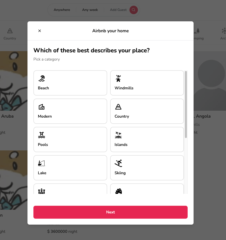
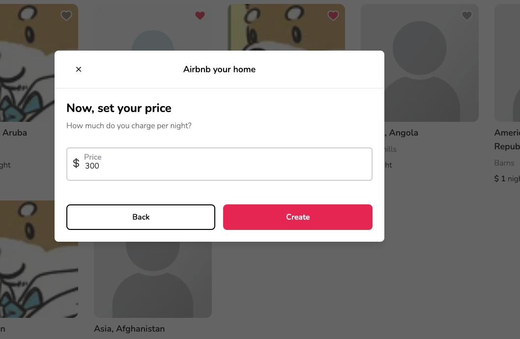
1.ウィザード画面1
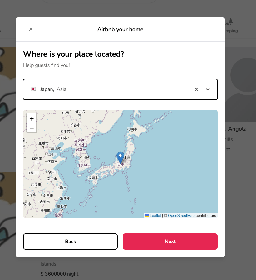
2.ウィザード画面2
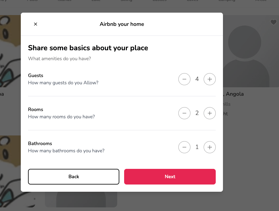
3.ウィザード画面3
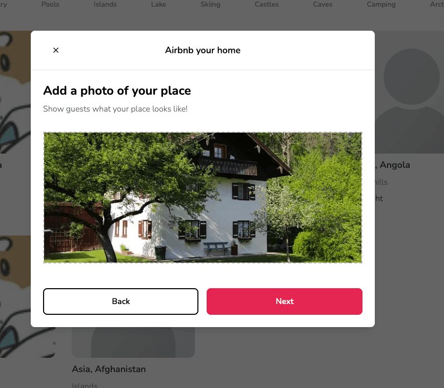
4.ウィザード画面4
5.ウィザード画面5
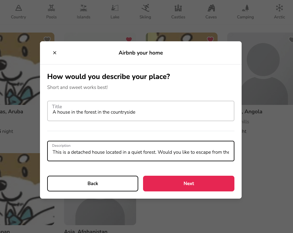
6.ウィザード画面6
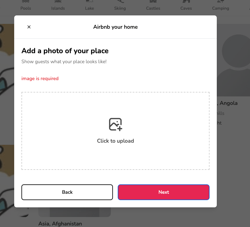
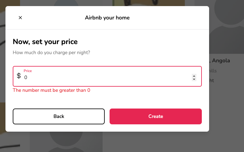
バリデーション時
1.ウィザード画面1
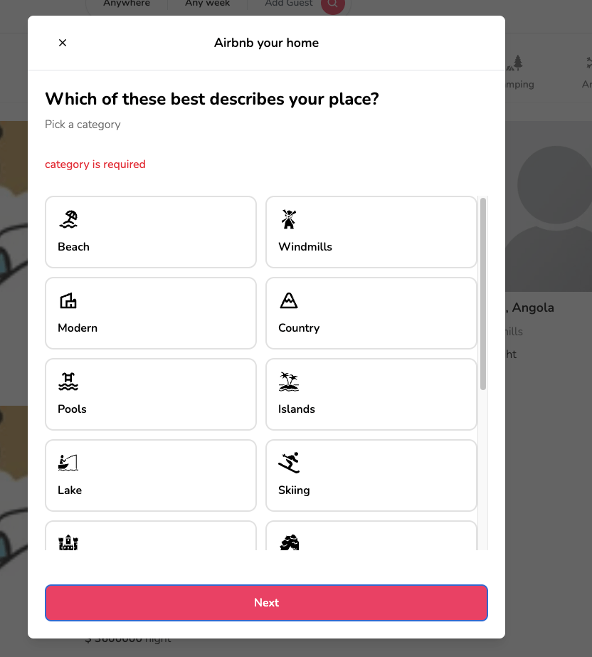
2.ウィザード画面2
3.ウィザード画面3
※ この画面は0以下のカウントだとバリデーションにかかりますが、値が1の場合に値を減らすことができないようにしています
4.ウィザード画面4
5.ウィザード画面5
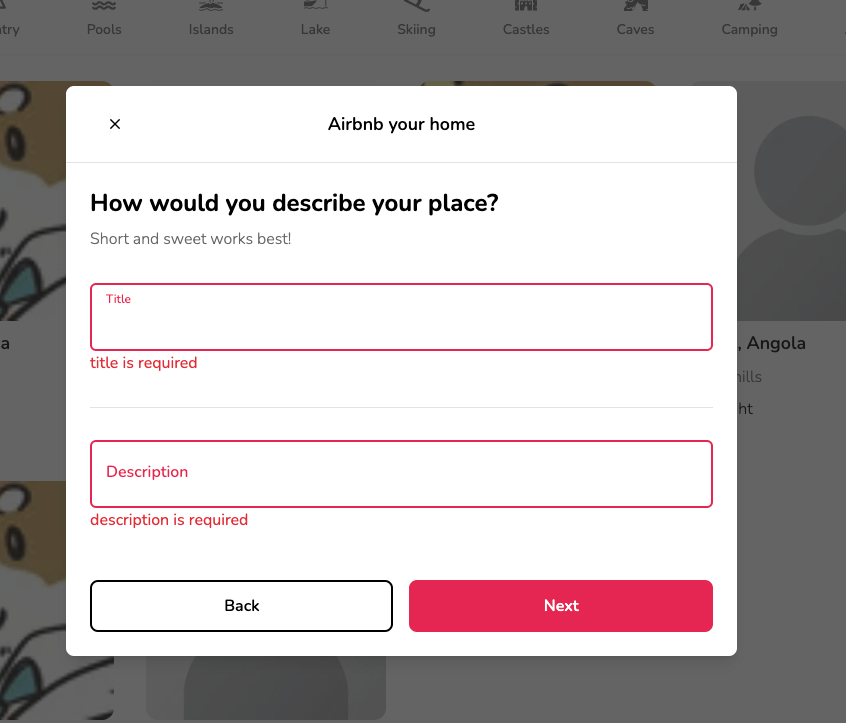
6.ウィザード画面6
実装
まずは、どんなデータを登録するかですが、今回の実装では、以下のデータの登録を行っていきます。
model Listing {
  id            String        @id @default(auto()) @map("_id") @db.ObjectId
  userId        String        @db.ObjectId
  title         String
  description   String
  imageSrc      String
  category      String
  roomCount     Int
  bathroomCount Int
  guestCount    Int
  locationValue String
  price         Int
  createdAt     DateTime      @default(now())
  updatedAt     DateTime      @updatedAt
  user          User          @relation(fields: [userId], references: [id], onDelete: Cascade)
  reservations  Reservation[]
}
zodのschemaを実装
前述のprismaのスキーマに合わせて、以下のようにzodのスキーマを作成し、バリデーションを定義します。
ほぼほぼ同じようなバリデーションですが、具体的な説明をすると、string・numberとobject内のstringのプロパティに対して必須入力と上限・下限のバリデーションを施しています。
import z from 'zod'

export const listingSchema = z.object({
  category: z
    .string()
    .min(1, 'category is required')
    .max(128, 'please enter at max 128 characters'),
  title: z
    .string()
    .min(1, 'title is required')
    .max(128, 'please enter at max 128 characters'),
  description: z
    .string()
    .min(1, 'description is required')
    .max(256, 'please enter at max 256 characters'),
  location: z.object({
    value: z
      .string()
      .min(1, 'location is required')
      .max(128, 'please enter at max 128 characters'),
  }),
  guestCount: z.number().min(1, 'The number must be greater than 0'),
  roomCount: z.number().min(1, 'The number must be greater than 0'),
  bathroomCount: z.number(),
  price: z.number().min(1, 'The number must be greater than 0'),
  imageSrc: z.string().min(1, 'image is required').max(224, 'please enter at'),
})

export type ListingForm = z.infer<typeof listingSchema>
モーダルの実装
まずは、コードの全体像です。
(概要を解説したら、細かい部分を抜粋して解説いたします)
概要としては、enumのSTEPSをStateとして管理し、stepの値に応じてモーダルのフォーム部分のUIを差し替えることをしています。
その際に、各差し替え部分に対してフォームバリデーションを実施できるように実装しています。
また、最終的にreact-hook-formのgetValueを使用して、値をまとめてDBに登録できるようにしています。
(この部分はgetValue以外の方法もあると思うので、効率的な記述があれば、ぜひ教えていただきたいです)
'use client'

import { zodResolver } from '@hookform/resolvers/zod'
import dynamic from 'next/dynamic'
import { useRouter } from 'next/navigation'
import React, { useMemo, useState } from 'react'
import type { SubmitHandler } from 'react-hook-form'
import { useForm } from 'react-hook-form'
import toast from 'react-hot-toast'
import { z } from 'zod'

import createListing from '@/app/actions/createListing'
import Heading from '@/components/Heading'
import CategoryInput from '@/components/inputs/CategoryInput'
import Counter from '@/components/inputs/Counter'
import CountrySelect from '@/components/inputs/CountrySelect'
import ImageUpload from '@/components/inputs/ImageUpload'
import Input from '@/components/inputs/Input'
import Modal from '@/components/modals/Modal'
import { categories } from '@/components/navbar/Categories'
import useRentModal from '@/hooks/useRentModal'
import type { CountrySelectValue } from '@/types/CountrySelectValue'
import type { ListingForm } from '@/types/ListingForm'
import { listingSchema } from '@/types/ListingForm'

enum STEPS {
  CATEGORY = 0,
  LOCATION = 1,
  INFO = 2,
  IMAGES = 3,
  DESCRIPTION = 4,
  PRICE = 5,
}

const RentModal = () => {
  const rentModal = useRentModal()
  const router = useRouter()

  const [step, setStep] = useState(STEPS.CATEGORY)
  const [isLoading, setIsLoading] = useState(false)

  const stepSchemas = {
    [STEPS.CATEGORY]: z.object({
      category: listingSchema.shape.category,
    }),
    [STEPS.LOCATION]: z.object({
      location: listingSchema.shape.location,
    }),
    [STEPS.INFO]: z.object({
      guestCount: listingSchema.shape.guestCount,
      roomCount: listingSchema.shape.roomCount,
      bathroomCount: listingSchema.shape.bathroomCount,
    }),
    [STEPS.IMAGES]: z.object({
      imageSrc: listingSchema.shape.imageSrc,
    }),
    [STEPS.DESCRIPTION]: z.object({
      title: listingSchema.shape.title,
      description: listingSchema.shape.description,
    }),
    [STEPS.PRICE]: z.object({
      price: listingSchema.shape.price,
    }),
  }

  const {
    handleSubmit,
    control,
    reset,
    watch,
    setValue,
    getValues,
    formState: { errors },
  } = useForm<ListingForm>({
    resolver: zodResolver(stepSchemas[step]),
    defaultValues: {
      category: '',
      location: undefined,
      guestCount: 1,
      roomCount: 1,
      bathroomCount: 1,
      imageSrc: '',
      price: 1,
      title: '',
      description: '',
    },
  })

  const category = watch('category')
  const location = watch('location') as CountrySelectValue | undefined
  const guestCount = watch('guestCount')
  const roomCount = watch('roomCount')
  const bathroomCount = watch('bathroomCount')
  const imageSrc = watch('imageSrc')

  const Map = useMemo(
    () => dynamic(() => import('../Map'), { ssr: false }),
    [location],
  )

  const setCustomValue = (
    id:
      | 'category'
      | 'location'
      | 'guestCount'
      | 'roomCount'
      | 'bathroomCount'
      | 'imageSrc',
    value: any,
  ) =>
    setValue(id, value, {
      shouldValidate: true,
      shouldDirty: true,
      shouldTouch: true,
    })

  const onBack = () => setStep((prev) => prev - 1)
  const onNext = () => setStep((prev) => prev + 1)

  const onSubmit: SubmitHandler<ListingForm> = async (data) => {
    if (step !== STEPS.PRICE) return onNext()

    setIsLoading(true)

    try {
      const listingFormData = {
        category: getValues('category'),
        location: getValues('location'),
        guestCount: getValues('guestCount'),
        roomCount: getValues('roomCount'),
        bathroomCount: getValues('bathroomCount'),
        imageSrc: getValues('imageSrc'),
        title: getValues('title'),
        description: getValues('description'),
        price: getValues('price'),
      }

      const response = await createListing(listingFormData)

      if (response.error) return toast.error(response.error)

      toast.success('Listing create!')
      router.refresh()
      reset()
      setStep(STEPS.CATEGORY)
      rentModal.onClose()
    } catch (err) {
      toast.error('Something Went Wrong')
    } finally {
      setIsLoading(false)
    }
  }

  const actionLabel = useMemo(
    () => (step === STEPS.PRICE ? 'Create' : 'Next'),
    [step],
  )

  const secondaryActionLabel = useMemo(
    () => (step === STEPS.CATEGORY ? undefined : 'Back'),

    [step],
  )

  let bodyContent: React.ReactElement

  switch (step) {
    case STEPS.LOCATION:
      bodyContent = (
        <div className="flex flex-col gap-8">
          <Heading
            title="Where is your place located?"
            subtitle="Help guests find you!"
          />
          {errors.location && (
            <span className="text-red-500">location is required</span>
          )}
          <CountrySelect
            value={location}
            onChange={(value) => setCustomValue('location', value)}
          />
          <Map center={location?.latlng} />
        </div>
      )
      break

    case STEPS.INFO:
      bodyContent = (
        <div className="flex flex-col gap-8">
          <Heading
            title="Share some basics about your place"
            subtitle="What amenities do you have?"
          />
          <Counter
            title="Guests"
            subtitle="How many guests do you Allow?"
            value={guestCount}
            onChange={(value) => setCustomValue('guestCount', value)}
          />
          <hr />
          <Counter
            title="Rooms"
            subtitle="How many rooms do you have?"
            value={roomCount}
            onChange={(value) => setCustomValue('roomCount', value)}
          />
          <hr />
          <Counter
            title="Bathrooms"
            subtitle="How many bathrooms do you have?"
            value={bathroomCount}
            onChange={(value) => setCustomValue('bathroomCount', value)}
          />
        </div>
      )
      break

    case STEPS.IMAGES:
      bodyContent = (
        <div className="flex flex-col gap-8">
          <Heading
            title="Add a photo of your place"
            subtitle="Show guests what your place looks like!"
          />
          {errors.imageSrc && (
            <span className="text-red-500">{errors.imageSrc.message}</span>
          )}
          <ImageUpload
            value={imageSrc}
            onChange={(value) => setCustomValue('imageSrc', value)}
          />
        </div>
      )
      break

    case STEPS.DESCRIPTION:
      bodyContent = (
        <div className="flex flex-col gap-8">
          <Heading
            title="How would you describe your place?"
            subtitle="Short and sweet works best!"
          />
          <Input
            id="title"
            label="Title"
            type="text"
            name="title"
            control={control}
            disabled={isLoading}
            required
          />
          <hr />
          <Input
            id="description"
            label="Description"
            type="text"
            name="description"
            control={control}
            disabled={isLoading}
            required
          />
          {/* Inputコンポーネントでfieldで一括展開しているため、hiddenとしてinputの紐づけを行う */}
          <div className="hidden">
            <Input
              id="price"
              label="Price"
              name="price"
              formatPrice
              type="number"
              control={control}
              disabled={isLoading}
            />
          </div>
        </div>
      )
      break

    case STEPS.PRICE:
      bodyContent = (
        <div className="flex flex-col gap-8">
          <Heading
            title="Now, set your price"
            subtitle="How much do you charge per night?"
          />
          {/* Inputコンポーネントでfieldで一括展開しているため、hiddenとしてinputの紐づけを行う */}
          <div className="hidden">
            <Input
              id="title"
              label="Title"
              type="text"
              name="title"
              control={control}
              disabled={isLoading}
              required
            />
            <Input
              id="description"
              label="Description"
              type="text"
              name="description"
              control={control}
              disabled={isLoading}
              required
            />
          </div>
          <Input
            id="price"
            label="Price"
            name="price"
            formatPrice
            type="number"
            control={control}
            disabled={isLoading}
            required
          />
        </div>
      )
      break

    default:
      bodyContent = (
        <div className="flex flex-col gap-8">
          <Heading
            title="Which of these best describes your place?"
            subtitle="Pick a category"
          />
          {errors.category && (
            <span className="text-red-500">{errors.category.message}</span>
          )}
          <div className="grid grid-cols-1 md:grid-cols-2 gap-3 max-h-[50vh] overflow-y-auto">
            {categories.map((item) => (
              <div key={item.label} className="col-span-1">
                <CategoryInput
                  onClick={(category: string) =>
                    setCustomValue('category', category)
                  }
                  selected={category === item.label}
                  category={item}
                />
              </div>
            ))}
          </div>
        </div>
      )
      break
  }

  return (
    <Modal
      isOpen={rentModal.isOpen}
      onClose={rentModal.onClose}
      onSubmit={handleSubmit(onSubmit)}
      actionLabel={actionLabel}
      secondaryActionLabel={secondaryActionLabel}
      secondaryAction={step === STEPS.CATEGORY ? undefined : onBack}
      title="Airbnb your home"
      body={bodyContent}
    />
  )
}

export default RentModal
'use client'

import React, { useCallback, useEffect, useState } from 'react'
import { IoMdClose } from 'react-icons/io'

import Button from '@/components/Button'

type ModalProps = {
  isOpen?: boolean
  onClose: () => void
  onSubmit: () => void
  title?: string
  body?: React.ReactElement
  footer?: React.ReactElement
  actionLabel: string
  disabled?: boolean
  secondaryAction?: () => void
  secondaryActionLabel?: string
}

const Modal: React.FC<ModalProps> = ({
  isOpen,
  onClose,
  onSubmit,
  title,
  body,
  footer,
  actionLabel,
  disabled,
  secondaryAction,
  secondaryActionLabel,
}) => {
  const [showModal, setShowModal] = useState(isOpen)

  useEffect(() => setShowModal(isOpen), [isOpen])

  const handleClose = useCallback(() => {
    if (disabled) return

    setShowModal(false)
    setTimeout(() => onClose(), 300)
  }, [disabled, onClose])

  const handleSubmit = useCallback(() => {
    if (disabled) return

    onSubmit()
  }, [disabled, onSubmit])

  const handleSecondaryAction = useCallback(() => {
    if (disabled || !secondaryAction) return

    secondaryAction()
  }, [disabled, secondaryAction])

  if (!isOpen) return null

  return (
    <div
      className="flex justify-center items-center overflow-x-hidden overflow-y-auto fixed inset-0 z-50 outline-none focus:outline-none bg-neutral-800/70"
      onClick={handleClose}
    >
      <div
        className="relative w-full md:w-4/6 lg:w-3/6 xl:w-2/5 my-6 mx-auto h-ful lg:h-auto md:h-auto"
        onClick={(e) => e.stopPropagation()}
      >
        {/* Content */}
        <div
          className={`translate duration-300 h-full ${
            showModal ? 'translate-y-0' : 'translate-y-full'
          } ${showModal ? 'opacity-100' : 'opacity-0'}`}
        >
          <div className="translate h-full lg:h-auto md:h-auto border-0 rounded-lg shadow-lg relative flex flex-col w-full bg-white outline-none focus:outline-none">
            {/* Header */}
            <div className="flex items-center justify-center p-6 rounded-t relative border-b-[1px]">
              <button
                onClick={handleClose}
                className="p-1 border-0 hover:opacity-70 transition absolute left-9"
              >
                <IoMdClose size={18} />
              </button>
              <div className="text-lg font-semibold">{title}</div>
            </div>
            {/* Body */}
            <div className="relative p-6 flex-auto">{body}</div>
            {/* Footer */}
            <div className="flex flex-col gap-2 p-6">
              <div
                className="
                    flex
                    flex-row
                    items-center
                    gap-4
                    w-full
                  "
              >
                {secondaryAction && secondaryActionLabel && (
                  <Button
                    disabled={disabled}
                    label={secondaryActionLabel}
                    onClick={handleSecondaryAction}
                    outline
                  />
                )}
                <Button
                  disabled={disabled}
                  label={actionLabel}
                  onClick={handleSubmit}
                />
              </div>
              {footer}
            </div>
          </div>
        </div>
      </div>
    </div>
  )
}

export default Modal
ウィザードごとにzodのスキーマを作成
ここが今回の実装で最も重要な点ですが、各ウィザードでバリデーションが実施できるように、ウィザード画面ごとにzodのスキーマを作成します。
なぜウィザード画面ごとにスキーマが必要なのかというと、フォームの最後の値のみバリデーション対象となっていしまうからです。
つまり、スキーマを分けなくてもウィザード画面自体の作成はできますが、最後のpriceのみバリデーションが実施されることになり、各ウィザードのフォームでバリデーションを実施することができないということです。
実装方法ですが、enumの各STEPSをプロパティとして、zodのスキーマを作成します。
その際に、大元のスキーマであるlistingSchemaの特定のスキーマを取得するためにshapeを使用します。
これで各ウィザード画面のzodスキーマを作成できます。
enum STEPS {
  CATEGORY = 0,
  LOCATION = 1,
  INFO = 2,
  IMAGES = 3,
  DESCRIPTION = 4,
  PRICE = 5,
}

const stepSchemas = {
  [STEPS.CATEGORY]: z.object({
    category: listingSchema.shape.category,
  }),
  [STEPS.LOCATION]: z.object({
    location: listingSchema.shape.location,
  }),
  [STEPS.INFO]: z.object({
    guestCount: listingSchema.shape.guestCount,
    roomCount: listingSchema.shape.roomCount,
    bathroomCount: listingSchema.shape.bathroomCount,
  }),
  [STEPS.IMAGES]: z.object({
    imageSrc: listingSchema.shape.imageSrc,
  }),
  [STEPS.DESCRIPTION]: z.object({
    title: listingSchema.shape.title,
    description: listingSchema.shape.description,
  }),
  [STEPS.PRICE]: z.object({
    price: listingSchema.shape.price,
  }),
}

const {
  handleSubmit,
  control,
  reset,
  watch,
  setValue,
  getValues,
  formState: { errors },
} = useForm<ListingForm>({
  resolver: zodResolver(stepSchemas[step]),
  defaultValues: {
    category: '',
    location: undefined,
    guestCount: 1,
    roomCount: 1,
    bathroomCount: 1,
    imageSrc: '',
    price: 1,
    title: '',
    description: '',
  },
})
カスタムの値を設定する
今回、categoryやlocationなどの値はカテゴリーのカードやセレクトボックスでの設定となっているため、setValueをカスタマイズして値を設定しています。
react-hook-formの各オプションについて説明します。
- shouldValidate: trueに設定すると値が設定された後にフィールドのバリデーションが実行される
- shouldDirty: trueに設定すると、フィールドが「dirty(変更された)」状態に設定される(ユーザーが入力した状態が設定される)
- shouldTouch: trueに設定すると、フィールドが「touched(触られた)」状態に設定される(ユーザーがフィールドにフォーカスした状態)
また、Mapですが、next/dynamicのdynamic importを使用しています。
これは動的importを実装するための機能で、コンポーネントを初めて必要とする場合に非同期でimportすることができるといったものです。
通常のimportは、アプリケーションの起動時にimportされます。
これを静的importといいます。反対に動的importの場合は、任意のコンポーネントをレンダリングしたときのみに初めてimportされるimportのことをいいます。
要するに、パフォーマンスの最適化になるということです。
今回の場合、RentModalがレンダリングされたときのみMapコンポーネントがimportされるということになります。また、オプションでssrをfalseにするとクライアントサイドレンダリングになります。
export type CountrySelectValue = {
  flag: string
  label: string
  latlng: number[]
  region: string
  value: string
}
const category = watch('category')
const location = watch('location') as CountrySelectValue | undefined
const guestCount = watch('guestCount')
const roomCount = watch('roomCount')
const bathroomCount = watch('bathroomCount')
const imageSrc = watch('imageSrc')

const Map = useMemo(
  () => dynamic(() => import('../Map'), { ssr: false }),
  [location],
)

const setCustomValue = (
  id:
    | 'category'
    | 'location'
    | 'guestCount'
    | 'roomCount'
    | 'bathroomCount'
    | 'imageSrc',
  value: any,
) =>
  setValue(id, value, {
    shouldValidate: true,
    shouldDirty: true,
    shouldTouch: true,
  })
ウィザード画面のページネーション関数の作成
以下の関数でページネーションをしています。
ウィザード画面が最後の画面以外なら次に進み、Modalコンポーネントには最初の画面でないなら前に戻る関数を渡します。
ちなみに、ボタンのラベルはactionLabelやsecondaryActionLabelで設定するようにしています。
const onBack = () => setStep((prev) => prev - 1)
const onNext = () => setStep((prev) => prev + 1)

const onSubmit: SubmitHandler<ListingForm> = async (data) => {
  if (step !== STEPS.PRICE) return onNext()
  // 以下、フォーム送信処理が続く
}

const actionLabel = useMemo(
  () => (step === STEPS.PRICE ? 'Create' : 'Next'),
  [step],
)

const secondaryActionLabel = useMemo(
  () => (step === STEPS.CATEGORY ? undefined : 'Back'),

  [step],
)

return (
  <Modal
    isOpen={rentModal.isOpen}
    onClose={rentModal.onClose}
    onSubmit={handleSubmit(onSubmit)}
    actionLabel={actionLabel}
    secondaryActionLabel={secondaryActionLabel}
    secondaryAction={step === STEPS.CATEGORY ? undefined : onBack}
    title="Airbnb your home"
    body={bodyContent}
  />
)
各ウィザード画面のUI差し替え
これもウィザード画面の主要な処理ですが、ページネーションに合わせて画面のコンテンツが切り替えられるようにする必要があります。
そのためbodyContetをstepに応じて差し替えています。
後ほど、各フォームのインプットのコンポーネントを紹介するので、ここでは差し替えてるんだなぁくらいの解釈で大丈夫です。
let bodyContent: React.ReactElement

switch (step) {
  case STEPS.LOCATION:
    bodyContent = (
      <div className="flex flex-col gap-8">
        <Heading
          title="Where is your place located?"
          subtitle="Help guests find you!"
        />
        {errors.location && (
          <span className="text-red-500">location is required</span>
        )}
        <CountrySelect
          value={location}
          onChange={(value) => setCustomValue('location', value)}
        />
        <Map center={location?.latlng} />
      </div>
    )
    break

  case STEPS.INFO:
    bodyContent = (
      <div className="flex flex-col gap-8">
        <Heading
          title="Share some basics about your place"
          subtitle="What amenities do you have?"
        />
        <Counter
          title="Guests"
          subtitle="How many guests do you Allow?"
          value={guestCount}
          onChange={(value) => setCustomValue('guestCount', value)}
        />
        <hr />
        <Counter
          title="Rooms"
          subtitle="How many rooms do you have?"
          value={roomCount}
          onChange={(value) => setCustomValue('roomCount', value)}
        />
        <hr />
        <Counter
          title="Bathrooms"
          subtitle="How many bathrooms do you have?"
          value={bathroomCount}
          onChange={(value) => setCustomValue('bathroomCount', value)}
        />
      </div>
    )
    break

  case STEPS.IMAGES:
    bodyContent = (
      <div className="flex flex-col gap-8">
        <Heading
          title="Add a photo of your place"
          subtitle="Show guests what your place looks like!"
        />
        {errors.imageSrc && (
          <span className="text-red-500">{errors.imageSrc.message}</span>
        )}
        <ImageUpload
          value={imageSrc}
          onChange={(value) => setCustomValue('imageSrc', value)}
        />
      </div>
    )
    break

  case STEPS.DESCRIPTION:
    bodyContent = (
      <div className="flex flex-col gap-8">
        <Heading
          title="How would you describe your place?"
          subtitle="Short and sweet works best!"
        />
        <Input
          id="title"
          label="Title"
          type="text"
          name="title"
          control={control}
          disabled={isLoading}
          required
        />
        <hr />
        <Input
          id="description"
          label="Description"
          type="text"
          name="description"
          control={control}
          disabled={isLoading}
          required
        />
        {/* Inputコンポーネントでfieldで一括展開しているため、hiddenとしてinputの紐づけを行う */}
        <div className="hidden">
          <Input
            id="price"
            label="Price"
            name="price"
            formatPrice
            type="number"
            control={control}
            disabled={isLoading}
          />
        </div>
      </div>
    )
    break

  case STEPS.PRICE:
    bodyContent = (
      <div className="flex flex-col gap-8">
        <Heading
          title="Now, set your price"
          subtitle="How much do you charge per night?"
        />
        {/* Inputコンポーネントでfieldで一括展開しているため、hiddenとしてinputの紐づけを行う */}
        <div className="hidden">
          <Input
            id="title"
            label="Title"
            type="text"
            name="title"
            control={control}
            disabled={isLoading}
            required
          />
          <Input
            id="description"
            label="Description"
            type="text"
            name="description"
            control={control}
            disabled={isLoading}
            required
          />
        </div>
        <Input
          id="price"
          label="Price"
          name="price"
          formatPrice
          type="number"
          control={control}
          disabled={isLoading}
          required
        />
      </div>
    )
    break

  default:
    bodyContent = (
      <div className="flex flex-col gap-8">
        <Heading
          title="Which of these best describes your place?"
          subtitle="Pick a category"
        />
        {errors.category && (
          <span className="text-red-500">{errors.category.message}</span>
        )}
        <div className="grid grid-cols-1 md:grid-cols-2 gap-3 max-h-[50vh] overflow-y-auto">
          {categories.map((item) => (
            <div key={item.label} className="col-span-1">
              <CategoryInput
                onClick={(category: string) =>
                  setCustomValue('category', category)
                }
                selected={category === item.label}
                category={item}
              />
            </div>
          ))}
        </div>
      </div>
    )
    break
}

return (
  <Modal
    isOpen={rentModal.isOpen}
    onClose={rentModal.onClose}
    onSubmit={handleSubmit(onSubmit)}
    actionLabel={actionLabel}
    secondaryActionLabel={secondaryActionLabel}
    secondaryAction={step === STEPS.CATEGORY ? undefined : onBack}
    title="Airbnb your home"
    body={bodyContent}
  />
)
categoryのinput
categoryのinputですが、重要なのはonClickです。
onClickでカスタムのsetValueが渡されます。
その時に、categoryの文字列であるlabelを値として設定するようにしています。
bodyContent = (
  <div className="flex flex-col gap-8">
    <Heading
      title="Which of these best describes your place?"
      subtitle="Pick a category"
    />
    {errors.category && (
      <span className="text-red-500">{errors.category.message}</span>
    )}
    <div className="grid grid-cols-1 md:grid-cols-2 gap-3 max-h-[50vh] overflow-y-auto">
      {categories.map((item) => (
        <div key={item.label} className="col-span-1">
          <CategoryInput
            onClick={(category: string) => setCustomValue('category', category)}
            selected={category === item.label}
            category={item}
          />
        </div>
      ))}
    </div>
  </div>
)
'use client'

import React from 'react'

type CategoryInputProps = {
  onClick: (category: string) => void
  selected?: boolean
  category: { label: string; icon: JSX.Element; description: string }
}

const CategoryInput: React.FC<CategoryInputProps> = ({
  onClick,
  selected,
  category,
}) => {
  const Icon = React.cloneElement(category.icon, { size: 30 })

  return (
    <div
      onClick={() => onClick(category.label)}
      className={`rounded-xl border-2 p-4 flex flex-col gap-3 hover:border-black transition cursor-pointer ${
        selected ? 'border-black' : 'border-neutral-200'
      }`}
    >
      {Icon}
      <div className="font-semibold">{category.label}</div>
    </div>
  )
}

export default CategoryInput
ちなみに、各カテゴリーは以下のような定義になっています。
export const categories: Category[] = [
  {
    label: 'Beach',
    icon: <TbBeach size={26} />,
    description: 'This property is close to the beach!',
  },
  {
    label: 'Windmills',
    icon: <GiWindmill size={26} />,
    description: 'This property has windmills!',
  },
  {
    label: 'Modern',
    icon: <MdOutlineVilla size={26} />,
    description: 'This property is modern!',
  },
  {
    label: 'Country',
    icon: <TbMountain size={26} />,
    description: 'This property is in the countryside!',
  },
  {
    label: 'Pools',
    icon: <TbPool size={26} />,
    description: 'This property has a pool!',
  },
  {
    label: 'Islands',
    icon: <GiIsland size={26} />,
    description: 'This property is on an island!',
  },
  {
    label: 'Lake',
    icon: <GiBoatFishing size={26} />,
    description: 'This property is close to lake!',
  },
  {
    label: 'Skiing',
    icon: <FaSkiing size={26} />,
    description: 'This property has skiing activities!',
  },
  {
    label: 'Castles',
    icon: <GiCastle size={26} />,
    description: 'This property is an ancient castle!',
  },
  {
    label: 'Caves',
    icon: <GiCaveEntrance size={26} />,
    description: 'This property is in a spooky cave!',
  },
  {
    label: 'Camping',
    icon: <GiForestCamp size={26} />,
    description: 'This property offers camping activities!',
  },
  {
    label: 'Arctic',
    icon: <BsSnow size={26} />,
    description: 'This property is in arctic environment!',
  },
  {
    label: 'Desert',
    icon: <GiCactus size={26} />,
    description: 'This property is in the desert!',
  },
  {
    label: 'Barns',
    icon: <GiBarn size={26} />,
    description: 'This property is in a barn!',
  },
  {
    label: 'Lux',
    icon: <IoDiamond size={26} />,
    description: 'This property is brand new and luxurious!',
  },
]
loactionのinput
続いて、locationのinput部分ですが、以下のコンポーネントと型で構成されています。
Mapコンポーネントについては動的importとして、locationの値が変更(選択された国が変更)となった場合のみ、再度メモ化するようにしています。
ここでもcategory同様にカスタムのsetValueを使用します。
次に、それぞれのコンポーネントについて解説します。
export type CountrySelectValue = {
  flag: string
  label: string
  latlng: number[]
  region: string
  value: string
}
const Map = useMemo(
  () => dynamic(() => import('../Map'), { ssr: false }),
  [location],
)

bodyContent = (
  <div className="flex flex-col gap-8">
    <Heading
      title="Where is your place located?"
      subtitle="Help guests find you!"
    />
    {errors.location && (
      <span className="text-red-500">location is required</span>
    )}
    <CountrySelect
      value={location}
      onChange={(value) => setCustomValue('location', value)}
    />
    <Map center={location?.latlng} />
  </div>
)
useCountries.ts・CountrySelect.tsx
これが実際にユーザーがlocationのinputを行うコンポーネントです。
react-selectを使用してセレクトボックスを作成しており、optionとしてworld-countriesのフォーマットした(formattedCountries)オブジェクトが設定されます。
各設定としては、以下を設定しました。
※ valueやonChangeなど見てわかるものの解説は割愛します
- isClearable: 選択したオプションをクリア(選択解除)するためのクリアボタンを表示
- formatOptionLabel: オプションのラベルをカスタマイズするために使用。今回の実装では、
flag・label・regionを表示するようにしています。 - classNames:
react-selectの各部分にカスタムクラス名を適用するために使用。今回はcontrol・input・optionの各部分に特定のスタイリングをしています。 - theme:
react-selectのテーマをカスタマイズするために使用。引数には現在のthemeを取り、新しいテーマオブジェクトを返却します。
色々なセレクトボックスが作成できるので、公式ドキュメントを見てみると良いと思います。
import countries from 'world-countries'

const formattedCountries = countries.map((country) => ({
  value: country.cca2,
  label: country.name.common,
  flag: country.flag,
  latlng: country.latlng,
  region: country.region,
}))

const useCountries = () => {
  const getAll = () => formattedCountries
  const getByValue = (value: string) =>
    formattedCountries.find((item) => item.value === value)

  return {
    getAll,
    getByValue,
  }
}

export default useCountries
'use client'

import React from 'react'
import Select from 'react-select'

import useCountries from '@/hooks/useCountries'
import type { CountrySelectValue } from '@/types/CountrySelectValue'

type CountrySelectProps = {
  value?: CountrySelectValue
  onChange: (value: CountrySelectValue) => void
}

const CountrySelect: React.FC<CountrySelectProps> = ({ value, onChange }) => {
  const { getAll } = useCountries()

  return (
    <div>
      <Select
        placeholder="Anywhere"
        isClearable
        options={getAll()}
        value={value}
        onChange={(value) => onChange(value as CountrySelectValue)}
        formatOptionLabel={(options: CountrySelectValue) => (
          <div className="flex flex-row items-center gap-3">
            <div>{options.flag}</div>
            <div>
              {options.label},{' '}
              <span className="text-neutral-500 ml-1">{options.region}</span>
            </div>
          </div>
        )}
        classNames={{
          control: () => 'p-3 border-2',
          input: () => 'text-lg',
          option: () => 'text-lg',
        }}
        theme={(theme) => ({
          ...theme,
          borderRadius: 6,
          colors: { ...theme.colors, primary: 'black', primary25: '#ffe4e6' },
        })}
      />
    </div>
  )
}

export default CountrySelect
Map.tsx
このコンポーネントは、その名の通り、地図をレンダリングします。
leaflet・react-leafletを使用して、地図を作成しています。
やっていることとしては、最初にdeleteでleafletのアイコンをカスタマイズし、公式ドキュメントにあるコードをコピー&ペーストして、カスタマイズしているだけという単純なことをしています。
centerには選択された国の「緯度・経度」が渡ってきて、そこにピンでマーカーされるUIになっています。
'use client'
import 'leaflet/dist/leaflet.css'
import L from 'leaflet'
import markerIcon from 'leaflet/dist/images/marker-icon.png'
import markerIcon2x from 'leaflet/dist/images/marker-icon-2x.png'
import markerShadow from 'leaflet/dist/images/marker-shadow.png'
import React from 'react'
import { MapContainer, Marker, TileLayer } from 'react-leaflet'
// @ts-ignore
// デフォルトのアイコンURLを削除し、カスタムアイコンに置き換える
delete L.Icon.Default.prototype._getIconUrl
L.Icon.Default.mergeOptions({
iconUrl: markerIcon.src,
iconRetinaUrl: markerIcon2x.src,
shadowUrl: markerShadow.src,
})
type MapProps = {
center?: number[]
}
const Map: React.FC<MapProps> = ({ center }) => {
return (
<MapContainer
center={(center as L.LatLngExpression) || [51, -0.09]}
zoom={center ? 4 : 2}
scrollWheelZoom={false}
className="h-[35vh] rounded-lg"
>
<TileLayer
attribution='© <a href="https://www.openstreetmap.org/copyright">OpenStreetMap</a> contributors'
url="https://{s}.tile.openstreetmap.org/{z}/{x}/{y}.png"
/>
{center && <Marker position={center as L.LatLngExpression} />}
</MapContainer>
)
}
export default Map
各数値のinput
ここでは、Counterをinputとしています。
他と比べて、非常にシンプルかなと思います。
ここでも重要なのはonChangeのカスタムのsetValueです。
内容はCounterの値を増減させる処理となっています。
bodyContent = (
  <div className="flex flex-col gap-8">
    <Heading
      title="Share some basics about your place"
      subtitle="What amenities do you have?"
    />
    <Counter
      title="Guests"
      subtitle="How many guests do you Allow?"
      value={guestCount}
      onChange={(value) => setCustomValue('guestCount', value)}
    />
    <hr />
    <Counter
      title="Rooms"
      subtitle="How many rooms do you have?"
      value={roomCount}
      onChange={(value) => setCustomValue('roomCount', value)}
    />
    <hr />
    <Counter
      title="Bathrooms"
      subtitle="How many bathrooms do you have?"
      value={bathroomCount}
      onChange={(value) => setCustomValue('bathroomCount', value)}
    />
  </div>
)
ここでの注意点は、値が1以下にならないようにしている点です。
なので、基本的には、ここはバリデーションにかかることはありません。
'use client'

import React, { useCallback } from 'react'
import { AiOutlineMinus, AiOutlinePlus } from 'react-icons/ai'

type CounterProps = {
  title: string
  subtitle: string
  value: number
  onChange: (value: number) => void
}

const Counter: React.FC<CounterProps> = ({
  title,
  subtitle,
  value,
  onChange,
}) => {
  const onAdd = useCallback(() => onChange(value + 1), [onChange, value])

  const onReduce = useCallback(() => {
    if (value === 1) return

    onChange(value - 1)
  }, [onChange, value])

  return (
    <div className="flex flex-row items-center justify-between">
      <div className="flex flex-col">
        <div className="font-medium">{title}</div>
        <div className="font-light text-gray-600">{subtitle}</div>
      </div>
      <div className="flex flex-row items-center gap-4">
        <div
          onClick={onReduce}
          className="w-10 h-10 rounded-full border-[1px] border-neutral-400 flex items-center justify-center text-neutral-600 cursor-pointer hover:opacity-80 transition"
        >
          <AiOutlineMinus />
        </div>
        <div className="font-light text-xl text-neutral-600">{value}</div>
        <div
          onClick={onAdd}
          className="w-10 h-10 rounded-full border-[1px] border-neutral-400 flex items-center justify-center text-neutral-600 cursor-pointer hover:opacity-80 transition"
        >
          <AiOutlinePlus />
        </div>
      </div>
    </div>
  )
}

export default Counter
imageSrcのinput
画像アップロードのinputです。
ここでの他の同じく、カスタムのsetValueで画像のsrcを設定するようにしています。
bodyContent = (
  <div className="flex flex-col gap-8">
    <Heading
      title="Add a photo of your place"
      subtitle="Show guests what your place looks like!"
    />
    {errors.imageSrc && (
      <span className="text-red-500">{errors.imageSrc.message}</span>
    )}
    <ImageUpload
      value={imageSrc}
      onChange={(value) => setCustomValue('imageSrc', value)}
    />
  </div>
)
画像アップロードのinputでは、cloudinaryとnext-cloudinaryを使用しています。
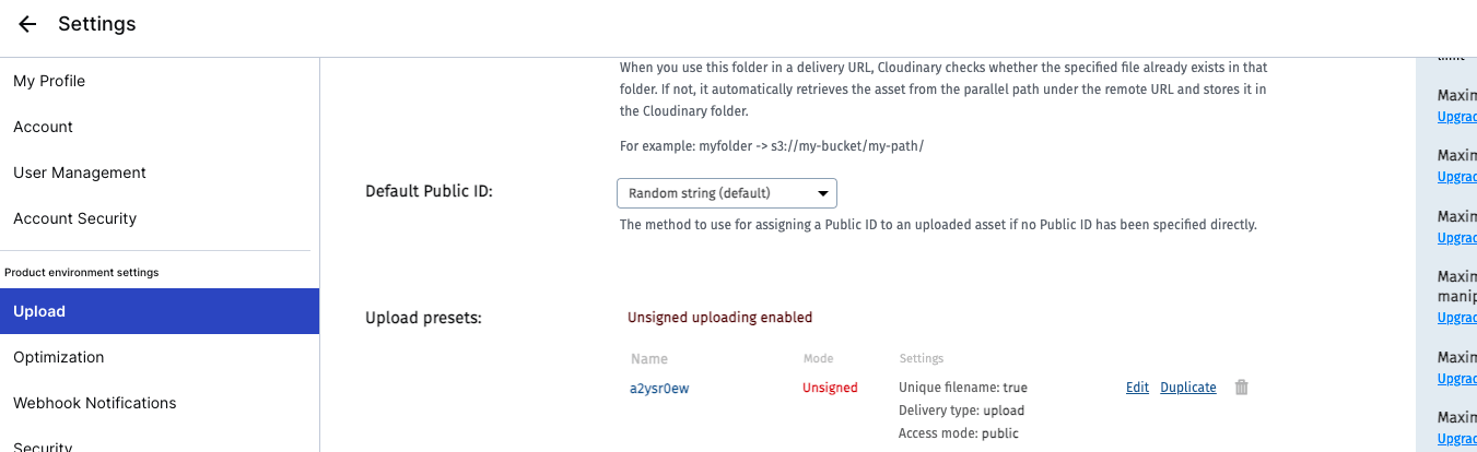
画像アップロードは、まずcloudinaryの設定を変更します。
「Settings」 > 「Upload」 > 「Upload Presets」でCldUploadWidgetのaploadPresetに渡す値のUnsigned uploading enabledをunsignedに変更します。
私の場合は、a2ysr0ewのeditから変更しました。
(Modeがsignedになっている場合、unsignedにする必要があります)
signedとunsignedの違いですが、APIキーとAPIシークレットが必要かどうかの違いがあります。
より安全に署名付きでアップロードを行う場合はsignedにする必要があります。ただし、singedの場合はサーバーサイドでアップロードの認証機能等作成する必要があります。
私の場合は、クライアントサイドでのアップロードのためunsignedに変更する設定をしました。
実際の実装では、CldUploadWidgetを使用しての実装ですが、こちらも公式ドキュメントに沿って実装しました。
valueがある場合はプレビューが表示される仕様です。
'use client'

import Image from 'next/image'
import { CldUploadWidget } from 'next-cloudinary'
import React, { useCallback } from 'react'
import { TbPhotoPlus } from 'react-icons/tb'

declare global {
  var cloudinary: any
}

type ImageUploadProps = {
  onChange: (value: string) => void
  value: string
}

const ImageUpload: React.FC<ImageUploadProps> = ({ onChange, value }) => {
  const handleUpload = useCallback(
    (result: any) => {
      onChange(result.info.secure_url)
    },
    [onChange],
  )

  return (
    <CldUploadWidget
      onUpload={handleUpload}
      uploadPreset="a2ysr0ew"
      options={{ maxFiles: 1 }}
    >
      {({ open }) => {
        return (
          <div
            onClick={() => open?.()}
            className="relative cursor-pointer hover:opacity-70 transition border-dashed border-2 p-20 border-neutral-300 flex flex-col justify-center items-center gap-4 text-neutral-600"
          >
            <TbPhotoPlus size={50} />
            <div className="font-semibold text-lg">Click to upload</div>
            {value && (
              <div className="absolute inset-0 w-full h-full">
                <Image
                  alt="Upload"
                  fill
                  style={{ objectFit: 'cover' }}
                  src={value}
                />
              </div>
            )}
          </div>
        )
      }}
    </CldUploadWidget>
  )
}

export default ImageUpload
title・description・priceのinput
こちらはよくあるテキストと数値のinputの実装です。
ただ、特殊な点として、これに関しては見た目上ではフォームを分けてますが、コード上では分けていない点です。このような記述をしないと、priceのinputに対してtitleのinputが紐付けられてしまうからです。
要するに、順序通りに並べないといけないということです。
このような実装になってしまった理由としては、Inputコンポーネントでreact-hook-formのuseControllerを使用してinputタグに対してfieldを展開しているためです。
具体的には、ウィザード画面での入力はページネーションで画面遷移しても保持できます。
そのため、priceのみコーディングした場合、react-hook-formのcontrolが自動で「これはtitleのフィールドだ」と判別します。
つまり、title・desciptionのstepで入力した値を保持する必要があるため、次のstepでそれらがないとreact-hook-formが「あれ?title・descriptionがないぞ?」ということになり、nameがpriceだとしてもtitleのフィールドとして識別してしまいます。
// title・descriptionのinput
bodyContent = (
  <div className="flex flex-col gap-8">
    <Heading
      title="How would you describe your place?"
      subtitle="Short and sweet works best!"
    />
    <Input
      id="title"
      label="Title"
      type="text"
      name="title"
      control={control}
      disabled={isLoading}
      required
    />
    <hr />
    <Input
      id="description"
      label="Description"
      type="text"
      name="description"
      control={control}
      disabled={isLoading}
      required
    />
    {/* Inputコンポーネントでfieldで一括展開しているため、hiddenとしてinputの紐づけを行う */}
    <div className="hidden">
      <Input
        id="price"
        label="Price"
        name="price"
        formatPrice
        type="number"
        control={control}
        disabled={isLoading}
      />
    </div>
  </div>
)

// priceのinput
bodyContent = (
  <div className="flex flex-col gap-8">
    <Heading
      title="Now, set your price"
      subtitle="How much do you charge per night?"
    />
    {/* Inputコンポーネントでfieldで一括展開しているため、hiddenとしてinputの紐づけを行う */}
    <div className="hidden">
      <Input
        id="title"
        label="Title"
        type="text"
        name="title"
        control={control}
        disabled={isLoading}
        required
      />
      <Input
        id="description"
        label="Description"
        type="text"
        name="description"
        control={control}
        disabled={isLoading}
        required
      />
    </div>
    <Input
      id="price"
      label="Price"
      name="price"
      formatPrice
      type="number"
      control={control}
      disabled={isLoading}
      required
    />
  </div>
)
Input.tsx
inputタグの部分で{...filed}としており、refやname、valueといったフォームのフィールドを制御するためのメソッドやプロパティを展開しています。
少し、特殊な点としてinputのtypeによってonChangeの処理を分岐している点です。
このようにしないと、numberのinputが入力した瞬間textになってしまい、zodのバリデーションエラーとなってしまいます。
あとは前述したbodyContentの説明の通りで、react-hook-formがウィザード画面の各ステップで、「どのフィールドに紐付けられるか」を意識した実装が必要となります。
'use client'

import React from 'react'
import {
  type FieldValues,
  useController,
  type UseControllerProps,
} from 'react-hook-form'
import { BiDollar } from 'react-icons/bi'

type InputProps = {
  id: string
  label: string
  type?: string
  disabled?: boolean
  formatPrice?: boolean
  required?: boolean
}

type ExtendInputProps<T extends FieldValues> = UseControllerProps<T> &
  InputProps

const Input = <T extends FieldValues>({
  name,
  label,
  type,
  control,
  disabled,
  formatPrice,
  rules,
}: ExtendInputProps<T>) => {
  const { field, fieldState } = useController<T>({ name, control, rules })
  const { error } = fieldState

  const onChange = (e: React.ChangeEvent<HTMLInputElement>) => {
    if (type === 'number') {
      // 入力値を数値に変換
      field.onChange(e.target.valueAsNumber)
    } else {
      field.onChange(e.target.value)
    }
  }

  return (
    <div className="w-full relative">
      {formatPrice && (
        <BiDollar
          size={24}
          className="text-neutral-700 absolute top-5 left-2"
        />
      )}
      <input
        {...field}
        onChange={onChange}
        type={type}
        disabled={disabled}
        placeholder=" "
        className={`peer w-full p-4 pt-6 font-light bg-white border-2 rounded-md outline-none transition disabled:opacity-70 disabled:cursor-not-allowed ${
          formatPrice ? 'pl-9' : 'pl-4'
        } ${error ? 'border-rose-500' : 'border-neutral-300'} ${
          error ? 'focus:border-rose-500' : 'focus:border-black'
        }`}
      />
      <label
        className={`absolute font-medium duration-150 transform -translate-y-3 top-5 z-10 origin-[0] ${
          formatPrice ? 'left-9' : 'left-4'
        } peer-placeholder-shown:scale-100 peer-placeholder-shown:translate-y-0 peer-focus:scale-75 peer-focus:-translate-y-4 ${
          error ? 'text-rose-500' : 'text-zinc-400'
        }`}
      >
        {label}
      </label>
      {error && <span className="text-red-500">{error.message}</span>}
    </div>
  )
}

export default Input
onSubmit関数
送信処理ですが、ウィザードで入力した値をまとめて送信します。
その際に、react-hook-formのgetValuesを使用します。
「dataで送信できるのでは?」と私の最初に思ったのですが、それだと、priceのみが送信されるので、この関数内で、getValuesを使用してまとめるようにしています。
あとは、まとめた値をcreateListingに渡して、DB保存処理を行っています。
const onSubmit: SubmitHandler<ListingForm> = async (data) => {
  if (step !== STEPS.PRICE) return onNext()

  setIsLoading(true)

  try {
    const listingFormData = {
      category: getValues('category'),
      location: getValues('location'),
      guestCount: getValues('guestCount'),
      roomCount: getValues('roomCount'),
      bathroomCount: getValues('bathroomCount'),
      imageSrc: getValues('imageSrc'),
      title: getValues('title'),
      description: getValues('description'),
      price: getValues('price'),
    }

    const response = await createListing(listingFormData)

    if (response.error) return toast.error(response.error)

    toast.success('Listing create!')
    router.refresh()
    reset()
    setStep(STEPS.CATEGORY)
    rentModal.onClose()
  } catch (err) {
    toast.error('Something Went Wrong')
  } finally {
    setIsLoading(false)
  }
}
createListing.ts
'use server'

import { getServerSession } from 'next-auth'

import authOptions from '@/libs/authOptions'
import prisma from '@/libs/prismadb'
import type { ListingForm } from '@/types/ListingForm'

const createListing = async (data: ListingForm) => {
  try {
    const session = await getServerSession(authOptions)

    if (!session?.user) return { error: 'User not found' }

    const {
      category,
      title,
      description,
      location,
      guestCount,
      roomCount,
      bathroomCount,
      price,
      imageSrc,
    } = data

    const listing = await prisma.listing.create({
      data: {
        title,
        description,
        imageSrc,
        category,
        roomCount,
        bathroomCount,
        guestCount,
        locationValue: location?.value as string,
        price: parseInt(price.toString()),
        userId: session.user.id,
      },
    })

    return { listing }
  } catch (err) {
    return { error: 'Internal Server Error' }
  }
}

export default createListing
Modalコンポーネント
最後にModalコンポーネントの解説をします。
Propsは以下を渡しています。
return (
  <Modal
    isOpen={rentModal.isOpen}
    onClose={rentModal.onClose}
    onSubmit={handleSubmit(onSubmit)}
    actionLabel={actionLabel}
    secondaryActionLabel={secondaryActionLabel}
    secondaryAction={step === STEPS.CATEGORY ? undefined : onBack}
    title="Airbnb your home"
    body={bodyContent}
  />
)
注目点はコメントにある``Footer`以降の部分です。
ここで送信処理やら、ウィザード画面のページネーションの処理やらを実装しています。
'use client'

import React, { useCallback, useEffect, useState } from 'react'
import { IoMdClose } from 'react-icons/io'

import Button from '@/components/Button'

type ModalProps = {
  isOpen?: boolean
  onClose: () => void
  onSubmit: () => void
  title?: string
  body?: React.ReactElement
  footer?: React.ReactElement
  actionLabel: string
  disabled?: boolean
  secondaryAction?: () => void
  secondaryActionLabel?: string
}

const Modal: React.FC<ModalProps> = ({
  isOpen,
  onClose,
  onSubmit,
  title,
  body,
  footer,
  actionLabel,
  disabled,
  secondaryAction,
  secondaryActionLabel,
}) => {
  const [showModal, setShowModal] = useState(isOpen)

  useEffect(() => setShowModal(isOpen), [isOpen])

  const handleClose = useCallback(() => {
    if (disabled) return

    setShowModal(false)
    setTimeout(() => onClose(), 300)
  }, [disabled, onClose])

  const handleSubmit = useCallback(() => {
    if (disabled) return

    onSubmit()
  }, [disabled, onSubmit])

  const handleSecondaryAction = useCallback(() => {
    if (disabled || !secondaryAction) return

    secondaryAction()
  }, [disabled, secondaryAction])

  if (!isOpen) return null

  return (
    <div
      className="flex justify-center items-center overflow-x-hidden overflow-y-auto fixed inset-0 z-50 outline-none focus:outline-none bg-neutral-800/70"
      onClick={handleClose}
    >
      <div
        className="relative w-full md:w-4/6 lg:w-3/6 xl:w-2/5 my-6 mx-auto h-ful lg:h-auto md:h-auto"
        onClick={(e) => e.stopPropagation()}
      >
        {/* Content */}
        <div
          className={`translate duration-300 h-full ${
            showModal ? 'translate-y-0' : 'translate-y-full'
          } ${showModal ? 'opacity-100' : 'opacity-0'}`}
        >
          <div className="translate h-full lg:h-auto md:h-auto border-0 rounded-lg shadow-lg relative flex flex-col w-full bg-white outline-none focus:outline-none">
            {/* Header */}
            <div className="flex items-center justify-center p-6 rounded-t relative border-b-[1px]">
              <button
                onClick={handleClose}
                className="p-1 border-0 hover:opacity-70 transition absolute left-9"
              >
                <IoMdClose size={18} />
              </button>
              <div className="text-lg font-semibold">{title}</div>
            </div>
            {/* Body */}
            <div className="relative p-6 flex-auto">{body}</div>
            {/* Footer */}
            <div className="flex flex-col gap-2 p-6">
              <div
                className="
                    flex
                    flex-row
                    items-center
                    gap-4
                    w-full
                  "
              >
                {secondaryAction && secondaryActionLabel && (
                  <Button
                    disabled={disabled}
                    label={secondaryActionLabel}
                    onClick={handleSecondaryAction}
                    outline
                  />
                )}
                <Button
                  disabled={disabled}
                  label={actionLabel}
                  onClick={handleSubmit}
                />
              </div>
              {footer}
            </div>
          </div>
        </div>
      </div>
    </div>
  )
}

export default Modal
おわりに
長くなりましたが、解説は以上です。
zodのスキーマを分ける部分が最重要な部分なのですが、モーダルのウィザード画面や通常のウィザード画面にも応用が効くものだと思うので、参考になれば幸いです。
参考文献
Discussion
丁寧な説明ありがとうございます!
予約サイトやECサイトでのウィザード画面のバリデーションは知っておきたい実装だったので解説を見て全体のイメージがつかめました!