UIButton.Configuration その2 〜設定てんやわんや
UIButton Configurationの2回目。今回は細かい情報です。
色やボーダーなどの設定の仕方を見ていきましょう。
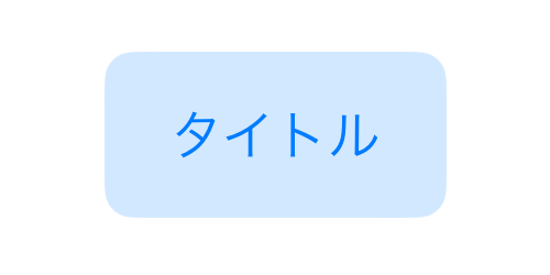
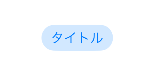
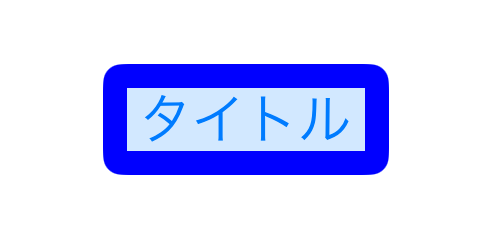
基本系
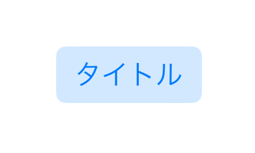
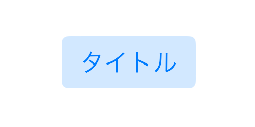
var configuration = UIButton.Configuration.tinted()
configuration.title = "タイトル"
let button = UIButton(configuration: configuration, primaryAction: nil)
これを基本とします。
-
Configurationの作成。 -
titleタイトルの文字 - 作成した
Configurationをボタンに適用
これを元に、基本的に次の場所にコードを追加します。
var configuration = UIButton.Configuration.tinted()
configuration.title = "タイトル"

//ここに追加します

let button = UIButton(configuration: configuration, primaryAction: nil)
ではいじっていきましょう。
ForegroundColor
文字の色を変えます。
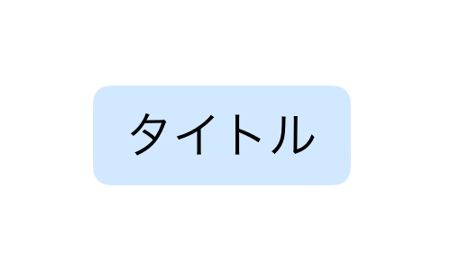
configuration.baseForegroundColor = .black
-
baseForegroundColor文字の色
画像、画像の位置
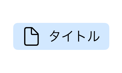
configuration.image = UIImage(systemName: "doc")
configuration.imagePadding = 10.0
configuration.imagePlacement = .leading
-
image画像の指定 -
imagePadding画像とタイトルの間隔 -
imagePlacement画像の位置、上下左右で指定する
サブタイトル
configuration.subtitle = "サブタイトル"
configuration.titlePadding = 10.0
configuration.titleAlignment = .center
-
subtitleサブタイトルの文字 -
titlePaddingタイトルとサブタイトルの間隔 -
titleAlignmentタイトルとサブタイトルの配置、短い方が長いほうにどうあわせるか。指定しないならデフォルトは.leading
titleAlignment の他のもやってみました。
leading
trailing
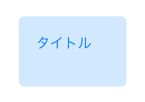
土台の大きさ
追加したコードが多くなったので、一旦基本形に戻します。ここからは毎回基本形に戻してから追加します。
土台の大きさは2つ設定があります。簡易的なものと、個々の場所を設定できるもの。どちらかで行います。
-
buttonSizeボタンの大きさ(簡易的な設定) -
contentInsets周辺の空白、4ヶ所別々に指定が可能。
//どちらかで行う
configuration.buttonSize = .large

configuration.contentInsets =
    NSDirectionalEdgeInsets(top: 20.0, leading: 20.0, bottom: 20.0, trailing: 20.0)
土台の大きさ buttonSize
buttonSizeは
- large
- medium
- small
- mini
がある。それぞれは以下の通り。
large
medium

small
mini

smallとminiは何が違うのかわからないが。
ちなみにsmallとminiはサブタイトルを入れて縦幅を増やせばサイドの輪郭に直線のところが出てきます。
土台の大きさ contentInsets
contentInsets の例は次の通り。わかりやすいように非対称にした。
configuration.contentInsets =
    NSDirectionalEdgeInsets(top: 20.0, leading: 20.0, bottom: 40.0, trailing: 40.0)
-
buttonSize土台の大きさ、言葉で指定する -
contentInsets土台の大きさ、上下左右の余白を数値で指定する
土台の色
これも設定が2つある。どちらかで行う。
//どちらかで行う
configuration.baseBackgroundColor = UIColor.cyan

configuration.background.backgroundColor = UIColor.cyan
2つの設定は違いがあって、コンフィグ直下の baseBackgroundColor はボタンの性質、つまり plain gray tinted filled に合わせた色になる。
一方 background.backgroundColor は指定した色がそのまま採用されるようである。
以下は baseBackgroundColor のそれぞれと、 background.backgroundColor で直接指定した場合である。
baseBackgroundColor
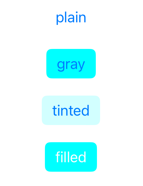
直接指定 background.backgroundColor

-
baseBackgroundColor土台の色、ボタンの性質に依存する -
background.backgroundColor土台の色、そのまま採用される
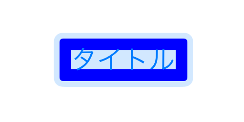
ボーダー
ボーダーの設定に関するものは次の3つ
-
background.strokeColor色 -
background.strokeWidth太さ -
background.strokeOutset位置を外側へずらす
configuration.background.strokeColor = UIColor.blue
configuration.background.strokeWidth = 8.0
configuration.background.strokeOutset = 0.0
ColorとWidthは色と太さで、Outsetというのは位置を調整するもの。Outsetが0の時はボーダーはボーダーなし時の範囲と比べて内側に描かれる。そこから外側にずらす分をOutsetで指定する。
次は、わざと太く(8)したボーダーを
- ボーダーなし
- -4でさらに内側に描く
- デフォルトの0
- 線の太さと同じ8
- 線の太さより大きい12にし、余白を作る
で比較したものである。デフォルトの0では内側に描かれることを確認してください。
なし

-4
0
線と同じ8
線より大きい12
-
background.strokeColorボーダーの色 -
background.strokeWidthボーダーの太さ -
background.strokeOutsetボーダーを外側へずらす
角の丸み
設定箇所は2つある。
まずは、言葉で指定する方
configuration.cornerStyle = .small
のように行う。
- large
- medium
- small
- capsule
の4つの言葉はそれだけで完結する。それぞれは以下の通り。
large

medium
small
capsule

そしてあと2つの
- fixed
- dynamic
は、もう一つの設定
configuration.background.cornerRadius = 20
と一緒に使うハイブリッドな方式。
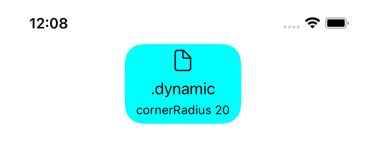
角の丸み ハイブリッド方式
2つを使うハイブリッド方式は .fixed 方式と .dynamic 方式がある。
.fixed方式
configuration.cornerStyle = .fixed
configuration.background.cornerRadius = 20
このようにすると デバイスの文字の大きさの設定がなんであろうと固定値になる。
.dynamic方式
configuration.cornerStyle = .dynamic
configuration.background.cornerRadius = 20
このようにすると デバイスの文字の大きさの設定に従った変動値になる。 デフォルトの大きさときは設定した値になり、デフォルト以外はその変化率がかけられる。
そして、 cornerStyle のデフォルト値は .dynamic なので、
configuration.background.cornerRadius = 20
このように数字だけを設定するやり方は
configuration.cornerStyle = .dynamic
configuration.background.cornerRadius = 20
と同じである。
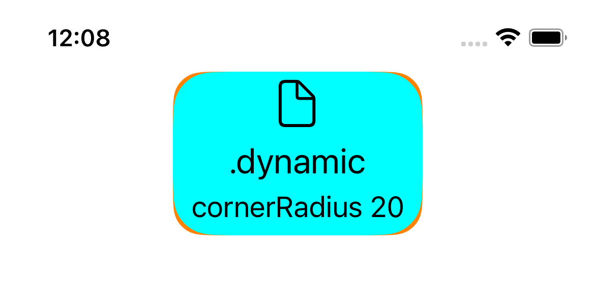
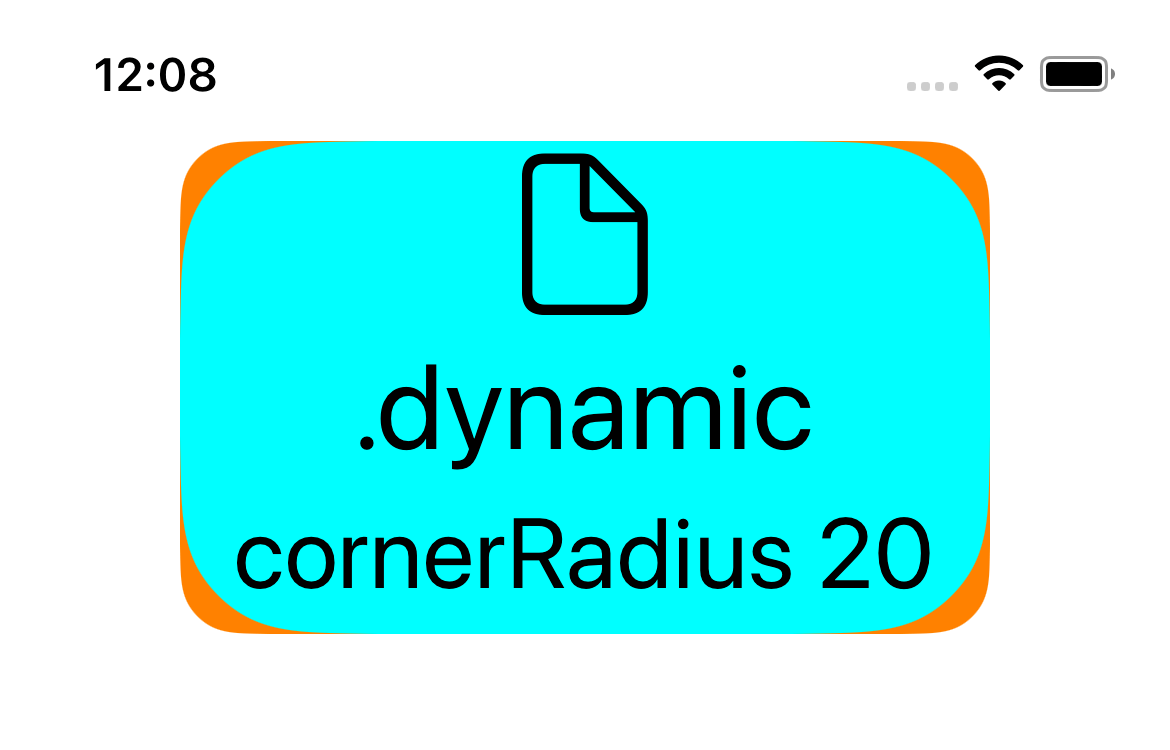
次の実験はfixed方式とdynamic方式の違いを調べている。
- オレンジに20の固定値
- 水色に20の変動値
という設定をして(ついでに文字の色も変えて)、いろいろな文字の大きさで表示し、重ねて表示した結果です。それぞれ小さい方を手前にしてある。ただし大きさ4のデフォルト値では両者の大きさが同じなのでそれぞれ手前にしたものを表示している。
オレンジの方の角の丸みは文字の大きさによらず一定(時刻の縦幅よりも少し大きいくらい)なのに比べ、水色の方は文字の大きさに合わせて削り方が変化することを確認してください。
大きさ1

大きさ4(デフォルト)

大きさ4(デフォルト)
大きさ7
大きさ10
大きさ12(最大)

-
cornerStyle言葉で指令する -
background.cornerRadius数値で指令する
Fontを変える
Fontを変える-その1。AttributedString
titleとsubtitleには AttributedString が使えます。
var configuration = UIButton.Configuration.filled()

var container = AttributeContainer()
container.font = UIFont.boldSystemFont(ofSize: 20)
configuration.attributedTitle = AttributedString("Title", attributes: container)

var container2 = AttributeContainer()
container2.foregroundColor = UIColor.white.withAlphaComponent(0.5)
configuration.attributedSubtitle = AttributedString("Subtitle", attributes: container2)
Fontを変える-その2。titleTextAttributesTransformer
Fontを変えるやりかたの2つ目は titleTextAttributesTransformer を使うやり方です。
config.titleTextAttributesTransformer =
	UIConfigurationTextAttributesTransformer { incoming in
		var outgoing = incoming
		outgoing.font = UIFont.preferredFont(forTextStyle: .headline)
		return outgoing
	}
incomingの中で上書きしたものに上書きしてoutgoingとして渡す。
その他
その1
その2は今あなたが見ている記事
その3
参考
英語です。説明の順番は性質ごと(表示内容、空白、装飾)になってます。私の記事では対象ごと(タイトル、サブタイトル、イメージ)にしましたが。性質ごとの方がわかりやすい人はどうぞ。
Discussion