Firefoxでも動くbackdrop-filterの代替実装
この記事はKMCアドベントカレンダー2021の19日目の記事です。大遅刻です。
概要
1月の半ば、KMC のSlack上でグラスモーフィズムが話題にあがりました。グラスモーフィズムは、すりガラスのように背景を透かしつつぼかすデザインです。[1] ここで私は、グラスモーフィズムを素直に実装しても Firefox では動かないのではないか、という話を持ち出しました。
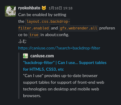
実際にインターネットで検索してみると、CSS を用いたグラスモーフィズムの実装は backdrop-filter を使用する方法ばかりがヒットします。しかし、 backdrop-filter はデフォルト設定の場合 Firefox では動きません。[2] [3] そこで、backdrop-filter を使用せずとも同等の視覚効果を得る方法について考えます。
本編
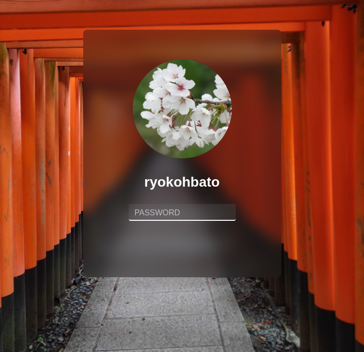
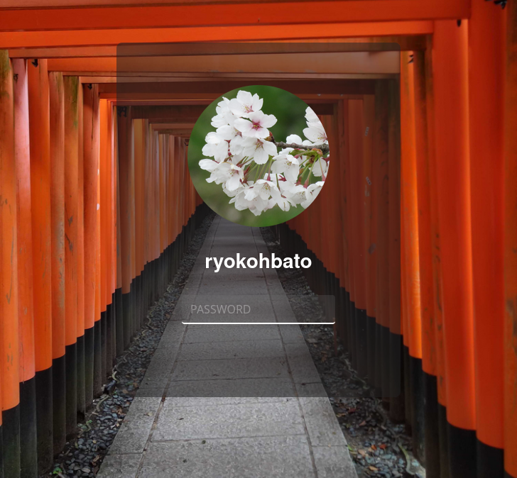
今回は例として、backdrop-filter を使用せずに以下のようなログインフォームのデザインを作成することにします。Vueを使って書いていますが、素のHTML/CSSでも使える方法です。
まずはこのデザインを素直に実装してみます。重要な部分のみ抜粋します。ソースコードの全体を示すと長くなるので、以下のアコーディオンを開いて確認してください。
まずはページ全体に背景画像を設定します。
html {
  background-image: url("./assets/background.jpg");
  background-position: center;
  background-repeat: no-repeat;
  background-size: cover;
  height: 100%;
  width: 100%;
}
続いてログインフォームの部分を作ります。HTMLは概ね以下のようになっています。
<div class="form">
  <img class="icon" src="../assets/ryokohbato.png" alt="" />
  <p class="name">ryokohbato</p>
  <div class="password">
    <input
      class="password__input"
      type="password"
      name="password"
      id="password"
      placeholder="PASSWORD"
    />
  </div>
</div>
そしてCSSですが、フォームの全体に半透明の灰色 (#2228) を設定した上で、backdrop-filter を使用して彩度150%・ぼかし12pxの背景効果をかけています。
.form {
  background-color: #2228;
  backdrop-filter: saturate(1.5) blur(12px);
}
ソースコード全体を確認
<template>
  <div id="app">
    <LoginForm/>
  </div>
</template>

<script lang="ts">
import { Component, Vue } from "vue-property-decorator";
import LoginForm from "./components/LoginForm.vue";

@Component({
  components: {
    LoginForm,
  },
})
export default class App extends Vue {}
</script>

<style lang="scss">
html {
  background-color: #222;
  background-image: url("./assets/background.jpg");
  background-position: center;
  background-repeat: no-repeat;
  background-size: cover;
  height: 100%;
  width: 100%;
}

body {
  margin: 0;
}

#app {
  font-family: Avenir, Helvetica, Arial, sans-serif;
  -webkit-font-smoothing: antialiased;
  -moz-osx-font-smoothing: grayscale;
  text-align: center;
  margin-top: 60px;
}
</style>
<template>
  <div class="form">
    <img class="icon" src="../assets/ryokohbato.png" alt="ryokohbato's icon" />
    <p class="name">ryokohbato</p>
    <div class="password">
      <input
        class="password__input"
        type="password"
        name="password"
        id="password"
        placeholder="PASSWORD"
      />
    </div>
  </div>
</template>
<script lang="ts">
import { Component, Vue } from "vue-property-decorator";

@Component
export default class LoginForm extends Vue {}
</script>

<style scoped lang="scss">
.form {
  $form-width: 400px;
  background-color: #2228;
  backdrop-filter: saturate(1.5) blur(12px);
  border-radius: 8px;
  display: inline-block;
  height: 500px;
  width: $form-width;

  .icon {
    border-radius: 50%;
    height: calc($form-width * 0.5);
    margin-top: 60px;
    width: calc($form-width * 0.5);
  }

  .name {
    color: white;
    font-size: 28px;
    font-weight: bold;
  }

  .password {
    display: inline-block;
    width: 60%;

    &__input {
      background-color: #7773;
      border-radius: 4px;
      border: none;
      border-bottom: 2px solid white;
      color: white;
      font-size: 28px;
      padding: 0 12px;
      width: 80%;

      &::placeholder {
        font-size: 16px;
        color: #fff9;
        transform: translateY(-2px);
      }

      &:focus {
        background-color: #aaa3;
        border-bottom: 2px solid #42b983;
        outline: 0;
        transition: all .3s;
      }
    }

    &__submit {
      border-radius: 4px;
      border: 1px solid white;
      font-size: 18px;
      font-weight: bold;
      margin-top: 140px;
      padding: 5px 60px;
      width: 80%;
    }
  }
}
</style>
さて、先程述べた通り、このコードはFirefoxでは動きません。以下のように、背景効果が適用されていない状態で表示されるはずです。
では、具体的な代替実装について考えたいと思います。まず前提として、backdrop-filter を使用せずにぼかしなどの視覚効果を得るために、filter を使用することができます。
clip-pathを用いた実装
おそらくこれが最も思いつきやすく、かつ汎用性も高い方法だと思います。clip-path は、要素を簡単にクリッピングできるCSSプロパティです。clip-pathを使用して背景効果を与える手順は以下の通りです。
- 背景を2枚重ね、(説明のために上のものを背景1、下のものを背景2と呼びます) その上にログインフォームを重ねる。

-
filterを用いて背景1に視覚効果をかける。

-
clip-pathを用いて背景1をログインフォームと同じ大きさに切り抜く。

では手順ごとにコードを追っていきます。重要な部分のみ抜粋して示しますが、以下のアコーディオンからソースコードの全体を確認できます。
1.
背景を2枚重ねてその上にログインフォームを重ねます。
<div id="app">
  <Background/>
  <GlassedBackground class="glassed-background"/>
  <LoginForm class="login-form"/>
</div>

<script lang="ts">
import { Component, Vue } from "vue-property-decorator";
import Background from "./components/Background.vue";
import GlassedBackground from "./components/GlassedBackground.vue";
import LoginForm from "./components/LoginForm.vue";

@Component({
  components: {
    Background,
    GlassedBackground,
    LoginForm,
  },
})
export default class App extends Vue {}
</script>

<style lang="scss">
#app {
  position: relative;

  .glassed-background {
    position: absolute;
    top: 0;
  }

  .login-form {
    position: absolute;
    top: 0;
  }
}
</style>
<template>
  <div class="background"/>
</template>

<script lang="ts">
import { Component, Vue } from "vue-property-decorator";

@Component
export default class Background extends Vue {}
</script>

<style scoped lang="scss">
.background {
  background-image: url("../assets/background.jpg");
  background-position: center;
  background-repeat: no-repeat;
  background-size: cover;
  height: 100vh;
  width: 100vw;
}
</style>
<template>
  <div class="background"/>
</template>

<style scoped lang="scss">
.background {
  background-image: url("../assets/background.jpg");
  background-position: center;
  background-repeat: no-repeat;
  background-size: cover;
  height: 100vh;
  width: 100vw;
}
</style>
2.
filter を用いて背景2に視覚効果をかけます。先程と同様、彩度150%・ぼかし12pxの視覚効果をかけます。
<style scoped lang="scss">
.background {
  filter: saturate(1.5) blur(12px);
}
</style>
3.
clip-path を用いて背景2をログインフォームと同じ大きさに切り抜きます。ウィンドウサイズの変更を検知して毎回計算しているだけなので、Vanilla JSでも簡単に書けると思います。
<script lang="ts">
export default {
  data () {
    return {
      insetTop: 60,
      height: window.innerHeight,
      width: window.innerWidth,
    }
  },
  computed: {
    insetRight: function () {
      return (this.width - 400) / 2;
    },
    insetBottom: function () {
      return (this.height - 500 - this.insetTop);
    },
    insetLeft: function () {
      return (this.width - 400) / 2;
    },
    clipPath: function () {
      return {
        clipPath: `inset(${this.insetTop}px ${this.insetRight}px ${this.insetBottom}px ${this.insetLeft}px round 8px)`,
      }
    }
  },
  methods: {
    resizeHandler: function () {
      this.width = window.innerWidth;
      this.height = window.innerHeight;
    }
  },
  mounted () {
    window.addEventListener('resize', this.resizeHandler);
  },
  beforeDestroy () {
    window.removeEventListener('resize', this.resizeHandler);
  }
}
</script>
ログインフォームと同じ大きさでくり抜くためには、角を8pxの半径で丸める必要がありますが、(ログインフォームには border-radius: 8px が設定されている) inset() の末尾に round 8px を付けることで、角を半径8pxで丸めることが出来ます。
ソースコード全体を確認
<template>
  <div id="app">
    <Background/>
    <GlassedBackground class="glassed-background"/>
    <LoginForm class="login-form"/>
  </div>
</template>

<script lang="ts">
import { Component, Vue } from "vue-property-decorator";
import Background from "./components/Background.vue";
import GlassedBackground from "./components/GlassedBackground.vue";
import LoginForm from "./components/LoginForm.vue";

@Component({
  components: {
    Background,
    GlassedBackground,
    LoginForm,
  },
})
export default class App extends Vue {}
</script>

<style lang="scss">
html {
  background-color: #222;
  height: 100%;
  width: 100%;
}

body {
  margin: 0;
}

#app {
  font-family: Avenir, Helvetica, Arial, sans-serif;
  -webkit-font-smoothing: antialiased;
  -moz-osx-font-smoothing: grayscale;
  position: relative;
  text-align: center;

  .glassed-background {
    position: absolute;
    top: 0;
  }

  .login-form {
    margin-top: 60px;
    position: absolute;
    top: 0;
  }
}
</style>
<template>
  <div class="background"/>
</template>

<script lang="ts">
import { Component, Vue } from "vue-property-decorator";

@Component
export default class Background extends Vue {}
</script>

<style scoped lang="scss">
.background {
  background-image: url("../assets/background.jpg");
  background-position: center;
  background-repeat: no-repeat;
  background-size: cover;
  height: 100vh;
  width: 100vw;
}
</style>
<template>
  <div class="background" :style="clipPath"/>
</template>

<script lang="ts">
export default {
  data () {
    return {
      insetTop: 60,
      height: window.innerHeight,
      width: window.innerWidth,
    }
  },
  computed: {
    insetRight: function () {
      return (this.width - 400) / 2;
    },
    insetBottom: function () {
      return (this.height - 500 - this.insetTop);
    },
    insetLeft: function () {
      return (this.width - 400) / 2;
    },
    clipPath: function () {
      return {
        clipPath: `inset(${this.insetTop}px ${this.insetRight}px ${this.insetBottom}px ${this.insetLeft}px round 8px)`,
      }
    }
  },
  methods: {
    resizeHandler: function () {
      this.width = window.innerWidth;
      this.height = window.innerHeight;
    }
  },
  mounted () {
    window.addEventListener('resize', this.resizeHandler);
  },
  beforeDestroy () {
    window.removeEventListener('resize', this.resizeHandler);
  }
}
</script>

<style scoped lang="scss">
.background {
  background-image: url("../assets/background.jpg");
  background-position: center;
  background-repeat: no-repeat;
  background-size: cover;
  filter: saturate(1.5) blur(12px);
  height: 100vh;
  width: 100vw;
}
</style>
この実装は確かにFirefoxでも動きます。
backgroundを継承することによる実装
かなり限られた場合にのみ利用できる方法ですが、こちらも面白い方法です。今回のような、画像の上に小さな要素が乗っているような場合に役立ちます。
まずはページ全体に背景画像を設定します。
<template>
  <div id="app">
    <LoginForm/>
  </div>
</template>

<style lang="scss">
#app {
  background-image: url("./assets/background.jpg");
  background-position: center;
  background-repeat: no-repeat;
  height: calc(100vh - 60px);
  padding-top: 60px;
  width: 100vw;

  .container {
    margin-left: 50%;
    transform: translateX(-50%);
  }
}
</style>
ログインフォームの部分も全く同様に作ります。背景用の要素を追加しておきます。
+ <div class="container">
+   <div class="glassed-background"></div>
    <div class="form">
      <img class="icon" src="../assets/ryokohbato.png" alt="" />
      <p class="name">ryokohbato</p>
      <div class="password">
        <input
          class="password__input"
          type="password"
          name="password"
          id="password"
          placeholder="PASSWORD"
        />
      </div>
+   </div>
+ </div>
CSSにいくつかポイントがあります。
-
background: inherit;を指定して、backgroundの値を親から子に継承し続けます。背景用の要素の::before疑似要素までbackgroundを継承し続けたら、filterプロパティで視覚効果を適用します。 - ぼかし半径の大きさだけ外側に要素を広げておき、
overflow: hidden;でその部分を表示しないようにします。そうすることで、要素全体にぼかしが十分にかかります。
.container {
  $form-width: 400px;
  background: inherit;
  background-position: 50% calc(50% + ((100vh - 500px) / 2 - 60px));
  border-radius: 8px;
  height: 500px;
  overflow: hidden;
  position: relative;
  width: $form-width;

  .glassed-background {
    background: inherit;
    filter: blur(12px) brightness(1.2);
    position: absolute;
    left: -12px;
    right: -12px;
    top: -12px;
    bottom: -12px;
  }
}
background プロパティは非継承プロパティなので、[4] background: inherit; を明示的に指定する必要があります。同時に background は shorthand property (一括指定プロパティ) [5] であるため、background: inherit; を指定すると背景に関する全てのスタイルが継承されることになります。
background-size も当然継承されるため、今回のような場合に background-size: cover; を設定してしまうと、子要素の背景は親要素の大きさに合わせて描画されるのではなく、子要素の大きさに合わせて描画されることになります。すなわち、親要素の側で background-size の値を正しく計算して設定した上で、それを子要素に継承させる必要があります。画像の横:縦の比が3:4なので、background-size: cover; を指定した場合と同じように描画されるように値を算出しています。以下該当部分を示します。
<script lang="ts">
import LoginForm from "./components/LoginForm.vue";

export default {
  data () {
    return {
      backgroundHeight: window.innerHeight * 0.75 < window.innerWidth ? window.innerWidth * 4 / 3 : window.innerHeight,
      backgroundWidth: window.innerHeight * 0.75 < window.innerWidth ? window.innerWidth : window.innerHeight * 0.75,
    }
  },
  computed: {
    backgroundSize: function () {
      return {
        backgroundSize: `${this.backgroundWidth}px ${this.backgroundHeight}px`,
      };
    }
  },
  methods: {
    resizeHandler: function () {
      if (window.innerHeight * 0.75 < window.innerWidth) {
        this.backgroundHeight = window.innerWidth * 4 / 3;
        this.backgroundWidth = window.innerWidth;
      } else {
        this.backgroundHeight = window.innerHeight;
        this.backgroundWidth = window.innerHeight * 0.75;
      }
    }
  },
  mounted () {
    window.addEventListener('resize', this.resizeHandler);
  },
  beforeDestroy () {
    window.removeEventListener('resize', this.resizeHandler);
  },
  components: {
    LoginForm,
  },
}
</script>
また background-position についても、background-position: center; を子要素まで継承するのではなく、適切な場所で修正をかけることで正しい位置に画像が描画されるように調整しています。
.container {
  background: inherit;
  // background-position のみ上書き
  background-position: 50% calc(50% + ((100vh - 500px) / 2 - 60px));
}
ソースコード全体を確認
<template>
  <div id="app" :style="backgroundSize">
    <LoginForm/>
  </div>
</template>

<script lang="ts">
import LoginForm from "./components/LoginForm.vue";

export default {
  data () {
    return {
      backgroundHeight: window.innerHeight * 0.75 < window.innerWidth ? window.innerWidth * 4 / 3 : window.innerHeight,
      backgroundWidth: window.innerHeight * 0.75 < window.innerWidth ? window.innerWidth : window.innerHeight * 0.75,
    }
  },
  computed: {
    backgroundSize: function () {
      return {
        backgroundSize: `${this.backgroundWidth}px ${this.backgroundHeight}px`,
      };
    }
  },
  methods: {
    resizeHandler: function () {
      if (window.innerHeight * 0.75 < window.innerWidth) {
        this.backgroundHeight = window.innerWidth * 4 / 3;
        this.backgroundWidth = window.innerWidth;
      } else {
        this.backgroundHeight = window.innerHeight;
        this.backgroundWidth = window.innerHeight * 0.75;
      }
    }
  },
  mounted () {
    window.addEventListener('resize', this.resizeHandler);
  },
  beforeDestroy () {
    window.removeEventListener('resize', this.resizeHandler);
  },
  components: {
    LoginForm,
  },
}
</script>

<style lang="scss">
html {
  background-color: #222;
  height: 100%;
  width: 100%;
}

body {
  margin: 0;
}

#app {
  background-image: url("./assets/background.jpg");
  background-position: center;
  background-repeat: no-repeat;
  font-family: Avenir, Helvetica, Arial, sans-serif;
  -webkit-font-smoothing: antialiased;
  -moz-osx-font-smoothing: grayscale;
  height: calc(100vh - 60px);
  text-align: center;
  padding-top: 60px;
  width: 100vw;

  .container {
    margin-left: 50%;
    transform: translateX(-50%);
  }
}
</style>
<template>
  <div class="container">
    <div class="glassed-background"></div>
    <div class="form">
      <img class="icon" src="../assets/ryokohbato.png" alt="ryokohbato's icon" />
      <p class="name">ryokohbato</p>
      <div class="password">
        <input
          class="password__input"
          type="password"
          name="password"
          id="password"
          placeholder="PASSWORD"
        />
      </div>
    </div>
  </div>
</template>
<script lang="ts">
import { Component, Vue } from "vue-property-decorator";

@Component
export default class LoginForm extends Vue {}
</script>

<style scoped lang="scss">
.container {
  $form-width: 400px;
  background: inherit;
  background-position: 50% calc(50% + ((100vh - 500px) / 2 - 60px));
  border-radius: 8px;
  height: 500px;
  overflow: hidden;
  position: relative;
  width: $form-width;

  .glassed-background {
    background: inherit;
    filter: blur(12px) brightness(1.2);
    position: absolute;
    left: -12px;
    right: -12px;
    top: -12px;
    bottom: -12px;
  }

  .form {
    background-color: #2228;
    border-radius: 8px;
    display: inline-block;
    height: 500px;
    left: 0;
    position: absolute;
    top: 0;
    width: $form-width;
    z-index: 10;

    .icon {
      border-radius: 50%;
      height: calc($form-width * 0.5);
      margin-top: 60px;
      width: calc($form-width * 0.5);
    }

    .name {
      color: white;
      font-size: 28px;
      font-weight: bold;
    }

    .password {
      display: inline-block;
      width: 60%;

      &__input {
        background-color: #7773;
        border-radius: 4px;
        border: none;
        border-bottom: 2px solid white;
        color: white;
        font-size: 28px;
        padding: 0 12px;
        width: 80%;

        &::placeholder {
          font-size: 16px;
          color: #fff9;
          transform: translateY(-2px);
        }

        &:focus {
          background-color: #aaa3;
          border-bottom: 2px solid #42b983;
          outline: 0;
          transition: all .3s;
        }
      }

      &__submit {
        border-radius: 4px;
        border: 1px solid white;
        font-size: 18px;
        font-weight: bold;
        margin-top: 140px;
        padding: 5px 60px;
        width: 80%;
      }
    }
  }
}
</style>
まとめ
backdrop-filter を使用せずに同様の視覚効果を得る方法として、同じ画像を2枚重ねて一方を clip-path でくり抜く方法と、background: inherit; を用いて background プロパティの値を継承し続ける方法の2つを紹介しました。どちらもほとんどのモダンブラウザで利用可能な方法なので、是非利用してみてください。
Discussion