Styleを定義する利点
Styleを定義することで、
下記のように肥大化したモディファイアを
Button {

} label: {
    Text("Start")
        .font(.title)
        .fontWeight(.bold)
        .foregroundStyle(.black)
        .lineLimit(1)
        .minimumScaleFactor(0.1)
        .frame(maxWidth: .infinity)
        .padding(.vertical, 8)
        .padding(.horizontal, 16)
        .background(
            Color.orange.gradient
        )
        .clipShape(RoundedRectangle(cornerRadius: 16))
        .shadow(radius: 10)
        .hoverEffect()
}
下記のように短縮できます。
  Button {

  } label: {
      Text("Start")
          .frame(maxWidth: .infinity)
  }
+ .buttonStyle(.startButton)
これにより、
- 可読性の向上
- デザインの変更に強くなる
等の恩恵を受けることができます。
Button Style
定義元
ButtonStyleExtension.swift
struct CustomButtonStyle: ButtonStyle {
    @Environment(\.isEnabled) var isEnabled: Bool

    func makeBody(configuration: Self.Configuration) -> some View {
        configuration.label
            .font(.body)
            .foregroundColor(isEnabled ? .white : Color(.placeholderText))
            .padding()
            .background(isEnabled ? .orange : Color(.secondarySystemFill))
            .opacity(configuration.isPressed ? 0.2 : 1.0) // タップしている間は色を薄く
            .clipShape(RoundedRectangle(cornerRadius: 16))
            .hoverEffect()
    }
}

extension ButtonStyle where Self == CustomButtonStyle {
    static var customButton: CustomButtonStyle {
        .init()
    }
}
呼び出し元
ContentView.swift
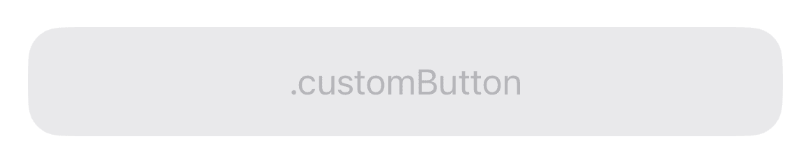
Button {} label: {
    Text(".customButton")
        .frame(maxWidth: .infinity) // 横幅いっぱいまで広げる
}
.buttonStyle(.customButton)
.disabled(false)
| .disabled(false) | タップ中 | .disabled(true) |
|---|---|---|
 |
 |
 |
Label Style
定義元
画像のサイズを、フォントサイズに応じて拡大・縮小するStyleを定義します。
LabelStyleExtension.swift
struct TitleAndImageLabelStyle: LabelStyle {
    func makeBody(configuration: Configuration) -> some View {
        HStack {
            Image(systemName: "square")
                .foregroundStyle(Color.clear)
                .background(
                    configuration.icon
                        .scaledToFit()
                )

            configuration.title
        }
    }
}

extension LabelStyle where Self == TitleAndImageLabelStyle {
    static var titleAndImage: TitleAndImageLabelStyle {
        .init()
    }
}
呼び出し元
ContentView.swift
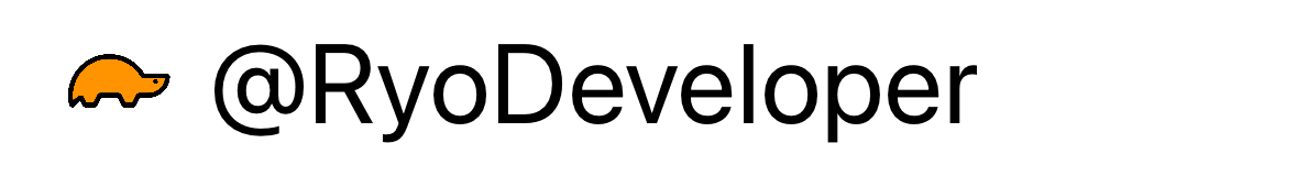
Label {
    Text(".titleAndImage")
        .frame(maxWidth: .infinity, alignment: .leading) // 横幅いっぱいまで広げる
} icon: {
    Image(.ryoDeveloperIcon)
        .resizable()
}
.labelStyle(.titleAndImage)
.font(.largeTitle)
| .font(.largeTitle) | .font(.body) |
|---|---|
 |
 |
Progress View Style
定義元
ProgressViewStyleExtension.swift
struct CustomProgressViewStyle: ProgressViewStyle {
    func makeBody(configuration: Configuration) -> some View {
        let value = configuration.fractionCompleted ?? 0.0

        VStack(alignment: .leading) {
            GeometryReader { geometry in
                ZStack(alignment: .leading) {
                    Capsule()
                        .foregroundStyle(Color(.systemGray6))
                        .frame(width: geometry.size.width, height: 10)
                    Capsule()
                        .foregroundStyle(.orange)
                        .frame(width: CGFloat(value) * geometry.size.width, height: 10)
                        .animation(.default, value: value)
                }
            }
        }
        .frame(height: 10)
    }
}

extension ProgressViewStyle where Self == CustomProgressViewStyle {
    static var customProgressView: CustomProgressViewStyle {
        .init()
    }
}
呼び出し元
ContentView.swift
ProgressView(value: 0.5)
    .progressViewStyle(.customProgressView)
| value: 0.5 | value: 1.0 |
|---|---|
 |
 |
Text Field Style
定義元
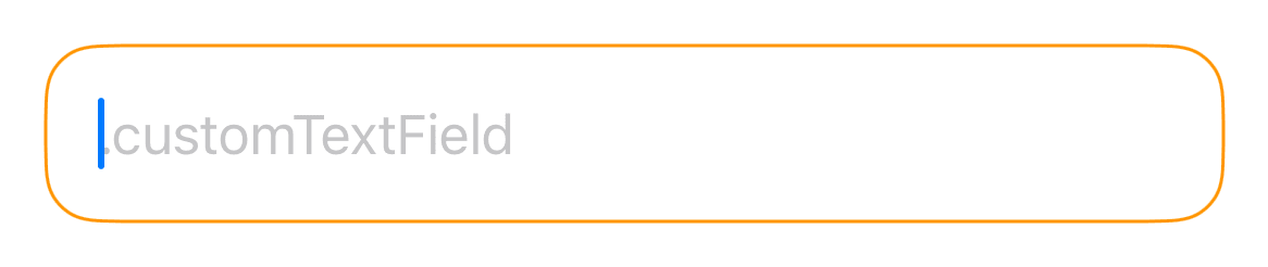
フォーカスが当たっている間は、色がつくStyleを定義します。
TextFieldStyleExtension.swift
struct CustomTextFieldStyle: TextFieldStyle {
    @FocusState private var isFocused: Bool

    init(isFocused: FocusState<Bool>) {
        self._isFocused = isFocused
    }

    func _body(configuration: TextField<Self._Label>) -> some View {
        configuration
            .frame(maxWidth: .infinity)
            .padding()
            .overlay(
                RoundedRectangle(cornerRadius: 16)
                    .stroke(isFocused ? .orange : .gray, lineWidth: 1)
            )
    }
}

extension TextFieldStyle where Self == CustomTextFieldStyle {
    static func customTextField(isFocused: FocusState<Bool>) -> CustomTextFieldStyle {
        CustomTextFieldStyle(isFocused: isFocused)
    }
}
呼び出し元
ContentView.swift
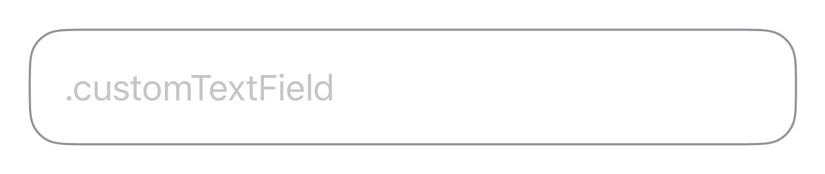
TextField(".customTextField", text: .constant(""))
    .textFieldStyle(.customTextField(isFocused: _isFocused))
    .focused($isFocused)
| isFocused = false | isFocused = true |
|---|---|
 |
 |
Toggle Style
定義元
ToggleStyleExtension.swift
struct CustomToggleStyle: ToggleStyle {
    func makeBody(configuration: Configuration) -> some View {
        Button {
            configuration.isOn.toggle()
        } label: {
            Image(
                systemName: configuration.isOn
                    ? "tortoise" : "hare")

            configuration.label
        }
        .buttonStyle(.plain)
    }
}

extension ToggleStyle where Self == CustomToggleStyle {
    static var customToggle: CustomToggleStyle {
        .init()
    }
}
呼び出し元
ContentView.swift
Toggle(isOn: $isOn) {
    Text(".customToggle")
}
.toggleStyle(.customToggle)
| isOn = true | isOn = false |
|---|---|
 |
 |
Font
定義元
FontExtension.swift
extension Font {
    /// システムフォントで、ダイナミックタイプに対応させる
    static var systemDynamic: Font {
        return Font.custom("", size: 20)
    }

    /// システムフォントで、ダイナミックタイプに対応させない
    static var systemFixed: Font {
        return Font.system(size: 20)
    }

    /// カスタムフォントで、ダイナミックタイプに対応させる
    static var customDynamic: Font {
        return Font.custom("FontName", size: 20)
    }

    /// カスタムフォントで、 ダイナミックタイプに対応させない
    static var customFixed: Font {
        return Font.custom("FontName", fixedSize: 20)
    }
}
呼び出し元
ContentView.swift
Text(".systemDynamic")
    .font(.systemDynamic)
| Medium | XXX Large |
|---|---|
 |
 |
パスワード入力欄

パスワード入力欄については、こちらで紹介しています。
まとめ
- 可読性の向上
- デザインの変更に強くなる
の恩恵をより多く受けるためには、類似するStyleを増殖させずに、
汎用性の高いStyleを必要な分だけ定義することが大切だと感じました。
そのため、
- Color
- Padding
- Frame
等の普遍的な値は定義元には書かずに、引数や呼び出し元で指定できるように工夫しました。
逆に、Buttonのdisabledなどのデフォルトで定義されているものは、独自に引数を作らずにデフォルトのモディファイアを@Environmentでキャッチできるように実装しました。
Styleを定義したサンプルプロジェクト
この記事で紹介した、すべてのStyleをGitHubに公開しました。
宣伝
株式会社アルクでは、ディズニー ファンタスピークの開発をしています。
ディズニー ファンタスピークはディズニーの作品や音楽を楽しみながら、英語学習ができるアプリです。
英語を勉強したいけど、教科書みたいなのはちょっと…という方におすすめです。
気になった方は下記からインストールお願いします。

Discussion