Sparkでヒストグラムを作る


Sparkで処理したデータフレームのデータをヒストグラムにして表示したい。
短いファイルであればto_pandas()しても良いが、
大きなparquetファイルからヒストグラムに集計するにはsparkを使いたい。
今回は、
- sparkでヒストグラムデータを作る。
- matplotlibでヒストグラムを作る。
- Jupyter notebookで表示
の手順でやってみた。
pysparkでヒストグラムを作る
Spark でヒストグラムを作る関数は用意されていないので自分で用意する。
機械学習用の pyspark.ml.features モジュールにある Bucketizerというのが使えそう。
Bucketizerはカラムの値がsplit引数で渡したリストのどの間にあるかを返すもの。
例えば、split=[0,5,10]だと 1.0の値が来たら0を、5.1の値が来たら1を返す。
なので、ヒストグラムのレンジをビン数で割った間隔でリストを作れば、対応するビンIDのカラムを作ることができる。
bin_edges = np.linspace(range[0], range[1], num=nbins).tolist()
ただし、対応するビンがないとエラーになるので、リストの頭に-inf, リストの最後にinfを追加して、アンダーフローとオーバーフローのビンも定義する。
bin_edges.append(np.inf)
bin_edges.insert(0, -np.inf)
bin_edgesをsplitに指定して、Bucketizerを定義、適応して"bin"カラムを作る
bucketizer = Bucketizer(splits=ex_bin_edges, inputCol=colName, outputCol="bin")
binned_df = bucketizer.transform(dataFrame.select(colName))
"bin"毎にグルーピングしてカウント、bin番号順にカウントを並べ替えるとヒストグラムになる。
histogram_df = binned_df.groupBy("bin").count().orderBy("bin")
matplotlibでヒストグラムをプロットする
基本的にはデータフレームにcollect()を呼ぶとlistになるので、bin centerと bin widthを計算して barプロットを作れば良さそう
bin_centers = 0.5 * (bin_edges[:-1] + bin_edges[1:])
bin_width = bin_centers[1] - bin_centers[0]
plt.bar(bin_centers, counts, width=bin_width)
1DHistをプロットする関数
以下が1DHistをプロットする関数、Hist1D。
ただし、カラムにアレイが入っているとプロットできないので、
事前にexplodeしてからHist1Dを呼ぶ、Hist1DArrays関数も用意した。
from pyspark.sql.functions import DataFrame, explode
from pyspark.ml.feature import Bucketizer
import matplotlib.pyplot as plt
import numpy as np

def Hist1D(dataFrame: DataFrame, colName: str, nbins: int, range: tuple[float, float]) -> plt:
    """
    Plot 1D histogram of the column named "colName". Assuming the column stores a value per row.
    Uses spark to count bin contents. pandasHist1d module could be faster for a short DataFrame

    Parameters
    ----------
    dataFrame: Input DataFrame that contains a column named colName
    colName: Column name to plot
    nbis: Number of bins
    range: Histogram range as [min, max]

    Returns
    -------
    1D histogram as matplotlib.pyplot.plt
    """
    # Define bin edges (n bins between -range[0] and range[1])
    bin_edges = np.linspace(range[0], range[1], num=nbins).tolist()

    # Add underflow and overflow bins to an extended list
    ex_bin_edges = bin_edges.copy()
    ex_bin_edges.append(np.inf)
    ex_bin_edges.insert(0, -np.inf)

    # Create a Bucketizer with the extended list of bins
    bucketizer = Bucketizer(splits=ex_bin_edges, inputCol=colName, outputCol="bin")

    # Apply the Bucketizer to the DataFrame
    binned_df = bucketizer.transform(dataFrame.select(colName))

    # Group by bin and count the occurrences in each bin and remove Null bins
    histogram_df = binned_df.groupBy("bin").count().orderBy("bin")
    histogram_df = histogram_df.filter(histogram_df["bin"].isNotNull())

    # Collect the histogram data from Spark to local
    histogram_data = histogram_df.collect()

    # Calculate bin centers
    bin_edges = np.linspace(range[0], range[1], num=nbins)
    counts = np.zeros(len(bin_edges)-1)

    # Populate the counts array based on the histogram data
    # Also, counts statistics for under/overflowed bins
    underflow = 0
    overflow = 0
    inrange = 0
    for row in histogram_data:
        bin_index = int(row['bin'])  # Get the bin index
        if bin_index == 0: # The underflow bin
            underflow = row['count']
        if bin_index == nbins: # The overflow bin
            overflow = row['count']
        else:
            counts[bin_index-1] = row['count']  # Populate the count for the bin
            inrange = inrange + row['count']

    # Calculate bin centers
    bin_centers = 0.5 * (bin_edges[:-1] + bin_edges[1:])
    bin_width = bin_centers[1] - bin_centers[0]

    # Plot the histogram
    plt.bar(bin_centers, counts, width=bin_width)

    # Add labels and title
    plt.xlabel(colName)
    plt.ylabel("Frequency")
    plt.title("Hist1D " + colName + " values")

    # Print statistics
    print("Total entries: {}, Underflow: {}, Inside: {}, Overflow: {}".format(inrange+underflow+overflow, underflow, inrange, overflow))

    return plt

def Hist1DArrays(dataFrame: DataFrame, colName: str, nbins: int, range: tuple[float, float]) -> plt:
    """
    Plot 1D histogram of the column named colName.
    The column stores an array of values.

    Parameters
    ----------
    dataFrame: Input DataFrame
    colName: Column name to plot
    nbis: Number of bins
    range: Histogram range as [min, max]

    Returns
    -------
    1D histogram as matplotlib.pyplot.plt
    """
    dataFrame = dataFrame.select(colName)
    exploded_df = dataFrame.select(explode(colName).alias(colName))

    return Hist1D(exploded_df, colName, nbins, range)
2DHistをプロットする関数
2次元ヒストグラムも基本同じだが、それぞれのカラムがアレイの場合は同じindex同士の値だけプロットしたいので、Hist2DArraysは row_numberとアレイのindexを定義してexplode、xとyをjoinという手順を踏む。
from pyspark.sql.functions import DataFrame, posexplode, row_number, lit
from pyspark.ml.feature import Bucketizer
from pyspark.sql.window import Window
import matplotlib.pyplot as plt
import numpy as np

def Hist2D(dataFrame: DataFrame, colName: tuple[str, str], nbins: tuple[int, int], range: tuple[tuple[float, float], tuple[float, float]]) -> plt:
    """
    Plot 2D histogram of the column named colName["x", "y"]. Assuming the column stores a value per row

    Parameters
    ----------
    dataFrame: Input DataFrame
    colName: Column names to plot [x, y]
    nbis: Number of bins [nbinsx, nbinsy]
    range: Histogram range as [x[min, max], y[min, max]]

    Returns
    -------
    2D histogram as matplotlib.pyplot.plt
    """
    # Define bin edges
    bin_edges_x = np.linspace(range[0][0], range[0][1], num=nbins[0]).tolist()
    bin_edges_y = np.linspace(range[1][0], range[1][1], num=nbins[1]).tolist()
    ex_bin_edges_x = bin_edges_x.copy()
    ex_bin_edges_y = bin_edges_y.copy()
    ex_bin_edges_x.append(np.inf)
    ex_bin_edges_y.append(np.inf)
    ex_bin_edges_x.insert(0,-np.inf)
    ex_bin_edges_y.insert(0,-np.inf)

    # Create a Bucketizer
    bucketizer_x = Bucketizer(splits=ex_bin_edges_x, inputCol=colName[0], outputCol="bin_x")
    bucketizer_y = Bucketizer(splits=ex_bin_edges_y, inputCol=colName[1], outputCol="bin_y")

    # Apply the Bucketizer to the DataFrame
    binned_df = bucketizer_x.transform(dataFrame.select(colName[0], colName[1]))
    binned_df = bucketizer_y.transform(binned_df)

    # Group by bin and count the occurrences in each bin and remove Null bins
    binned_df = binned_df.filter(binned_df["bin_x"].isNotNull() & binned_df["bin_y"].isNotNull())
    histogram_2d_df = binned_df.groupBy("bin_x","bin_y").count()

    # Collect the histogram data from Spark to local
    histogram_data = histogram_2d_df.collect()

    # Extract bin indices and counts from the collected data
    counts = np.zeros((len(bin_edges_x) - 1, len(bin_edges_y) - 1))

    # Populate the 2D counts array
    # statArray is an 3 x 3 numpy.ndarray with underflow, inrange, overflow statistics for x and y
    statArray = np.zeros(shape=(3,3))
    for row in histogram_data:
        bin_x = int(row['bin_x'])
        bin_y = int(row['bin_y'])
        idx = 1
        idy = 1
        if bin_x == 0:
            idx = 0
        elif bin_x == nbins[0]:
            idx = 2
        if bin_y == 0:
            idy = 0
        elif bin_y == nbins[1]:
            idy = 2
        if idx == 1 and idy == 1:
            counts[bin_x-1, bin_y-1] = row['count']
        statArray[idx,idy] = statArray[idx,idy] + row['count']

    # Plot the 2D histogram using a heatmap
    plt.imshow(counts.T, extent=[range[0][0], range[0][1], range[1][0], range[1][1]], origin='lower', aspect='auto', cmap='viridis')

    # Add labels and title
    plt.xlabel(colName[0])
    plt.ylabel(colName[1])
    plt.title("2D Histogram of " + colName[1] + " vs " + colName[0])

    # Show the color bar
    plt.colorbar(label='Counts')

    # Print statistics
    print("Statistics:")
    print(statArray)
    return plt

def Hist2DArrays(dataFrame: DataFrame, colName: tuple[str, str], nbins: tuple[int, int], range: tuple[tuple[float, float], tuple[float, float]]) -> plt:
    """
    Plot 2D histogram of the column named colName["x", "y"]. Assuming the column stores an array that is aligned with each other

    Parameters
    ----------
    dataFrame: Input DataFrame
    colName: Column names to plot [x, y]
    nbis: Number of bins [nbinsx, nbinsy]
    range: Histogram range as [x[min, max], y[min, max]]

    Returns
    -------
    2D histogram as matplotlib.pyplot.plt
    """
    dataFrame = dataFrame.select(colName[0],colName[1])
    windowSpec = Window.orderBy(lit(0))
    dataFrame = dataFrame.withColumn("row", row_number().over(windowSpec))
    exploded_pos_x_df = dataFrame.select(posexplode(colName[0]).alias("idx", colName[0]),"row")
    exploded_pos_y_df = dataFrame.select(posexplode(colName[1]).alias("idx", colName[1]),"row")
    exploded_df = exploded_pos_x_df.join(exploded_pos_y_df, ["row", "idx"])

    return Hist2D(exploded_df, colName, nbins, range)
Jupyter notebook から関数を呼ぶ
Jupyter notebook の設定
Spark環境のあるサーバ上でnotebookを走らせる場合、ssh hostname -L 8888:localhost:8888でポートフォワードを指定してログインし、Jupyter notebookをインストール
pip install notebook
ヒストグラムをプロットする関数を保存した hist/ ディレクトリがある場所に移動し、PYTHONPATHを設定する。
export PYTHONPATH=${PWD}:${PYTHONPATH}
notebookの起動
jupyter notebook --no-brower
http://localhost:8888/tree?token=...と表示が出たらtokenを含めてURLをローカルマシンのWebブラウザで開く。
File → New → Notebook を開く。Kernel は pysparkをインストールしているものを選ぶ。

セル[1]:に図のように SparkSession の定義を書いて Ctrl+Enter する。
"spark.executor.cores"を設定しないとnotebookで全てのCoreを占有してしまうので注意が必要。この辺のリソース管理についてはまだあんまり理解できてない。
基本的に セルにコードを書いて Ctrl + Enter で実行、Spark sessionを再起動したい時 Restart Kernel (⟳) が必要。
File → Save and Export Notebook As → Markdown とすると簡単にこのZenn記事のような Markdown 式の場所に貼り付けられる。
ファイルからデータフレームの読み込み
一旦1000行だけ読み込む。
import pyspark.sql.functions as F
df = spark.read.parquet("hdfs://"+CLUSTER_HOST_NAME+":9000/test/calib1029_sr91x.parquet")
df = df.limit(1000)
df = df.filter(F.col("sr91x_id").isNotNull())
df.show(10)
+--------+--------------------+--------------------+
|event_id|            sr91x_id|         sr91x_value|
+--------+--------------------+--------------------+
|   74103|[39, 40, 38, 40, ...|[31075, 123074, 3...|
|   74104|[51, 50, 49, 51, ...|[30985, 30958, 31...|
|   74106|[53, 51, 52, 50, ...|[30994, 30947, 30...|
|   74108|[55, 58, 55, 57, ...|[31286, 31261, 31...|
|   74110|[47, 46, 45, 47, ...|[31021, 30974, 31...|
|   74111|[46, 45, 44, 46, ...|[31114, 31096, 31...|
|   74113|[39, 42, 41, 40, ...|[31071, 30984, 30...|
|   74115|[39, 40, 38, 41, ...|[31209, 31257, 31...|
|   74116|[47, 49, 47, 48, ...|[30900, 30889, 31...|
|   74117|[36, 35, 36, 34, ...|[31001, 30965, 31...|
+--------+--------------------+--------------------+
only showing top 10 rows
1DHist を試してみる
hist/sparkHist1d.py に関数を保存したとして、以下のように読み込む。
関数の引数は Hist1DArrays(データフレーム、プロットするカラム名、ビン数、レンジ[min, max])
from hist.sparkHist1d import Hist1DArrays
plt = Hist1DArrays(df,"sr91x_value",100,[0,50000])
plt.yscale('log')
Total entries: 8260, Underflow: 0, Inside: 7080, Overflow: 1180
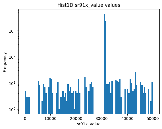
Matplotlib の plot を返すので、plt.yscale('log') 等適宜呼べばよい。
2DHist を試してみる
from hist.sparkHist2d import Hist2DArrays
plt = Hist2DArrays(df,["sr91x_id","sr91x_value"],[100,100],[[0,100],[0,40000]])
24/08/29 18:07:34 WARN WindowExec: No Partition Defined for Window operation! Moving all data to a single partition, this can cause serious performance degradation.
24/08/29 18:07:34 WARN WindowExec: No Partition Defined for Window operation! Moving all data to a single partition, this can cause serious performance degradation.
24/08/29 18:07:34 WARN WindowExec: No Partition Defined for Window operation! Moving all data to a single partition, this can cause serious performance degradation.
24/08/29 18:07:34 WARN WindowExec: No Partition Defined for Window operation! Moving all data to a single partition, this can cause serious performance degradation.
24/08/29 18:07:35 WARN WindowExec: No Partition Defined for Window operation! Moving all data to a single partition, this can cause serious performance degradation.
24/08/29 18:07:35 WARN WindowExec: No Partition Defined for Window operation! Moving all data to a single partition, this can cause serious performance degradation.


Statistics:
[[   0.    0.    0.]
 [   0. 6950. 1310.]
 [   0.    0.    0.]]
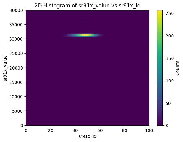
Statisticsとして、X, Y それぞれがunderflow, in range, overflow のどれかでフラグ訳したエントリ数がプリントされる。
WARNINGが出るが、row_numberをつけるのにpartitionを定義せず全体に番号を振っているのでそこで出ていると思われる。これはどうしようもないと思われる。"event_id"でjoin()すれば良いのだが、関数が汎用的でなくなってしまうのでとりあえずこのまま。
おわりに
Jupyter notebookを使ってこのくらいの手間でヒストグラムを見ることが出来れば、
一応実験解析で使うことができるレベルではあるかなという感じ。今後実用してみたい。
ROOT と比べるとspark自体にはVisualizationのツールが揃っていないが、Sparkは他のサービスと連携してこそなので、今後探っていきたい。
Discussion