Next.js (5): TailwindCSSの導入 & ZennのArticlesカードを作ってみました
概要
今度はNext.jsにTailwindCSSを導入してZennのArticles一覧を作って見ました。
環境設定からTailwindCSSの要素の説明を書きたいと思います。

Next.jsのアプリ作成はこちらの記事にも書いてありますが、ここにも簡単に触れます。
TailwindCSSとは
Utility-FirstのCSSフレームワーク
予めスタイリングがセッティングされているClassを組み合わせてデザインを適用します。カスタマイズが用意です。
HTMLにClassを直接指定するので別途CSSが不要です。(同じデザインをcomponentとして扱いたい場合はcssファイルに書く場合もあります。)
Tailwind CSS Cheat Sheet
Tailwind Document
環境設定
Next.js (react18)
react18が正式にリリースされたので、最新のnext.jsアプリを作成するとreactのバージョンは自動で18になりました。
$ npx create-next-app@latest --typescript
Need to install the following packages:
  create-next-app@latest
Ok to proceed? (y) y

# アプリの名前を入力します。
✔ What is your project named? … redpanda-nextjs
Creating a new Next.js app in /Users/redpanda/Projects/redpanda-nextjs.

# アプリをVS Codeで開きます。
$ code redpanda-nextjs/

# package.json
"dependencies": {
    "next": "12.1.4",
    "react": "18.0.0",
    "react-dom": "18.0.0"
  },
TailwindCSSを入れる
# アプリのホームディレクトリで実行します。
$ npm install -D tailwindcss postcss autoprefixer prettier prettier-plugin-tailwindcss

# tailwindcssの設定ファイルが作成されます。
$ npx tailwindcss init -p
※ prettier-plugin-tailwindcssは以下の例のようにclassNameの順番をソートしてくれるものです。
<!-- Before -->
<button class="text-white px-4 sm:px-8 py-2 sm:py-3 bg-sky-700 hover:bg-sky-800">...</button>

<!-- After -->
<button class="bg-sky-700 px-4 py-2 text-white hover:bg-sky-800 sm:px-8 sm:py-3">...</button>
configとglobal.cssに設定を追加します。
TailwindCSSでみるファイルの経路を入れています。これでそのファイル中のclassを見てCSSに生成します。
module.exports = {
  content: [
    "./pages/**/*.{js,jsx,ts,tsx}",
    "./components/**/*.{js,jsx,ts,tsx}",
  ],
  theme: {
    extend: {},
  },
  plugins: [],
};
@tailwind base;
@tailwind components;
@tailwind utilities;
アプリを起動してみます。
$ npm run dev

// port番号はデフォルト3000ですが、私はすでに使っているので3001
// 表示されたlocalhostのURLをブラウザで開きます。
warn  - Port 3000 is in use, trying 3001 instead.
ready - started server on 0.0.0.0:3001, url: http://localhost:3001
http://localhost:3001 この画面が出たらOK
⚠️ もしTypeError: Cannot set properties of undefined (setting 'reactRoot') の場合
/** @type {import('next').NextConfig} */
const nextConfig = {
  reactStrictMode: true,
  experimental: {
    reactRoot: "concurrent",
  },
};

module.exports = nextConfig;
TailwindCSSを試す
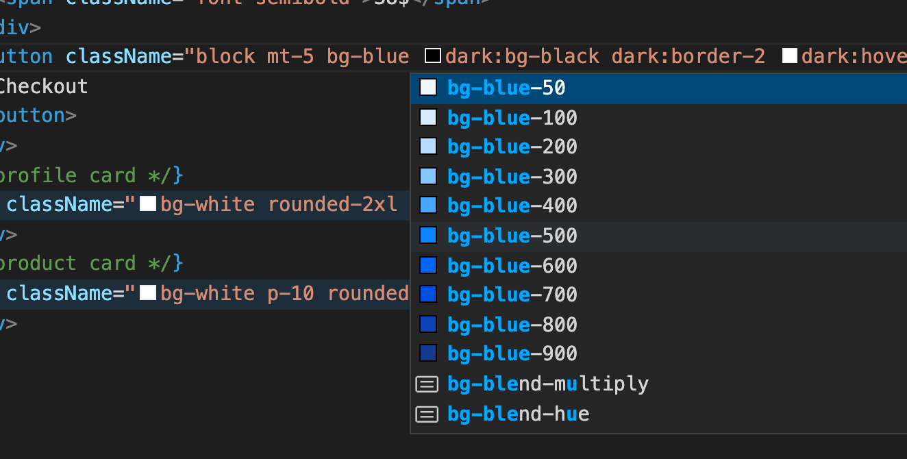
まずはVS Codeに Tailwind CSS IntelliSense extenstionを入れましょう。
色や使えるclass名、単位などを表示してくれるのでとても楽になります。
ZennのArticleカードを作ってみました。
まず全体のソースコードはこのように書きました。pages/index.tsxに貼り付けるだけで確認できます。
tailwindCSSが目的なのHTMLタグはとりあえず気にせずdivで作りました。また表現を簡略した箇所もあります。
cardの部分を繰り返して作るとgrid設定によっていい感じに配置されます。
import Image from "next/image";
import type { NextPage } from "next";

const Home: NextPage = () => {
  return (
    <div className="mh-screen bg-gray-200 p-10">
      <div className=" grid max-w-7xl place-items-center gap-5 lg:grid-cols-3 xl:grid-cols-4">
        {/* Card */}
        <div className="relative overflow-hidden rounded-xl bg-white shadow-lg">
          <div className="flex justify-center bg-blue-200 ">
            <a className="absolute top-2 left-2 rounded-3xl bg-[#3ea8ff] py-1 px-2 text-xs font-bold text-white">
              TECH
            </a>
            <div className="p-9 text-5xl">🦾</div>
          </div>
          <div className="space-y-4 p-4">
            <div className="mb-6 text-lg font-bold text-gray-500">
              Next.js : CSR SSG SSRについて
            </div>
            <div className="space-x-2 leading-3">
              <a className="rounded-md bg-gray-200 py-1 px-2 text-xs font-light text-gray-500">
                React
              </a>
              <a className="rounded-md bg-gray-200 py-1 px-2 text-xs font-light text-gray-500">
                JavaScript
              </a>
              <a className="rounded-md bg-gray-200 py-1 px-2 text-xs font-light text-gray-500">
                TailwindCSS
              </a>
            </div>
            <div className="flex items-center space-x-2">
              <Image
                src="/cat.jpg"
                width={28}
                height={28}
                className="rounded-full"
                alt="profile"
              />
              <div className="space-y-1">
                <div className="text-xs">mini redpanda</div>
                <div className="text-xs text-gray-500">
                  5日前・2min read ♥️2
                </div>
              </div>
            </div>
          </div>
        </div>
      </div>
    </div>
  );
};

export default Home;
ポイント
いくつかポイントになる箇所を詳しくみていきます。
1.記事のタグの要素
Tailwindcssの使い方は簡単で、入れたいデザインをClass名ベースで追加します。
記事のタグは以下のよう書けます。
<a className="rounded-md bg-gray-200 py-1 px-2 text-xs font-light text-gray-500">
React
 </a>
CSSと比較するとこのように設定されています。
- border-radius: rounded-md
- background-color: bg-gray200
- padding-top padding-bottom: py-1
- padding-left padding right: px-2
- font-size: text-xs
- font-weight: font-light
- color: text-gray-500
font-size paddingなどはpx単位ではなく、基本rem単位になっています。
例えばpy-1は1pxではなく0.25remになっています。
class名にマウスカーソルを当てると、実際に設定されるCSSが表示されます。

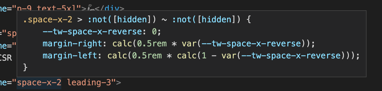
space
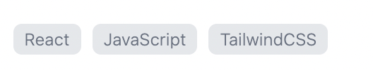
間隔を作りたい場合使います。space-x-N space-y-Nはそれぞれx軸とy軸でいい感じで計算して広げてくれます。
記事のタグはspace-x-2を利用して横の間隔を空けています。
<div className="space-x-2 leading-3">
  <a className="rounded-md bg-gray-200 py-1 px-2 text-xs font-light text-gray-500">
    React
  </a>
  <a className="rounded-md bg-gray-200 py-1 px-2 text-xs font-light text-gray-500">
    JavaScript
  </a>
  <a className="rounded-md bg-gray-200 py-1 px-2 text-xs font-light text-gray-500">
    TailwindCSS
  </a>
</div>
2.カードの上段

こちらはTECHというバッジが左上に、Iconは中央に配置されています。
<div className="flex justify-center bg-blue-200 ">
  <a className="absolute top-2 left-2 rounded-3xl bg-[#3ea8ff] py-1 px-2 text-xs font-bold text-white">
  TECH
  </a>
  <div className="p-9 text-5xl">🦾</div>
</div>
absolute
「TECH」のバッジはabsoluteで表現しています。
親のdiv要素であるカードの全体のdivに(上のコードでは省略)relativeを入れてバッジのaタグにtop-2 left-2を入れることで上手くカードの左上に表示されます。
ここでまた大事なところですが、バッジの色がbg-[#3ea8ff]になっています。
実はtailwindCSSで決まっているClassだけではなく、実際のCSSの書き方も対応しています。
flex
flexとjustify-centerを使って🦾iconを中央添えにしました。iconは文字になっているのでtext-5xlで大きく表示しています。
3.全体
shadow
カード全体にshadowをかけています。shadowが使って簡単に反映できます。
<div className="relative overflow-hidden rounded-xl bg-white shadow-lg"></div>
gridとresponsive
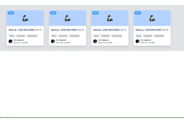
サンプルコードはカードが一つですが、下にコピーして複数に増やすとgridによってカード配置になります。
また、lg:grid-cols-3 xl:grid-cols-4により画面サイズがlgの場合はカードが最大三つ、xlの場合は四つに表示させることができます。
これを使うと簡単にレスポンシブアプリを作成できます。
<div className="grid max-w-7xl place-items-center gap-5 lg:grid-cols-3 xl:grid-cols-4">
 {/* Card */}
 {/* Card */}
 {/* Card */}
</div>
次の記事では、class名をカスタムする方法、Drakモードについて書きたいと思います。
ソースコードは私のgitリポジトリにあげておきましたのでよかったらみてください。
Discussion