💡
備忘録10 Flutter Widgetの基礎
概要
アプリ開発において、Widgetはとても重要なので、今回は基礎の部分を記載する。
Widgetの種類
ざっと分けるとこんな感じ
・構造ウィジェット
・表示ウィジェット
・インタラクションウィジェット
・ナビゲーションウィジェット
・リストウィジェット
・入力ウィジェット
・アニメーションウィジェット
・レイアウトウィジェット
・その他のウィジェット
これらは今後一つずつ記事に記載していきたいと思う。
今回はウィジェットツリーについて記載する。
ウィジェットツリーとは
ウィジェットツリーとは、ウィジェットの階層構造を表現したもので、FlutterアプリケーションのUIを構築する基本的な概念である。ウィジェットツリーは、ウィジェットが親子関係を持ちながら階層的に配置されることで構築される。
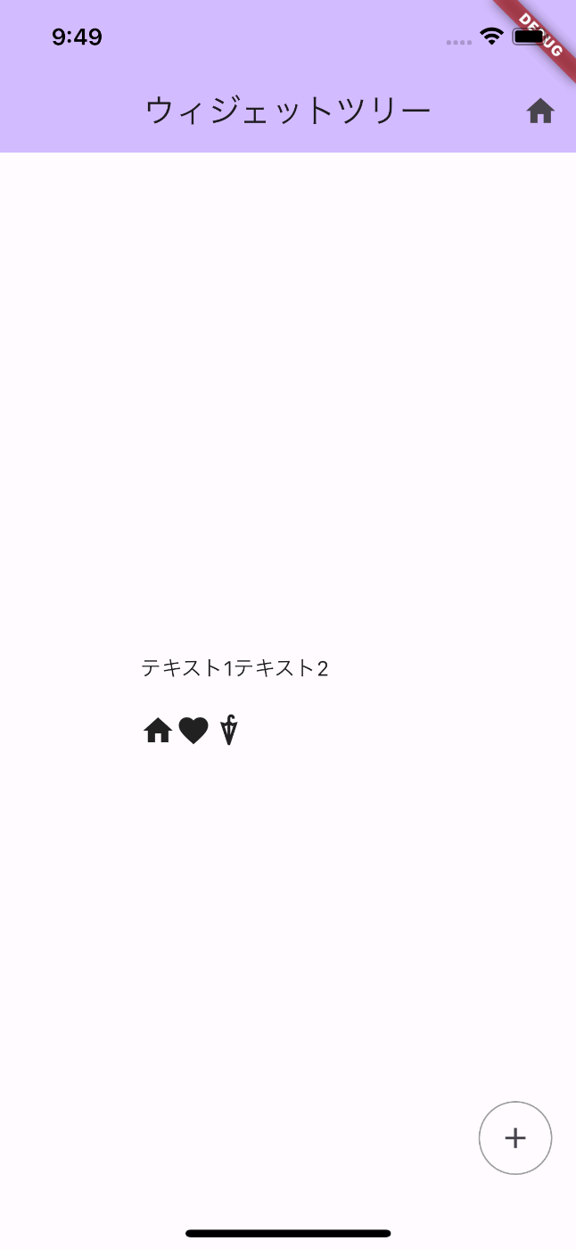
ちょっと汚いけど、以下のようなUIを作ってみた。
これをウィジェットごとで色分けするととこんな感じ。

コードはこんな感じ
今回はScaffold以下の部分を抜粋
import 'package:flutter/material.dart';

void main() async {
  // WidgetsFlutterBinding.ensureInitialized();
  runApp(const MyApp());
}

class MyApp extends StatelessWidget {
  const MyApp({super.key});

  // This widget is the root of your application.
  @override
  Widget build(BuildContext context) {
    return MaterialApp(
      title: 'Flutter Demo',
      theme: ThemeData(
        colorScheme: ColorScheme.fromSeed(seedColor: Colors.deepPurple),
        useMaterial3: true,
      ),
      home: const MyHomePage(title: 'ウィジェットツリー'),
    );
  }
}

class MyHomePage extends StatefulWidget {
  const MyHomePage({super.key, required this.title});

  final String title;

  @override
  State<MyHomePage> createState() => _MyHomePageState();
}

class _MyHomePageState extends State<MyHomePage> {
  @override
  Widget build(BuildContext context) {
    return Scaffold(
      appBar: AppBar(
        backgroundColor: Theme.of(context).colorScheme.inversePrimary,
        title: Text(widget.title),
        actions: [IconButton(onPressed: () {}, icon: const Icon(Icons.home))],
      ),
      body: Center(
        child: Column(
          mainAxisAlignment: MainAxisAlignment.center,
          children: <Widget>[
            Container(
              margin: const EdgeInsets.all(10),
              width: 200,
              child: Row(
                children: [
                  Text("テキスト1"),
                  Text("テキスト2"),
                ],
              ),
            ),
            Container(
              margin: const EdgeInsets.all(10),
              width: 200,
              child: const SingleChildScrollView(
                scrollDirection: Axis.horizontal,
                child: Row(
                  children: [
                    Icon(Icons.home),
                    Icon(Icons.favorite),
                    Icon(Icons.umbrella),
                  ],
                ),
              ),
            ),
          ],
        ),
      ),
      floatingActionButton: Container(
        decoration: BoxDecoration(
          borderRadius: BorderRadius.circular(50),
          border: Border.all(color: Colors.grey),
        ),
        child: IconButton(
          onPressed: () {},
          icon: const Icon(
            Icons.add,
          ),
        ),
      ),
    );
  }
}
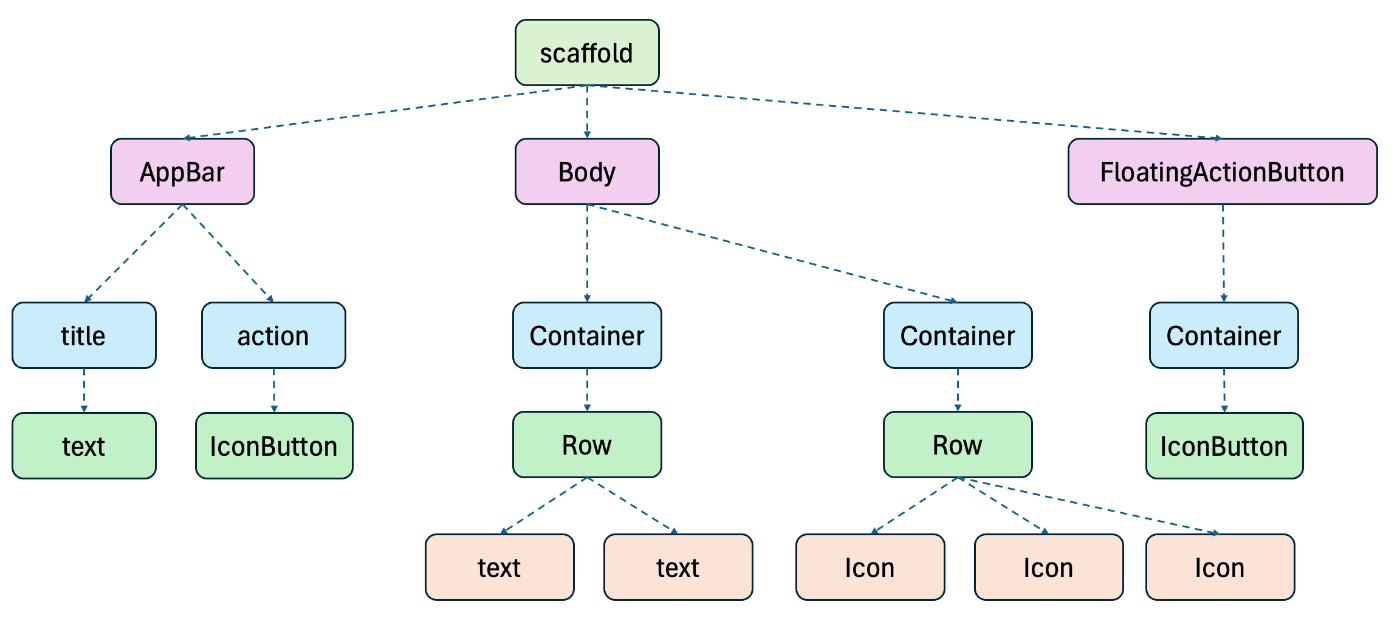
これをウィジェットツリーで表すとこんな感じ
色分けした枠と同じ色に合わせている。
Discussion