🍡
【Shopify構築】よくある特徴ページをLiquidを用いて実装してみた
今回は、Liquidを使って、よくある特徴ページを実装したんで備忘録として残しておきます。
イメージはこんな感じです。
完成イメージ

jsonファイル
aboutページを作るんで、jsonを定義しておきます。
今回は、メールフォーム、タイトルとかも入れたいんで、jsonに書いておきます。
page.about.json
{
  "sections": {
    "main": {
      "type": "main-page",
      "settings": {
        "padding_top": 36,
        "padding_bottom": 28
      }
    },
    "newsletter": {
      "type": "newsletter",
      "blocks": {
        "heading": {
          "type": "heading",
          "settings": {
            "heading": "ここにメールフォームのタイトル",
            "heading_size": "h1"
          }
        },
        "paragraph": {
          "type": "paragraph",
          "settings": {
            "text": "<p>ここにメールフォームのメッセージを入れます</p>"
          }
        },
        "email-form": {
          "type": "email_form",
          "settings": {}
        }
      },
      "block_order": ["heading", "paragraph", "email-form"],
      "settings": {
        "color_scheme": "accent-2",
        "full_width": true,
        "padding_top": 60,
        "padding_bottom": 60
      }
    }
  },
  "order": ["main", "newsletter"]
}
Schema
jsonを定義したら、liquidファイルをいじってきます。
まずは、Schemaを定義していきます。
section-about.liquid
{% schema %}
{
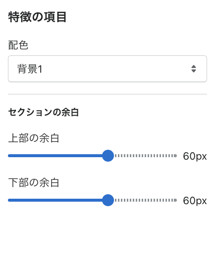
"name": "特徴の項目",
"tag": "section",
"class": "about-contents u-wrap",
"settings": [
{
"type": "select",
"id": "color_scheme",
"options": [
{
"value": "accent-1",
"label": "t:sections.all.colors.accent_1.label"
},
{
"value": "accent-2",
"label": "t:sections.all.colors.accent_2.label"
},
{
"value": "background-1",
"label": "t:sections.all.colors.background_1.label"
},
{
"value": "background-2",
"label": "t:sections.all.colors.background_2.label"
},
{
"value": "inverse",
"label": "t:sections.all.colors.inverse.label"
}
],
"default": "background-1",
"label": "t:sections.all.colors.label"
},
{
"type": "header",
"content": "t:sections.all.padding.section_padding_heading"
},
{
"type": "range",
"id": "padding_top",
"min": 0,
"max": 100,
"step": 4,
"unit": "px",
"label": "t:sections.all.padding.padding_top",
"default": 60
},
{
"type": "range",
"id": "padding_bottom",
"min": 0,
"max": 100,
"step": 4,
"unit": "px",
"label": "t:sections.all.padding.padding_bottom",
"default": 60
}
],
"blocks" :[
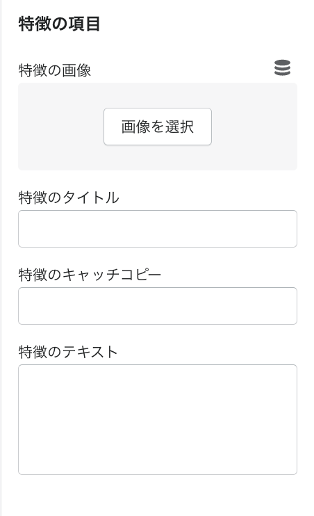
{
"type": "feature-contents",
"name": "特徴の項目",
"settings": [
{
"id" : "feature-contents__image",
"type" : "image_picker",
"label" : "特徴の画像"
},
{
"id" : "feature-contents__ttl",
"type" : "text",
"label" : "特徴のタイトル"
},
{
"id" : "feature-contents__copy",
"type" : "text",
"label" : "特徴のキャッチコピー"
},
{
"id" : "feature-contents__txt",
"type" : "textarea",
"label" : "特徴のテキスト"
}
]
}
],
"presets": [
{
"name": "特徴の項目"
}
]
}
{% endschema %}
どんなもんか確認。。
ブロックの中は、、
いいですね。。
あとは、HTML、CSSの中に入れるだけですね。
HTML,CSSの組み込み
最後は、HTML,CSSを組み込んでやって完成ですね。
about-section.liquid
{{ 'section-about.css' | asset_url | stylesheet_tag }}
{% for block in section.blocks %}
<div class="feature-contents__item">
  <div class="feature-contents__image">
      <img
        srcset="{%- if block.settings.feature-contents__image.width >= 165 -%}{{ block.settings.feature-contents__image | image_url: width: 165 }} 165w,{%- endif -%}
          {%- if block.settings.feature-contents__image.width >= 360 -%}{{ block.settings.feature-contents__image | image_url: width: 360 }} 360w,{%- endif -%}
          {%- if block.settings.feature-contents__image.width >= 533 -%}{{ block.settings.feature-contents__image | image_url: width: 533 }} 533w,{%- endif -%}
          {%- if block.settings.feature-contents__image.width >= 720 -%}{{ block.settings.feature-contents__image | image_url: width: 720 }} 720w,{%- endif -%}
          {%- if block.settings.feature-contents__image.width >= 940 -%}{{ block.settings.feature-contents__image | image_url: width: 940 }} 940w,{%- endif -%}
          {%- if block.settings.feature-contents__image.width >= 1066 -%}{{ block.settings.feature-contents__image | image_url: width: 1066 }} 1066w,{%- endif -%}
          {{ block.settings.feature-contents__image | image_url }} {{ block.settings.feature-contents__image.width }}w"
          src="{{ block.settings.feature-contents__image | img_url: "master" | crop:'center' }}"
          alt="{{ block.settings.feature-contents__image.alt}}"
          width="{{ block.settings.feature-contents__image.width}}"
          height="{{block.settings.feature-contents__image.height}}" loading="lazy">
  </div>

  <div class="feature-contents__textarea">
      <h2 class="feature-contents__ttl">{{ block.settings.feature-contents__ttl }}</h2>

      <p class="feature-contents__copy">{{ block.settings.feature-contents__copy }}</p>

      <p class="feature-contents__txt">
          {{ block.settings.feature-contents__txt }}
      </p>
  </div>
</div>
{% endfor %}
あとはcssはこんな感じ。。
section-about.css
.u-wrap{
  margin: 100px auto;
  width: 95%;
  max-width: 1280px;
}

.feature-contents__item{
      display: flex;
      display: -webkit-box;
      display: -ms-flexbox;
      justify-content: space-between;
      -webkit-box-pack: justify;
      -ms-flex-pack: justify;
      align-items: center;
      -webkit-box-align: center;
      -ms-flex-align: center;
      flex-wrap: wrap;
      margin: 0 30px;
}
@media screen and (max-width: 768px) {
.feature-contents__item {
    justify-content: center;
    -webkit-box-pack: justify;
    -ms-flex-pack: justify;
    margin: 0 ;
  }
}
.feature-contents__item:nth-child(even){
    -webkit-box-orient: horizontal;
    -webkit-box-direction: normal;
    -ms-flex-direction: row;
    flex-direction: row;
}

.feature-contents__item:nth-child(odd){
    -webkit-box-orient: horizontal;
    -webkit-box-direction: reverse;
    -ms-flex-direction: row-reverse;
    flex-direction: row-reverse;
}

.feature-contents__item:not(:first-child){
  margin-top: 150px;
}

@media screen and (max-width: 768px){
.feature-contents__item:not(:first-child) {
    margin-top: 50px;
  }
}

.feature-contents__image{
  width: 45%;
}
@media screen and (max-width: 768px) {
  .feature-contents__image {
      width: 90%;
    }
}

.feature-contents__image img{
  width: 100%;
  height: auto;
  vertical-align: bottom;
  object-fit: cover;
}

.feature-contents__textarea{
  /* margin-top: 0; */
  width: 44%;
}
@media screen and (max-width: 768px) {
.feature-contents__textarea {
    width: 85%;
  }
}
.feature-contents__ttl{
  color: #1A5479;
  font-size: 18px;
  font-weight: 700;
}
@media screen and (max-width: 768px) {
.feature-contents__ttl {
    font-size: 16px;
  }
}
.feature-contents__copy{
  position: relative;
  margin-top: 0;
  padding: 1rem .5rem;
  font-size: 20px;
  font-weight: 700;
}
@media screen and (max-width: 768px) {
.feature-contents__copy {
    font-size: 18px;
  }
}
.feature-contents__copy::after {
  content: "";
    position: absolute;
      bottom: 0;
      left: 0;
      width: 100%;
      height: 6px;
      border-radius: 3px;
      background-image: -webkit-gradient(linear, right top, left top, from(#68c2ff), to(#1A5479));
      background-image: -webkit-linear-gradient(right, #68c2ff 0%, #68c2ff 100%);
      background-image: linear-gradient(to left, #68c2ff 0%, #1A5479 100%);
}

.feature-contents__txt {
  margin-top: 20px;
  line-height: 2.0;
  font-size: 16px;
  letter-spacing: 1px;
}
@media screen and (max-width: 768px) {
.feature-contents__txt {
    font-size: 14px;
  }
}
Discussion