ポップアップバナーのセクションの作成
こんばんは。PeiWebです。今回は、トップページにポップアップバナーのセクションを制作してみました✨ 動的に、バナーを表示するまでの時間と表示期限を設定できるスキーマを設定しました。
よく使うので備忘録として残しておきます。
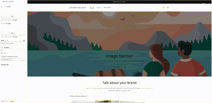
完成形
まずは、完成形を見ていきます。
■スマホ版
■PC版
それでは、実装していきます。
Liquidを用いたカスタマイズ
まずは、いつも通り、Schemaから定義していきます。
一例として、定義するSchemaは以下です。

今回、ポップアップバナーの制作を行うセクションを「custom-section-popup.liquid」とします。
Schemaの定義
{% schema %}
{
  "name": "ポップアップバナー",
  "tag": "div",
  "class": "modal-section",
  "settings": [
    {
      "type": "image_picker",
      "id": "modal_image_sp",
      "label": "spバナー用の画像",
      "info": "spポップアップバナー用の画像"
    },
    {
      "type": "image_picker",
      "id": "modal_image_PC",
      "label": "PCバナー用の画像",
      "info": "PCポップアップバナー用の画像"
    },
    {
      "type": "url",
      "id": "modal_link",
      "label": "遷移先リンク"
    },
    {
      "type": "number",
      "id": "delay",
      "label": "バナー待機時間",
      "info": "単位:秒"
    },
    {
      "type": "text",
      "id": "display_limit_time",
      "label": "表示期限 YYYY/MM/DD HH:MM",
      "default": "2024/01/01 01:00"
    }
  ],
  "presets": [
    {
      "name": "popup"
    }
  ]
}
{% endschema %}
ポップアップバナーに、「画像」「遷移先のリンク」「バナー待機時間(バナーが出てくるまでの時間)」「表示期限」を動的に設定できるように設定しております。
変数の設定
次に、実装していく上で必要になる変数を実装していきます。
{{ 'section-custom-modal.css' | asset_url | stylesheet_tag }}


{% assign image_pc = section.settings.modal_image_PC %}
{% assign image_sp = section.settings.modal_image_sp %}

{% assign current_time = 'now' | date: '%s' %}
{% assign setting_limit_time = section.settings.display_limit_time | date: '%s' %}


{% javascript %}
let modal = document.querySelector('.l_modal');
let CloseBtn = document.querySelector('.l_modal-close');
let overlay = document.querySelector('.l_modal_overlay');

CloseBtn.addEventListener('click', function(){
  modal.classList.add('active');
  overlay.classList.add('active');
});

var currentDate = new Date();
var currentDateString = currentDate.toISOString();
Shopify.theme.currentDate = currentDateString;
{% endjavascript %}

{% assign popup_enabled = true %}
{% if Shopify.theme.currentDate > setting_limit_time %}
{% assign popup_enabled = false %}
{% endif %}
詳しく解説していきます。
{{ 'section-custom-modal.css' | asset_url | stylesheet_tag }}:
このコードは、指定されたCSSファイルを読み込むためのShopifyテンプレートタグです。
'section-custom-modal.css' はカスタムモーダルのスタイルを定義しているCSSファイルの名前です。
ファイル内の変数の設定
{% assign image_pc = section.settings.modal_image_PC %}
{% assign image_sp = section.settings.modal_image_sp %}
{% assign current_time = 'now' | date: '%s' %}
{% assign setting_limit_time = section.settings.display_limit_time | date: '%s' %}
・image_pc および image_sp:
セクションの設定からモーダルのPCバージョンとスマートフォンバージョンの画像を取得しています。
・current_time および setting_limit_time:
現在の日時と、表示制限時間を設定するためのセクションの設定から取得した日時を比較するための変数です。日時は秒単位に変換されます。
{% javascript %} ~ {% endjavascript %}
カスタムモーダルの表示と制御に関連するJavaScriptコードが記述されています。
let modal = document.querySelector('.l_modal');
let CloseBtn = document.querySelector('.l_modal-close');
let overlay = document.querySelector('.l_modal_overlay');
上記のコードでは、モーダルウィンドウの要素と閉じるボタン、オーバーレイをそれぞれ変数として定義します。
CloseBtn.addEventListener('click', function(){
  modal.classList.add('active');
  overlay.classList.add('active');
});
上記のコードは、閉じるボタン(CloseBtn)がクリックされたときに、モーダル(modal)とオーバーレイ(overlay)に 'active' クラスを追加して表示します。
var currentDate = new Date();
var currentDateString = currentDate.toISOString();
Shopify.theme.currentDate = currentDateString;
currentDate という変数に現在の日時のJavaScript Dateオブジェクトを格納します。
currentDateString に現在の日時をISO 8601形式の文字列に変換して格納します。
最後の行では、Shopifyテーマの currentDate 変数に現在の日時を設定します。
モーダルの表示制御:
{% assign popup_enabled = true %}
{% if Shopify.theme.currentDate > setting_limit_time %}
{% assign popup_enabled = false %}
{% endif %}
popup_enabled 変数を true に初期化します。
現在の日時が setting_limit_time より大きい場合、popup_enabled を false に設定します。これにより、モーダルが表示されるかどうかが制御されます。
HTML要素組み込み
次にHTML要素を組み込んでいきます。
{% if popup_enabled %}
<div class="l_modal_overlay" id="js-overlay"></div>
<div class="l_modal" id="js-modal">
<div class="l_modal-close_wrap">
<div class="l_modal-close">×</div>
</div>
<a href="{{ section.settings.modal_link }}">
<div class="section_modal_content js-modal-content">
<figure class="section-modal_image u_mobile">
{% if image_sp != blank %}
<img src="{{ image_sp | img_url: "master" }}" alt="{{ image_sp.alt }}" width="{{ image_sp.width }}" height="{{ image_sp.height }}" loading="lazy">
{% endif %}
</figure>
<figure class="section-modal_image u_not_mobile">
{% if image_pc != blank %}
<img src="{{ image_pc | img_url: "master" }}" alt="{{ image_pc.alt }}" width="{{ image_pc.width }}" height="{{ image_pc.height }}" loading="lazy">
{% endif %}
</figure>
</div>
</a>
</div>
{% endif %}
詳しく解説していきます。
{% if popup_enabled %}:
この条件は、popup_enabled 変数が true の場合にその中のコードブロックを実行します。
これにより、モーダルを表示するかどうかが制御されます。
モーダルのオーバーレイとコンテンツを生成:
<div class="l_modal_overlay" id="js-overlay"></div>
モーダルのオーバーレイを作成します。モーダルコンテンツの背後に表示される半透明の領域です。
<div class="l_modal" id="js-modal">
モーダルコンテンツの要素を生成します。モーダル内のコンテンツ全体が含まれます。
モーダル内の要素:
.l_modal-close:
モーダルを閉じるための "×" アイコンを含む要素です。これをクリックするとモーダルが閉じられます。
<a href="{{ section.settings.modal_link }}">
モーダル内のリンク要素です。指定されたリンク先への遷移が可能です。
モーダル内のコンテンツ:
.section_modal_content js-modal-content:
モーダル内のコンテンツ全体を囲む要素です。
.section-modal_image u_mobile / .section-modal_image u_not_mobile:
これらのクラスは、モーダル内の画像コンテンツを制御するための要素です。u_mobile クラスはモバイル表示用、u_not_mobile クラスはモバイル以外の表示用に指定されています。
{% if image_sp != blank %}:
モーダル内のモバイル用画像が空でない場合の条件分岐です。画像が存在する場合、指定された画像を表示します。img_url: "master" は画像をマスターサイズで表示する指示です。
{% if image_pc != blank %}:
モーダル内のPC用画像が空でない場合の条件分岐です。画像が存在する場合、指定された画像を表示します。
</a>:
リンク要素の終了タグ。
{% endif %}:
popup_enabled の条件分岐の終了。
CSS組み込み
「section-custom-modal.css」ファイルにCSSを組み込んでいきます。
カスタム変数やクラスを使用して、モーダルのスタイルやコンテンツの表示を制御するためのものです。レスポンシブなデザインをサポートし、モーダル内の要素に対してスタイルを適用します。
コード自体は、「まとめ」の箇所に記載しております。
もし、ご質問があればお気軽に、Twitter等でご質問ください。
まとめ
これまで説明したコードを以下にまとめます。
custom-section-popup.liquid
{{ 'section-custom-modal.css' | asset_url | stylesheet_tag }}
{% assign image_pc = section.settings.modal_image_PC %}
{% assign image_sp = section.settings.modal_image_sp %}
{% assign current_time = 'now' | date: '%s' %}
{% assign setting_limit_time = section.settings.display_limit_time | date: '%s' %}
{% javascript %}
let modal = document.querySelector('.l_modal');
let CloseBtn = document.querySelector('.l_modal-close');
let overlay = document.querySelector('.l_modal_overlay');
CloseBtn.addEventListener('click', function(){
modal.classList.add('active');
overlay.classList.add('active');
});
var currentDate = new Date();
var currentDateString = currentDate.toISOString();
Shopify.theme.currentDate = currentDateString;
{% endjavascript %}
{% assign popup_enabled = true %}
{% if Shopify.theme.currentDate > setting_limit_time %}
{% assign popup_enabled = false %}
{% endif %}
{% if popup_enabled %}
<div class="l_modal_overlay" id="js-overlay"></div>
<div class="l_modal" id="js-modal">
<div class="l_modal-close_wrap">
<div class="l_modal-close">×</div>
</div>
<a href="{{ section.settings.modal_link }}">
<div class="section_modal_content js-modal-content">
<figure class="section-modal_image u_mobile">
{% if image_sp != blank %}
<img src="{{ image_sp | img_url: "master" }}" alt="{{ image_sp.alt }}" width="{{ image_sp.width }}" height="{{ image_sp.height }}" loading="lazy">
{% endif %}
</figure>
<figure class="section-modal_image u_not_mobile">
{% if image_pc != blank %}
<img src="{{ image_pc | img_url: "master" }}" alt="{{ image_pc.alt }}" width="{{ image_pc.width }}" height="{{ image_pc.height }}" loading="lazy">
{% endif %}
</figure>
</div>
</a>
</div>
{% endif %}
{%- style -%}
@keyframes modal-delay {
0%{
opacity:0;
}
100%{
opacity:1;
}
}
.l_modal {
animation: modal-delay 1s ease-in {{ section.settings.delay }}s 1 normal forwards;
}
{%- endstyle -%}
{% schema %}
{
"name": "ポップアップバナー",
"tag": "div",
"class": "modal-section",
"settings": [
{
"type": "image_picker",
"id": "modal_image_sp",
"label": "spバナー用の画像",
"info": "spポップアップバナー用の画像"
},
{
"type": "image_picker",
"id": "modal_image_PC",
"label": "PCバナー用の画像",
"info": "PCポップアップバナー用の画像"
},
{
"type": "url",
"id": "modal_link",
"label": "遷移先リンク"
},
{
"type": "number",
"id": "delay",
"label": "バナー待機時間",
"info": "単位:秒"
},
{
"type": "text",
"id": "display_limit_time",
"label": "表示期限 YYYY/MM/DD HH:MM",
"default": "2024/01/01 01:00"
}
],
"presets": [
{
"name": "popup"
}
]
}
{% endschema %}
section-custom-modal.css
:root {
  --z-index-back: -1;
  --z-index-default: 1;
  --z-index-page-top: 50;
  --z-index-header: 100;
  --z-index-menu: 150;
  --z-index-popup: 1500;
}

:root {
  --content-width-sm: 480px;
  --content-width: 960px;
  --content-width-lg: 1088px;
}

:root {
  --black-color: #333;
  --white-color: #fff;
  --gray-color: #aaa;
  --gray-color02: #fafafa;
  --primary-color: #87ceeb;
  --accent-color: #00D600;
}

/* ---------- layout ---------- */
h1,h2,h3,h4{
  font-weight: 700;
}

.l_modal_overlay {
  z-index: var(--z-index-popup);
  position: fixed;
  width: 100%;
  background: var(--gray-color);
  opacity: .6;
  top: 0;
  left: 0;
  right: 0;
  opacity: 1;
  visibility: visible;
  transition: .2s;
}

.l_modal_overlay.active {
  opacity: 0;
  visibility: hidden;
}


.l_modal {
  position: fixed;
  bottom: 0;
  right: 50%;
  transform: translate(50%,0);
  max-width: 600px;
  width: 80%;
  opacity: 0;
  visibility: visible;
  transition: .2s;
  flex-shrink: 0;
  background: var(--white-color);
  z-index: var(--z-index-popup);
}

.l_modal {
  box-shadow:0px 5px 25px rgba(0, 0, 0, 0.35);
}

@media screen and (min-width: 768px) {
  .l_modal {
    max-width: 350px;
    width:100%;
    right: 0;
    transform: translate(0,0);
  }
}

.l_modal.active {
  opacity: 0;
  visibility: hidden;
}

.l_modal-close {
  color: var(--white-color);
  position: absolute;
  top: -10px;
  right: 10px;
  cursor: pointer;
  font-size: 60px;
  width: 20%;
  text-align: end;
  z-index: 10;
}

@media screen and (min-width: 768px) {
  .l_modal-close {
    right: 20px;
    width: 100px;
    height: 100px;
  }
}

/* ---------- module ---------- */


/* ---------- utility ---------- */
.u_not_mobile {
  display: none;
}

@media screen and (min-width: 768px) {
  .u_not_mobile {
    display: block;
  }
}

.u_mobile {
  display: block;
}

@media screen and (min-width: 768px) {
  .u_mobile {
    display: none;
  }
}

/* ---------- .section-module ---------- */
@media screen and (min-width: 768px) {
  .section_modal_content {
    display: flex;
    flex-direction: reverse;
  }
}

.section-modal_image {
  margin: 0;
}

.section-modal_image img {
  display: block;
  width: 100%;
  height: 100%;
  object-fit: cover;
}

@media screen and (min-width: 768px) {
  .section-modal_image img {
    width: 350px;
    height: auto;
    flex-shrink: 0;

  }
}

@media screen and (min-width: 768px) {
  .section-modal_btn-wrapper {
      padding: 10px 0;
    }
}
.section-modal_bottom {
  max-width: var(--content-width-sm);
  width: 100%;
  padding: 15px 20px;
  background: var(--white-color);
  text-align: center;
}

.section-modal_ttl {
  margin: 20px 0;
  font-size: 20px;
}

@media screen and (min-width: 768px) {
  .section-modal_ttl {
    margin-top: 50px;
    font-size: 32px;
  }
}

.section-modal_txt {
  font-size: 16px;
}

@media screen and (min-width: 768px) {
  .section-modal_txt {
    margin: 20px 0;
    font-size: 24px;
  }
}
最後に、、、
少しでも参考になれば記事にイイねしていただけますと嬉しいです。
Webサイト & ECサイト構築のご相談・ご依頼はTwitterのDMまでお願いいたします!
お待ちしております^^
Discussion
ポップアップ表示させるために色々検索している時に、こちらの記事に辿り着き大変助かりました!
ありがとうございます!