Reactでの開発力UPのため色々試してみたまとめ
 nabetsu
Emotion & Tailwind (Twin.macro)の環境構築
リンク先の通りEmotion & Tailwindでの開発環境の構築を実施
完成したコードは以下。
ポイント
twin.macroからcssをimportしてスタイルの指定をしていくが
import { css } from 'twin.macro'

export const Home = () => {
  return (
    <div css={container}>
    ...
cssを使うところでWarningが出てしまう。
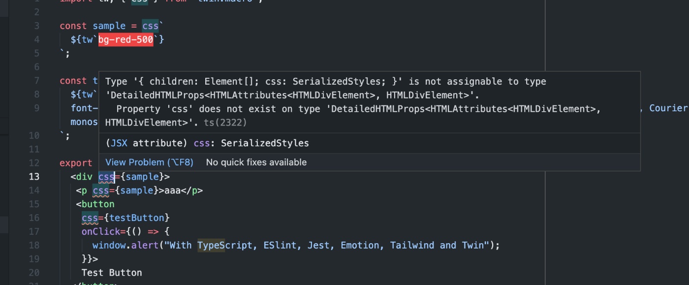
Type '{ children: Element[]; css: SerializedStyles; }' is not assignable to type 'DetailedHTMLProps<HTMLAttributes<HTMLDivElement>, HTMLDivElement>'.
  Property 'css' does not exist on type 'DetailedHTMLProps<HTMLAttributes<HTMLDivElement>, HTMLDivElement>
以下の指定をtsconfig.jsonに追加したらWarningが解消された。
{
  "compilerOptions": {
    ...
+   "types": ["@emotion/react/types/css-prop"],
  },
  "files": ["src/types/twin.d.ts"],
  "include": ["next-env.d.ts", "**/*.ts", "**/*.tsx"],
  "exclude": ["node_modules"]
}
汎用的なComponentの作成をしてみる
以下の記事を参考にTypographyのComponentをEmotion & Tailwind (Twin.macro)の環境で構築してみる
完成したコードは以下。
ポイント
条件によって適用するスタイルを変える
Twin.macroのGitHubページに記載されている通り、Componentのcssプロパティ内で[]によって複数のスタイルを適用できる。
import tw, { css } from 'twin.macro'

const hoverStyles = css`
  &:hover {
    border-color: black;
    ${tw`text-black`}
  }
`
const Input = ({ hasHover }) => (
  <input css={[tw`border`, hasHover && hoverStyles]} />
)
これを利用してpropsの値によって適用するスタイルを変更できる。
// boldが渡された時だけboldStyleを適用する
const Typography = ({ text, bold }: TypographyProps) => {
  return <div css={[typo, bold && boldStyle]}>{text}</div>;
};

export default Typography;

const color = "#d04221";

const typo = css`

  color: ${color};
`;

const boldStyle = css`
  font-weight: bold;
`;
Typographyの表示結果
以下の通りboldをpropsとして渡した場合だけboldStlyleが適用された。
      <Typography text="デフォルトのテキスト" />
      <Typography text="Boldのテキスト" bold />

条件が複数ある場合
Componentの設定の中でInlineに指定してもいいが、変数に切り出した方が可読性が高い?
以下はsizeのpropsによって適用するスタイルを変更するため、sizeStyleという変数に切り出した例。
const SizePattern = {
  h1: "h1",
  h2: "h2",
  h3: "h3",
} as const;
type SizePattern = typeof SizePattern[keyof typeof SizePattern];

export type TypographyProps = {
  text: string;
  bold?: boolean;
  size?: SizePattern;
};

const Typography = ({ text, bold, size }: TypographyProps) => {
  // sizeのPropsによって適用するスタイルを変更する
  const sizeStyle =
    size === SizePattern.h1
      ? h1
      : size === SizePattern.h2
      ? h2
      : size === SizePattern.h3
      ? h3
      : "";

  return <div css={[typo, bold && boldStyle, sizeStyle]}>{text}</div>;
};
propsで直接スタイルを指定できるようにする
Componentの呼び出し元から直接スタイルを指定できるようにします。
Emotion & Tailwind (Twin.macro)を使用する前提ということで、twまたはcssで定義したスタイルをpropsとして渡せる設計にしてみます。
const testStyleTw = tw`
  mt-10
`;

const testStyleCss = css`
  ${tw`bg-purple-200`}
`;

export const TypographyTest = () => {
  return (
    ...
      <Typography
        text="twを渡したテキスト"
        size="h1"
        bold
        styles={testStyleTw}
      />
      <Typography
        text="cssを渡したテキスト"
        size="h1"
        bold
        styles={testStyleCss}
      />
    </div>
  );
};
色々試しましたが、最終的には以下のコードで意図した挙動が実現できました。
import tw, { css, TwStyle } from "twin.macro";
import { SerializedStyles } from "@emotion/react";
...

export type TypographyProps = {
  styles?: TwStyle | SerializedStyles; // TwStyleかSerializedStylesを型として指定
};
const Typography = ({ text, bold, size, color, styles }: TypographyProps) => {
  ...
  return (
    <div
      css={[typo, bold && boldStyle, sizeStyle, colorStyle, styles && styles]}
    >
...
tw
twによって生成されるオブジェクトの型はTwStyleというものになるみたいです。
ソースコードとしては https://github.com/ben-rogerson/twin.macro/blob/master/types/index.d.ts に定義があります。
twin.macroのGitHubにtwin.macroが動作する仕組みについて記載があり、css-in-jsライブラリ(ここではemotion)に渡される前はcss objectsの状態に変換されているようです。
When babel runs over your javascript or typescript files at compile time, twin grabs your classes and converts them into css objects. These css objects are then passed into your chosen css-in-js library without the need for an extra client-side bundle:
上記のページから持ってきたものですが、css objectsの形式は以下のようなイメージです。
{
  fontSize: '0.875rem',
  '@media (min-width: 768px)': {
    fontSize: '1.125rem',
  },
}
そして、前述の通りTwStyleというのがtwin.macroで上記のcss objectsを定義している型だと理解しました。
css
cssの場合はemotionで定義されているSerializedStylesが生成されるようです。
これはtwinで触れたtwin.macroの仕組みとも関連しますが、cssはtwin.macroではなくemotionの機能を利用しているためだと思います。
emotionの動作については以下のページが非常に参考になりました。
nabetsuStorybookの導入
公式ページに記載の通り以下の手順で実行する。
# Storybookの追加
npx sb init

# ローカルでの起動
yarn storybook // エラー
すると以下のエラーが出る。
Error: PostCSS plugin tailwindcss requires PostCSS 8.
Migration guide for end-users:
https://github.com/postcss/postcss/wiki/PostCSS-8-for-end-users
メッセージに表示されているIssueを見ると色々書いてあるが、Next.js + Tailwind CSS に Storybook を導入する方法に記載の通りアドオンの@storybook/addon-postcssをインストールして設定を追加したらエラーは出なくなった。
module.exports = {
  "stories": [
    "../src/**/*.stories.mdx",
    "../src/**/*.stories.@(js|jsx|ts|tsx)"
  ],
  "addons": [
    "@storybook/addon-links",
    "@storybook/addon-essentials",
+    {
+      name: '@storybook/addon-postcss',
+      options: {
+        postcssLoaderOptions: {
+          implementation: require('postcss'),
+        },
+      },
+    },
  ]
}
emotionの問題
以下のメッセージが表示され、storybook上でCSSが反映されない。
yarn devでNext.jsを立ち上げた時は問題なく表示される。
ChromeのDeveloper Toolsで見てみると以下のメッセージが表示されている。
You have tried to stringify object returned from `css` function. It isn't supposed to be used directly (e.g. as value of the `className` prop), but rather handed to emotion so it can handle it (e.g. as value of `css` prop)
以下の記事を参考にStorybookの設定を変えたら正常にスタイルが適用されることを確認。
module.exports = {
  "stories": [
    "../src/**/*.stories.mdx",
    "../src/**/*.stories.@(js|jsx|ts|tsx)"
  ],
  "addons": [
    "@storybook/addon-links",
    "@storybook/addon-essentials",
    {
      name: '@storybook/addon-postcss',
      options: {
        postcssLoaderOptions: {
          implementation: require('postcss'),
        },
      },
    },
  ],
+  babel: async (options) => ({
+   ...options,
+    // any extra options you want to set
+    "presets": ["@emotion/babel-preset-css-prop"]
+  }),
}
色々な設定
documentの追加
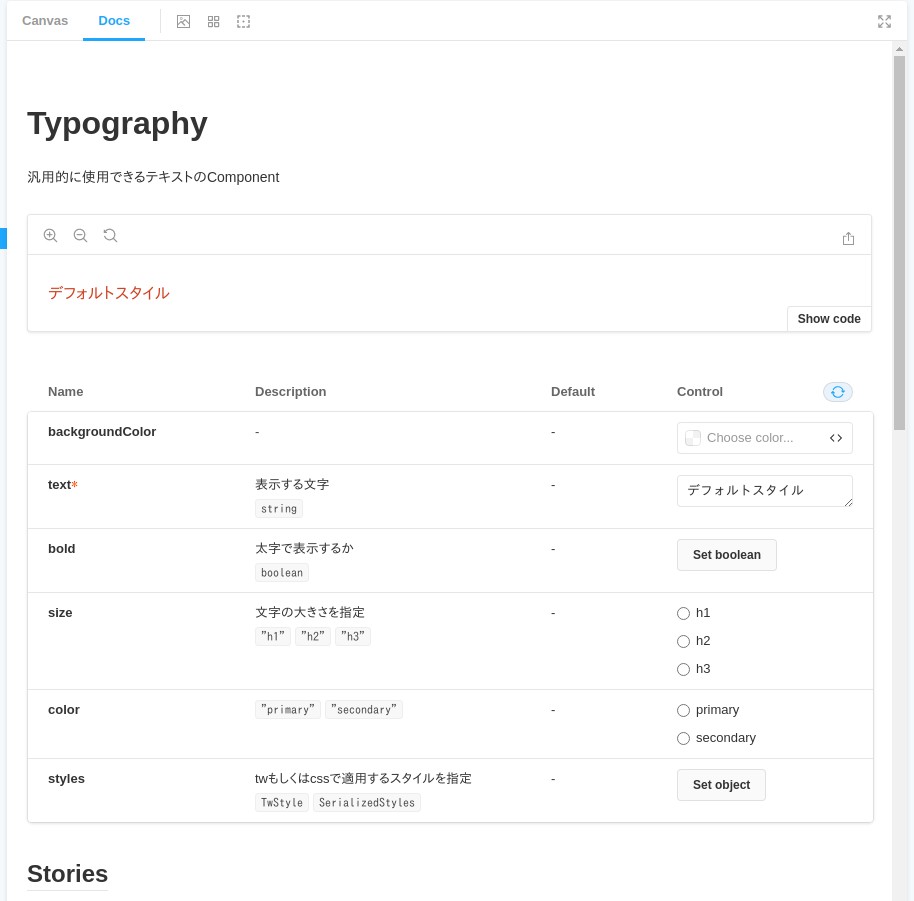
PropsとComponentにコメントを追加すればその内容がdocsに表示される。記法は通常のコメントでも、JSDocでも大丈夫っぽい。(他のツール等を併用する可能性とかを考えるとJSDocで書いといた方が安心?)
export type TypographyProps = {
  /**
  * 表示する文字
  */
  text: string;
  /**
  * 太字で表示するか
  */
  bold?: boolean;
  /**
  * 文字の大きさを指定
  */
  size?: SizePattern;
  /**
  *
  */
  color?: ColorPattern;
  /**
  * twもしくはcssで適用するスタイルを指定
  */
  styles?: TwStyle | SerializedStyles;
};

/**
 * 汎用的に使用できるテキストのComponent
 *
 * @component
 * @example
 * const text = 'サンプルテキスト'
 * return (
 *   <Typography text={text} />
 * )
 */
const Typography = ({ text, bold, size, color, styles }: TypographyProps) => {
上記のように説明を追加すると、StorybookのDocsタブから確認できる。
アクセシビリティの自動チェック
@storybook/addon-a11yというアドオンを追加することで、アクセシビリティについてチェックを自動で実行してくれる
セットアップ
使用方法
アドオンとして追加するだけで自動でAccessibilityタブが追加され、チェック結果を表示してくれる。
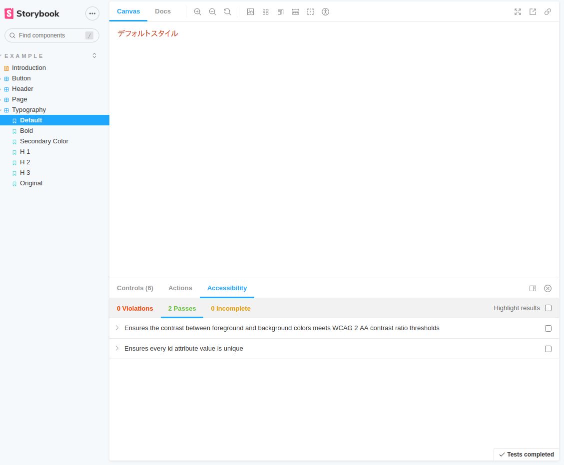
チェック内容自体は設定を加えることで色々とカスタマイズできる。
詳細は公式ページ 参照。
自動化
しかし、これだけだと一々目視して確認しないといけない。
CI等でチェックを自動で実行するにはstorybook-a11y-reportというライブラリを入れればいい。
ライブラリをインストールして、package.jsonのスクリプトに追加。
{
  "name": "my-app",
  "version": "0.1.0",
  "private": true,
  "scripts": {
    ..
+    "a11y-report": "storybook-a11y-report"
  },
後はコマンドを実行すると自動でチェックを実施してくれる。
# storybookを事前に起動させておく
$ yarn storybook

# その上でstorybook-a11y-reportを起動する
$ yarn a11y-report
yarn run v1.22.10
$ storybook-a11y-report
✔ Found 15 stories.

A11y ID: color-contrast
description: Ensures the contrast between foreground and background colors meets WCAG 2 AA contrast ratio thresholds
Detected on:
    http://localhost:6006/?path=/story/example-button--primary
    http://localhost:6006/?path=/story/example-header--logged-out
    http://localhost:6006/?path=/story/example-page--logged-in
    http://localhost:6006/?path=/story/example-page--logged-out

You can check the report out here:
    /xxxxxxxxxx/my-app/__report__/a11y_report.md
Done in 3.01s.
参考資料
nabetsuForm
- react-hook-formに依存しないようにする
- Formの要素それぞれでComponentを作成し、外側(親Component)からReact-hook-formの機能を使ってラップするイメージ
注意点
yupでのスキーマ定義で不要な項目を定義しているとsubmitが行われない
const schema = yup.object().shape({
  username: yup.string().required(),
  firstName: yup.string().required(),
  age: yup.number().positive().integer().required(),
});
Controllerの定義
公式ドキュメントに記載の通りv7から?renderの書き方が変わった。
<Controller
  name="username"
  render={({
    field: { onChange, onBlur, value },
  }) => (
    <TextField
      value={value}
      onChange={onChange}
      onBlur={onBlur}
    />
)}
Componentのみ
Componentとelementの組み合わせ
import tw, { css } from "twin.macro";
import { TextField } from '~/components/atoms/TextField'
import { Controller, useForm, FormProvider, useFormContext } from 'react-hook-form'
import { yupResolver } from '@hookform/resolvers/yup';
import * as yup from "yup";

const schema = yup.object().shape({
  username: yup.string().required(),
  firstName: yup.string().required(),
  age: yup.number().positive().integer().required(),
});

const defaultValues = {
  username: '初期値',
  firstName: null,
  age: null
}

export const Form = () => {
  const methods = useForm({
    resolver: yupResolver(schema),
    mode: "onBlur",
    defaultValues: defaultValues
  })
  const { handleSubmit, formState: { errors }, register } = methods
  return (
    <div css={tw`w-full max-w-xs mx-auto`}>
      <FormProvider {...methods}>
        <form css={tw`bg-white shadow-md rounded px-8 pt-6 pb-8 mb-4`} onSubmit={handleSubmit(data => console.log(data))}>
          <div css={tw`mb-4`}>
            <label css={tw`block text-gray-700 text-sm font-bold mb-2`}>
              Username
            </label>
            <Controller
              name="username"
              render={({
                field: { onChange, onBlur, value },
              }) => (
                <TextField
                  value={value}
                  onChange={onChange}
                  onBlur={onBlur}
                />
              )}
            />
            <p>{errors.username?.message}</p>
          </div>
          <div css={tw`mb-4`}>
            <label css={tw`block text-gray-700 text-sm font-bold mb-2`}>
              FirstName
            </label>
            <input {...register("firstName")} css={tw`shadow appearance-none border rounded w-full py-2 px-3 text-gray-700 leading-tight focus:outline-none`} />
            <p>{errors.firstName?.message}</p>
          </div>
          <div css={tw`mb-4`}>
            <label css={tw`block text-gray-700 text-sm font-bold mb-2`}>
              Age
            </label>
            <input {...register("age")} css={tw`shadow appearance-none border rounded w-full py-2 px-3 text-gray-700 leading-tight focus:outline-none`} />
            <p>{errors.age?.message}</p>
          </div>
          <button type='submit' css={tw`bg-blue-500 hover:bg-blue-700 text-white font-bold py-2 px-4 rounded focus:outline-none focus:shadow-sm`}>Submit</button>
        </form>
      </FormProvider>
    </div>
  );
};


export default Form;
yupの日本語化
objectの定義で直接エラーメッセージを定義することもできる。
const schema = yup.object().shape({
  username: yup.string().required('aaaa'),
  ...
});
setLocale
setLocaleを使うことでメッセージとの対応関係を定義することができる。
yup.setLocale({
  mixed: {
    required: () => `入力必須項目です。`,
  }
});

const schema = yup.object().shape({
  username: yup.string().required(),
  firstName: yup.string().required(),
  age: yup.number().positive().integer().required(),
});
指定可能な項目についてはyupの公式ページを参照。
参考資料
nabetsuインタラクションの追加
- ライブラリとして
framer-motionを使う
Install
yarn add framer-motion
基本的な使い方
以下のようにmotionをimportしてComponentに対してアニメーションを指定する。
スタイリングに関してはこれまでと同様Twin.macroをつかってできる。
import { motion } from "framer-motion"

      <motion.div
        css={tw` bg-black w-12 h-12`}
        animate={{ scale: 2 }}
        transition={{ duration: 0.5 }}
      />
animationにArrayを渡すことで複数の効果を順番に適用できる。
      <motion.div
        css={tw` bg-black w-12 h-12`}
        animate={{
          scale: [1, 2, 2, 1, 1],
          rotate: [0, 0, 270, 270, 0],
          borderRadius: ["20%", "20%", "50%", "50%", "20%"],
        }}
        transition={{ duration: 0.5 }}
      />
Point
ページを遷移しても表示するようにする
一定時間経過後に表示を消す
aaa
nabetsuFormの作成
インストール
yarn add react-hook-form